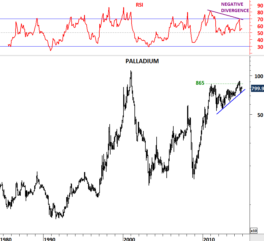
NIKKEI 225 & EURO STOXX 50

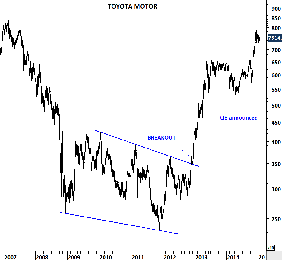
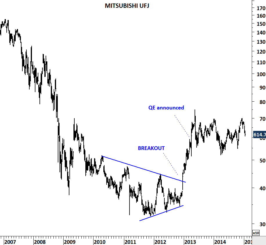
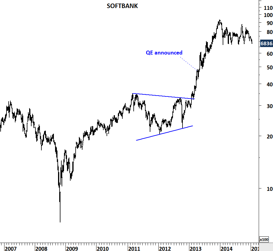
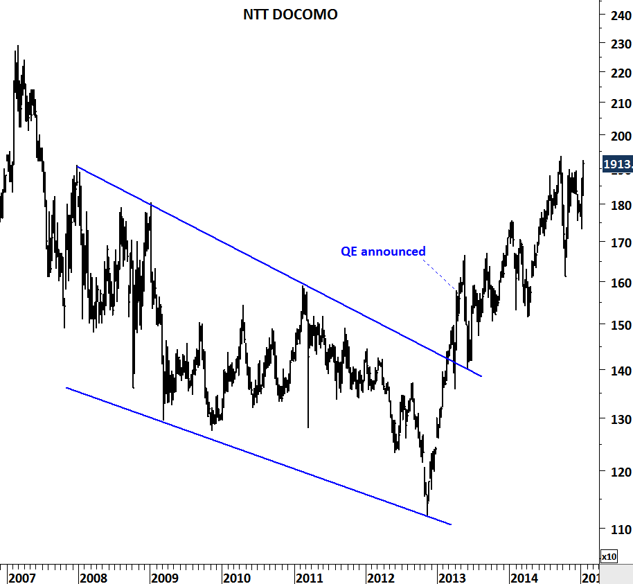
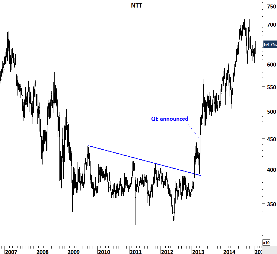
When Japan’s Central Bank announced its QE program in April 2013 it was a big surprise for the public at least according to the way some of the mainstream media announced it. The Independent wrote “Japan tries shock and awe to jump-start stalled economy”. At the time Japan had already elected a new government which signaled monetary easing.

I reviewed the top 5 names in the widely followed Japanese equity benchmark – Nikkei 225. Most of the names anticipated the monetary easing and broke out of their multi-year base formations. When the QE was announced it was a confirmation for the market rather than a surprise. Below are the top 5 names from the Nikkei 225. Markets are discounting mechanisms.

TOYOTA MOTORS

MITSUBISHI

SOFTBANK

NTT DOCOMO

NTT

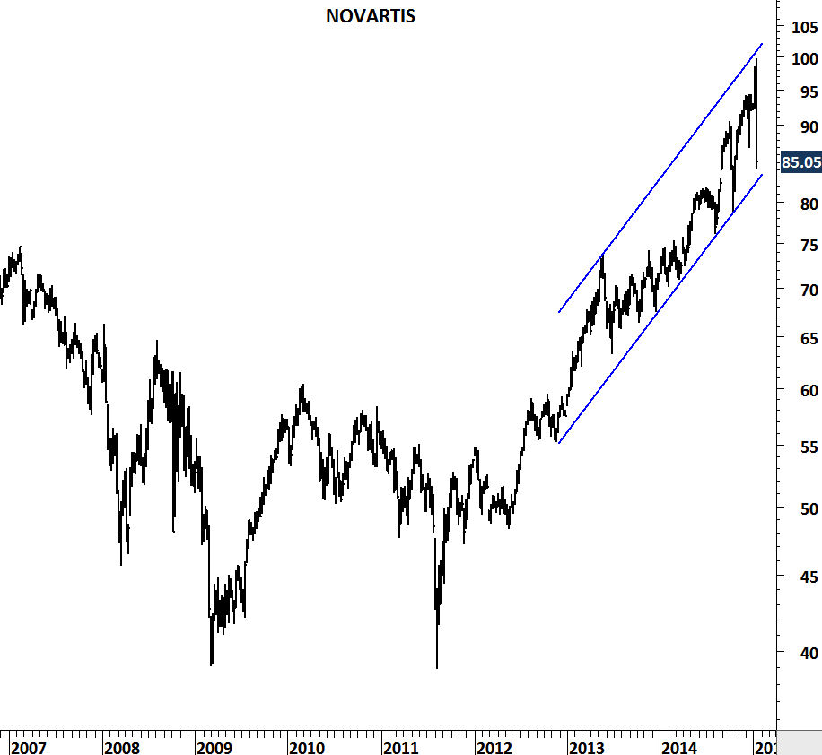
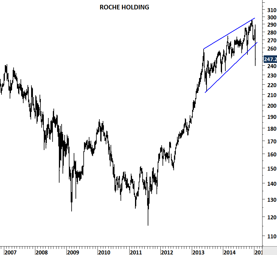
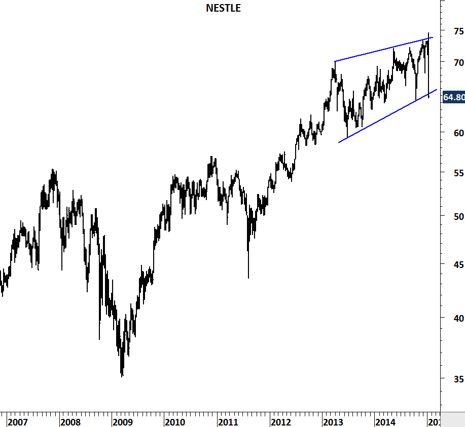
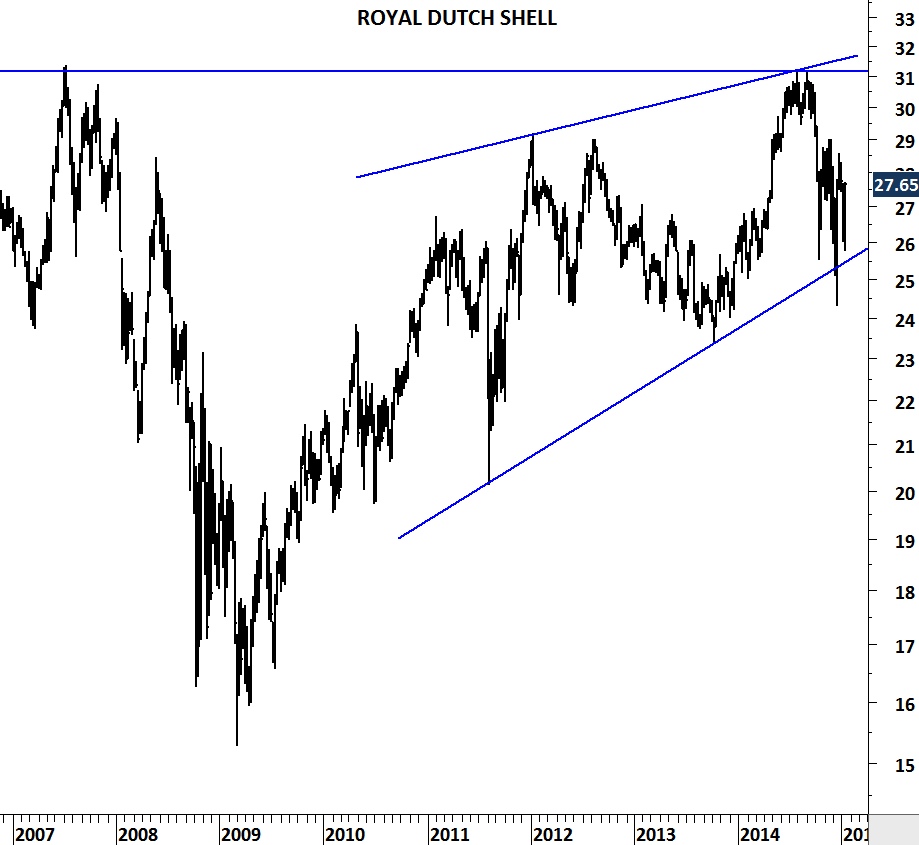
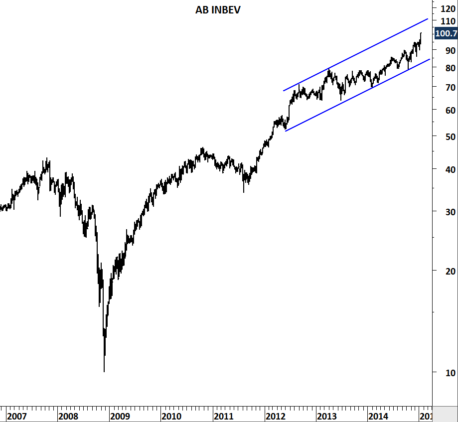
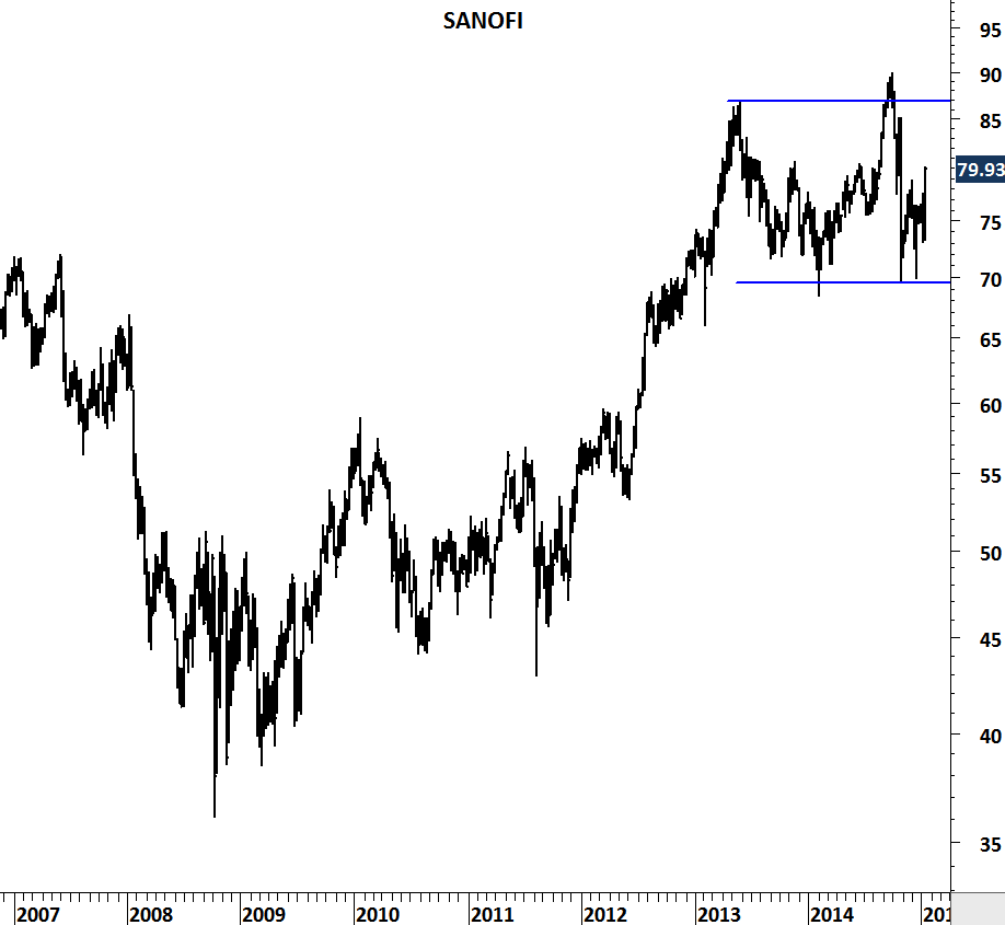
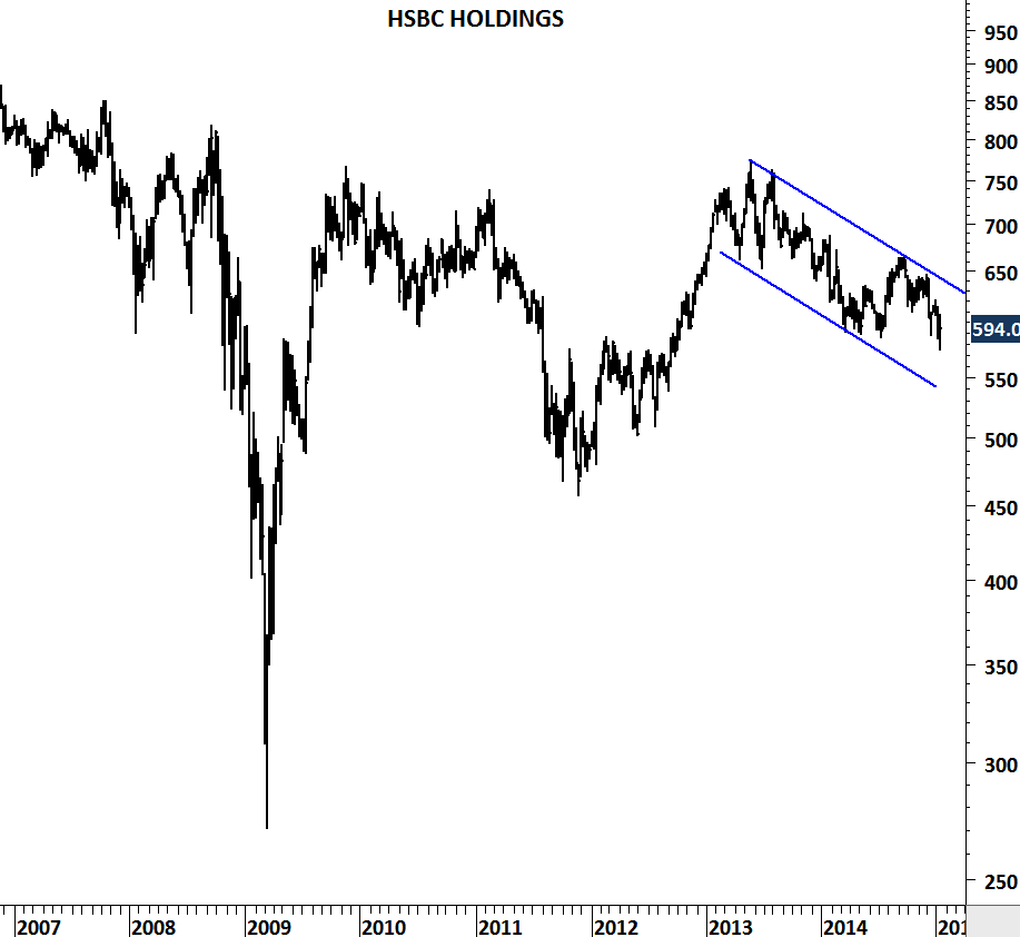
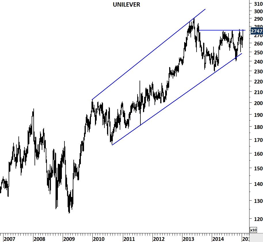
When a trade is assigned %100 probability of success, I start getting uncomfortable. I look around and see almost certainty for an event to occur… this becomes a case study for me. European Central Bank’s Quantitative easing is now being announced by the mainstream media as almost a certain event. I reviewed the top names in the Euro Stoxx 50 index to see if the market is anticipating this almost sure event. What I find is a bit different from the Japanese QE announcement. None of the names except UNILEVER is preparing for a breakout. Some of the names are overbought and some are showing significant weakness.

Take this update as a case study and not as a forecast. My conclusion for the top European stocks is that there is no clear anticipation of QE that would spill over to result in further equity gains. Below are the largest market cap stocks in the Euro Stoxx 50 index. I welcome any thoughts on this.

NOVARTIS

ROCHE HOLDING

NESTLE

ROYAL DUTCH

AB INBEV

SANOFI

HSBC HOLDINGS

UNILEVER

U.S. UNEMPLOYMENT RATE

Two-decade long horizontal support at 280K on the U.S. weekly jobless claims chart suggest we might be at a “positive extreme” for the U.S. job market. 1989, 2000 and 2006 have proved to be the lowest levels for the weekly jobless claims. Reversals from 280K area resulted in a weak U.S. job market in the following years. Unemployment rate moved higher following the years 1989, 2000 and 2006. In 2014, U.S. weekly jobless claims reached as low as 266K. Latest data stand at 316K. Every long-term trend has an end. Historical levels on the long-term charts are warning us of a possible reversal. It is important to keep an eye on these two long-term charts in the following months.

US WEEKLY JOBLESS CLAIMS

US UNEMPLOYMENT RATE

MSCI ALL COUNTRIES WORLD INDEX

This update will cover several markets. There has been significant developments in the first half of January. I’ve given the title MSCI ALL COUNTRIES WORLD INDEX because I think it is one of the most important chart in this update. However, developments in Copper, Palladium and Emerging Markets index are also exciting. Over the past few weeks I’ve updated Tech Charts twitter followers on Copper, Palladium, Light Crude Oil, MSCI Emerging Markets index and some other chart patterns on equities. This will be an update for all followers.

MSCI ALL COUNTRIES WORLD INDEX

MSCI ALL COUNTRIES WORLD INDEX is at a critical juncture. Index covers more than 9000 securities in 46 different Developed and Emerging markets. I find it as a good representation of the global equity market performance. Attached is a monthly scale chart. MACD, which is a momentum and a trend following indicator generated a sell signal in November 2014. Cross-over on MACD is usually the first warning signal for a possible trend reversal. 2-year moving average which acted as a good trend following tool over the past decades is now at 395 levels. Breakdown below 392 (previous low in October 2014) will confirm the medium/long-term correction in global equities. We need to be prepared. This chart is at the top of my watch list.

COPPER

Dr. Copper warned us and I’ve sent several updates on this chart development. Weakness in Copper prices is negative for the global growth. Chart pattern (descending triangle) suggested lower prices below 3 levels. Breakdown was followed by an acceleration on the downside. Descending triangle price target is between 2.10-2.25. 2.10-2.25 area is also the lower boundary of the trend channel. Weakness can continue.

MSCI EMERGING MARKETS INDEX

I study volatility on daily, weekly and monthly scale. A chart with low volatility on weekly and monthly scale is important for me. The longer the low volatility period, the better it is. Because that means there is a lot of energy built in that low volatile consolidation range and a a breakout is usually followed by a strong directional movement. This is the case for the MSCI Emerging Markets Index. Volatility reached multi-decade low levels on the monthly scale chart. A decisive monthly scale breakdown below 900 levels will push emerging markets to lower levels. This is a developing story and should also be watched closely.

LIGHT CRUDE OIL

Mainstream media is talking about $40 oil price. Here is where that level is coming from. $40 is a long-term support/resistance level for the WTI Light Crude Oil. The important question is will it find support at that level? Well, for me the long-term chart is the best available information. In the past buyers/sellers appeared around $35-$40 area. I’ll expect the same. If we see a rebound, the next thing I will check will be how strong the rebound is. A weak rebound that hardly pushes the prices above $50 will signal further weakness for energy prices in the long-term.

PALLADIUM

Last but not least, Palladium. I think the last 2 year’s uptrend has been extremely weak. Price tried to reach 2011 high level and it took 2 years for Palladium to reach that level with a major negative divergence on RSI on the monthly scale chart. October low stands at 725 levels. Breakdown below this level will send prices lower, possibly towards 500 levels.

TIN

TIN IMAGEOne of the strongest bull markets in the metal complex is about to end. Tin is highly used in electronics. It is mixed into solder for circuitry in smartphones. Tin is used in everyday life in almost all electronic item. Notebooks, tablets, smartphones… Chart pattern suggests prices are headed for lower levels as we have seen some major breakdowns over the past year. Both the uptrend that has been intact since 2002 and the medium-term sideways consolidation (symmetrical triangle) have broken down. Unless we see a recovery above 21K levels, price could sell-off towards 15K-12K area in the following months. I have also added other industrial metals such as Lead, Aluminum and Copper. Both Copper and Tin are likely to join the weakness in other industrial metals.

TIN

ALUMINUM

COPPER

LEAD

MSCI ALL COUNTRIES WORLD INDEX

For those of you who don’t follow twitter, here are some of the important charts that I shared today. Both MSCI ALL COUNTRIES WORLD INDEX and MSCI EMERGING MARKETS INDEX are at critical levels. Multi-year low volatility in equity indices and commodities (metals) suggest we are approaching strong trend periods.

PALLADIUM

PALLADIUM

Negative divergence on Palladium chart is a red flag. Divergences are first warning signals of a possible trend reversal. However they should be confirmed by price action – a decisive breakdown. There are few negative signs on this long-term (monthly scale) chart.

1) Price breached its previous high but failed to hold above that level (865).

2) Top in 2011 and the new high in 2014 are not confirmed by the momentum indicator (RSI (14)).

3) Uptrend that started from the low in 2012 has been very weak and choppy.

In the coming months, a breakdown below 700 levels can send Palladium towards 500.

I welcome any thoughts on the possible supply/demand that resulted in such price action or could impact the price in the coming months.

AUD/USD

In a downtrend the lower boundary of a trend channel represents the “negative” extreme and the upper boundary the “positive” extreme. Price is expected to rebound from the positive and negative extremes. A downtrend is likely to reverse when the upper boundary is broken on the upside. Likewise an uptrend is likely to reverse when the lower boundary is broken on the downside.

CHANGE IN TREND DIRECTION

But what happens when the price doesn’t rebound from the lower or the upper boundary of the trend channel? Breaking down a negative extreme is usually a sign of an accelerated move in the direction of the breakdown.

ACCELERATION IN CURRENT TREND

This is the case with AUD/USD. Since 2011, Australian Dollar vs. U.S. Dollar has been in a downtrend. Cross rate rebounded from the lower boundary twice in 2013. With the latest sell-off AUD/USD breached the lower boundary, failing to rebound. Unless the cross rate recovers above 0.85 levels in the following weeks, latest breakdown will be the beginning of an accelerated move on the downside. In the short/medium-term and Australian dollar is weak against the U.S. dollar.

AUDUSD

MALAYSIA KLSE COMPOSITE INDEX

Malaysia KLSE Composite index formed a head and shoulder chart pattern. Head and shoulder top is a reversal chart pattern and it is bearish. Today the index slipped below the neckline at 1,770 level. Consecutive daily closes below the support at 1,770 level will confirm the breakdown and possibly push the index towards 1,650 levels in the following weeks. Negative view for the Malaysian equities is confirmed by the weakness in the local currency which breached 3.37 resistance over the past few days. Breakout from a year-long sideways consolidation range can result in further weakness towards 3.55 levels for the Malaysian ringgit.

MALAYSIA KLSE COMP INDEX

USDMYR

Financial sector performance has been weak and below are some of the names that experienced major breakdowns.

CIMB GROUP HOLDING HONG LEONG FINANCIAL GROUP

MAYBANK

USD/RUB (U.S. DOLLAR/RUSSIAN RUBLE)

USDRUB

Parabolic moves are not sustainable. They are also not easy to trade. It is costly to pick a top or a bottom. Price usually doesn’t stop where we think it would stop. However as a chartist I feel the urge to bring such imbalances to your attention. Whatever the instrument, these type of price movements are the perfect case studies to examine crowd psychology. USD/RUB entered into a parabolic move after breaking above 36.50 – historical high level. Sharp reversals are experienced after such steep price actions. In the past, similar price movements took place on few other charts.

USDKES

In 2011, USD/KES (U.S. DOLLAR/KENYAN SHILLING) had a similar long-term breakout followed by a 8 month-long parabolic move. Steep price action was reversed by Central Bank of Kenya’s bold action to raise interest rates from 6 percent to 18 percent in less than a year.

KENYA INTEREST RATES

In 2008, Rough Rice price rallied from 11.45 to 25 levels. Rice made the headlines (news on Rough Rice). Hoarding and export bans were the result of the sharp price increase. Rough rice fell back to 11.45 levels in the following year.

ROUGH RICE

US DOLLAR/INDONESIAN RUPIAH

It’s been the year of the U.S. dollar. USD gained strength against most of the developed and emerging market currencies. Central Banks in emerging markets had to adjust interest rates to control currency depreciation. There is one emerging market cross rate that is worth paying attention to. Worst might not be over for the Indonesian rupiah as the USD/IDR cross rate challenges decade-long horizontal resistance. Breakouts from such long-term consolidations usually signal major shift in sentiment and also stress for the economic conditions. USD/IDR is testing critical levels and a breakout above 12,400 levels can result in a sharp depreciation of the currency.

USDIDR

Monthly scale price chart of the US Dollar / Indonesian Rupiah

Weekly scale chart shows the ascending triangle chart pattern – usually regarded as a bullish development in technical analysis. Both the boundaries of the ascending triangle and the decade-long flat consolidation range are overlapping at 12,400 levels – a technical condition that increases the validity of the resistance level.

USDIDR II

Weekly scale price chart of the U.S. Dollar / Indonesian Rupiah