NATURAL GAS

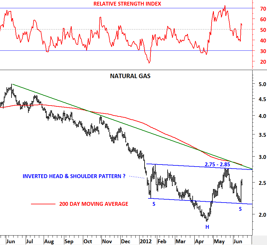
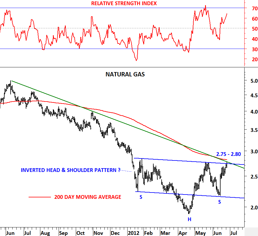
Since my last update on Natural Gas price moved higher and reached the important resistance area between 2.75 and 2.80. Earlier analysis discussed the possibility of a head & shoulder bottom reversal.

http://techcharts.wordpress.com/2012/06/18/natural-gas-3/

Natural gas is now closer to a decisive price action. A breakout above 2.75-2.80 will confirm the head and shoulder bottom and target 4.0 levels. It is important to note that 3 different technical resistances are overlapping at this resistance area. Year-long downward trend line, 200 day moving average and the neckline of the inverted head & shoulder pattern. A breakout should be significant. Failure to break above 2.75-2.80 area will pull the price back to 2.5 levels and result in more sideways consolidation below 2.75.

 

MSCI EMERGING MARKETS

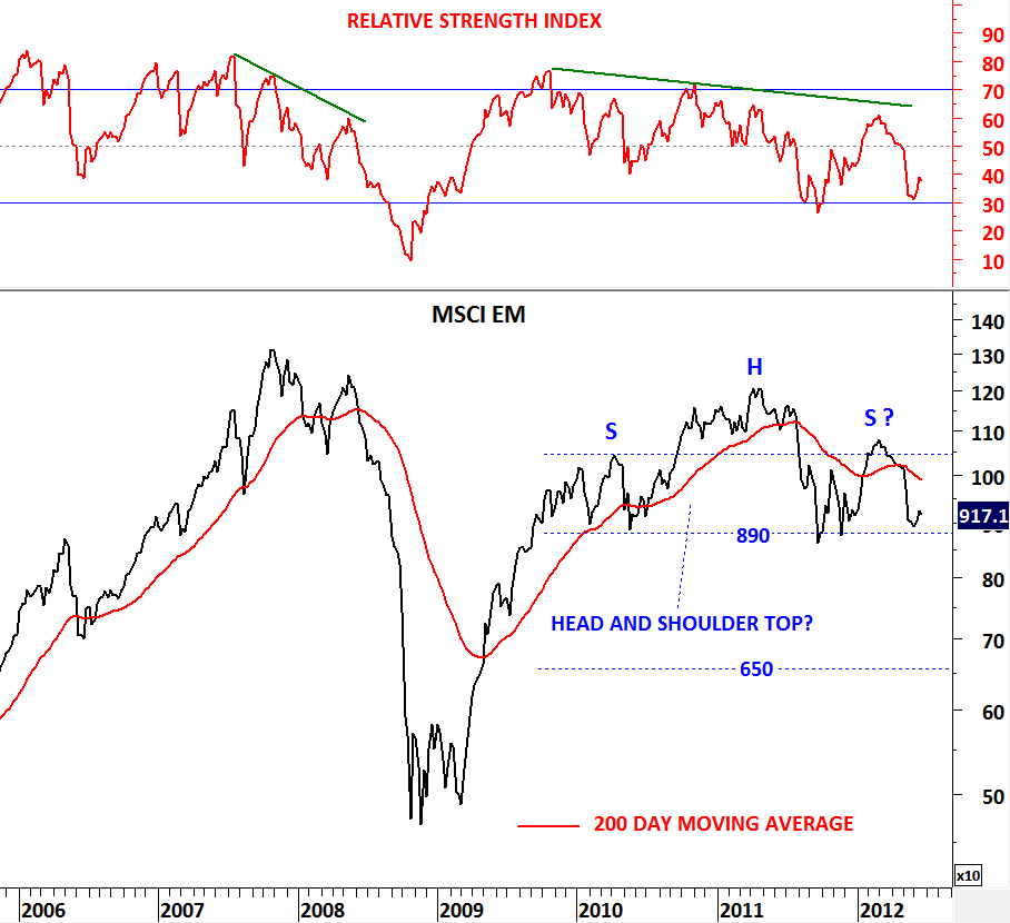
High volatility in May is followed by a calm period in June. After the sharp sell-off in almost all asset classes during May we are now seeing short-term rebounds. Even though some commodities, equity indices and currency pairs are resuming their slide. MSCI Emerging Markets is a widely followed index that found support in the beginning of June. Index rebounded from an extremely critical level. MSCI EM formed a 3 year-long head and shoulder top reversal with the neckline standing at 890 levels. Head and shoulder top hasn’t been confirmed yet. For confirmation we need to see a decisive “weekly” close below 890 levels. Given the symmetry between the left and the right shoulders on the H&S top, there is a high chance of this chart pattern being a classical head & shoulder top.

A decisive break below 890 levels will target 650 levels in the medium/long-term. Head and shoulder tops or bottoms do fail. A failure will occur only if the index breaches above the peak of the right shoulder at 1,070 levels. For now we continue to follow MSCI EM index with a bearish outlook and watch this major chart pattern as a Head & Shoulder top.

U.S. HOUSING STARTS & U.S. BUILDING PERMITS

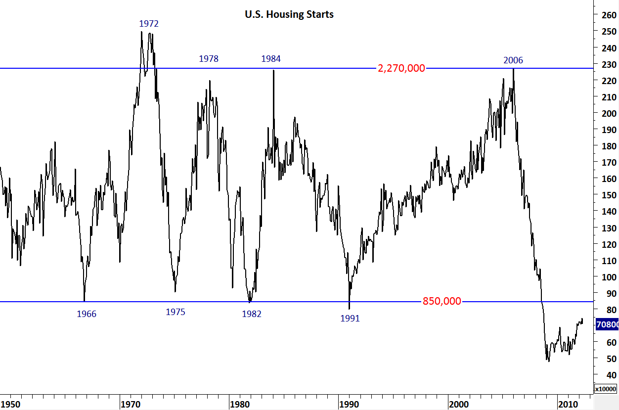
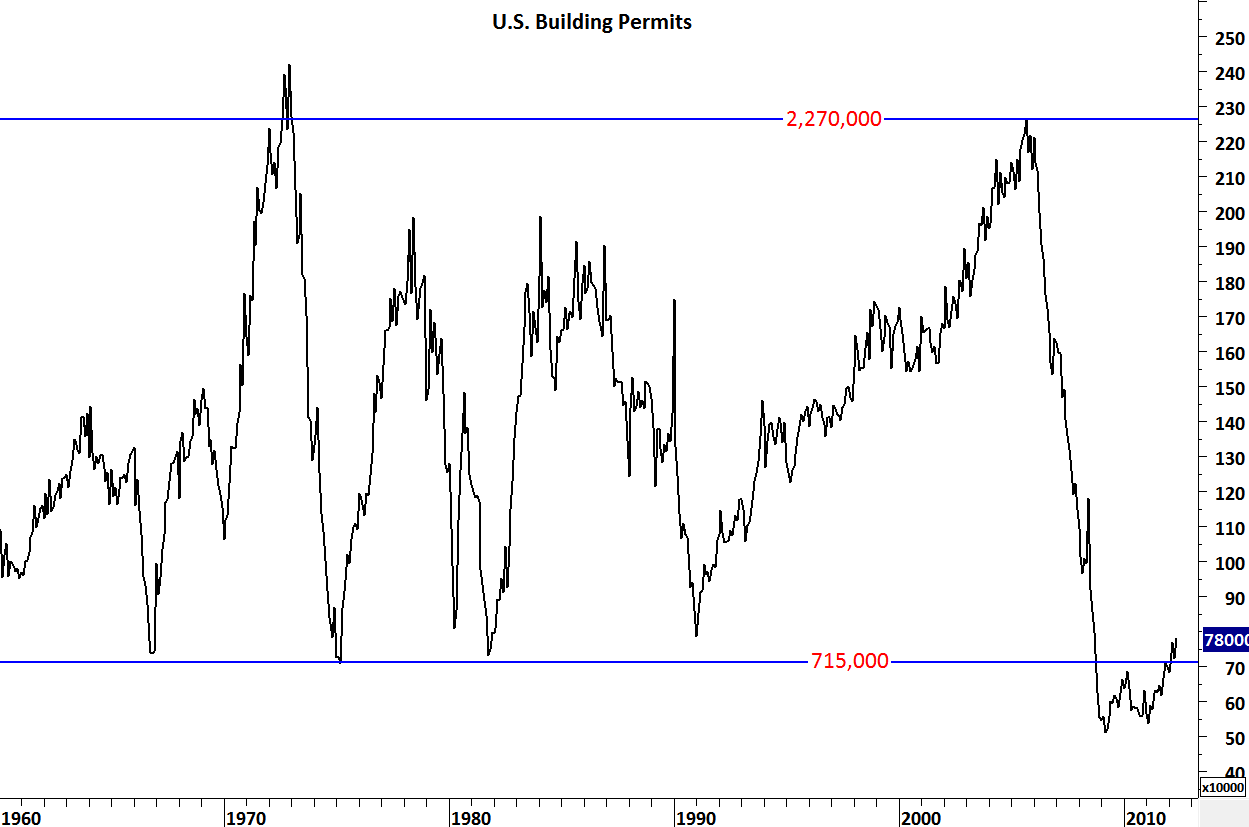
Housing starts in U.S. fell 4.8% in May. Total starts dropped 4.8 percent to a 708,000 annual pace in May from a revised 744,000 rate in the prior month that was the highest since October 2008, today’s report showed. Building permits increased 7.9 percent to a 780,000 annual rate, reflecting gains in single-family and multifamily homes.

How strong are these numbers and what has it been like historically? I’m posting two historical charts on both housing starts and building permits.

Since 1960s housing starts have been cyclical between 2,270,000 and 850,000 units. Until the latest collapse (2006-2009) there has been 4 consecutive troughs and peaks. 1966,1975, 1982 and 1991 were depressed housing market years with housing starts reaching 850K level and 1972,1978, 1984 and 2006 were strong housing market years reaching 2,270,000 level. What is different in the latest housing collapse (2006-now)? First, the market overshoot the 850K number, second it has taken longer to rebound when compared with the previous V-shaped reversals/recoveries.

It is true that building permits are rising and this is definitely positive. However, we should see the housing starts back above 850K threshold to be more optimistic about the U.S. housing market.


NATURAL GAS

Natural gas had a strong rebound from 2.2 levels. It recorded +10% gain in one day. Price formed a perfect symmetry after finding support at 2.2 levels, a requirement for a head and shoulder pattern. Now we have symmetrical Left and Right shoulders. Confirmation of the inverted head and shoulder pattern will be a decisive break above 2.75-2.85 area. It is important to note that both the neckline and the long-term 200 day moving average is forming resistance between 2.75 and 2.85. Breakout above this area will be positive for Natural Gas. Keep this chart on your watch list.

SPAIN 10 YEAR YIELDS

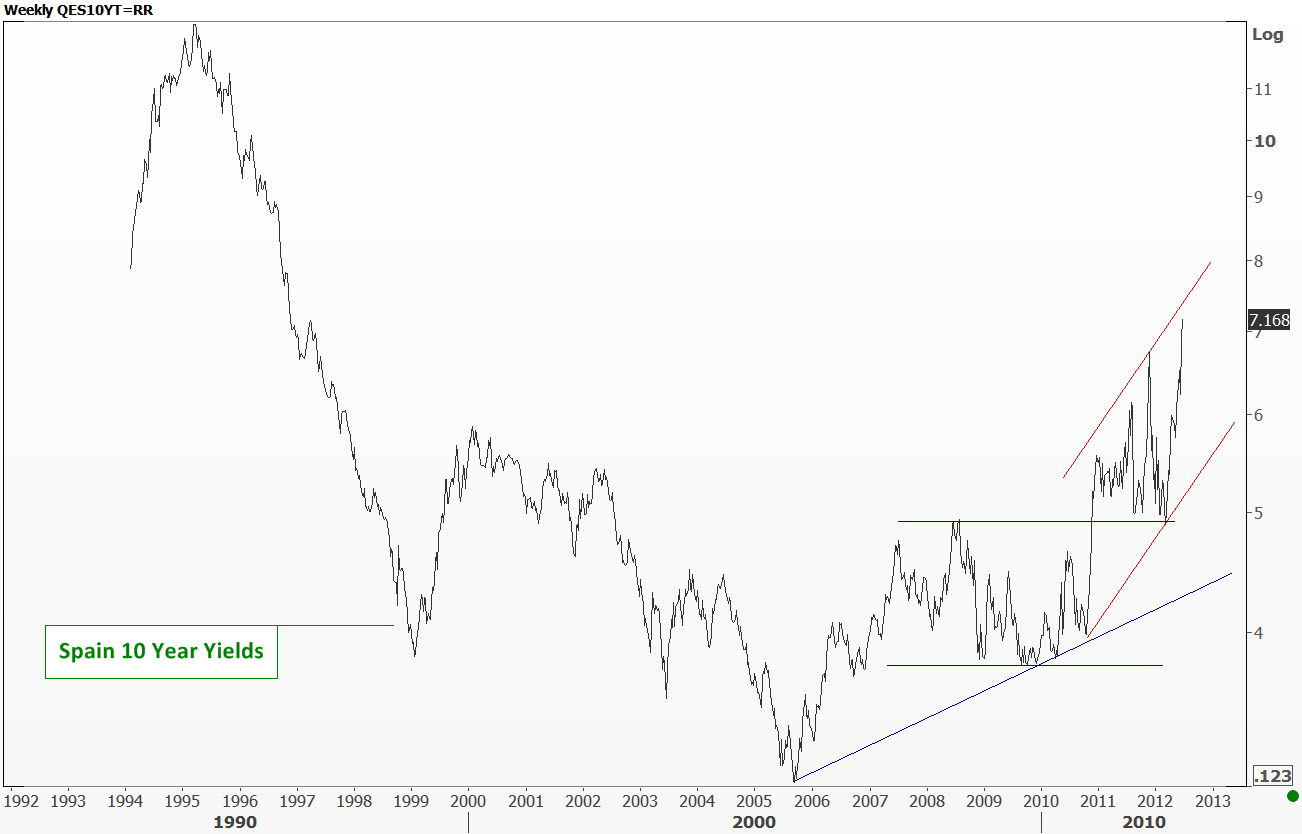
Spain meets Croatia tonight for Euro 2012 tournament. Greece had a great victory against Russia. Both teams are probably qualifying for quarter finals. While the news for Spain and Greece is exciting on the Euro cup side, it is not as rosy on the economics side. Yesterday Greece had elections. Results: positive. Market reaction: short-lived optimism. Markets are now focusing on Spanish 10 year govt. yields which is now exceeding 7%. 7 percent was the threshold that forced Greece, Ireland and Portugal to call for sovereign rescues for the first time since the euro’s creation. Likewise this level is extremely critical for Spain.

Uptrend that started in the beginning of 2006 is now accelerating on the upside. Spanish yields bottomed at 3% in the beginning of 2006 and reached 7% over the past 6 years, levels that was not seen since 1997. Charts are telling us that the uptrend is gaining strength. Intermediate term support area is between 5 and 6. Expect yields to move higher and challenge Spain and euro zone further.

U.S. Initial Jobless Claims

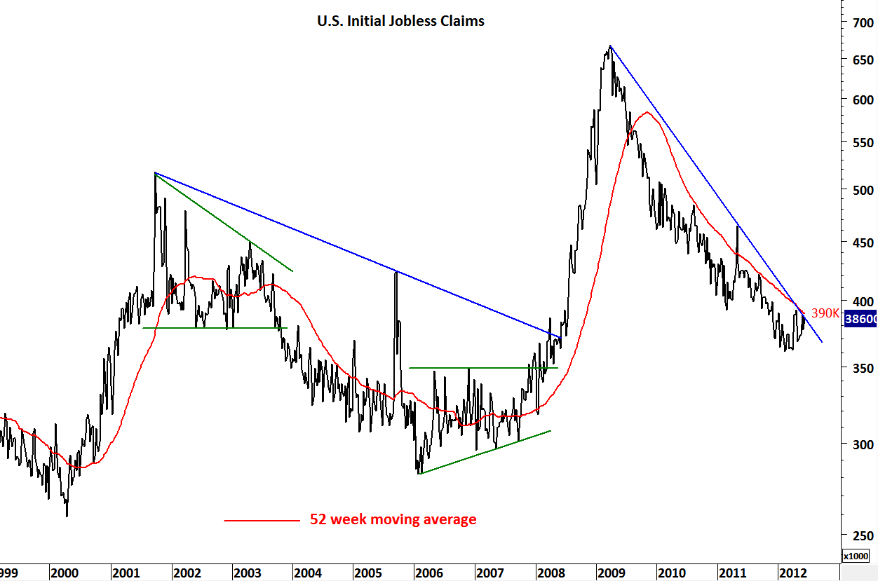
Another negative data for the unemployment with an increase in initial jobless claims by 6,000.  Prior week is now at 380,000 which is 3,000 higher than the initial estimate. Though still below the 52-week moving average 386,000 is now very close to the important resistance at 390,000. Continuing deterioration in the unemployment figures can reverse the downtrend that has been intact since the first quarter of 2009. This will not bode well for the unemployment that is now at 8.2%

U.S. Initial Jobless Claims

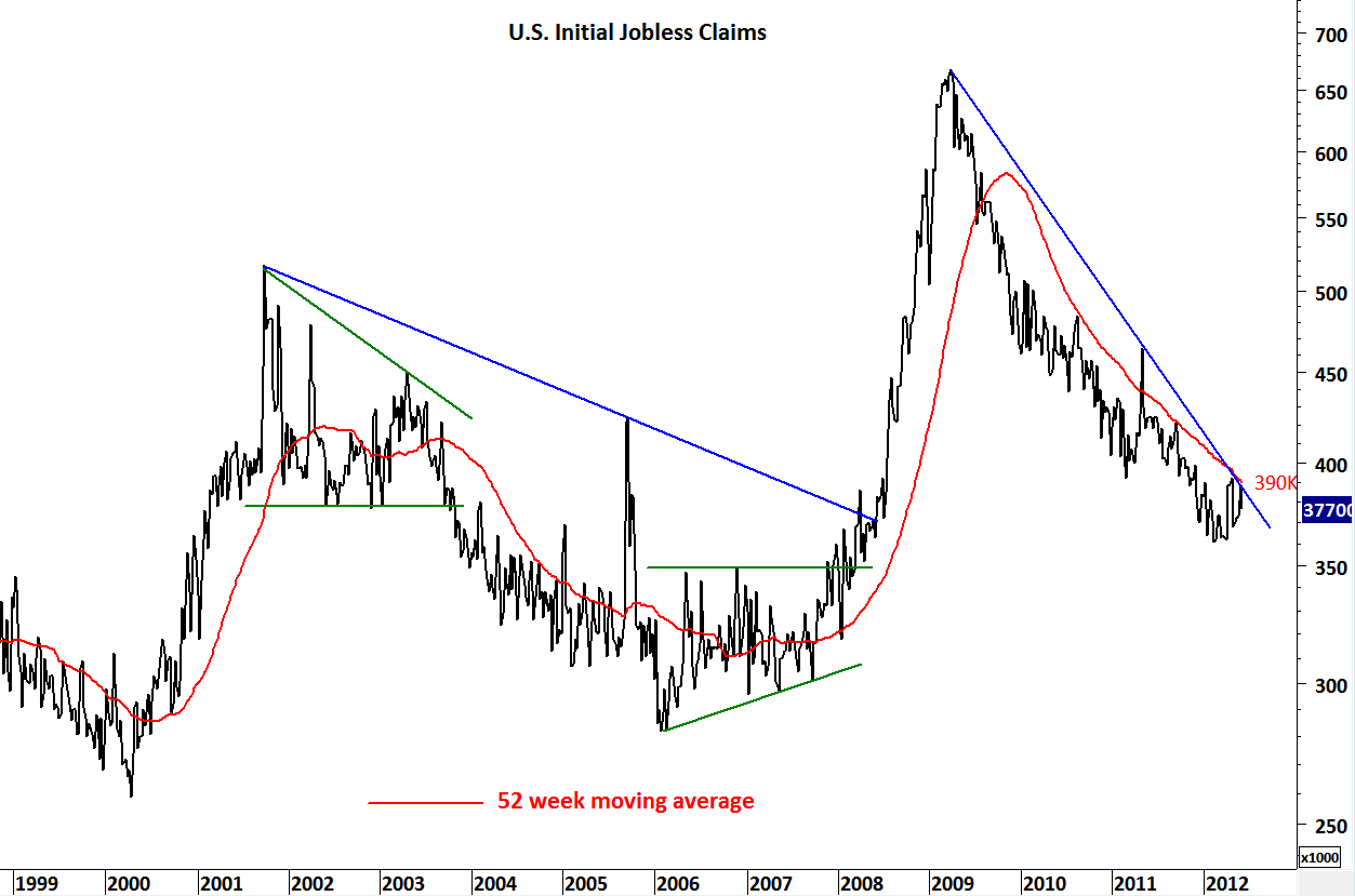
First-time claims for jobless benefits fell by 12,000 to 377,000 in the week ended June 2 from a revised 389,000 the prior week. This number continued the declining trend on the jobless claims that has been intact since the second quarter of 2009. The initial jobless claims continues to stay below the 52 week average which is now at 390,000 levels. I think 390K is the magic number for jobless claims. Over the past 2 years there has been one violation of the 52 week average in May 2011, but this was quickly reversed by a sharp drop from 464K to 430K. So it is important for the trend to continue below the 52 week average and 390,000 is the level to watch that would reverse the downtrend on jobless claims. Watch 390K as an important threshold.

GBP/USD

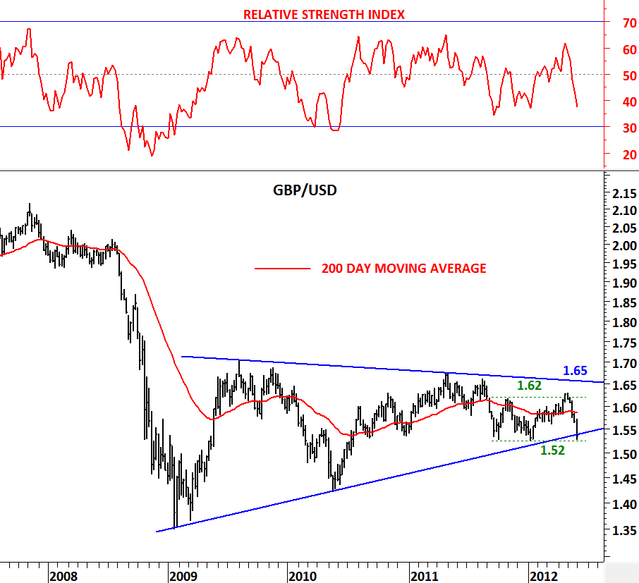
One of the best long-term opportunity is presenting itself on the GBP/USD chart. This widely followed currency pair is now forming a perfect symmetrical triangle. Since 2009, GBP/USD has been consolidating in a range between 1,35 and 1,70. As it is always the case with symmetrical triangles, consolidation range narrows and is usually followed by a strong breakout. It is hard to guess the direction of the breakout. Symmetrical triangles can be continuation patterns as well as reversal patterns. In order not to anticipate it is always better to wait for a decisive close outside of the boundaries as a confirmation.

Over the past 3 years consolidation range has narrowed on the GBP/USD chart and the boundaries are now between 1.52 and 1.65. We are getting close to a strong breakout that is likely to result in a medium/long-term trend. Watch these two levels carefully on a weekly basis. 1.52 is support and 1.62-1.65 area is strong resistance.

U.S. Unemployment Rate (%) & Chicago PMI

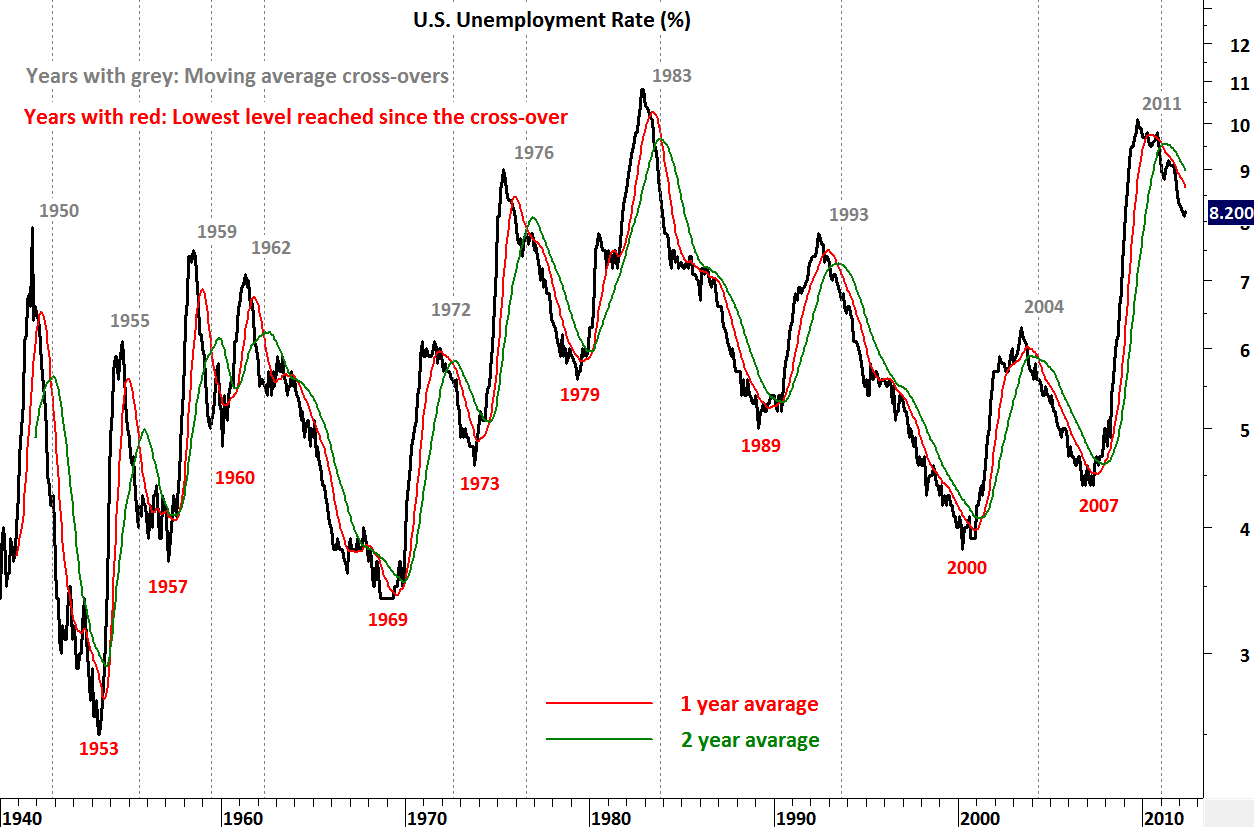
U.S. unemployment rate jumped to 8.2% in May. U.S. Employers added 69,000 jobs, fewer than forecast. If you remember from the earlier posts I’ve analyzed the unemployment rate with technical indicators and applied moving average crossovers to see the changes in trend on this time series. Study showed improving job market followed by bullish cross-over on the 1 & 2 year moving averages. Employment figures improved for at least one year after the technical signal. 1972-1973 and 1959-1960 were two periods where unemployment declined but improvement last only one year. All other cycles last between 3 and 7 years. So it is extremely important to see the continuation of the positive trend as we have now finalized 1 year since the last cross-over. However today’s data warns us to be more cautious going forward. It is a clear indication of weak job market and if we don’t see better figures in the next few months we can experience a repeat of 1960-1962 and 1973-1976.

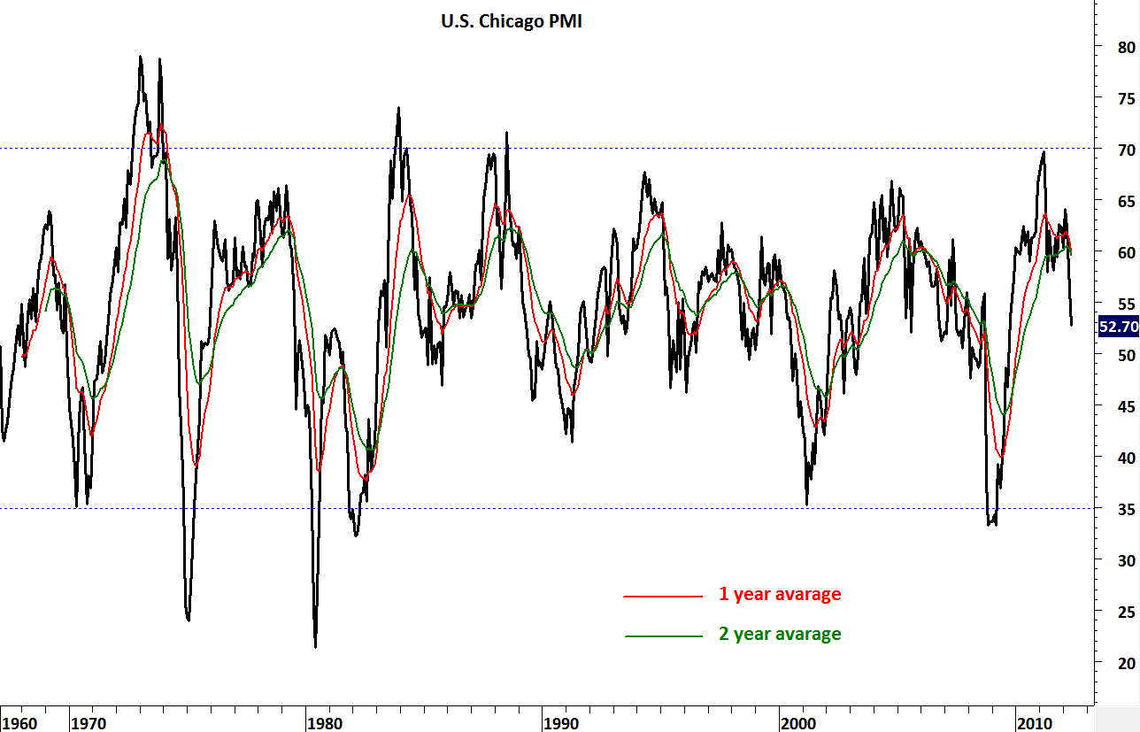
Here is another data point that looks like it has peaked. Throughout the recovery this report has been posting strong rates of growth, and the slowdown here points at the risk of monthly slowing and even contraction for an increasing number of other regional surveys. The official name of this report is ISM – Chicago although it is commonly referred to as the Chicago PMI.  ISM stands for Institute for Supply Management while PMI is shorthand for purchasing managers’ index.  The traditional name goes back to the years when the ISM was called the National Association of Purchasing Management. Investors should track economic data like the Chicago PMI to understand the economic backdrop for the various markets. The stock market likes to see healthy economic growth because that translates to higher corporate profits. The bond market prefers a moderate growth environment that won’t generate inflationary pressures. The Chicago PMI gives a detailed look at the Chicago region’s manufacturing and non-manufacturing sectors. Many market players don’t realize that non-manufacturing activity is covered in this index and tend to focus on the manufacturing side only. This survey is somewhat local in nature – reflecting overall economic activity in the Chicago area.  But many see the Chicago PMI as being representative of the overall economy.
Markets focus on the overall index – the Business Barometer which many refer to as the Chicago PMI.  The breakeven point for the index is 50.  Readings above 50 indicate positive growth while numbers below 50 indicate contraction.  The farther the reading is from 50, the more rapid the pace of growth or decline.

COFFEE

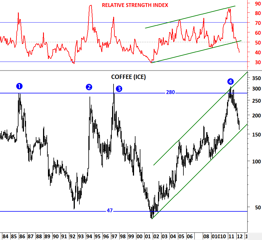
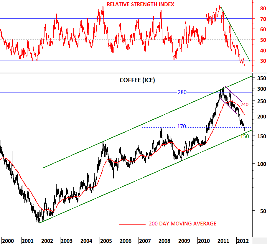
Back in January and February I analyzed Coffee price and posted long and medium term charts. A that time Coffee had tested its long-term trend resistance at 280 levels for the 4th time and it was trading slightly below its 200 day moving average at 240 levels. Coffee had a perfect parallel trend channel and the target for the medium-term correction was the lower boundary of this trend channel. When technical outlook deteriorated further in February, I posted another update on this commodity warning of more downward pressure.

http://techcharts.wordpress.com/2012/01/23/coffee/ (January)

http://techcharts.wordpress.com/2012/02/15/coffee-2/ (February)

We are now in June and Coffee is very close to its major support level at the lower boundary of the long-term trend channel. With RSI reaching oversold levels and price nearing to test the long-term trend support, Coffee is presenting a good buying opportunity at these levels. By placing a medium/long-term stop-loss at 150 levels, we can expect the price to stabilize and move higher in the following months.