COTTON
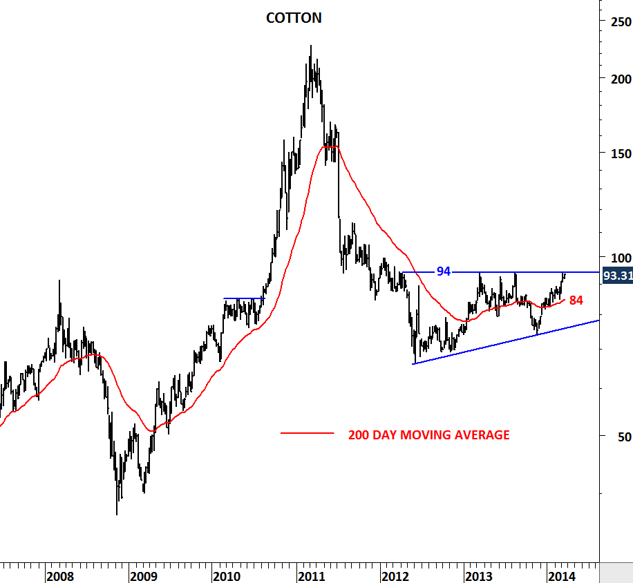
Cotton price prepares for a strong breakout from its 2 year-long base formation. Recent consolidation can be one of the two bullish chart formations. A cup with handle chart pattern or an ascending triangle.
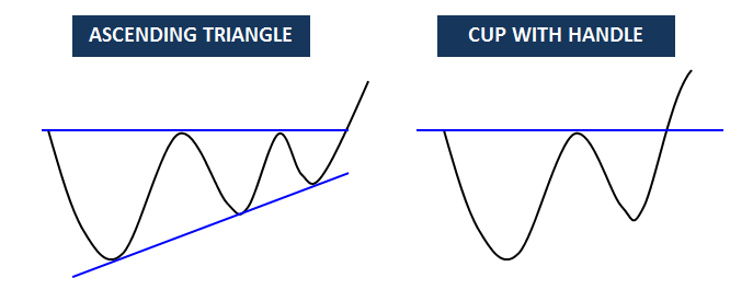
If it is the former, Cotton should break above 94 levels in the short-term. Breakout above 94 levels will clear 2 year-long horizontal resistance and should be very bullish for Cotton prices.
If prices are forming an ascending triangle, breakout above 94 will be delayed. Only after another pullback towards the 200-day moving average will Cotton challenge the 94 resistance. One or the other, current technical outlook is bullish and suggests higher prices in the medium-term. Watch 94 levels as strong resistance.