LONG-TERM BOND YIELDS

First half of 2016 can be a volatile time for developed market bonds. Yields can move higher from current levels. I’m not sure what could be the economic trigger for such price action but charts suggest possible trend periods in the coming months. Here are the charts I will be following in the first quarter of 2016.

After sharp rebounds in the first half of 2015, developed market bond yields moved sideways in the remaining part of the year. Yields failed to test 2015 lows and the consolidation formed flag chart patterns. Flag formation is regarded as a continuation, usually forms halfway through out the price action. Breakout from the flag signals continuation in the direction of the breakout.

GERMANY 10 YR GOVT BOND YIELDS

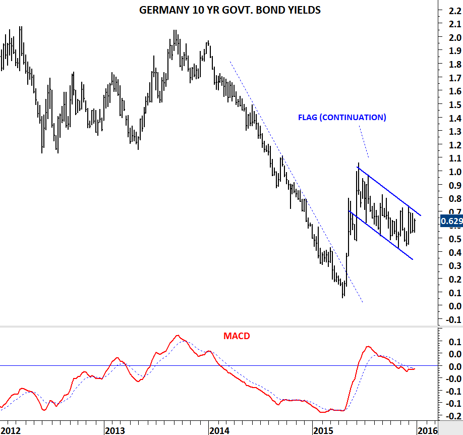
While German 10 year government bond yields pulled back in an orderly correction, MACD found support around 0 levels. Breakout from the 6 month-long channel will be confirmed with a weekly MACD buy signal.

FRANCE 10 YR GOVT BOND YIELDS

SPAIN 10 YR GOVT BOND YIELDS

US 10 YR GOVT BOND YIELDS

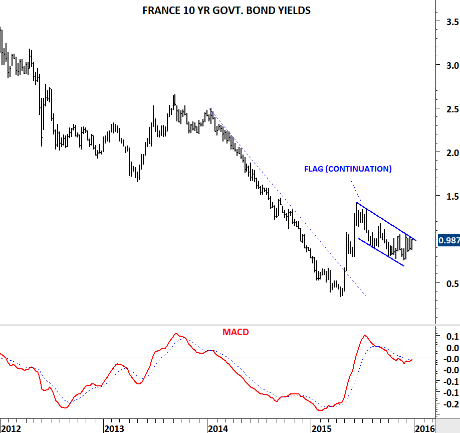
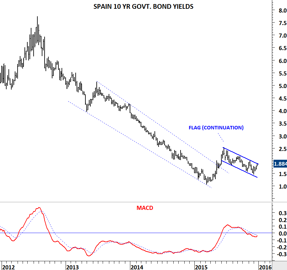
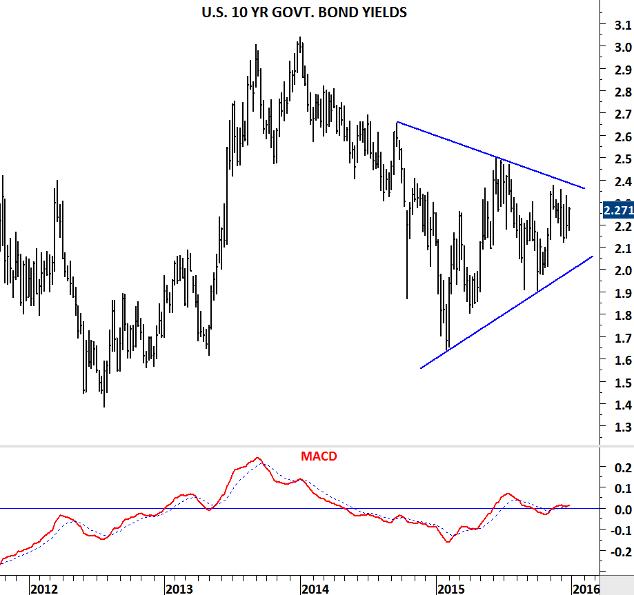
Chart pattern on the U.S. 10 year government bond yield is different from its European peers. U.S. yields have been forming a symmetrical triangle. Breakout in either direction will confirm this chart pattern. Resistance is at 2.4 and support at 2.0.

EURO BUND

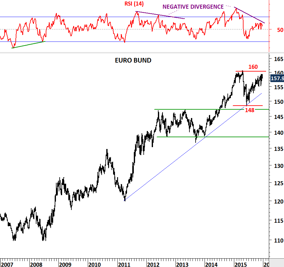
When yields go up, bonds move in the opposite direction. Euro BUND which is the 10 year German government bond, reached an important resistance area with a clear negative divergence on its momentum indicator. When analyzed with the underlying yields, we can conclude that higher interest rates can result in a pullback towards 148 levels.

VANGUARD LONG TERM CORP BOND ETF

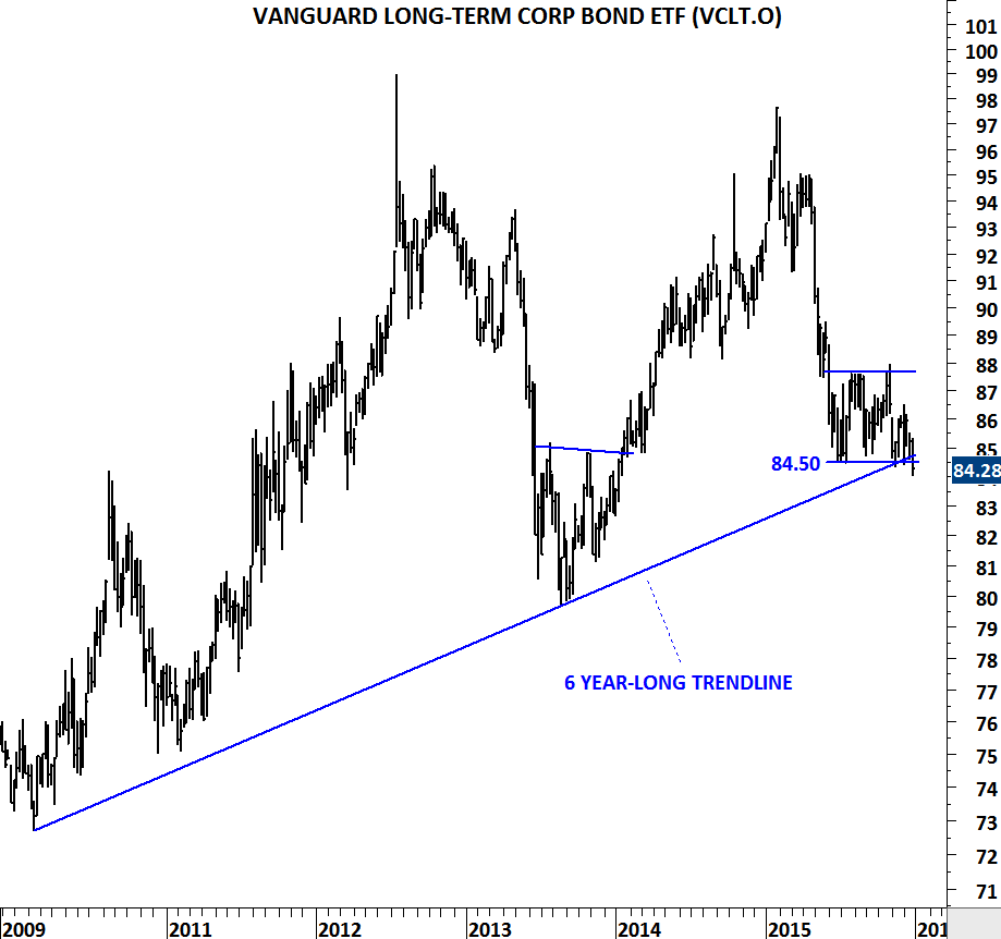
Another interesting chart that drew my attention is the long-term corporate bond ETF. The chart above shows the Nasdaq listed Vanguard Long-Term Corporate Bond ETF (VCLT.O). Price is now challenging 6 year-long trend support. A decisive breakdown on the weekly scale chart will signal higher yields and lower corporate bond prices. (For more information on the above ETF)

DOW JONES COMPOSITE INDEX

Dow Jones Averages are price weighted indices, while most of the broad market indices such as S&P 500 and Nasdaq 100 are market-cap weighted. In a price-weighted index higher prices will influence the direction of the average more than lower prices, regardless of the actual size of the company.

Dow Jones Composite Index measures changes within the 65 companies that make up three Dow Jones averages: the 30 stocks that form the Dow Jones Industrial Average (DJIA), the 20 stocks that make up the Dow Jones Transportation Average (DJTA) and the 15 stocks of the Dow Jones Utility Average (DJUA). The Dow Jones 65 Composite, like the three sub-indexes, is price-weighted.

Over the past two years Dow Jones Composite Index has formed a top formation usually regarded as Head & Shoulder. Head and shoulder chart pattern forms after a prolonged uptrend and signals a possible change in trend. Chart pattern is confirmed with the breakdown of the neckline. Similar chart patterns can be seen on some of the constituents of the top US indices. If not in the next few weeks, the first quarter of 2016 we can see some corrective price action on these charts. Confirmation of such price movement will be a decisive break below horizontal support levels (neckline).

DOW JONES COMP INDEX

GS

UPS

AAPL

USD/CAD

Weak energy and metal prices continue to put pressure on the Canadian economy and its currency. Since the beginning of 2011, Canadian dollar has been losing ground against the U.S. dollar (for earlier analysis on USD/CAD). 1.3040 was an important resistance – levels that were seen during the 2008 financial meltdown.

In the last quarter of 2015, USD/CAD breached the strong resistance at 1.3040 and possibly completed a longer-term base formation. With the last couple of week’s sharp depreciation we can conclude that there is further weakness due for 2016. Unless the cross rate falls below 1.3040 levels in the following months,  the new trading range will be between 1.3040 and 1.62.

USDCAD

WHEAT, SOYBEANS & METALS

SILVER VS GOLD

Silver is likely to outperform Gold prices in the coming months. Long-term chart of SILVER/GOLD suggests the ratio is at a major turning point. Multi-decade support reversed the ratio three times over the past two decades and this could be the fourth time. Reversal from the strong support in the past resulted in an approximately 1.5x-1.6x outperformance with the exception of 2.3x during 2009-2011 period.

SOYBEANS

Grains and beans complex is at a major turning point. Soybean price is trying to reverse from a multi-year trend support. Two long-term trend lines acted as support around 850 levels. Momentum indicator RSI formed positive divergence. This could prove to be a major low for Soybeans.

WHEAT

Similar price action can be seen on Wheat price. Last three year’s downtrend found support around 455 levels. Strong support can prove to be a turning point for the agricultural commodity.

HUNGARY BUDAPEST SE INDEX

Since the beginning of 2011, developed market equities have been performing better than emerging markets. This trend is still intact.

MSCI DM VS MSCI EM

Though there is one emerging European equity market that is showing clear strength against its peers. That is HUNGARY. Budapest SE index is ready for another upward leg, after an initial breakout followed by a pullback.

HUNGARY BUDAPEST SE INDEX

Since the beginning of the year MSCI Hungary has been outperforming MSCI emerging markets index. Also, a major reversal chart pattern; head and shoulder bottom, might be developing on the MSCI HUNGARY price index. These are bullish sign for the emerging European country.

MSCI HUNGARY

MSCI HUNGARY VS MSCI EM

Two charts from the constituents of Budapest SE index have positive technical outlook:

OTP BANK formed a flag (or symmetrical triangle) continuation chart pattern.

RICHTER GEDEON formed a massive bullish ascending triangle.

Breakouts from these chart patterns should resume existing uptrends.

OTP BANK

RICHTER GEDEON

SMALL CAPS vs. LARGE CAPS

Small caps show relative weakness vs. the large caps when investors move out of riskier/high-beta names and into relatively safe large caps. Opposite can be said during small cap strength vs. large caps.

There are two ways to capture this relationship to understand if there is a possibility of small cap outperformance in the following weeks.

1) Russell 2000 vs DJIA is now testing a 6 year-long trend line support. Until it is broken down, these type of trend lines are expected to resume the current trend. In this case the trend is upwards and the ratio is likely to rebound from the long-term support, resulting in an outperformance for the small caps.

RUSSELL VS DOW JONES INDUSTRIAL

Data Source: Thomson Reuters, Charts created in MetaStock

2) Russell 2000 vs. S&P 500 index is now testing the lower boundary of the horizontal trading range. A rebound from the lower boundary will likely result in an outperforming period for Russell 2000 index versus the S&P 500 index.

RUSSELL VS S&P 500

Data Source: Thomson Reuters, Charts created in MetaStock

U.S. DOLLAR/HUNGARIAN FORINT

U.S. dollar remains strong against major cross-rates. Several emerging market currencies lost ground against the U.S. dollar during 2014-2015 period. Weak performance was interrupted by a medium-term consolidation over the past few months.

U.S. dollar/Hungarian Forint formed one of those identifiable consolidation chart patterns that is usually regarded as a flag or a triangle. These type of consolidation chart patterns usually resolve in the direction of the dominant trend, in this instance possibly upwards.

Breakout above 290-295 area will target the historical high around 320 levels. Expect emerging market currencies to remain weak in the following months.

USDHUF