U.S. DOLLAR INDEX ETF (UUP)

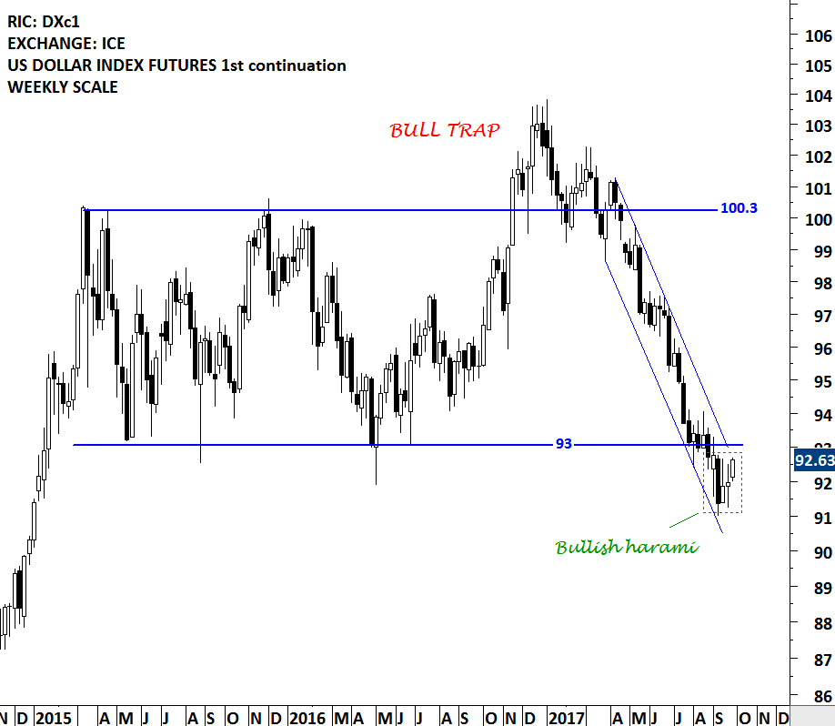
While still at the early stages, an important chart development might be taking place on the U.S. Dollar Index. In the second half of 2016, the U.S. dollar index breached the upper boundary of its consolidation range at 100.3 levels. The breakout was a bull trap (false breakout) and after couple of weeks, the price reversed back into the trading range and traveled sharply towards the lower boundary of the rectangle. In the beginning of September 2017, the price breached the chart pattern boundary on the downside. Those who are looking for a possible reversal of the downtrend on the U.S. dollar, should keep an eye on the 93 levels on the U.S. Dollar Index Futures chart and 24.15 levels on the US Dollar ETF (UUP) chart. A reversal above the mentioned levels can result in a bear trap (false breakdown) and turn out to be positive for the U.S. dollar in the coming months.
Read More

PREMATURE & FALSE BREAKOUTS

Below two paragraphs are taken from Peter L. Brandt's Diary of a Professional Commodity Trader - Lessons from 21 weeks of real trading.

"A premature breakout is different from an out of line movement in the sense that a premature breakout can close outside of a predrawn boundary line and even spend several days in breakout mode. Prices then return back to the geometric pattern. However, the initial breakout was only a harbinger of things to come, and within a few weeks a genuine breakout occurs. I call these subsequent breakouts secondary breakouts or pattern recompletions." - Ch 3, page 38, Identifying the trades and the trading vocabulary

"Unlike the premature breakout, which is followed by a genuine breakout in the same direction, the false breakout results in prices either developing a much larger pattern or strongly moving in the opposite direction. Some traders refer to false breakouts to the downside as a bear trap and false upside breakouts as a bull trap. This means that traders who normally position themselves in the direction of the initial price thrust get stuck on the wrong side of the market." - Ch 3, page 40, Identifying the trades and the trading vocabulary

Read More

H&S CONTINUATION

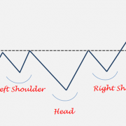
Head and shoulder chart pattern can form as a continuation on price charts. In uptrends, a H&S continuation will be similar to a H&S bottom and in downtrends it will resemble an inverse H&S. The implications and interpretations continuation H&S are usually the same with reversals. Price objectives can be derived in the same way as it is calculated on a reversal chart pattern.

Head and shoulder continuation is one of my favorite chart pattern. A head and shoulder continuation that forms in an uptrend, will usually breakout to all-time highs once the chart pattern is completed. Breakout to all-time highs from bullish continuation chart patterns are usually reliable and powerful.

A head and shoulder continuation that forms in a downtrend will usually take out the minor lows and move in the path of least resistance. Price that is already in a downtrend is likely to accelerate on the downside (sometimes in a sharp fall) as it breaks down a well-defined horizontal support.

Below are some examples of H&S continuation chart patterns in up and down trends.

Read More

CHINA SSE COMPOSITE INDEX

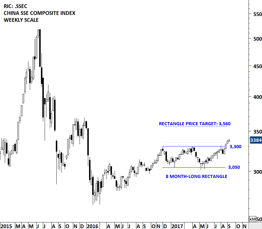
China SSE Composite has been forming an 8 month-long rectangle chart pattern. Over the past two weeks the index breached the upper boundary of its multi month-long rectangle chart pattern standing at 3,300 levels. The daily close above 3,350 levels confirmed the breakout with a possible chart pattern price target of 3,560 levels. Breakouts from chart patterns with horizontal boundaries are reliable. After a confirmed breakout, resistance becomes support. Strong support for the index now stands at 3,300 levels. Positive momentum in Chinese equities can boost Emerging Markets performance. (Learn more: Video Tutorial - Rectangle)

Read More

SUPPORT & RESISTANCE

A stock (ETF, Index etc.) price is either in a trending phase or in a consolidation period. During strong trend periods prices move uninterrupted from one price level to another. During consolidations prices move in both directions without producing any meaningful or sustained price change and will form well-defined support and resistance areas on the charts. A support range represents a concentration of demand, and a resistance range represents a concentration of supply.

A resistance level is an approximate level or fairly well-defined price range, where previously advancing stock meets resistance in the form of strong selling. A support level is an approximate level or price range where a preceding decline meets support, in the form of strong buying. A possible explanation for appearance of such well-defined price boundaries in the form of support and resistance can be the fact that the public tend to remember previous levels the stock has traded.

Read More

LOGARITHMIC vs. LINEAR SCALE CHARTING

The weekly Global Equity Markets report now has a new section; TECH CHARTS STUDY. In this new section I try to answer member's questions on different aspects of classical charting and technical analysis. Members who are new to classical charting and technical analysis will have another resource other than the educational video series to learn from and apply this knowledge to their own analysis. The latest weekly report's Tech Charts Study section reviewed the difference between logarithmic and linear scale charting applied on Russell 2000 Index ETF (IWM).

Read More

MSCI ALL COUNTRIES WORLD INDEX ETF

Every week Tech Charts Global Equity Markets report features some of the well-defined, mature classical chart patterns (bullish & bearish) under a lengthy watchlist and the chart pattern breakout signals that took place during that week. Global Equity Markets report covers single stocks from developed and emerging markets, ETF's and global equity indices. The main focus of the weekly report is to bring member's attention some of the best examples of classical charting and chart patterns that are likely to resolve in a directional move. This blog post reviews one of several important technical developments in the Global Equity Markets.

ISHARES MSCI ALL COUNTRY WORLD INDEX ETF (ACWI.O)

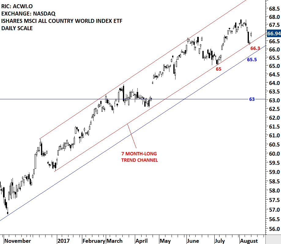
Last week's price action did some technical damage on the charts. MSCI ALL COUNTRY WORLD INDEX ETF, a benchmark for global equity market performance gave back three weeks of gains in one weekly bar. The discussion on the financial networks and social media was about buying the dip. The iShares MSCI All Country World Index ETF is listed on the Nasdaq Stock Exchange. 66.3 is the lower boundary of the 7 month-long trend channel for the ACWI ETF. The index rebounded from the strong support once again. Failure to hold this support level can push the price to the next support at 65.5, which is the 17 month-long upward trendline. There is no clear chart pattern forming on the MSCI ACWI ETF that would suggest a top reversal. For those who are looking for a sell signal on the ACWI, the breakdown of the trend channels should give some guidance. In case of further weakness in the global equity markets ( i.e. a breakdown on the ACWI), the weekly Global Equity Markets report featured some of the well-defined bearish chart setups in the global equities and ETFs.

Read More

The Tech Charts Service – Public Webinar


What is the TechCharts service?

  Live public webinar recorded May 24, 2017 Please watch this 30 minute webinar where Aksel discusses what the TechCharts service is all about. Speakers: Aksel Kibar of TechCharts and Peter L. Brandt of Factor LLC  Webinar Outline
  • Markets covered by TechCharts 1:49
  • Examples of past Global Equity Reports issued — before and after 2:31
  • Chart selection 12:05
Read More

SOUTH AFRICA ALL SHARE INDEX

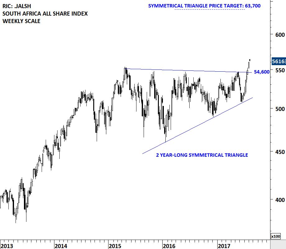
South Africa equities are possibly entering into a strong uptrend with the completion of a 2 year-long sideways consolidation. Last week's price action breached the multi-year trend resistance on the South Africa All Share index and pushed the local equity benchmark to all-time highs. Breakouts from multi-year consolidations usually result in multi-month trends. 54,600 levels will remain as strong support. Possible chart pattern price target for the South Africa All Share Index stands at 63,700 levels.

There are several tradable ETFs listed on the local exchange and also on the global exchanges. Below is a chart of South Africa listed ETF.

Read More

ROYAL DUTCH SHELL

Every week Tech Charts Global Equity Markets report features some of the well-defined, mature classical chart patterns under a lengthy watchlist and the chart pattern breakout signals that took place during that week. Global Equity Markets report covers single stocks from developed and emerging markets, ETF's and global equity indices. The main focus of the weekly report is to bring member's attention some of the best examples of classical charting. Chart patterns that are likely to resolve in a directional move. This blog post highlights one of several great chart setups from the latest Global Equity Markets report.

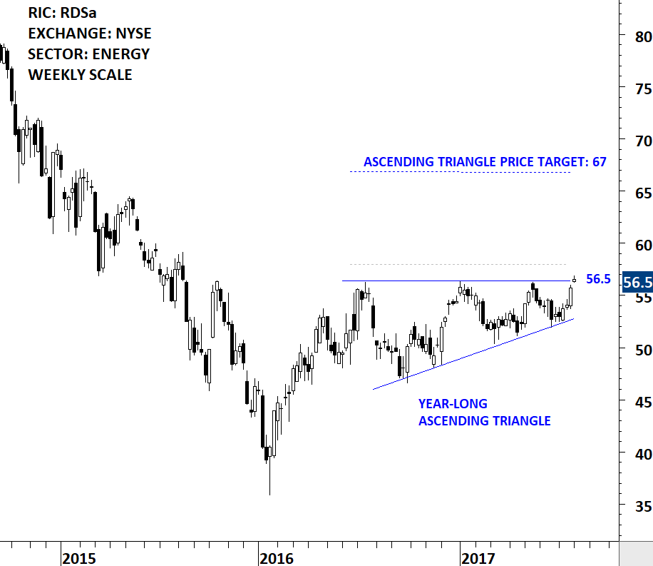
ROYAL DUTCH SHELL PLC (RDSa)

The Royal Dutch Shell plc explores for crude oil and natural gas around the world, both in conventional fields and from sources, such as tight rock, shale and coal formations. The stock is listed in European exchanges as well as the New York Stock Exchange. The chart below shows the New York Stock Exchange listing. Price chart formed a year-long ascending triangle with the strong horizontal resistance standing at 56.5 levels. The stock once again reversed from the lower boundary of its chart pattern. A daily close above 58 levels will confirm the breakout from the year-long ascending triangle with a possible price target of 67 levels.

Read More