U.S. DOLLAR INDEX ETF (UUP)
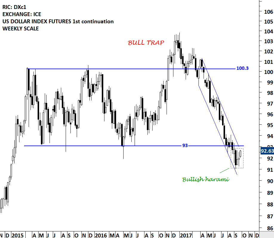
While still at the early stages, an important chart development might be taking place on the U.S. Dollar Index. In the second half of 2016, the U.S. dollar index breached the upper boundary of its consolidation range at 100.3 levels. The breakout was a bull trap (false breakout) and after couple of weeks, the price reversed back into the trading range and traveled sharply towards the lower boundary of the rectangle. In the beginning of September 2017, the price breached the chart pattern boundary on the downside. Those who are looking for a possible reversal of the downtrend on the U.S. dollar, should keep an eye on the 93 levels on the U.S. Dollar Index Futures chart and 24.15 levels on the US Dollar ETF (UUP) chart. A reversal above the mentioned levels can result in a bear trap (false breakdown) and turn out to be positive for the U.S. dollar in the coming months.
 Read More