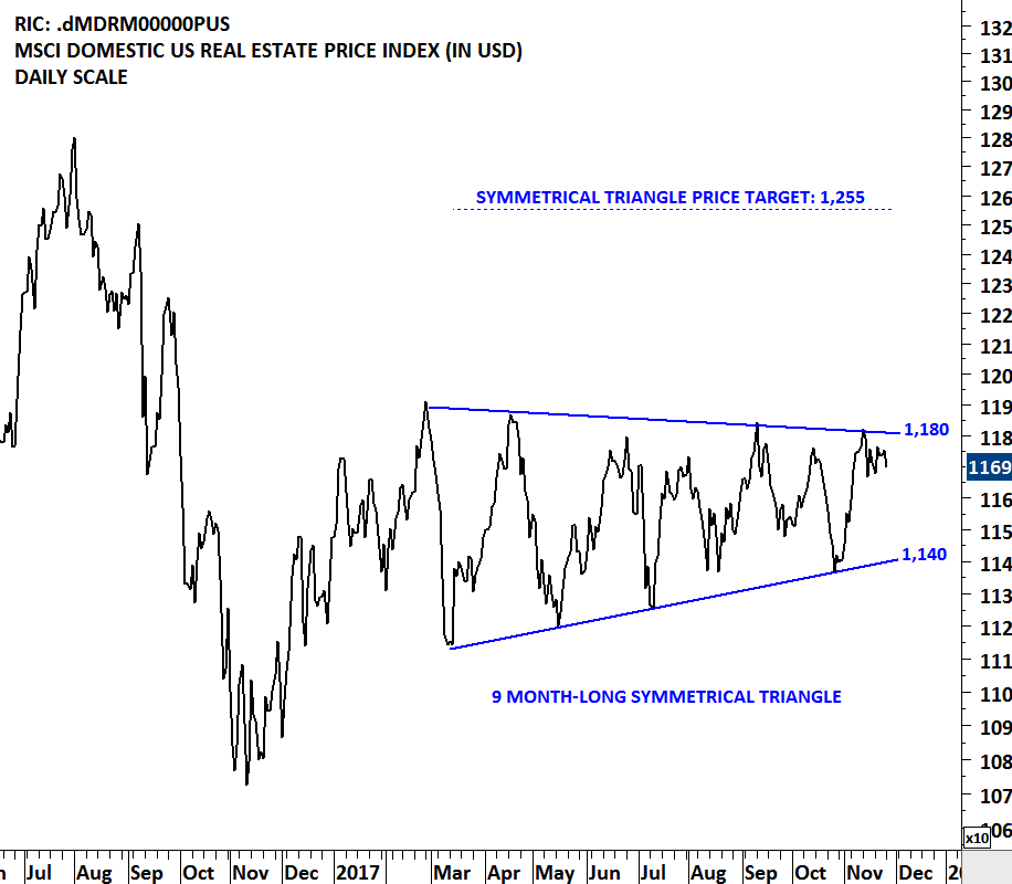
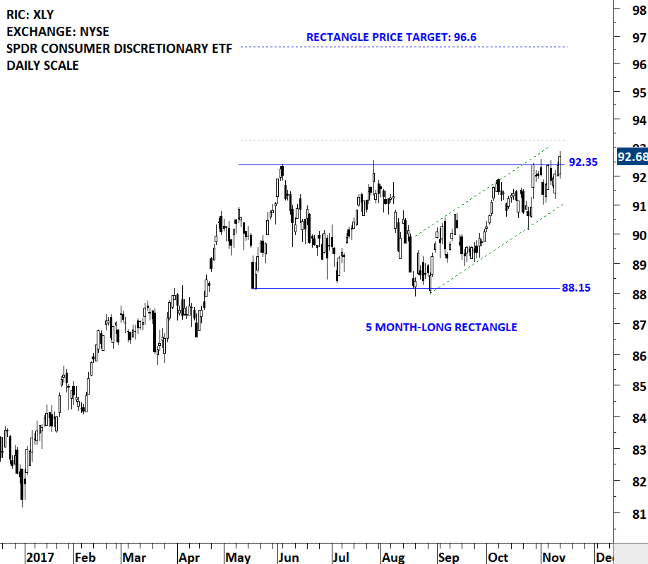
RECTANGLE – TRADING RANGE

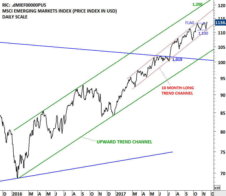
A stock (ETF, Index etc.) price is either in a trending phase or in a consolidation period. During strong trend periods prices move uninterrupted from one price level to another. During consolidations prices move in both directions without producing any meaningful or sustained price change and will form well-defined support and resistance areas on the charts. A support range represents a concentration of demand, and a resistance range represents a concentration of supply.

A resistance level is an approximate level or fairly well-defined price range, where previously advancing stock meets resistance in the form of strong selling. A support level is an approximate level or price range where a preceding decline meets support, in the form of strong buying. A possible explanation for appearance of such well-defined price boundaries in the form of support and resistance can be the fact that the public tend to remember previous levels the stock has traded.

The longer the time which the stock spent in that range, therefore, the greater the number of transactions, the more important that range becomes for future technical consideration. In applying support and resistance study to price charts, the weekly scale time frame is usually more informative than daily scale. Weekly charts show much more plainly the levels at which congestion of significant duration appeared.

Read More

HEAD & SHOULDER FAILURE

Every week Tech Charts Global Equity Markets report features some of the well-defined, mature classical chart patterns under a lengthy watchlist and the chart pattern breakout signals that took place during that week. Global Equity Markets report covers single stocks from developed and emerging markets, ETF’s and global equity indices. The report starts with a review section that highlights the important chart developments on global equity benchmarks. This blog post features an educational piece from the Tech Charts Study of the Global Equity Markets report.

HEAD & SHOULDER FAILURE

Head and Shoulder is a reliable reversal chart pattern that forms after an advance or a decline and the completion of the formation suggests a reversal of the existing trend. Global Equity Markets report focuses mainly on chart patterns with horizontal boundaries. H&S shoulder chart patterns with horizontal necklines are usually highlighted in the weekly reports.

Read More

HOW TO START ANALYZING A PRICE CHART

As part of our member webinars, on the 14th of December 2017 we recorded a live webinar discussing rectangle chart patterns. During the Q&A session one of the Tech Charts members asked a very important question.

The points I discussed were my "AHA moments" in becoming better at analyzing price charts over the past decade. We have prepared an excerpt from the webinar. I hope that it will add value in your learning experience.

Read More

UBS GROUP

Every week Tech Charts Global Equity Markets report features some of the well-defined, mature classical chart patterns under a lengthy watchlist and the chart pattern breakout signals that took place during that week. Global Equity Markets report covers single stocks from developed and emerging markets, ETF’s and global equity indices. The report starts with a review section that highlights the important chart developments on global equity benchmarks. This blog post features one of several great chart analysis that were highlighted in the breakout alerts section from the previous Global Equity Markets report.

UBS GROUP AG (UBSG.S)

UBS Group AG is a holding company and conducts its operations through UBS AG and its subsidiaries. The Company comprises Corporate Center and five business divisions: Wealth Management, Wealth Management Americas, Personal & Corporate Banking, Asset Management and the Investment Bank. The stock is listed on the Swiss Stock Exchange. Price chart formed a year-long rectangle with the strong horizontal boundary acting as resistance at 17.50 levels. The upper boundary of the rectangle was tested several times over the course of the chart pattern. The daily close above 18 levels confirmed the breakout from the bullish continuation chart pattern with the possible price target of 19.80.

Read More

ISHARES MSCI PHILIPPINES ETF

Every week Tech Charts Global Equity Markets report features some of the well-defined, mature classical chart patterns under a lengthy watchlist and the chart pattern breakout signals that took place during that week. Global Equity Markets report covers single stocks from developed and emerging markets, ETF’s and global equity indices. The report starts with a review section that highlights the important chart developments on global equity benchmarks. This blog post features one of several great chart analysis that were highlighted in the review section from the latest Global Equity Markets report.

Equity indices of the South East Asia Emerging Markets are showing strength. The Philippines Stock Exchange index cleared its 2 year-long horizontal resistance at 8,125 levels and reached all-time highs. Since then, the index pulled back to the broken resistance which is now acting as a strong support. As long as 8,125 level holds, we can expect the Philippine equity market to remain strong and trend higher.

Read More

EURO STOXX BANKS PRICE INDEX

During established up trends pullback to the long-term averages are considered to be low risk entry points. A widely followed trend indicator is the 200 day moving average. Price action above the 200 day moving average is recognized as an uptrend, while price trading below the 200 day (40 week) average is considered to be a downtrend. In the last quarter of 2016, the Euro Stoxx Banking index breached its long-term average on the upside what was considered to be the beginning of a possible uptrend. Since then, each pullback found support at the long-term moving average, confirming the steady uptrend. Over the past 6 months, the Euro Stoxx Banking index formed a sideways consolidation that can be identified as a symmetrical triangle.  Read More

NYSE ARCA GOLD BUGS INDEX

Every week Tech Charts Global Equity Markets report features some of the well-defined, mature classical chart patterns under a lengthy watchlist and the chart pattern breakout signals that took place during that week. Global Equity Markets report covers single stocks from developed and emerging markets, ETF’s and global equity indices. The report starts with a review section that highlights the important chart developments on global equity benchmarks. This blog post features one of several great chart analysis from the latest Global Equity Markets report.

The XAU is a capitalization-weighted index of thirty precious metal mining companies that has been traded on the Philadelphia Stock Exchange since 1983. As its name suggests it includes both gold and silver mining companies. In order to track gold and silver mining companies performance in an index there are several options available for investors, but the two most watched indices are: the NYSE Arca Gold BUGS (Basket of Unhedged Gold Stocks) Index (called the HUI Index) and Philadelphia Gold and Silver Index (called the XAU Index). Below charts feature the Philadelphia Gold and Silver Index and the NYSE Arca Gold BUGS Index.

Read More

MSCI DOMESTIC U.S. REAL ESTATE PRICE INDEX

The MSCI Domestic U.S. Real Estate Index and related REIT ETFs are going through a lengthy consolidation. Breakouts from tight and lengthy consolidations are usually followed by strong directional movement. Price index respected the boundaries of the 9 month-long symmetrical triangle. Both boundaries were tested several times over the past months. The upper boundary of the possible symmetrical triangle is acting as resistance at 1,180 levels and the lower boundary as support at 1,140 levels. A decisive breakout above 1,180 levels will confirm the symmetrical triangle as a bullish continuation with a possible chart pattern price target of 1,255 levels.

Read More

MSCI EMERGING MARKETS INDEX

Emerging Markets equities continue to remain strong. A widely followed benchmark for the Emerging Markets equity performance, MSCI Emerging Markets index resumes its multi-month uptrend in a steady parallel trend channel. Last one month's short-term consolidation can be identified as a possible flag; a bullish continuation chart pattern. The lower boundary of the flag at 1,100 level will act as a short-term support. Earlier in July 2017, the MSCI Emerging Markets index cleared a decade-long trend line resistance at 1,015 levels as shown on the monthly scale price chart.

Read More

CONSUMER DISC. SELECT SECTOR SPDR FUND (XLY)

Consumer Discretionary Select Sector SPDR (XLY) Fund (the Fund) seeks to provide investment results that correspond to the price and yield performance of the Consumer Discretionary Select Sector of the S&P 500 Index (the Index). The Index includes companies from industries, such as automobiles and components, consumer durables, apparel, hotels, restaurants, leisure, media and retailing. The ETF is listed on the New York Stock Exchange. Price chart formed a 5 month-long rectangle with the boundaries acting as resistance at 92.35 and support at 88.15 levels. Both the upper and lower boundary of the rectangle was tested several times. A daily close above 93.25 levels will confirm the breakout from the sideways consolidation with the possible chart pattern price target of 96.6 levels. You can check out the sample video below on bullish rectangle continuation.

Here are some of the sample educational videos you might find valuable.  This sample video explains how to identify rectangles and to calculate possible chart pattern price targets. Tech Charts Educational Videos cover major reversal and continuation chart patterns.

Read More