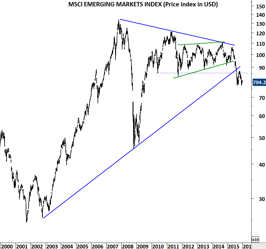
Emerging markets are experiencing renewed weakness after three months of sideways consolidation. MSCI Emerging Markets index sold-off between May and August 2015. Since August the index rebounded but hardly reached the strong resistance area formed by several long-term trend lines. In August, 850-900 area was broken down with a long monthly price action. Three months of consolidation was not able to push prices back to July-August levels. As the FED December meeting approached, emerging markets started weakening again. Breakdown below August 2015 low levels (771) can result in further sell-off.
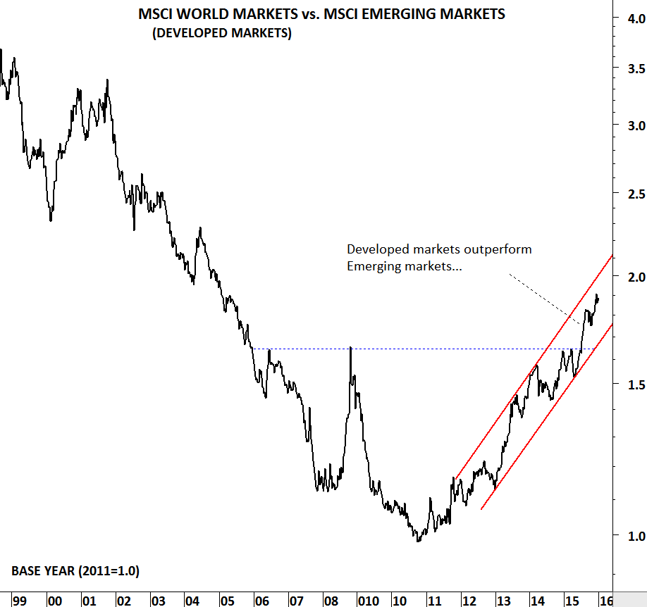
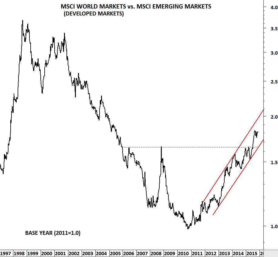
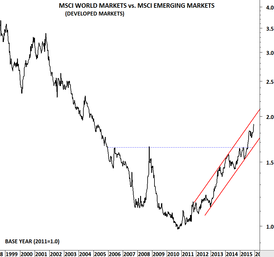
It is important to note that, since 2011 emerging markets are under performing developed markets. This trend is likely to continue.
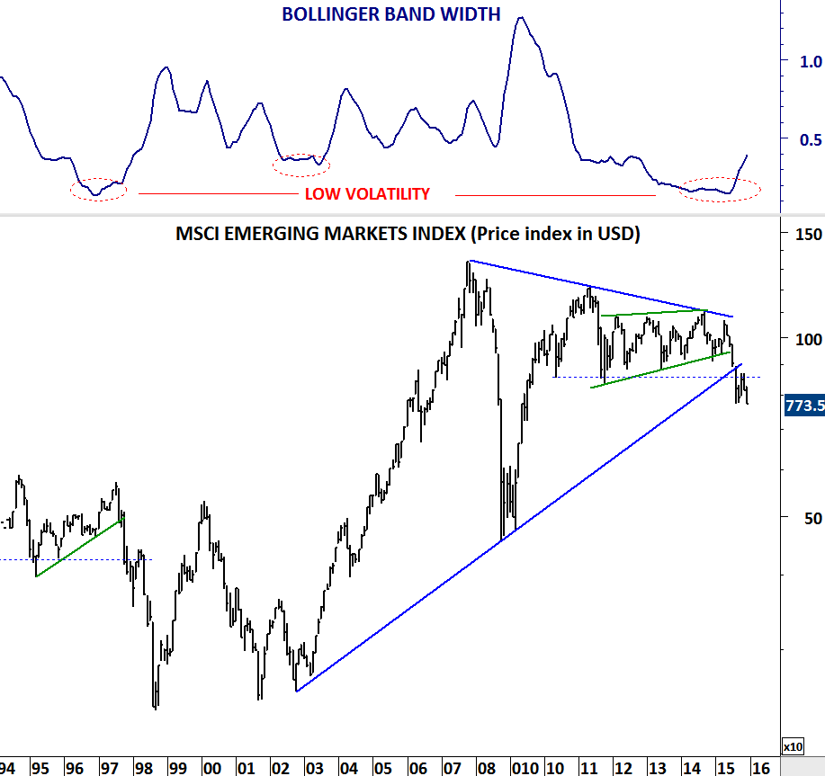
Not all emerging markets are showing weakness. Selective markets are performing better than their peers. I’m reviewing below markets that are exposed to strong downward momentum if the MSCI Emerging Markets index breaks below August 2015 low levels.
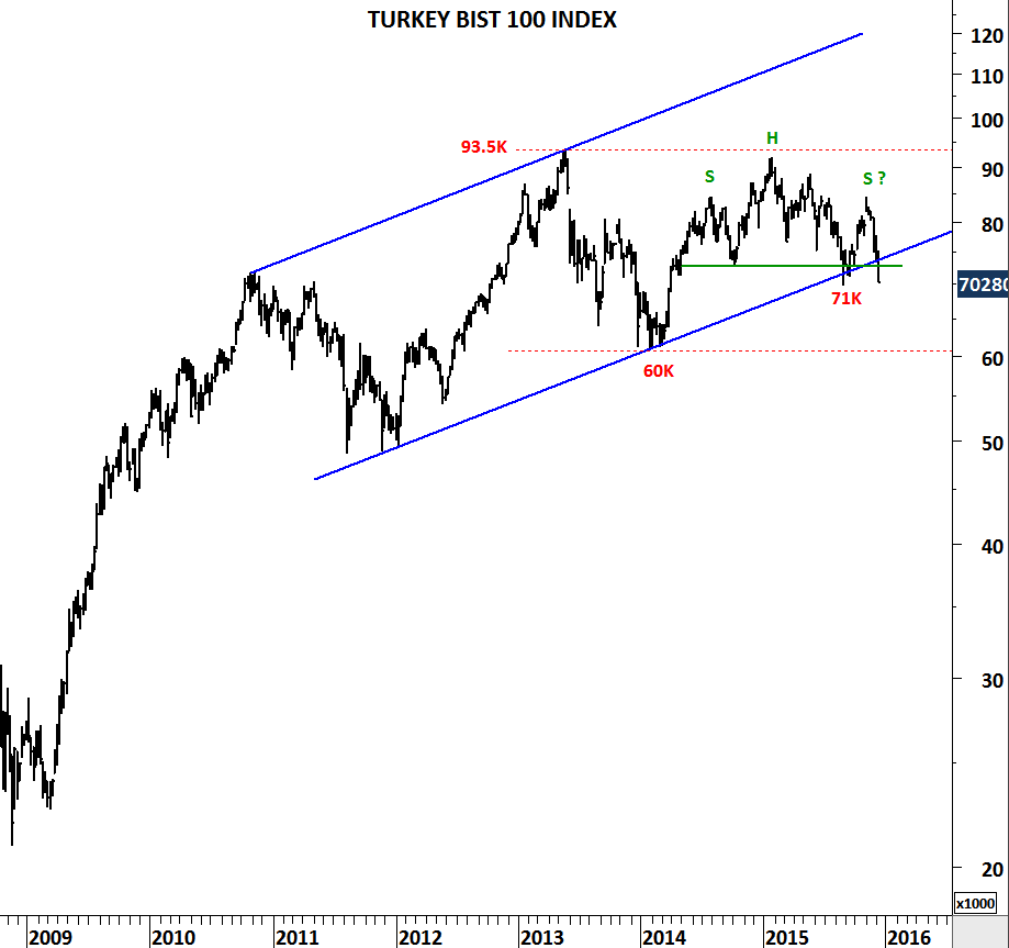
Turkey BIST 100 index formed head and shoulder chart pattern. Index is in the process of breaking down the year-long top formation. Another week of price action might be needed for confirmation as the index closed at its August low.
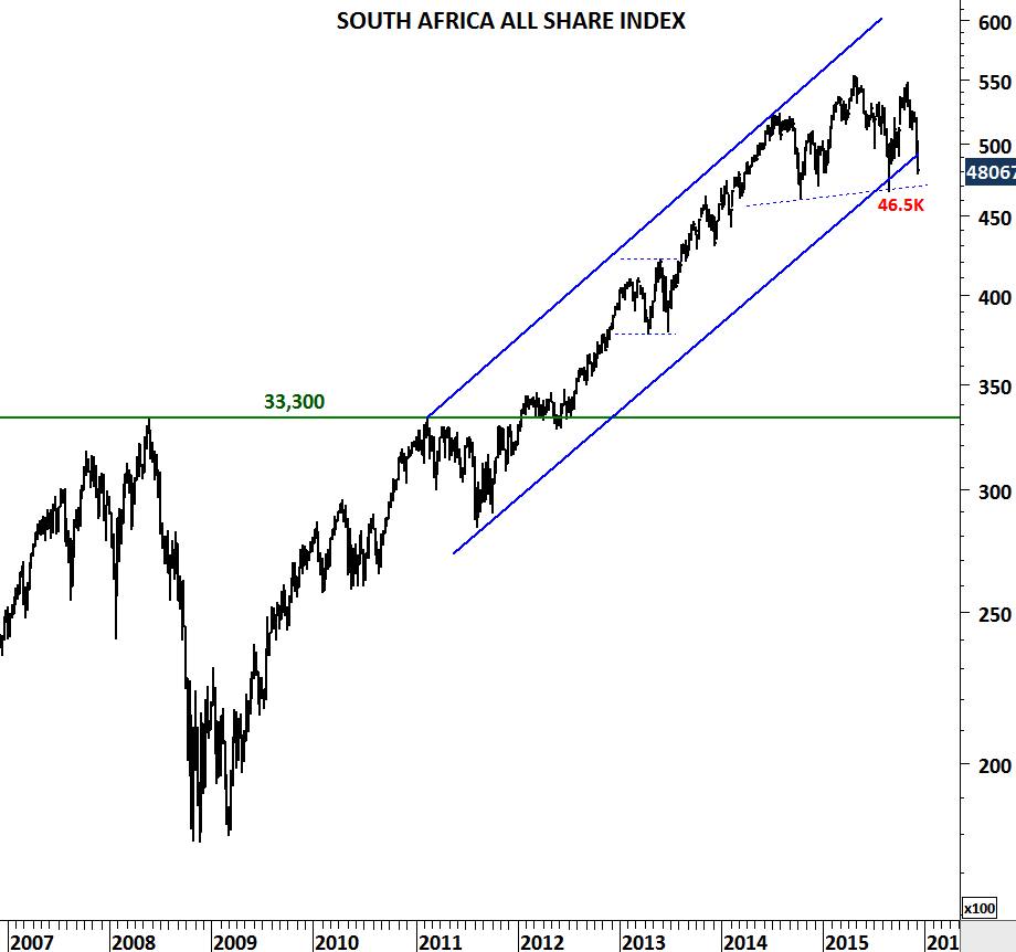
Not sure if the top formation on South Africa All Share can be plotted as H&S top, but breakdown below 46,000-46,500 area will result in further weakness in the coming months.
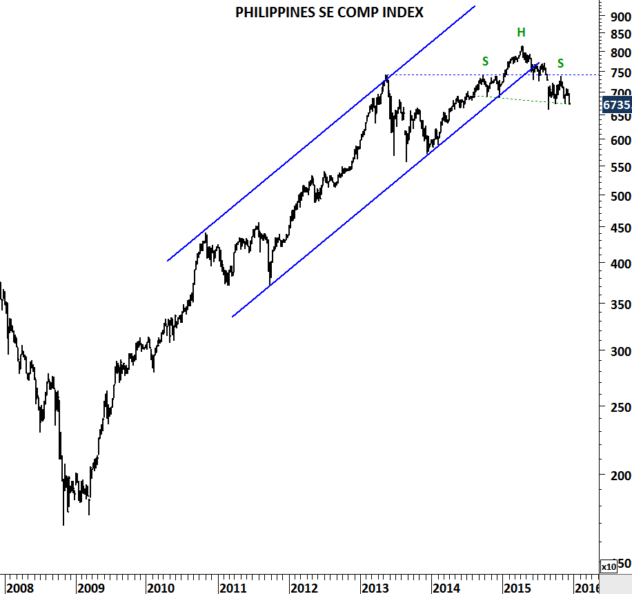
Philippines SE Composite Index is rolling over with a possible H&S top formation. I see this market a strong candidate for further weakness.
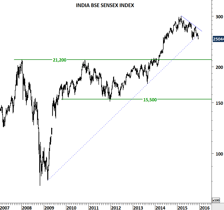
Another Asian emerging markets index that has outperformed its peers, is now showing signs of weakness. While the long-term trend might remain intact, BSE Sensex index can retest 21,200 levels.
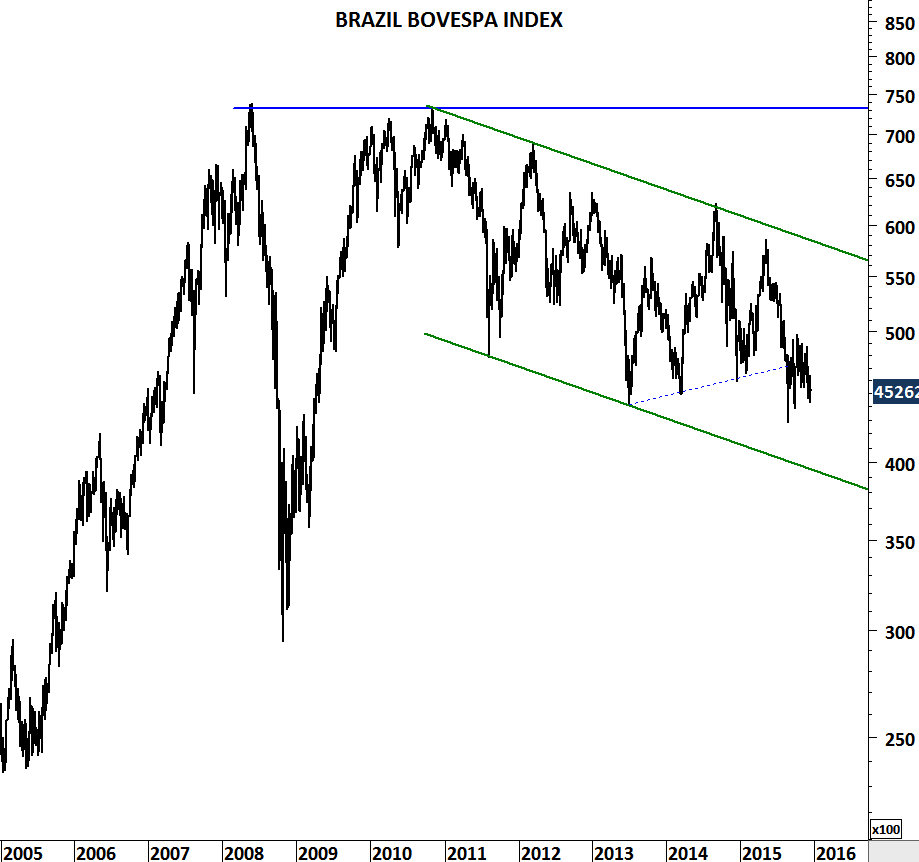
Brazil’s Bovespa Index has been in a clear downtrend and it continues to make lower lows. In case of a breakdown on the MSCI emerging markets index, Bovespa can test the lower boundary of its trend channel at 40,000 levels.
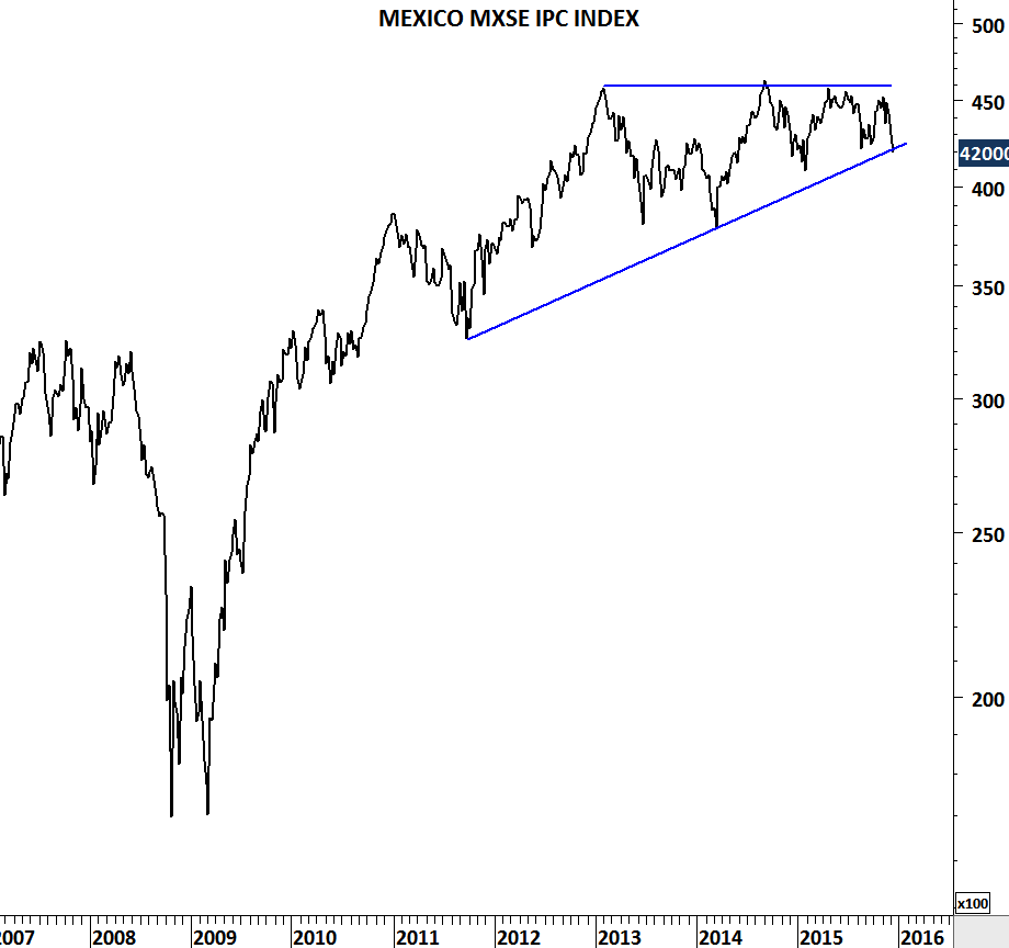
Mexico IPC index performed better than its peers. Though, the South American index is also challenging multi-year trend support.
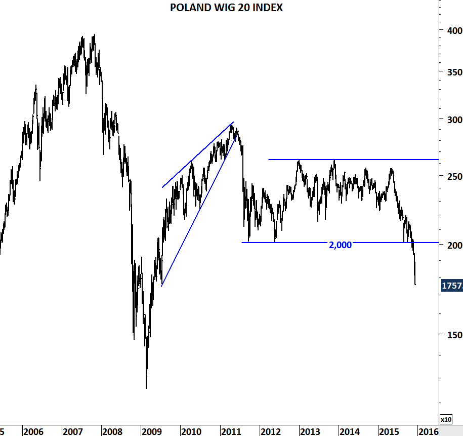
In emerging Europe, Poland’s WIG 20 index is selling off sharply. Index can test 2009 low levels.
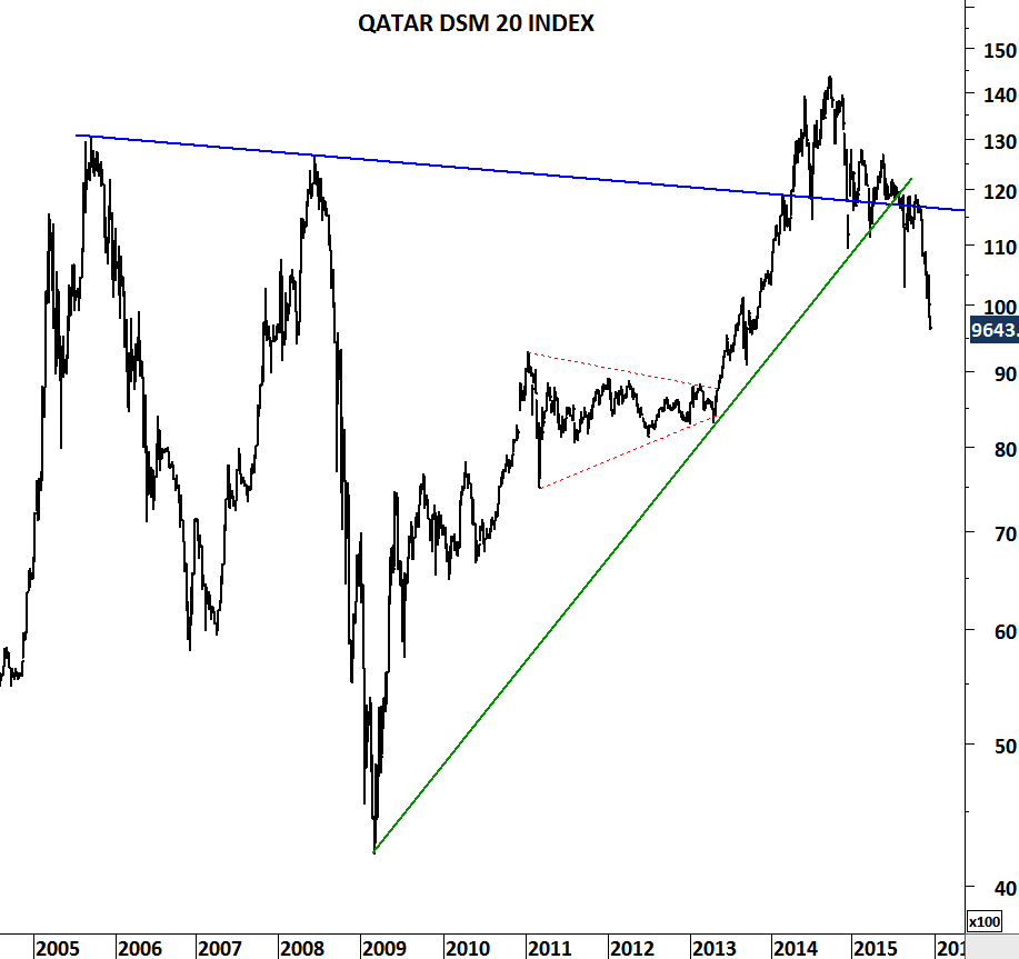
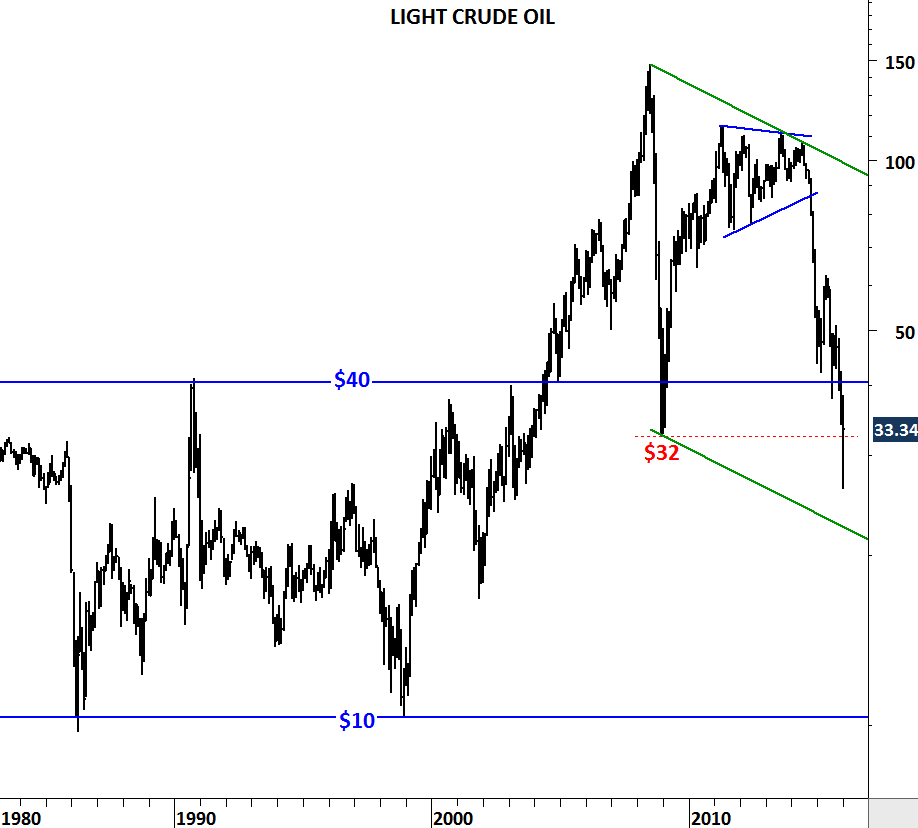
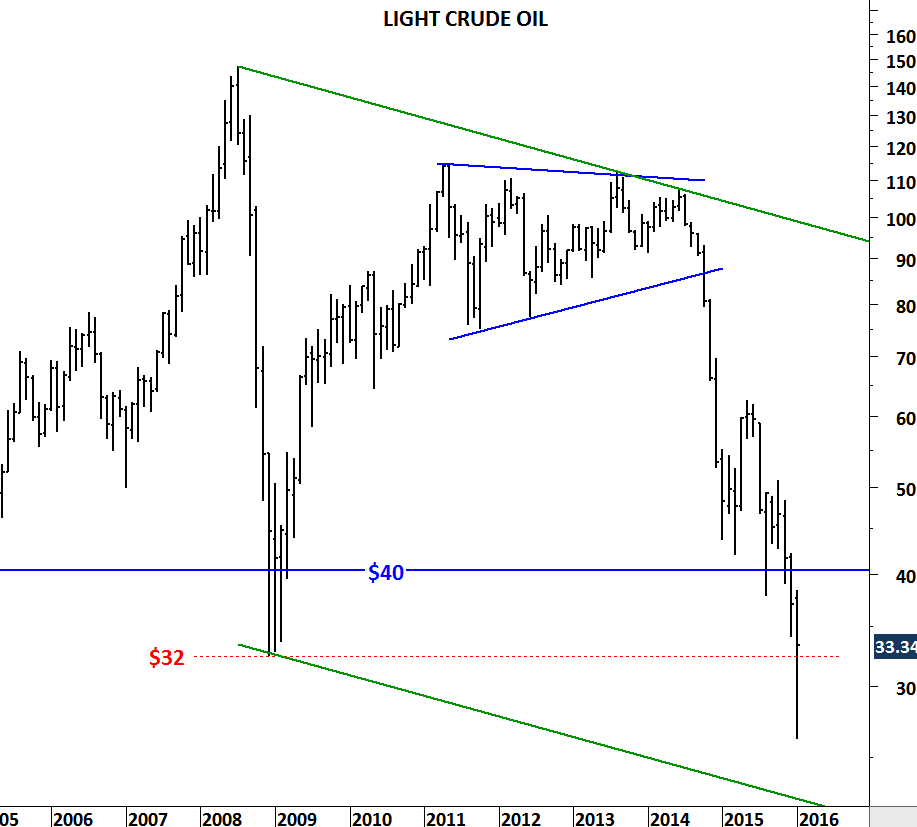
Recently upgraded energy economies are facing tough times. With the collapse of oil and gas prices, Qatar’s DMS 20 index started selling off. First support area remains between 8,000 and 8,500.
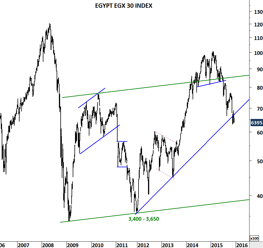
Egypt’s EGX 30 index is now challenging multi-year trend support. Breakdown could result in further weakness towards 5,000-5,500 area.