EURO BUND & US 10 YEAR T-NOTE

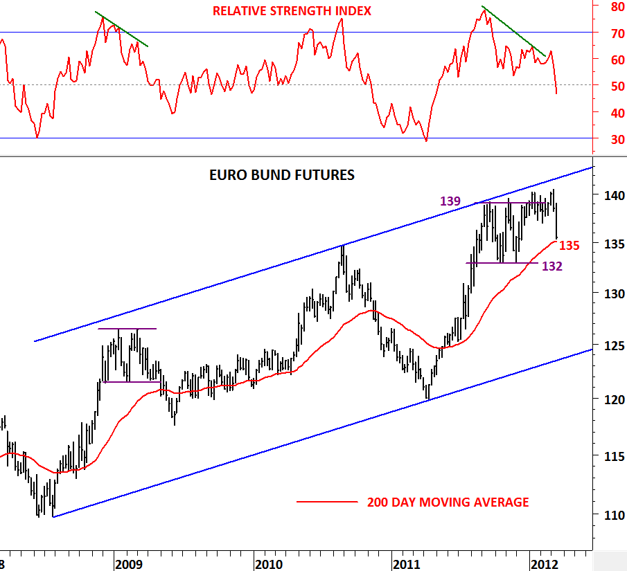
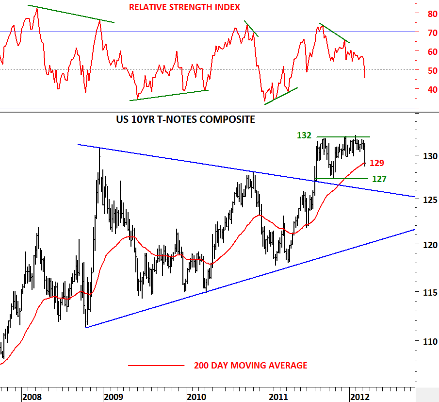
In January I’ve analyzed government bonds and drew attention to the weakness and to several negative divergences on the momentum indicators. These signaled weaker bond prices and possible “RISK ON” rally for equities.

http://techcharts.wordpress.com/2012/01/21/euro-bund-us-10-year-t-note/

This week bonds gave up and experienced a sharp “sell-off”. Of course the sell-off in bonds, buoyed by higher CPI data from U.S. due to higher energy prices renewed inflationary expectations. Could this be the beginning of an inflationary environment?

Given that the technicals have played out well in the past few months with prices pulling back to their long-term moving averages after seeing several negative divergences, I believe we should again wait for the prices to tell us what the market is thinking. It is still early to call for an inflationary environment given that Euro Bund and US 10 Year Note prices are holding above their 200 day moving averages. This is still a bull market for bonds and we are experiencing a pullback to important support areas. For Euro Bund continuous futures prices 132-135 is an important support area (horizontal trend support & 200 day moving average). For US 10 Year T-Note continuous futures prices 127-129 area is an important support area (horizontal trend support & 200 day moving average) where we can expect some sort of stabilization.

SWITZERLAND SMI

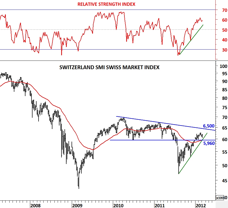
Switzerland SMI index has been volatile due to euro zone debt problems. Until mid-2011 price action between 2010 and 2011 was more like a sideways consolidation. However, index broke down the strong support at 5,960 levels in July 2011. This triggered a sharp sell-off towards 4,600 levels. Recovery took 6 months and by the end of 2011 SMI was back above the previously broken support level and the 200 day moving average. I think this was the most important technical action that put the index back to positive territory. Being able to push back above the long-term moving average and the resistance at 5,960 level helped the index to find firm ground.

In the past few months we have seen SMI consolidating above the trend support and the long-term moving average. Index is likely to challenge the resistance at 6,500 levels in the following weeks. Unless we see 5,960 level break down again, we should expect a positive trend.

POLAND WIG 20 INDEX

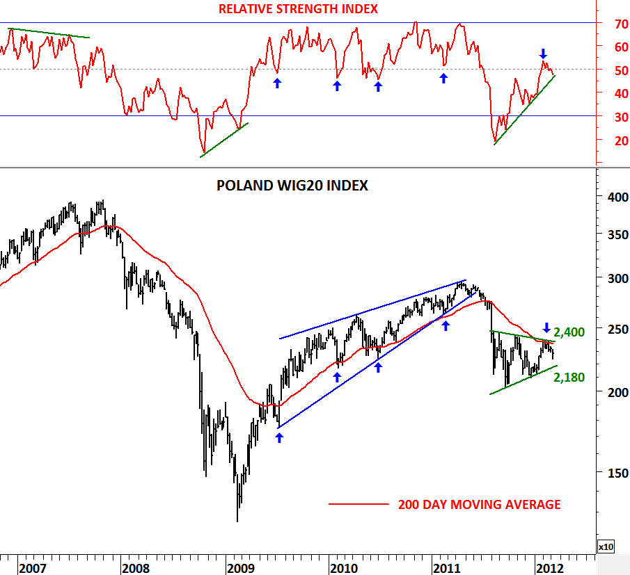
Thanks to wordpress.com’s improved statistics page, I can now see the visitor’s country profiles. This helps me to diversify my analysis in order to create a larger community at Tech Charts. Tech Charts blog is having visitors from more than 20 different countries everyday. In today’s post I’m analyzing Poland’s WIG 20 index with my usual template (Weekly chart + RSI + 200 day moving average). I like to look at the big picture and weekly charts help me to see the major trends.

Poland’s WIG 20 Index respected the 200 day moving average both during the downtrend and the uptrend. Between 2009 and 2011, index trended higher after finding support each time at the 200 day moving average. RSI confirmed the uptrend by finding support at 50 level. In mid-2011 WIG 20 index broke down its long-term moving average at 2,700 level and fell sharply to test 2,000 levels. Since the last quarter of 2011 WIG 20 has been forming a sideways consolidation range with the boundaries standing at 2,400 and 2,180. Upper boundary of the consolidation range and the long-term moving average are both forming resistance at 2,400 level. In the intermediate term index is in a sideways consolidation. A breakout will follow soon.

A break above 2,400 level will reverse the last 8 month’s downtrend and will be positive for the index. A break below 2,180 level will resume the downtrend and the consolidation pattern will be confirmed as a symmetrical triangle continuation pattern.

U.S. Unemployment Rate (%)

U.S. unemployment rate is unchanged at 8.3%. Employers in the U.S. boosted payrolls more than forecast in February, capping the best six month streak of job growth since 2006. Some 1.2 million jobs were created in the last six months, the most since the same period ended May 2006.

I’ve been updating the unemployment chart since August 2011 with the 1 & 2 year moving averages and back in 2011 I’ve concluded that in the worst case  unemployment rate can continue lower for another year until 2012.

http://techcharts.wordpress.com/2011/08/10/u-s-unemployment-rate/

In the past, after the long-term moving average crossovers, the shortest trend last for a year and the longest trend for 8 years. Since the crossover in February 2011 it has been one year and unemployment rate dropped from 8.9% to 8.3%. It has been a slow recovery but in the positive direction. It is now extremely important for this trend to continue in the following months. A rise in unemployment rate from these levels could have long-term negative effects for the economy. As a result in the next few months we should keep a close eye on the unemployment rate.

DOW JONES INDUSTRIAL

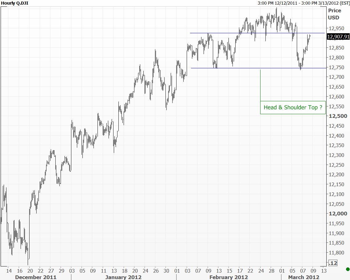
I usually try to share daily & weekly price charts on this platform but today I wanted to post an interesting chart pattern Dow Jones Industrial Average might be forming on an hourly chart. When analyzing charts my main time frame is daily scale. I check weekly (one level higher) and 60 minute (one level lower) to better understand and evaluate the technical outlook. So the 60 min chart drew my attention while I was looking at Dow indices on daily and weekly scale.

If Dow Jones Industrial Average is forming a Head & Shoulder top index should not break above 12,920 level. According to this chart pattern and analysis Dow Jones industrial is completing the right shoulder of a Head & Shoulder top. Neckline is standing at 12,740 level which should eventually break down if this is a valid H&S top formation. For this bearish pattern to stay intact, Dow Jones Industrial Average should start moving lower from these levels.

BHP BILLITON & RIO TINTO

Rio Tinto Group is an multinational exploration, development, production and processing corporation with headquarters in London, United Kingdom. The company was founded in 1873. It is among the world leaders in the production of many commodities, including aluminium, iron ore, copper, uranium, coal, and diamonds.The company has operations on six continents but is mainly concentrated in Australia and Canada.

BHP Billiton is a global mining, oil and gas company headquartered in Melbourne, Australia and with a major management office in London, United Kingdom. It is the world’s largest mining company. BHP Billiton operates a wide variety of mining and processing operations in 25 countries.

Everyday I review several charts, I look at different countries indices and their blue-chip companies. Australia drew my attention due to its underperformance over the past one year. So I decided to spend more time analyzing the S&P ASX 50 constituents. Here are two interesting analysis that I would like to share on this post. I’m asking what is wrong with the commodity play Australia and its major mining companies?

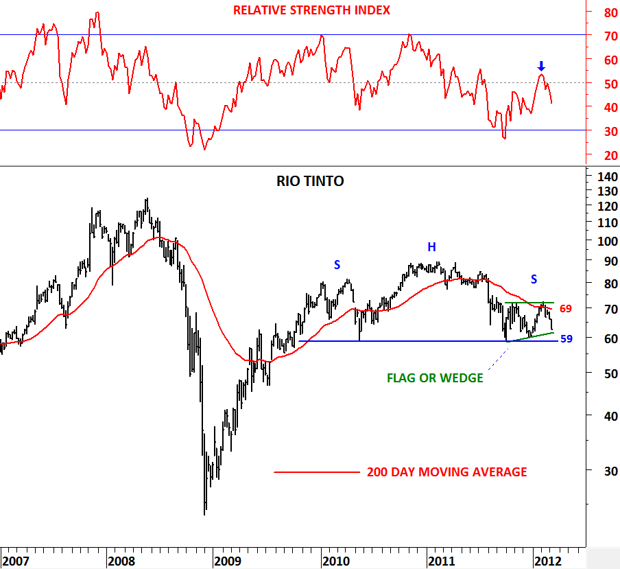
Both stocks failed to break above their 200 day moving averages during the past 6 month strength in global equity markets. More worrying is that they both formed bearish continuation patterns which are likely to resolve on the downside in the following months. BHP BILLITON formed a clear symmetrical triangle below the long-term average with the boundaries standing at 37.80 and 34.50. RIO TINTO formed a flag or a wedge pattern as bearish as BHP BILLITON’s symmetrical triangle. RIO TINTO has 69 as resistance and 59 as major support.

So the question is why are these blue chips lagging and also suggesting further weakness? Are they discounting weaker global growth and demand?

CBOE VIX (Volatility Index)

VIX is the ticker symbol for the Chicago Board Options Exchange Market Volatility Index, a popular measure of the implied volatility of S&P 500 index options. Often referred to as the fear index or the fear gauge, it represents one measure of the market’s expectation of stock market volatility over the next 30 day period.

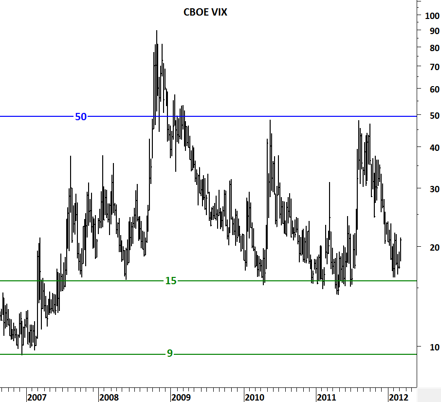
Since August-October 2011 period global equity markets have been in an uptrend. During the same period CBOE VIX has fallen from 50 levels to 15 levels. Historically 50 has been the boundary for negative sentiment and 15 has been for positive sentiment. Though in the past  CBOE VIX reached 9 levels (extreme optimism) on the downside and 89 levels (extreme pessimism) on the upside, on average it consolidated between 15 and 50. 6 month strong equity market performance helped sentiment to improve and pushed the VIX lower towards the boundary of positive sentiment.

There is now higher probability of CBOE VIX to rebound from 15 levels in the following months as a result of short/intermediate term equity market correction. It is important to watch the levels on the VIX as we are now rebounding from a major support area. 

SOY MEAL

In December 2011 and January 2012 I wrote about Soy Meal and the possibility of strong moves that could follow in Soy products.

http://techcharts.wordpress.com/2012/01/24/soy-meal-2/

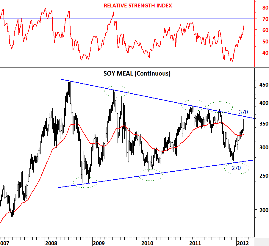
Soy Meal has been forming a perfect text-book long-term symmetrical triangle and in the past two months it has rebounded from the lower boundary of its long-term consolidation range. The rebound started from 270 levels and reached 325 levels in January. It formed a clear inverted head and shoulder pattern with the neckline standing at 325 levels. This important resistance at 325 levels was broken on the upside in February. The strong breakout was followed by a rally towards the upper boundary of the long-term symmetrical triangle at 370 levels.

Strength in soy products in the past two months helped Soy Meal to reach its long-term resistance at 370 levels. This is also the inverted Head & Shoulder pattern price target. A breakout above 370 will generate a long-term buy signal for Soy Meal, but before that we are likely to see a pause in the strong rally that took prices from 270 levels to 370 levels in less than 3 months.

3 year-long symmetrical triangle on Soy Meal is on our watch list. This is a chart pattern that a technical trader/investor shouldn’t miss. It is important to note that price is now close to a major trend resistance that was tested 4 times in the past 3 years.

Crude Oil, Natural Gas & Heating Oil

In the world of finance correlation is a statistical measure of how two securities move in relation to each other. Correlation is computed into what is known as the correlation coefficient, which ranges between -1 and +1. Perfect positive correlation (a correlation co-efficient of +1) implies that as one security moves, either up or down, the other security will move in lockstep, in the same direction. Alternatively, perfect negative correlation means that if one security moves in either direction the security that is perfectly negatively correlated will move in the opposite direction.

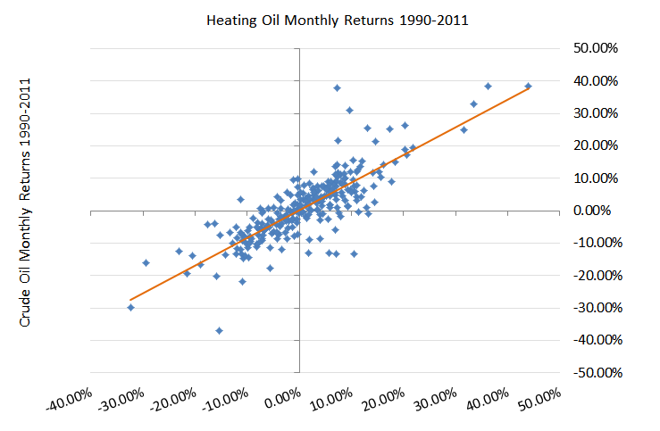
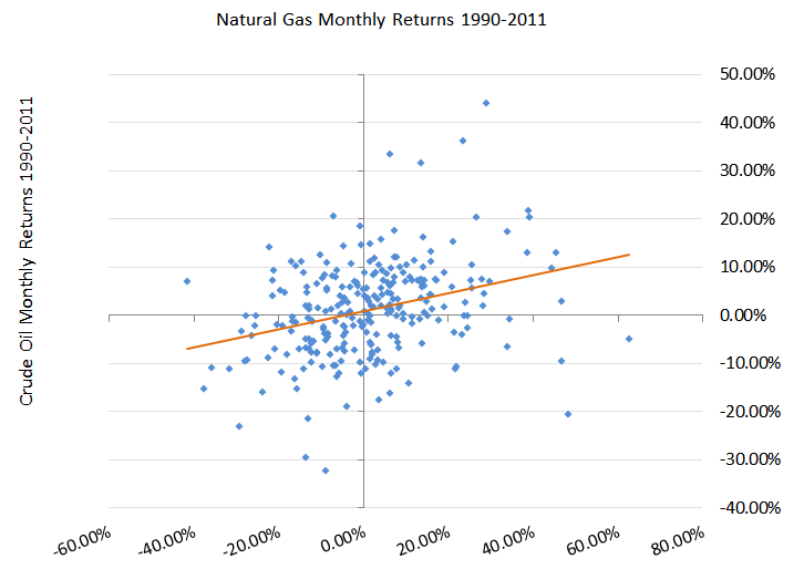
In the energy sector, Natural Gas, Crude Oil and Heating Oil prices are correlated. Though it is important to know the magnitude of the correlation between these commodities. Historical analysis of monthly returns have shown strong correlation between Heating Oil and Crude Oil. During the analyzed period between 1990 and 2011 crude oil and heating oil have shown strong correlation with 0.81 correlation co-efficient. During the same time period Natural Gas and Crude Oil have shown relatively weak correlation. Correlation was still positive with 0.31 correlation co-efficient. Monthly returns and their correlation can be seen on the figures below. Weak correlation between two instruments creates diversification opportunity. However, two closely correlated asset class or commodity would increase the risk in a portfolio.
 

Given the strong correlation between Crude Oil and Heating Oil, as the previous analysis suggests, one would expect a flat relative performance between the two commodities in the long-run. Relative performance (relative strength) is a measure of price trend that indicates how an index, commodity, stock or currency is performing relative to the other. I.e EUR vs. USD is the most common relative performance ratio that we follow everyday. It is the performance of EUR versus USD. It would have been great if we were to know that EUR/USD will trade between 1.10 and 1.30 in the next decade. During a period of 10 years we would have an edge by knowing when to sell EUR and when to buy USD.

After finalizing correlation study between the three energy commodities we search for relative strength patterns by calculating the ratio between Heating Oil and Crude Oil and also between Natural Gas and Crude Oil. Our findings show that we do actually have an edge to forecast the relative performance between each commodity. Heating Oil/Crude Oil ratio trades in a perfect range. 1993, 2000, 2003, 2008 and 2011 have been the peak levels for the ratio. At he peak levels Heating Oil was overvalued versus Crude Oil. 1995, 1999, 2002, 2004 and 2009 have been the bottom levels for the ratio. At bottom levels Heating Oil was undervalued versus Crude Oil. Knowing that Heating oil and Crude oil historically have 81% correlation and their relative performance ratio moves from one extreme to another should give us an edge. Heating Oil vs. Crude Oil shows cyclical behavior.

What about trending behavior? We know that Natural Gas and Crude Oil have 31% correlation. As a result their relative performance is not likely to be flat in the long run. Unlike the ratio between Heating Oil and Crude Oil, Natural Gas/Crude Oil ratio has shown trending behavior. 1990-2000 period shows positive relative performance, while 2000-2011 period shows negative relative performance for Natural Gas. Even though there has been spikes on the Natural Gas/Crude Oil ratio during the analyzed period, trends persisted.

CANADIAN DOLLAR

This currency has a special place for me. During my post-graduate studies in Canada, I used to follow it closely as I was converting U.S. dollars to Canadian dollars almost every month. When I decided to move to Canada in 2003 crossrate was at 1.4 levels. 1 USD used to buy 1.4 CAD. It has constantly moved lower over the past decade and at one point it reached 0.90 levels.

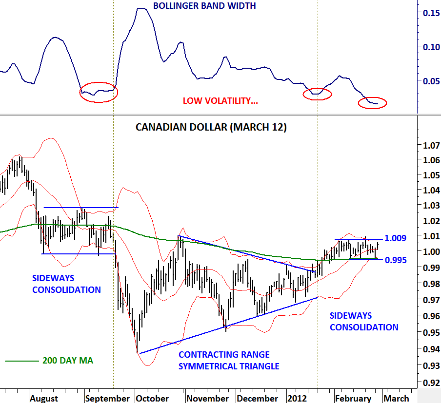
Today I’m analyzing Canadian dollar and giving Tech Charts visitors a “heads up” on the possibility of a strong breakout in the following days. Canadian dollar formed several consolidation ranges in the past year. In Aug-Sep period a sideways consolidation, in Oct-Dec period a contracting range (symmetrical triangle) and now over the past one month another sideways consolidation. Each breakout from these consolidation ranges was strong and was followed by a directional move. Canadian dollar has been trading in a range between 1.009 and 0.995. Price found support above the 200 day moving average, a bullish development. We are likely to see a breakout soon. Please note that volatility reached an extreme low reading and a breakout could result in a strong move. A break above 1.009 level will be very positive for Canadian dollar. A break below 0.995 will be negative. My suggestion is to wait for a confirmation and take action when one of these levels are breached.