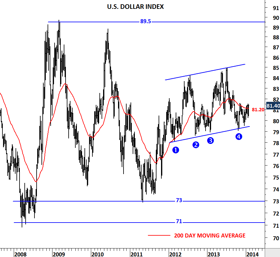
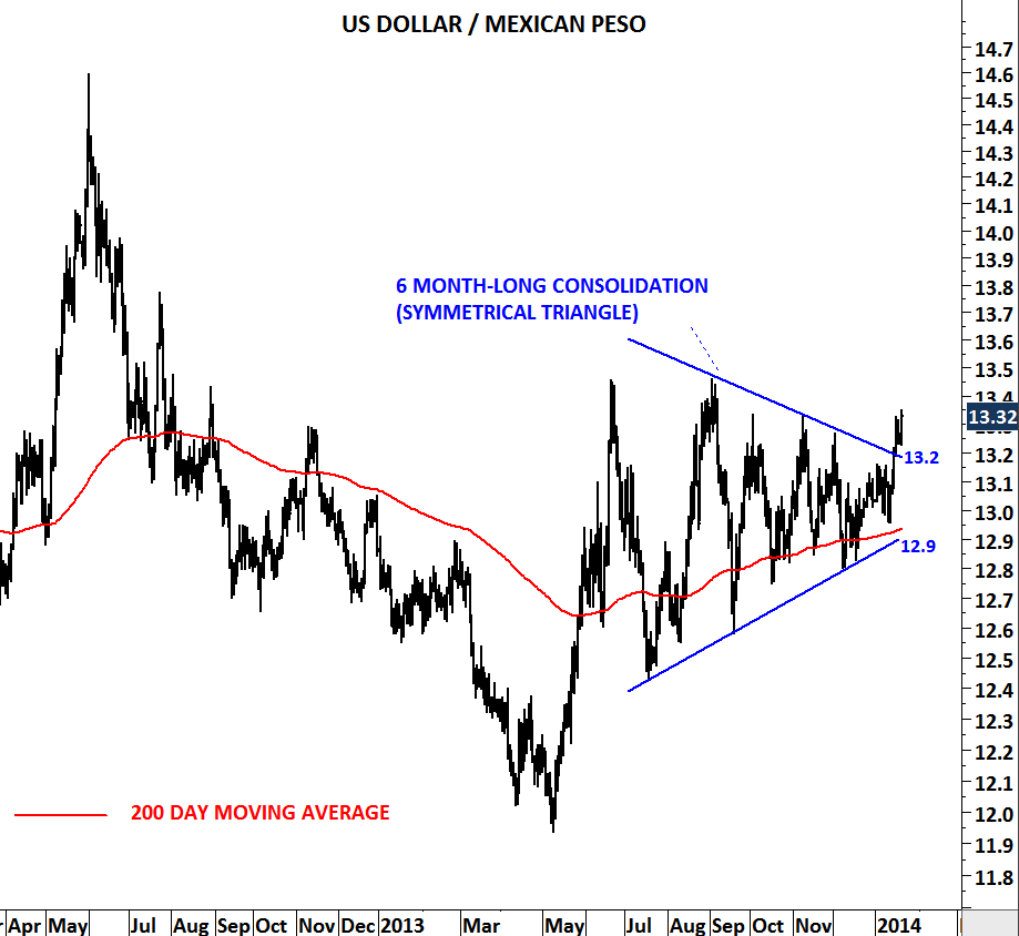
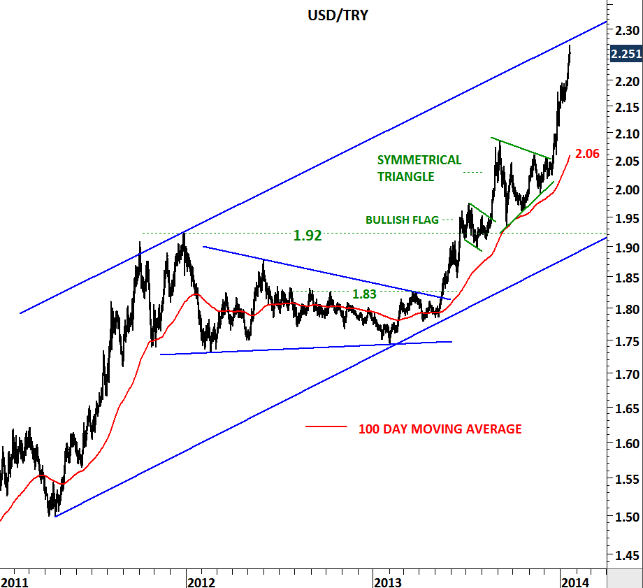
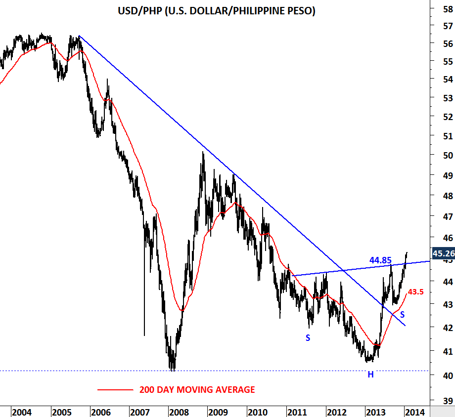
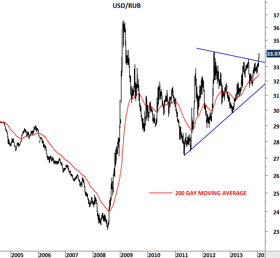
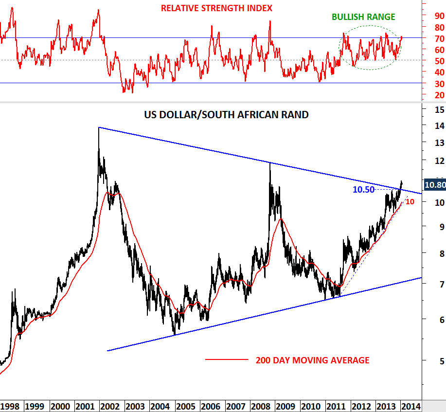
In financial markets trying to pick tops and bottoms has always been costly. Predicting the beginning of a larger scale correction or a uptrend is not only difficult but also a low probability bet. High probability set-ups are the ones when you have confirmation. Trade-off is that confirmations don’t come at the very early stages of a trend. As a result, to have a high probability trade you should be willing to miss part of the move.
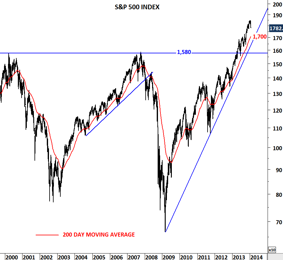
S&P 500 Index and Europe’s STOXX 50 had a rough week. Both indices experienced sharp pull-backs. Does this change the trend? Can it be the beginning of a larger-scale correction? We don’t know the answers to these questions… What we know is that indices are currently above their long-term averages. In the past, 200-day moving average has always been a good indicator. Breakdown of the moving average supported by a breakdown on a trend line support resulted in larger-scale corrections. In this case 1,700 levels will be important for S&P 500 index and 2,800 levels will be decisive for STOXX 50.
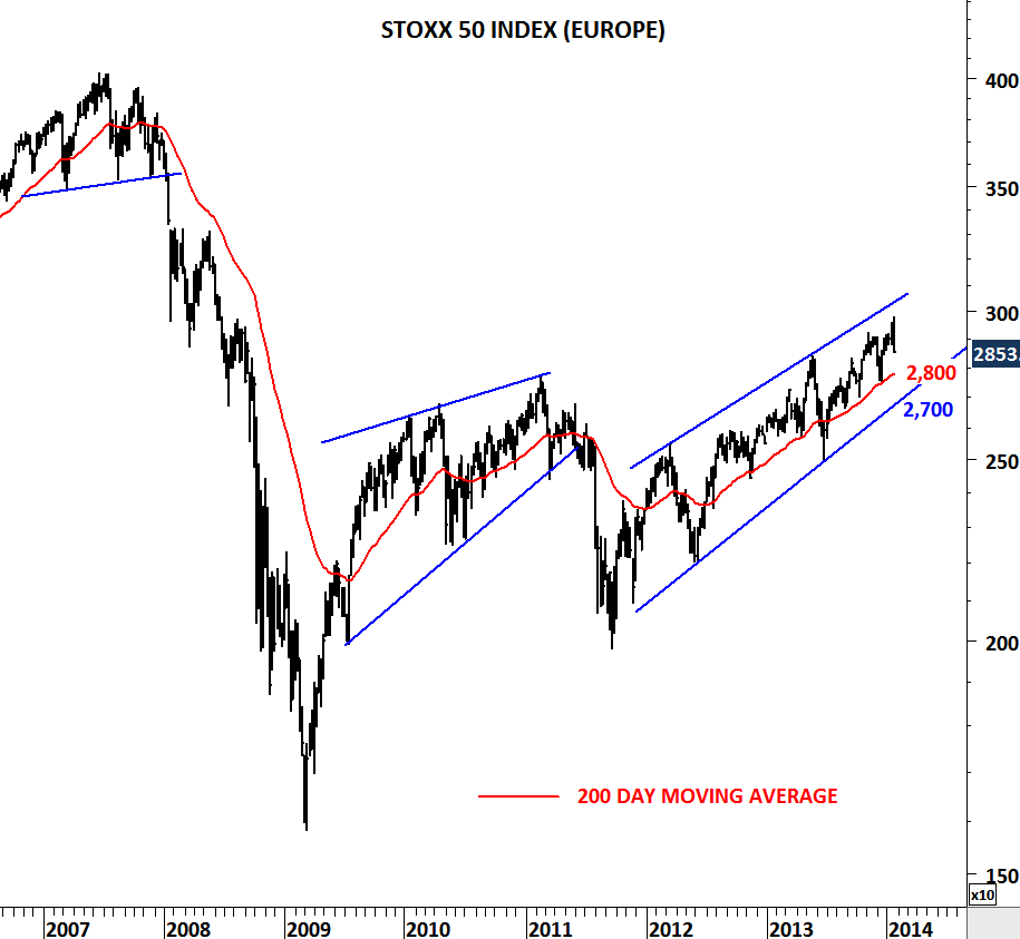
S&P 500 index is above historical highs which is at 1,580 levels. I’d define the strong support range for the S&P 500 as 1,580-1,700. Since the beginning of 2012, STOXX 50 index is in a uptrend. Strong support area for the STOXX 50 will be 2,700-2,800.
It is too early to call for a larger-scale correction. We need confirmation. We need to see decisive breakdowns.