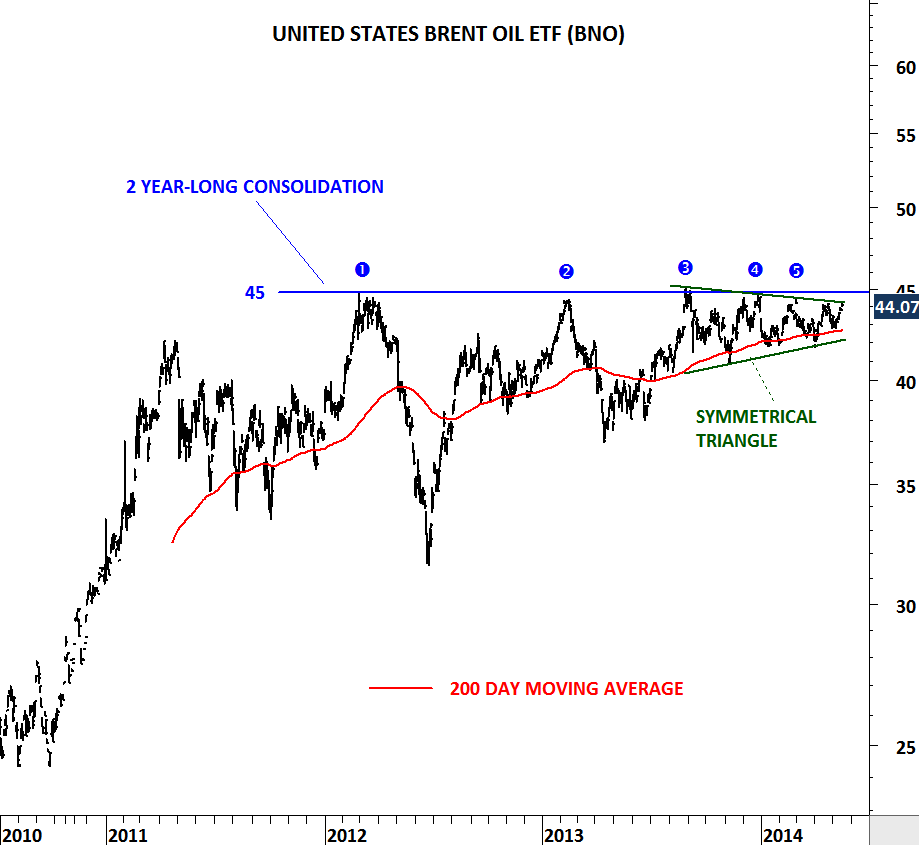
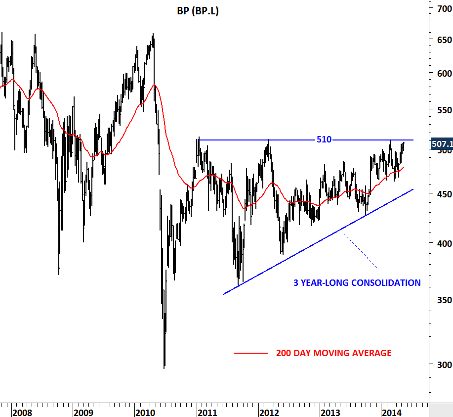
U.S. INITIAL JOBLESS CLAIMS

Can additional QE help the jobs market? FED believes that it will. What the data tell us is something different. Let’s analyze… I’ve been frequently updating the U.S. Initial Jobless Claims chart and drawing attention to the slowing downward momentum on the jobless claims. In this post I added the timeline for past and present quantitative easing announcements. As you can see from the chart, between QE I and QE II jobless claims dropped sharply from 650 K to 400K. However after the QE II announcement the impact on the jobs market was limited. It has been a year since QE II was announced and initial jobless claims are still at 382K levels. Last week FED decided to go ahead with another round of QE which is called QE III. At the same time jobless claims reached 382K levels. We all know from the earlier updates that 52-week moving average is an important threshold and jobless claims above 380K could reverse the last 3 year’s downtrend. Now the question is: What if QE III fails to push jobless claims further down but instead we see higher jobless claims in the following months? In the following weeks and months we should keep an eye on 380K levels. Jobless claims data that is above 380K could challenge the argument of fixing unemployment with further quantitative easing.

U.S. UNEMPLOYMENT RATE and JOBLESS CLAIMS

One of the most important time series that I’m following is the employment situation in U.S. The other one is related to housing. In this post I’m updating my charts with the latest data. On Thursday initial jobless claims data was better than expected with 365,000. Expectation was a range between 365,000-380,000. What is the importance of this data and how should we read it? Since the beginning of 2009, initial jobless claims have been trending down. Over the past few months downward momentum has weakened. In other words the pace of an improving job market has slowed down. That’s why it is crucial to see the resumption of the last 3 year downtrend.  A critical threshold is the 52-week moving average which is now at 380K. As long as we see the initial jobless claims below its long-term average we will expect better jobs market. A trend reversal (to the upside) would occur only if jobless claims break above the 52-week moving average.

Unemployment rate dropped to 8.1% in August. Payroll jobs were anemic even though the unemployment rate dipped.  The unemployment rate slipped to 8.1 percent from 8.3 percent in July due to a sharp drop in the labor force. Is this positive? Well any number that helps the unemployment rate maintain its downtrend is positive in my opinion. After we have seen the 1 & 2 year moving average crossover (bearish crossover suggesting lower unemployment rate) on the unemployment rate, our expectation was to see better numbers month after month. However, unemployment has been sticky and took longer to drop from 9% to 8% levels. What we need to see is the continuation of this downtrend. For now donwtrend remains intact and we should expect better numbers in the following months.

AUD/USD

Commodity currencies had a strong run since the beginning of 2009. With the help of metals, agriculture and mineral prices going higher Canadian, Australian and New Zealand dollar gained strength against U.S. dollar. Australian dollar reached 1.1 levels in May 2011. However, since then we have seen the commodity currencies entering into sideways corrections. Choppy price action around the 200-day moving average formed a year-long symmetrical triangle on the AUD/USD chart. In the beginning of August, Australian dollar found resistance at 1.06 which is the upper boundary of the consolidation range. Over the past month AUD/USD moved lower towards the 200-day moving average at 1.025. The consolidation pattern is not completed yet. We are likely to see further weakness in AUD towards 1.00 levels. The real price action and the directional movement will take place once we see the major breakout from the year-long consolidation range.

GOLD (EUR/Ounce)

Gold is shining again… read the headlines over the weekend and today. I’ve updated metal charts in August and drew attention to possible strong breakouts. Now is the time for some long-term charts. This time I wanted to put Gold price in euros. The chart below is very powerful and gives a very important message. Since the beginning of 2009 strong uptrend formed a clear parallel trend channel and over the past year price formed a perfect symmetrical triangle. We are now seeing a clear breakout from a year-long consolidation range. If we are going to see the Euro strengthening in the next couple of weeks than Gold is going to outperform the Euro. Gold in euros is likely to start a new uptrend. This chart is telling us that yellow metal is breaking out of a medium/long-term consolidation range and price can target 1,500 levels. (please note that price scale is denominated in euro).

CBOE VIX

Earlier during the month I wrote about CBOE VIX. Volatility is a good measure of market sentiment. Historical chart studies show 3 important levels for CBOE VIX. 50 level has been an extreme pessimism in the equity markets and 9 & 15 levels; extreme optimism. Over the past 5 years VIX couldn’t break below 15 levels. As a result, equity market peaks occurred every time VIX reached 15 levels. In the past few weeks, CBOE VIX made an attempt to break below 15 levels. This was critical as it would have pushed the volatility index and the sentiment to a new extreme. However, the attempt failed to break down the important support level. We are now back into the trading range between 15 and 50. Given that MACD is generating a positive divergence (a warning signal for a possible reversal), we are likely to see higher prices on the VIX, that could result in a weak equity market. We continue to watch 15 levels as an important support and unless index closes below 15 levels on a weekly basis, we expect higher VIX levels in the coming months.

U.S. INITIAL JOBLESS CLAIMS

Jobless claims rose by 4,000 for a second week to reach 372,000 in the period ended Aug. 18. Unemployment has been above 8 percent since February 2009 – – the longest stretch in the post-World War II era. Last week I drew attention to the loss of momentum on the U.S. Jobless Claims data. There is a downtrend, and yes Jobless claims have been going down when compared with April 2009 peak. However, the pace of the downtrend has been decelerating. As of this week, the 52 week moving average is at 382,000 level and I believe this technical resistance should be respected. Further weakness in unemployment data has the risk of breaching 382,000 level and reversing the 3 year-long downtrend. This could result in higher unemployment rate.

SOY MEAL

Low volatility periods are usually followed by high volatility and vice versa. Strong agricultural commodity prices are taking a breather but looks like trends are not over. Short-term sideways consolidations and low volatility ranges suggest upward breakouts and continuations. Soy Meal is one of the agricultural commodity that has been consolidating over the past one month. We are now very close to a strong breakout. Two levels to watch: Resistance: 550 and Support: 512.

GOLD, SILVER and PALLADIUM

Metals have been one of the exciting areas as we got closer to the end of this week. Precious metals moved higher and challenged important resistances. First, we saw a major breakout on Platinum followed by Palladium. Low volatility range breakouts are usually very powerful and are followed by strong moves. While a surge in volatility can last for several weeks it can also fade in a few days. False breakouts (head fakes) are part of the game. However, when combined with technical chart pattern breakouts (flags, wedges, pennants, triangles etc.), low volatility breakouts usually present good trading opportunities.

Palladium was one of the precious metals that clearly broke out of its short-term consolidation range on Friday. The strong move was followed by Platinum’s breakout which took place on Thursday. Both Gold and Silver closed the week at critical resistance areas and we are likely to see a directional movement on these metals sooner or later. I’ve attached metals charts with their critical support/resistance levels to watch. Gold has to clear 1,630 level and Silver has to break above 2,850 level. Failure to do so will result in more sideways consolidation.

CURRENCIES

Here is an update on major currency pairs including U.S. dollar index, GBP/USD, EUR/USD, AUD/USD, NZD/USD, USD/JPY, USD/CAD and USD/CHF.

CURRENCIES (PDF Document)

Highlights:

U.S. dollar index continues to hold above its intermediate-term trend.

Best intermediate-term trading opportunity will present itself on GBP/USD.

AUD/USD & NZD/USD might have another leg up.

USD/JPY might be forming a major base formation.

COFFEE

Will Coffee price reverse its decade-long uptrend or is this another major medium-term low? We are looking for an answer to this question. I attached two charts of Coffee price, one with a long-term view and the other with a medium-term. Coffee is testing the lower boundary of its 10 year-long upward trend channel. A break below 158-148 area could reverse the long-term uptrend and push prices much lower in the medium term. Until we see a decisive break below 148-158 area we will expect the uptrend to resume. However, weekly close below 148 level would be a medium/long-term sell signal. If price can rebound from the support as it did in the previous tests, we will expect a spike towards the 200 day moving average, which is now strong resistance at 190 levels.

COFFEE (PDF Document)