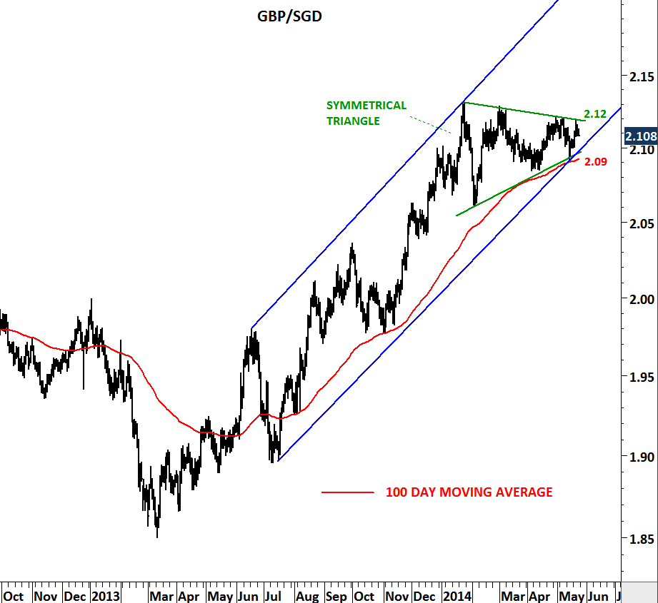
EUR/USD

Did euro reverse its 2 year-long downtrend? EUR/USD broke down its long-term moving average in September 2011. Since then it has been trending below the 200 day moving average with one exception in October 2011, which was a 3 day spike above the long-term average and was not a valid breakout. In July 2012, EUR/USD reached 1.20 levels. Rebound from the oversold levels carried EUR/USD to the trend resistance at 1.2650. It didn’t take long for the cross rate to clear this resistance in September 2012. Breakout was followed by a sharp rally towards 1.3150 levels. During this rally EUR/USD breached the 200-day moving average for the first time in one year. In the last two months we have seen a pullback to the long-term average which is now forming support at 1.2860. If EUR/USD can stabilize above the long-term average at 1.2860 levels, we are likely to see the continuation of the strength in the euro. It is important for the cross rate to hold above this support. Failure to hold above 1.2860, could send EUR/USD back to 1.25 levels.

VOLATILITY INDEX

Followers of Tech Charts will remember this chart on the CBOE VIX. I have been bringing this important chart to your attention for almost 3 months. Repetitive positive divergences and similar technical outlook in the past two CBOE VIX reversals made this chart even more essential. VIX found support at 15 levels in 2008, 2010, 2011 and 2012. Each one of those tests were followed by a sharp spike in volatility. In the past two reversals MACD generated positive divergences that were early warning signals of correction in equity markets. When we compare the low in the first quarter of 2012 and the low in the second half of the year, we can’t miss the non-confirmation on the momentum indicator and the volatility index. So the question is: Are we at the beginning of an increased volatility period?

USD/TL

Long-term charts are usually self-explanatory. They lay out the big picture in a clear-cut way. The below long-term chart (decade-long) shows U.S. dollar vs. Turkish Lira. From 2002 to 2011 USD/TL moved between 1.15 and 1.76. This was a wide trading range with several of volatile swings. In the last quarter of 2011 there has been a major change in supply & demand. USD/TL breached 1.76 levels… This was followed by a consolidation above the long-term resistance. Long-term resistance at 1.76 became support.

Not only USD/TL found support at 1.76 levels but also above the 200-day moving average. Over the past year, the consolidation took the shape of a symmetrical triangle. Symmetrical triangle is usually regarded as a continuation chart pattern. The chart below takes a closer look at the symmetrical triangle consolidation between 1.8420 and 1.78. It is now clear that USD/TL will breakout from the year-long contracting range. A breakout on the upside (breaching above 1.8420) will be bullish for the dollar. Unless we see USD/TL below 1.76, we should continue to expect strong USD and weak TL.

SUGAR

Sugar prices are now testing a 5 year-long trend support. Since the beginning of 2007 prices have been moving higher. Swings in the uptrend have been sharp and volatile. It is now the 5th time sugar is testing the long-term trend support at 18.90 levels. Relative Strength Index formed a positive divergence on the weekly scale suggesting weakening downward momentum and warning of a possible reversal. From a long-term perspective sugar is offering a good risk/reward trade opportunity. It is important for the price to hold above 18.90 levels in the following weeks. In case of a rebound from the strong support levels price can test the 200-day moving average at 22 levels. Watch sugar prices with a possibility of a strong rebound.

U.S. INITIAL JOBLESS CLAIMS

Claims for the September 15 week are down only 3,000 to a 382,000 level that is above consensus for 373,000. The September 8 week is revised to 385,000 with roughly half of the week’s 18,000 jump due to Isaac. In my opinion people are too focused on week to week changes while on the other hand slowing down in the last 3 year’s downtrend deserves more attention. I’m following the momentum and the 1 year average of the jobless claims unlike the widely reported 4 week average of the data. I believe 4 week average is too volatile. You’ll remember from my earlier updates that I kept on drawing attention to the 380K level which was the 52 week moving average. Last week I also added the timeline for the past and recent QE announcements on the chart. My concern is the slowing down momentum of the last 3 year’s downtrend. And if we don’t see jobless claims falling below 380K in the following weeks, this could be a medium term reversal on the jobless claims. This would eventually push unemployment rate higher. Okay, I understand the argument that QE 3 will take time to have an impact on the unemployment but what about the impact of QE 2. Aren’t we at the same levels of jobless claims since QE 2?

U.S. HOUSING STARTS

New housing construction rose in August, boosted by the strongest pace of single-family home starts in more than two years that shows an improving U.S. real estate market – says the news headlines… Beginning construction climbed 2.3 percent to a 750,000 annual rate, less than forecast and restrained by a drop in the building of apartments, from a revised 733,000 annual pace in July, Commerce Department figures showed today. The average rate on a 30-year fixed mortgage held at 3.55 percent in the week ended Sept. 13, near the 3.49 percent on July 26 that was the lowest in data dating to 1971, according to McLean, Virginia-based Freddie Mac.

I’ve frequently updated the U.S. housing starts data with a historical perspective. Today I’m adding the latest data and reviewing this important chart once again. Given the amount of liquidity out there (QE1, QE2, QE3 and QE Unlimited…) and the lowest level of mortgage rates and the relatively low level of median home prices don’t you think the recovery so far looks anemic? In 1966, 1975, 1982 and 1991 each rebound has taken a “V” shape reversal and resulted in a strong recovery. It has been 3 years since the bottom and the U.S. housing starts are still below the 850K threshold. Yes, housing starts data shows improvement and there has been a 2.3% increase MoM, though let’s not forget that the July figure was revised down! My conclusion is that; I still see the housing market fragile. Until we get the U.S. housing starts data above 850K levels (historical support), I will NOT be bullish on the U.S. housing market.

U.S. INITIAL JOBLESS CLAIMS

Can additional QE help the jobs market? FED believes that it will. What the data tell us is something different. Let’s analyze… I’ve been frequently updating the U.S. Initial Jobless Claims chart and drawing attention to the slowing downward momentum on the jobless claims. In this post I added the timeline for past and present quantitative easing announcements. As you can see from the chart, between QE I and QE II jobless claims dropped sharply from 650 K to 400K. However after the QE II announcement the impact on the jobs market was limited. It has been a year since QE II was announced and initial jobless claims are still at 382K levels. Last week FED decided to go ahead with another round of QE which is called QE III. At the same time jobless claims reached 382K levels. We all know from the earlier updates that 52-week moving average is an important threshold and jobless claims above 380K could reverse the last 3 year’s downtrend. Now the question is: What if QE III fails to push jobless claims further down but instead we see higher jobless claims in the following months? In the following weeks and months we should keep an eye on 380K levels. Jobless claims data that is above 380K could challenge the argument of fixing unemployment with further quantitative easing.

U.S. UNEMPLOYMENT RATE and JOBLESS CLAIMS

One of the most important time series that I’m following is the employment situation in U.S. The other one is related to housing. In this post I’m updating my charts with the latest data. On Thursday initial jobless claims data was better than expected with 365,000. Expectation was a range between 365,000-380,000. What is the importance of this data and how should we read it? Since the beginning of 2009, initial jobless claims have been trending down. Over the past few months downward momentum has weakened. In other words the pace of an improving job market has slowed down. That’s why it is crucial to see the resumption of the last 3 year downtrend.  A critical threshold is the 52-week moving average which is now at 380K. As long as we see the initial jobless claims below its long-term average we will expect better jobs market. A trend reversal (to the upside) would occur only if jobless claims break above the 52-week moving average.

Unemployment rate dropped to 8.1% in August. Payroll jobs were anemic even though the unemployment rate dipped.  The unemployment rate slipped to 8.1 percent from 8.3 percent in July due to a sharp drop in the labor force. Is this positive? Well any number that helps the unemployment rate maintain its downtrend is positive in my opinion. After we have seen the 1 & 2 year moving average crossover (bearish crossover suggesting lower unemployment rate) on the unemployment rate, our expectation was to see better numbers month after month. However, unemployment has been sticky and took longer to drop from 9% to 8% levels. What we need to see is the continuation of this downtrend. For now donwtrend remains intact and we should expect better numbers in the following months.

AUD/USD

Commodity currencies had a strong run since the beginning of 2009. With the help of metals, agriculture and mineral prices going higher Canadian, Australian and New Zealand dollar gained strength against U.S. dollar. Australian dollar reached 1.1 levels in May 2011. However, since then we have seen the commodity currencies entering into sideways corrections. Choppy price action around the 200-day moving average formed a year-long symmetrical triangle on the AUD/USD chart. In the beginning of August, Australian dollar found resistance at 1.06 which is the upper boundary of the consolidation range. Over the past month AUD/USD moved lower towards the 200-day moving average at 1.025. The consolidation pattern is not completed yet. We are likely to see further weakness in AUD towards 1.00 levels. The real price action and the directional movement will take place once we see the major breakout from the year-long consolidation range.

GOLD (EUR/Ounce)

Gold is shining again… read the headlines over the weekend and today. I’ve updated metal charts in August and drew attention to possible strong breakouts. Now is the time for some long-term charts. This time I wanted to put Gold price in euros. The chart below is very powerful and gives a very important message. Since the beginning of 2009 strong uptrend formed a clear parallel trend channel and over the past year price formed a perfect symmetrical triangle. We are now seeing a clear breakout from a year-long consolidation range. If we are going to see the Euro strengthening in the next couple of weeks than Gold is going to outperform the Euro. Gold in euros is likely to start a new uptrend. This chart is telling us that yellow metal is breaking out of a medium/long-term consolidation range and price can target 1,500 levels. (please note that price scale is denominated in euro).