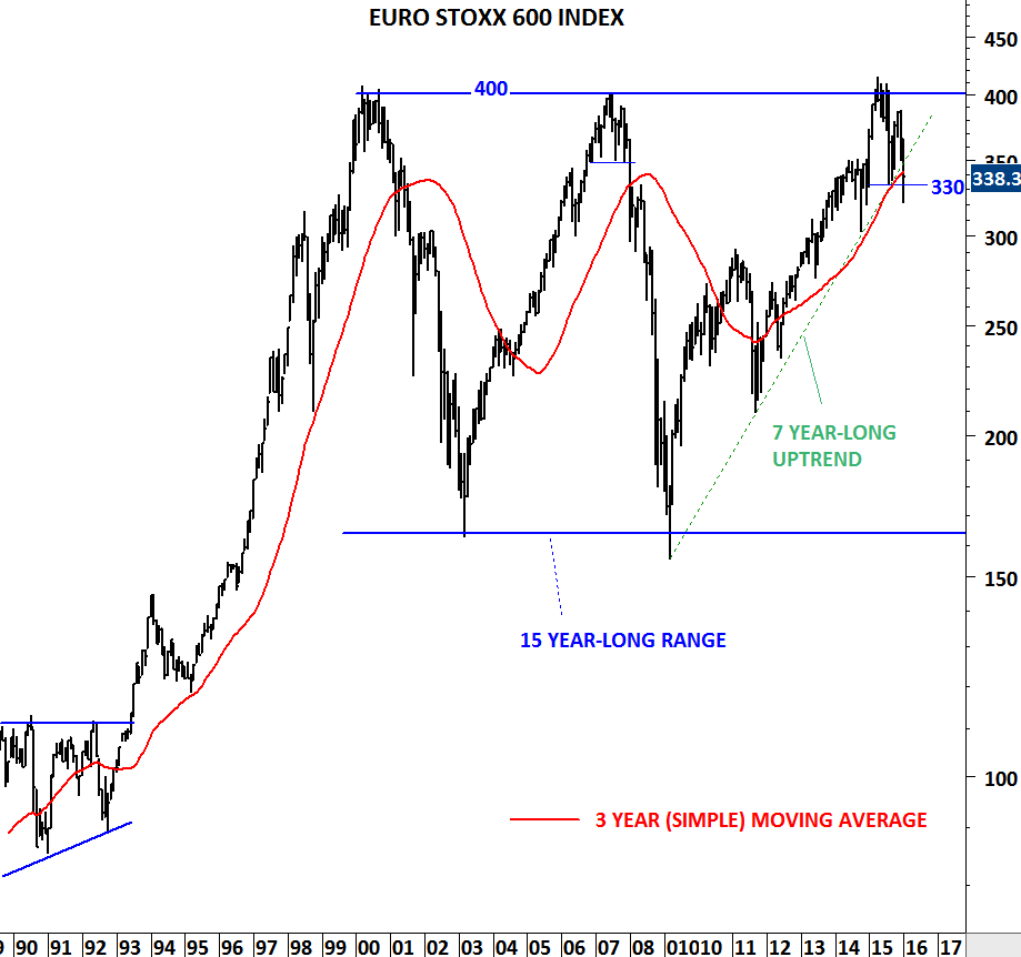
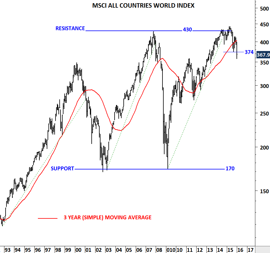
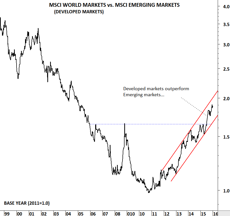
EUROSTOXX 600, MSCI ACWI and MSCI EM

As we are getting closer to eventful few weeks (thanks to Central Banks), I wanted to review some of the charts that will be important in our decision-making.

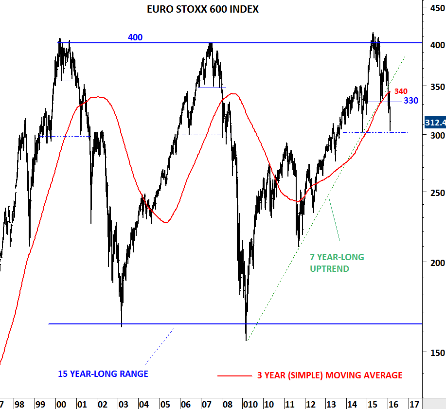
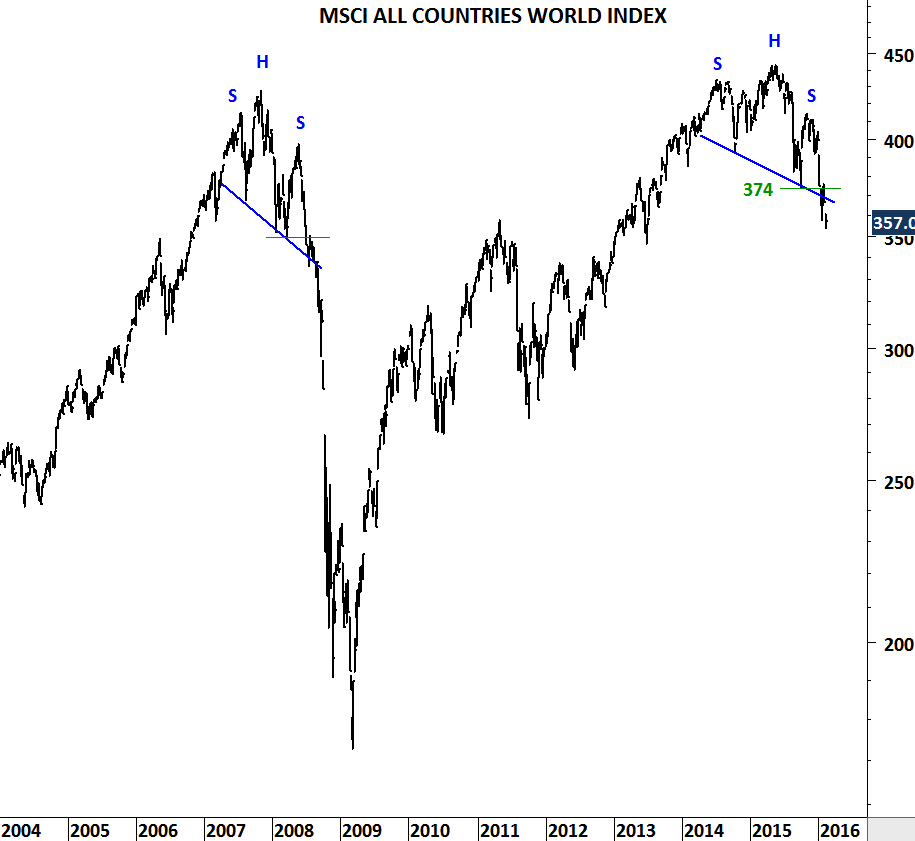
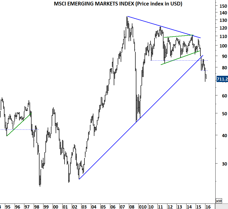
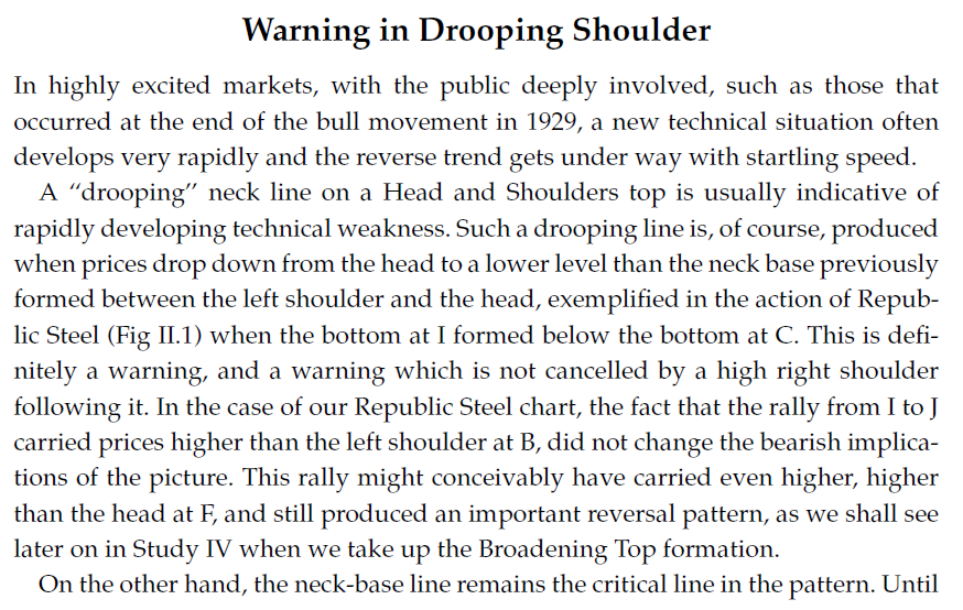
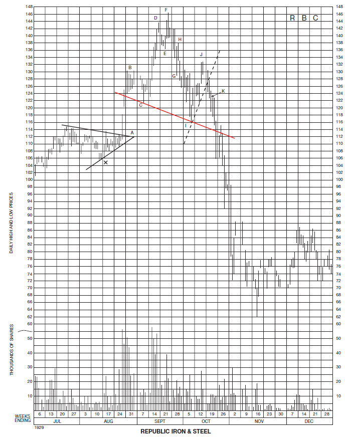
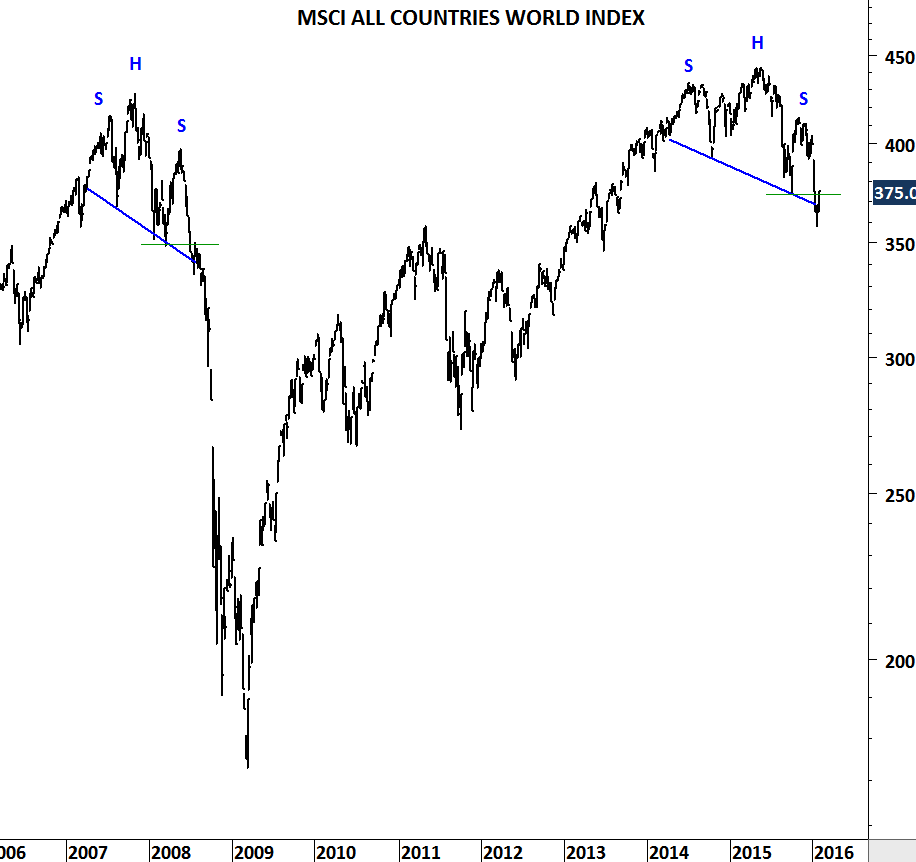
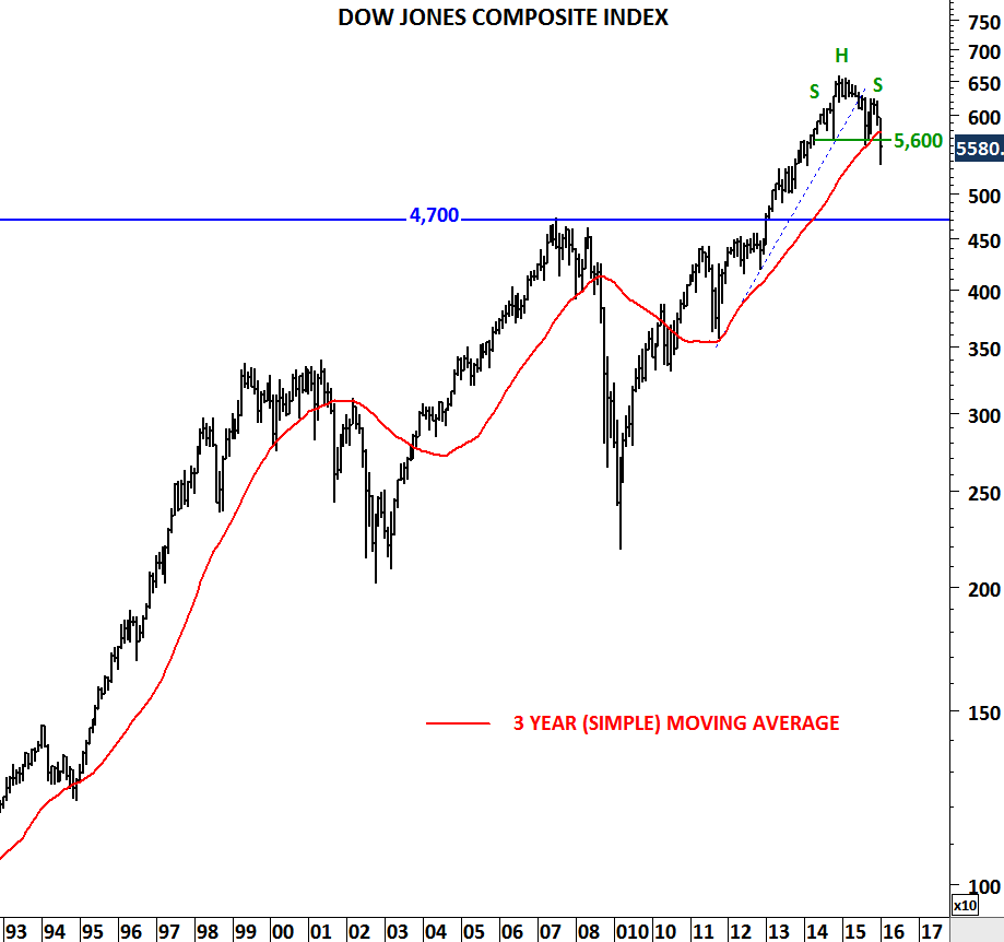
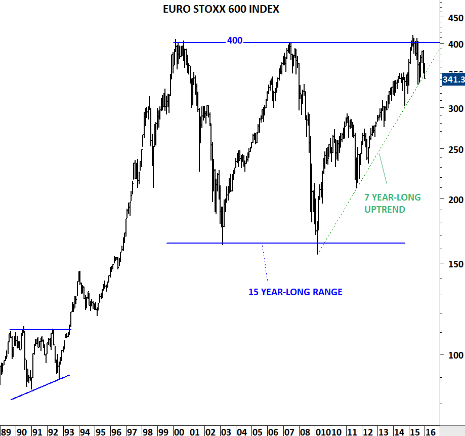
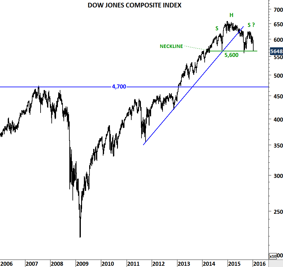
For those who trust the validity of long-term trend lines; most of the global equity indices breached +7 year-long upward sloping trend lines. These are major technical breakdowns, not minor violations.

Last few week’s counter-trend moves didn’t reverse the negative technical outlook on the long-term charts. Indices continue to make lower lows and lower highs and breaking down previous reaction low levels.

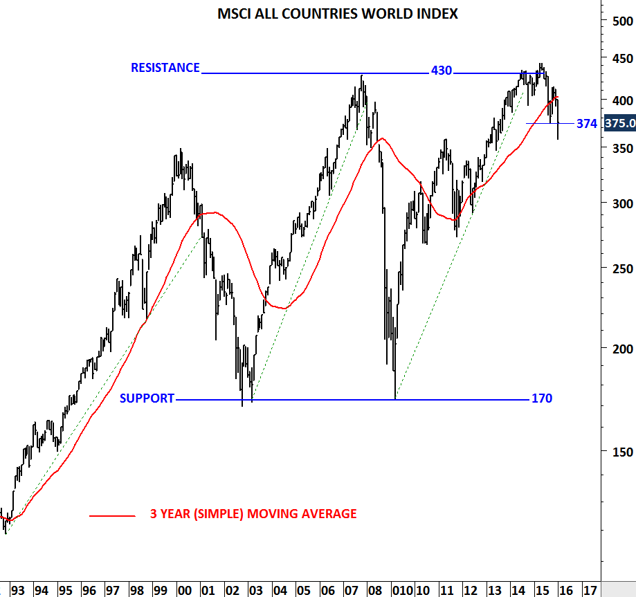
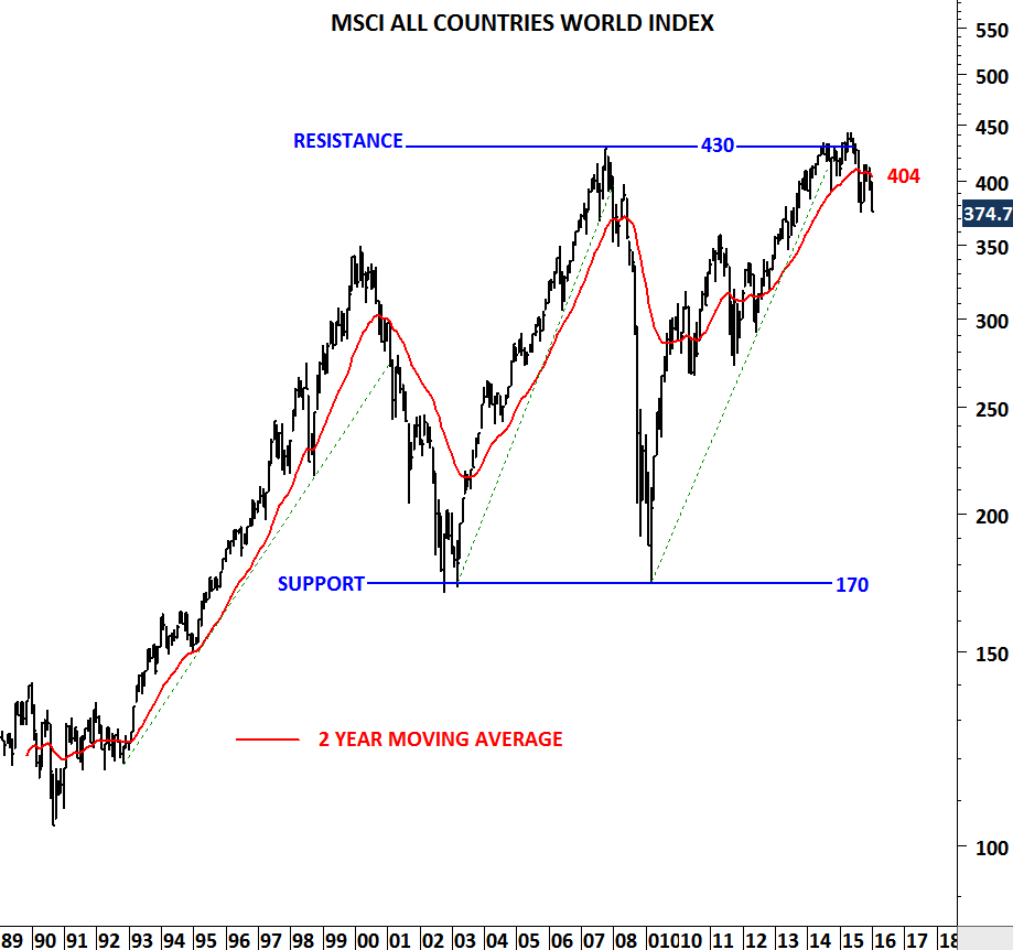
8-10% rallies can take place in bear markets. For reference I plotted the line chart of the MSCI ALL COUNTRIES WORLD INDEX. Major bear markets over the past two decades show counter-trend moves exceeding 8% in price appreciation. In fact during 2001-2002 bear market MSCI ACWI rebounded from 203 levels to 245 levels, a 20% rally, followed by another 35% drop.

Wide price swings and of course mood swings are characteristics of market correction. Since the beginning of the correction in mid-2015, there has been two counter trend price movements. One has taken the index from 383 levels to 413 levels (7.8%) during September-November 2015 and the other one is ongoing. So far the reaction resulted in 8.8% appreciation from the low of 356 levels.

MSCI ALL COUNTRIES WORLD INDEX

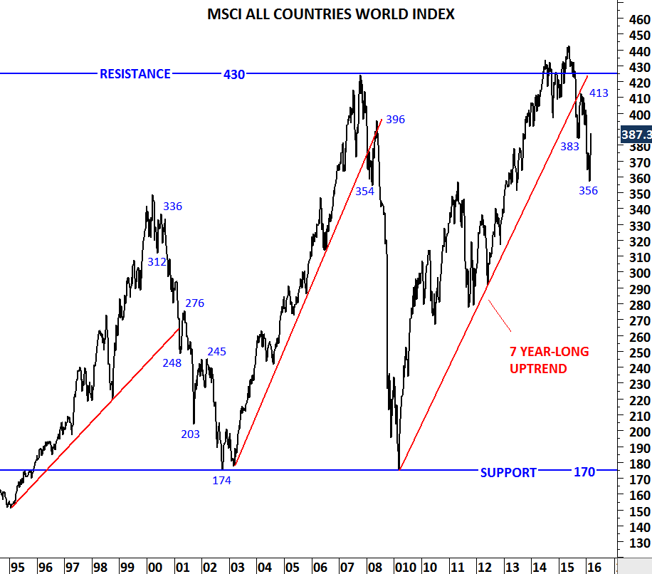
Line price chart of MSCI ALL COUNTRIES WORLD INDEX with linear scale

EUROSTOXX 600 INDEX

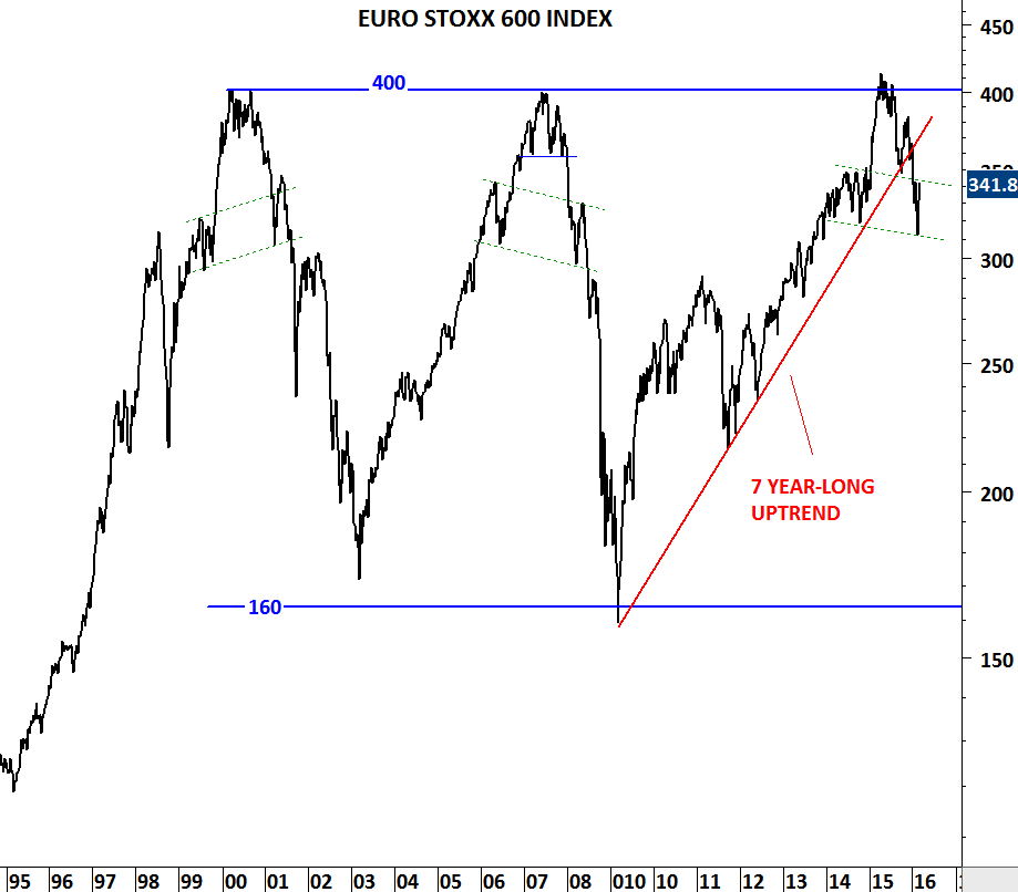
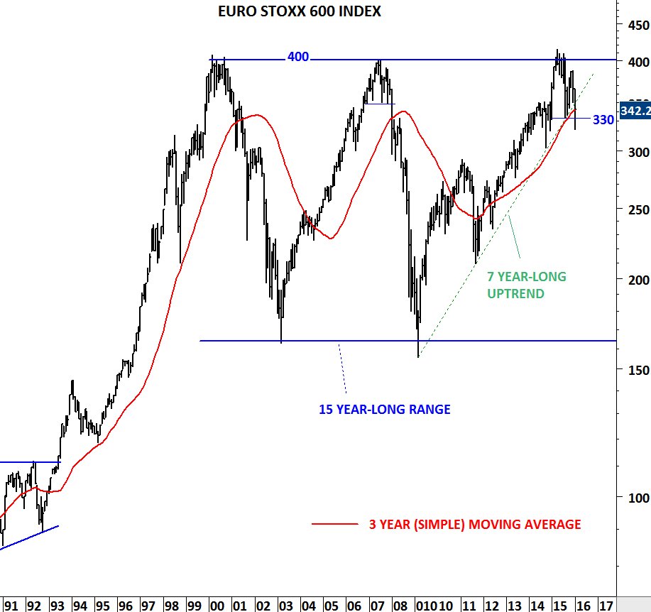
Line price chart of EUROSTOXX 600 Index on semi-log scale

MSCI EM

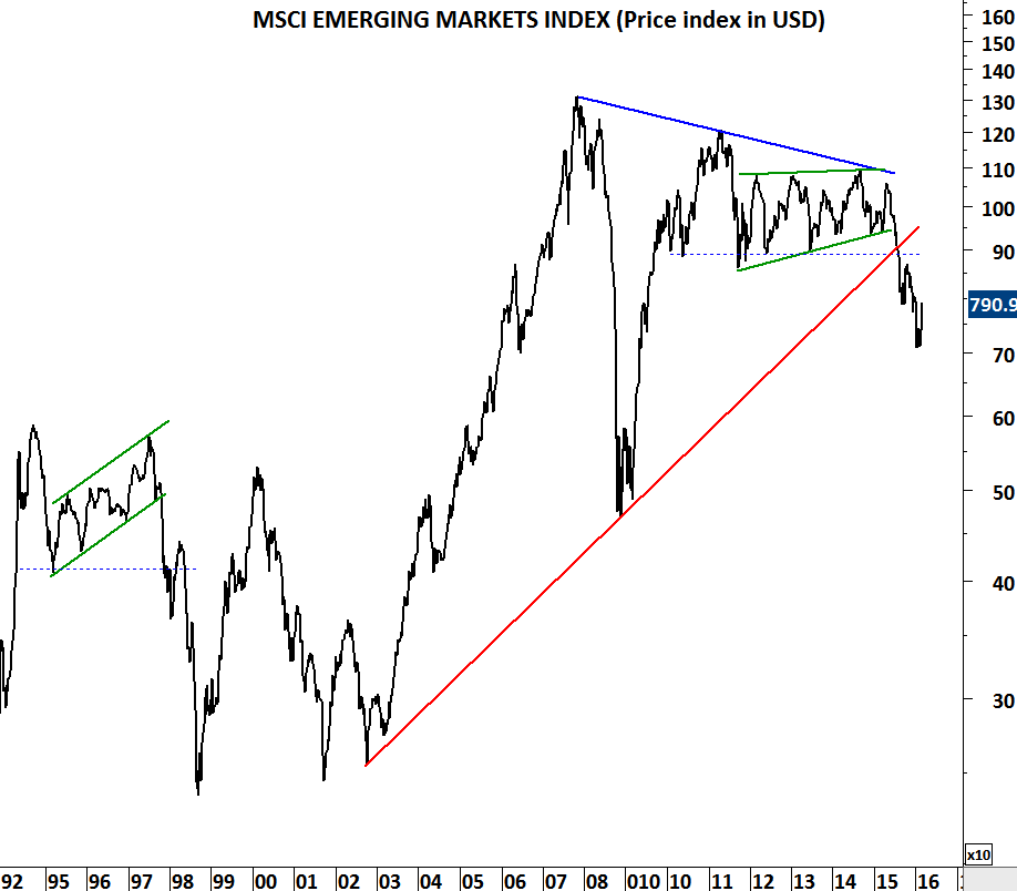
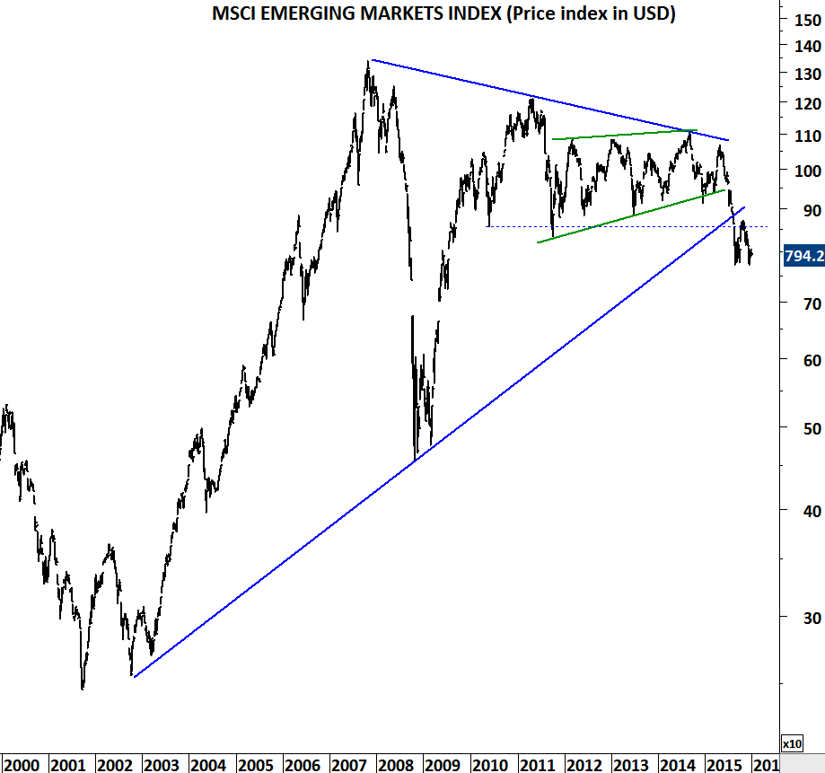
Line price chart of MSCI EMERGING MARKETS INDEX on semi-log scale

EURO STOXX 600, NIKKEI and MSCI ACWI

After reviewing the charts I posted two weeks ago on Euro Stoxx 600 and MSCI ALL COUNTRIES WORLD INDEX, I can conclude that since then there has been more technical damage on global equity indices. Until markets recover above previously broken support levels, we should watch out for further downside in the global equity markets. In other words I’ll treat the current market conditions as a bear market.

Markets seldom move in straight lines. Earlier price action on Euro Stoxx 600 shows how two different bear markets unfolded in 2001 and 2008. 330-340 area will remain as strong resistance. Both the 7 year-long uptrend and the long-term moving average are breached on the downside. Rebounds should be considered as bear market rallies.

EUROSTOXX 600 INDEX

Monthly price chart of EURO STOXX 600 INDEX

EUROSTOXX 600 INDEX II

Weekly price chart of EURO STOXX 600 INDEX

It clearly takes more effort to change the direction of the trend on MSCI ALL COUNTRIES WORLD INDEX when the global equity benchmark includes 23 developed and 23 emerging market equity index performance. So far it has given us a bearish message. 374-400 area will remain as strong long-term resistance. Failure to recover above 374 levels will resume the downtrend.

MSCI ALL COUNTRIES WORLD INDEX I

Monthly price chart of MSCI ALL COUNTRIES WORLD INDEX

MSCI ALL COUNTRIES WORLD INDEX II

Weekly price chart of MSCI ALL COUNTRIES WORLD INDEX

MSCI Emerging markets index is in a clear downtrend. The downtrend can accelerate. Index broke down decade-long trend line support and also the 5 year-long horizontal support at 850 levels. It is usually difficult to reverse momentum after such significant breakdowns.

MSCI EM

Monthly price chart of MSCI EMERGING MARKETS INDEX

Sell-off in Japan has been sharp over the past few weeks. Two strong technical supports overlapping at 17,000 levels has been broken on the downside. While we can conclude that in the short-term the market is oversold, it will need a lot of effort for the market to reverse the negative sentiment and recover above 17,000 levels. This market is also suggesting weak performance for the coming months.

NIKKEI 225 INDEX

Weekly price chart of NIKKEI 225 index

NATURAL GAS and COCOA

Long-term price chart of Natural Gas suggests that the volatile commodity is now trying to recover from historical strong support area. Over the past two decades Natural Gas (Henry Hub) prices traded as low as 1.62. There has been several instances when price reversed sharply from the strong support area between 1.62 and 1.76.

NGAS I

Natural Gas might be forming a base formation above strong support area. Possible head and shoulder bottom might be completing with the right shoulder now testing the left shoulder price level and forming symmetry. It is important to note that a breakout above 2.5 levels will confirm the H&S base formation and suggest higher levels in the following months.

NGAS II

Head and shoulder bottom and top chart patterns usually form after prolonged down/up trends. Natural gas has been in a consistent downtrend since the beginning of 2014. A similar reversal took place in 2012 after the energy price fell from 5 levels to 1.9 in less than a year. Below chart shows the base formation (head and shoulder bottom) in the first half of 2012.

NGAS III

Cocoa is another commodity that could enjoy higher prices in the following weeks/months if strong trend channel and horizontal support holds. Last one year’s consolidation has been between 2700 and 3400 levels. Price is now back to 2700 levels. While long-term trend is upwards, intermediate-term trend is still sideways. Though, Cocoa can present a low risk/reward entry around the strong support level.

COCOA

DOW JONES AVERAGES and MSCI ACWI

There are discussions right now if last few week’s sell-off was another failed breakdown. Was this another bear trap? Did Central Banks again manage to put a floor to equity markets? ECB’s dovish comments and BOJ’s negative interest rate moves both came this month, after sharp sell-off in equity markets.

Due to developing bearish chart patterns and the fact that major indices are below their long-term averages I’m weighing the possibility of a correction more than a strong bull market in the coming months. This time could be different and the technical outlook might prove to be a bear trap. I’m fine with that. That’s what markets are. Current chart set-up is something that I can’t ignore and I’ll try to explain here.

First let’s look at two major equity indices that we have been following. On a monthly scale “close” was at the border. The jury is still out in my opinion. Though, I would say last week of the month we have seen a good attempt to close at the higher levels for the month.

MSCI ALL COUNTRIES WORLD INDEX III

EURO STOXX 600 INDEX III

Richard W. Schabacker in his book TECHNICAL ANALYSIS AND STOCK MARKET PROFITS (Printed in US in1932) discusses Important Reversal Formations. Under this section there is a detailed study of Head and Shoulder reversal chart patterns. We are all familiar with the Head and Shoulder chart pattern. I want to draw attention to a specific type that we are seeing right now on equity index charts. Schabacker explains:

Schabacker ISchabacker II

Here is the chart he was analyzing at the time. Please note that the original chart doesn’t include the red trend line (neckline). I added this to show the similarities with the current chart patterns.

Schabacker III

Several decades later similar chart patterns are appearing on the widely followed and traded equity indices. Dow Jones Transportation Index broke down a similar downward sloping trend line. Head and shoulder price target is at 5,800 levels, still far from current 6,906 levels.

DOW JONES TRANSPORTATION INDEX

Now let’s look at some similarities between 2008 and 2016. In 2008, Dow Jones Industrial Average reversed its 4 year-long uptrend with a Head & Shoulder top. Neckline was downward slanting. After the breakdown there was a pullback that violated the neckline but couldn’t push above the long-term average or inside the trend channel. The head and shoulder top that formed in 2007-2008 showed significant market weakness due to its drooping shoulder.

DOW JONES INDUSTRIAL AVERAGE

Dow Jones Composite Average is now forming a similar Head and Shoulder top with downward sloping neckline. Both the long-term moving average and the lower boundary of the 6 year-long trend channel is violated. If this time is not different, current chart set-up suggests a correction is more likely in the following months than the continuation of the bull market.

DOW JONES COMPOSITE INDEX III

We can also look at MSCI ALL COUNTRIES WORLD INDEX and compare the top in 2007-2008 with the latest chart development. I think the current technical conditions can’t be ignored. I want to give these markets some more time to prove the bears wrong.


MSCI ALL COUNTRIES WORLD INDEX IV

WTI CRUDE OIL

Oil prices are rebounding but strong resistance area remains between $32 and $40. In 2009, when oil price dipped below $40 support area, it took two months to recover back above critical level and there hasn’t been a single month of close below $40. Latest breakdown below $40 has been decisive and unless we see a rally above $40 in the last trading day of the month, this will be the second monthly close below $40.

It is highly likely that the new equilibrium will form between $10 and $40. Recovery above $40 can take longer. Possibly there  will be a lengthy consolidation and the upper boundary of that consolidation remains at $40.

Both charts are plotted on monthly scale. Each bar represents one month of price action.

WTI CRUDE OIL

WTI CRUDE OIL II

MSCI ACWI, EUROSTOXX and DOW JONES

Volatility increased in the global equity markets. Last week of January will be important as we get closer to the end of the month. Why the last week of January is important? After the sharp sell-off equities are now trying to rebound. Another week of strength will result in a “close” at the higher end of monthly bars. This is the case for almost all the indices analyzed below. However, a flat or weak market action in the last week of the month will result in a “close” at the lower end of the monthly bars. A long monthly bar with a close at the lower end will confirm sellers willingness to push the markets lower. When there is an increase in volatility, it is always better to step back and look at charts with long-term focus. Preferably one or two higher degree than your usual template. This is one of the reason I’m paying close attention to monthly charts. Daily price movements can be considered “noise” in such highly volatile trading.

If EURO STOXX 600 manages to push above 350 levels, an immediate correction will be negated. However, a weak monthly close below August 2015 low (330) will suggest weakness for the coming months.

EURO STOXX 600 INDEX II

MSCI ALL COUNTRIES WORLD INDEX has similar technical outlook. Failure to push above August 2015 low at 374 levels will result in further weakness in the coming months. In order to compare all charts in this update, I added the 3 year simple moving average. You can pick different periods for the long-term average. Having a long-term filter on a chart is better than not having at all. When price is below the long-term average one should be more alert on the possibility of continued correction. In this case it is important to note that price is below several long-term averages.

DOW JONES COMPOSITE INDEX II

MSCI ALL COUNTRIES WORLD INDEX

2016 started with negative performance for global equities. And weak performance can continue in the coming months. Sharp sell-off in Chinese equities mainly driven by a devaluation of the Chinese yuan, resulted in a broad market weakness. Sharp price action is making the headlines as it is one of the few bad starts for the new year in several decades. However, since April 2015 charts have been showing market weakness. (Earlier updates on MSCI ALL COUNTRIES WORLD INDEX here)

Weakness can be seen from the MSCI ALL COUNTRIES WORLD INDEX failing to breakout to new high levels in April 2015. Global equities experienced the first sharp sell-off in August 2015. Last quarter of 2015 was a reaction to August sell-off. Now, it seems like the downward momentum is picking up steam. Index is below its long-term average once again. Breakdown below the September low at 374, can send the index towards 300-350 area. MSCI All Countries World Index captures large and mid cap representation across 23 Developed Markets and 23 Emerging Markets countries. (For more information on MSCI indices) With 2,491 constituents, the index covers approximately 85% of the global investable equity opportunity set.

MSCI ALL COUNTRIES WORLD INDEX

Europe’s STOXX 600 index has similar deteriorating outlook with the index now testing a 7 year-long trend line support. In April 2015 STOXX 600 reversed from 400 levels for the third time since 2000. Failure to clear 400 during its 3rd test suggests supply is overcoming the demand every time index tests 400 levels. If we see Euro Stoxx 600 breaking down its long-term trend line support, we will expect a larger scale correction towards 300 levels.

EURO STOXX 600 INDEX

Dow Jones Composite index that measures changes within the 65 companies that make up three Dow Jones averages: the 30 stocks that form the Dow Jones Industrial Average (DJIA), the 20 stocks that make up the Dow Jones Transportation Average (DJTA) and the 15 stocks of the Dow Jones Utility Average (DJUA), is also showing weakness with a classic bearish chart pattern; Head and Shoulder Top. Support level for the index is at 5,600 levels. Breakdown below 5,600 can send the Dow Jones Composite Index towards 4,700-5,000 area. (For more information on Head and Shoulder Top chart pattern)

DOW JONES COMPOSITE INDEX


U.S. DOLLAR/CHINESE YUAN

2016 can be another year of weak performance for the emerging markets. USD/CNY chart will have significant impact on emerging market currencies and equities. In the second half of 2015, sharp devaluation of the Yuan resulted in a sell-off in emerging market equities. Current technical outlook for the USD/CNY suggests further devaluation for the Chinese currency is likely in the coming months. A runaway price movement on USD/CNY can trigger another wave of selling in the emerging market equities.

USDCNY

MSCI EM

Already, emerging market equities are underperforming the developed markets. This trend is likely to continue if the above two (sharp devaluation of the Chinese Yuan and another sell-off in emerging market equities) takes place in the following months.

MSCI DM VS MSCI EM

LONG-TERM BOND YIELDS

First half of 2016 can be a volatile time for developed market bonds. Yields can move higher from current levels. I’m not sure what could be the economic trigger for such price action but charts suggest possible trend periods in the coming months. Here are the charts I will be following in the first quarter of 2016.

After sharp rebounds in the first half of 2015, developed market bond yields moved sideways in the remaining part of the year. Yields failed to test 2015 lows and the consolidation formed flag chart patterns. Flag formation is regarded as a continuation, usually forms halfway through out the price action. Breakout from the flag signals continuation in the direction of the breakout.

GERMANY 10 YR GOVT BOND YIELDS

While German 10 year government bond yields pulled back in an orderly correction, MACD found support around 0 levels. Breakout from the 6 month-long channel will be confirmed with a weekly MACD buy signal.

FRANCE 10 YR GOVT BOND YIELDS

SPAIN 10 YR GOVT BOND YIELDS

US 10 YR GOVT BOND YIELDS

Chart pattern on the U.S. 10 year government bond yield is different from its European peers. U.S. yields have been forming a symmetrical triangle. Breakout in either direction will confirm this chart pattern. Resistance is at 2.4 and support at 2.0.

EURO BUND

When yields go up, bonds move in the opposite direction. Euro BUND which is the 10 year German government bond, reached an important resistance area with a clear negative divergence on its momentum indicator. When analyzed with the underlying yields, we can conclude that higher interest rates can result in a pullback towards 148 levels.

VANGUARD LONG TERM CORP BOND ETF

Another interesting chart that drew my attention is the long-term corporate bond ETF. The chart above shows the Nasdaq listed Vanguard Long-Term Corporate Bond ETF (VCLT.O). Price is now challenging 6 year-long trend support. A decisive breakdown on the weekly scale chart will signal higher yields and lower corporate bond prices. (For more information on the above ETF)

DOW JONES COMPOSITE INDEX

Dow Jones Averages are price weighted indices, while most of the broad market indices such as S&P 500 and Nasdaq 100 are market-cap weighted. In a price-weighted index higher prices will influence the direction of the average more than lower prices, regardless of the actual size of the company.

Dow Jones Composite Index measures changes within the 65 companies that make up three Dow Jones averages: the 30 stocks that form the Dow Jones Industrial Average (DJIA), the 20 stocks that make up the Dow Jones Transportation Average (DJTA) and the 15 stocks of the Dow Jones Utility Average (DJUA). The Dow Jones 65 Composite, like the three sub-indexes, is price-weighted.

Over the past two years Dow Jones Composite Index has formed a top formation usually regarded as Head & Shoulder. Head and shoulder chart pattern forms after a prolonged uptrend and signals a possible change in trend. Chart pattern is confirmed with the breakdown of the neckline. Similar chart patterns can be seen on some of the constituents of the top US indices. If not in the next few weeks, the first quarter of 2016 we can see some corrective price action on these charts. Confirmation of such price movement will be a decisive break below horizontal support levels (neckline).

DOW JONES COMP INDEX

GS

UPS

AAPL