GLOBAL EQUITY MARKETS – May 5, 2018
Dear Tech Chart followers,
Every week Tech Charts Global Equity Markets report features some of the well-defined, mature classical chart patterns under a lengthy watch list and the chart pattern breakout signals that took place during that week. Global Equity Markets report covers single stocks from developed and emerging markets, ETF’s and global equity indices. The report starts with a review section that highlights the important chart developments on global equity benchmarks. Following the breakout alerts and the lengthy watch list, a section on correlation helps members to see the degree of relationship between the stocks and indices in the weekly report.
Below I'm sharing with you a sample report that was published on May 5, 2018. I hope this sample report will give you an idea of what to expect from the weekly Global Equity Markets report that Tech Charts Members receive.
REVIEW
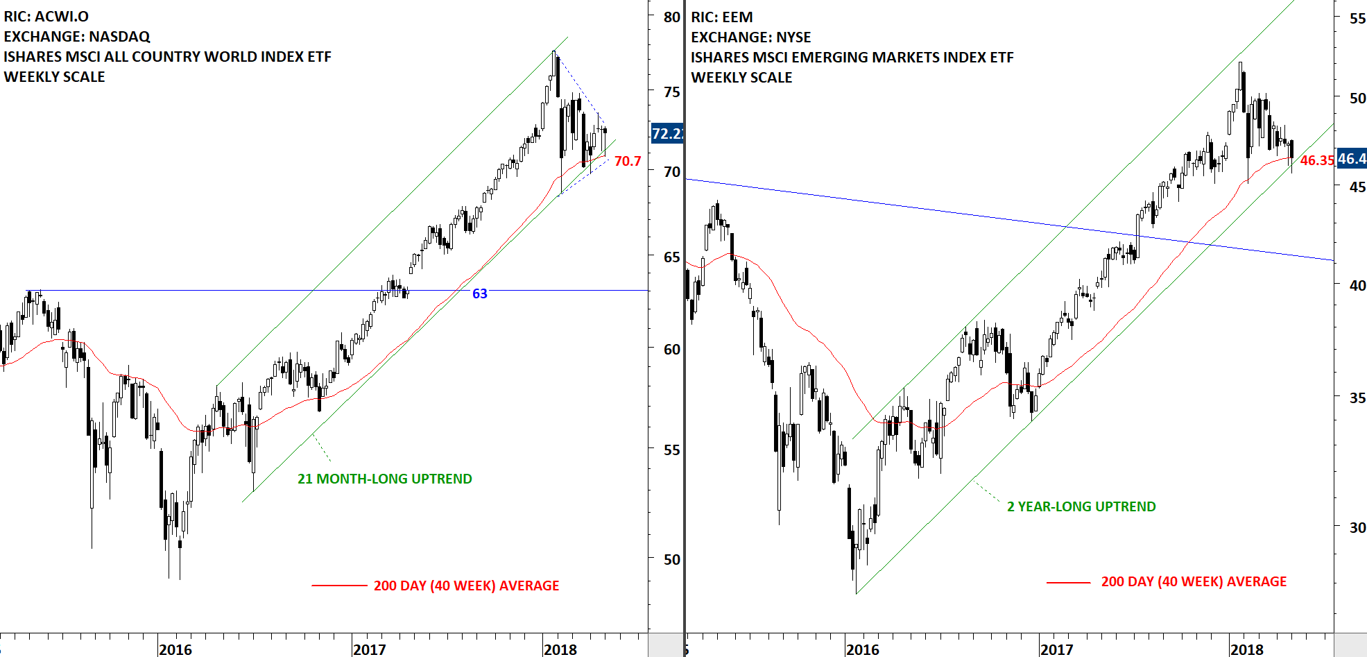
Global equity markets is getting closer to a strong directional movement. Tight consolidations on both the iShares MSCI All Country World Index ETF and the iShares MSCI Emerging Markets Index ETF suggest breakouts can result in a trend period. Consolidations are followed by trends and vice versa. Both ACWI and EEM are trading above their long-term moving averages and inside the boundaries of multi-month long uptrend channels. Breakdown below the long-term averages and the lower boundary of trend channels can result in a larger scale correction. At this point, with the current available information, we can conclude that the long-term uptrend is still intact. We are very close to the completion of last quarter's tight consolidation.
 Read More
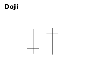 Doji form when a security's open and close are virtually equal. The length of the upper and lower shadows can vary and the resulting candlestick looks like a cross, inverted cross or plus sign. Alone, doji are neutral patterns. Any bullish or bearish bias is based on preceding price action and future confirmation. Doji convey a sense of indecision or tug-of-war between buyers and sellers. Prices move above and below the opening level during the session, but close at or near the opening level. The result is a standoff. The relevance of a doji depends on the preceding trend or preceding candlesticks. After an advance, or long white candlestick, a doji signals that the buying pressure is starting to weaken. After a decline, or long black candlestick, a doji signals that selling pressure is starting to diminish. Doji indicate that the forces of supply and demand are becoming more evenly matched and a change in trend may be near. Doji alone are not enough to mark a reversal and further confirmation may be warranted.
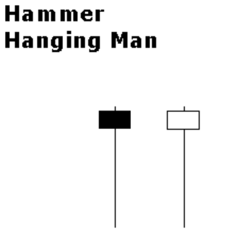 The Hammer and Hanging Man look exactly alike, but have different implications based on the preceding price action. Both have small real bodies (black or white), long lower shadows and short or non-existent upper shadows. As with most single and double candlestick formations, the Hammer and Hanging Man require confirmation before action.