FIAT CHRYSLER AUTOMOBILES NV (FCHA.MI)
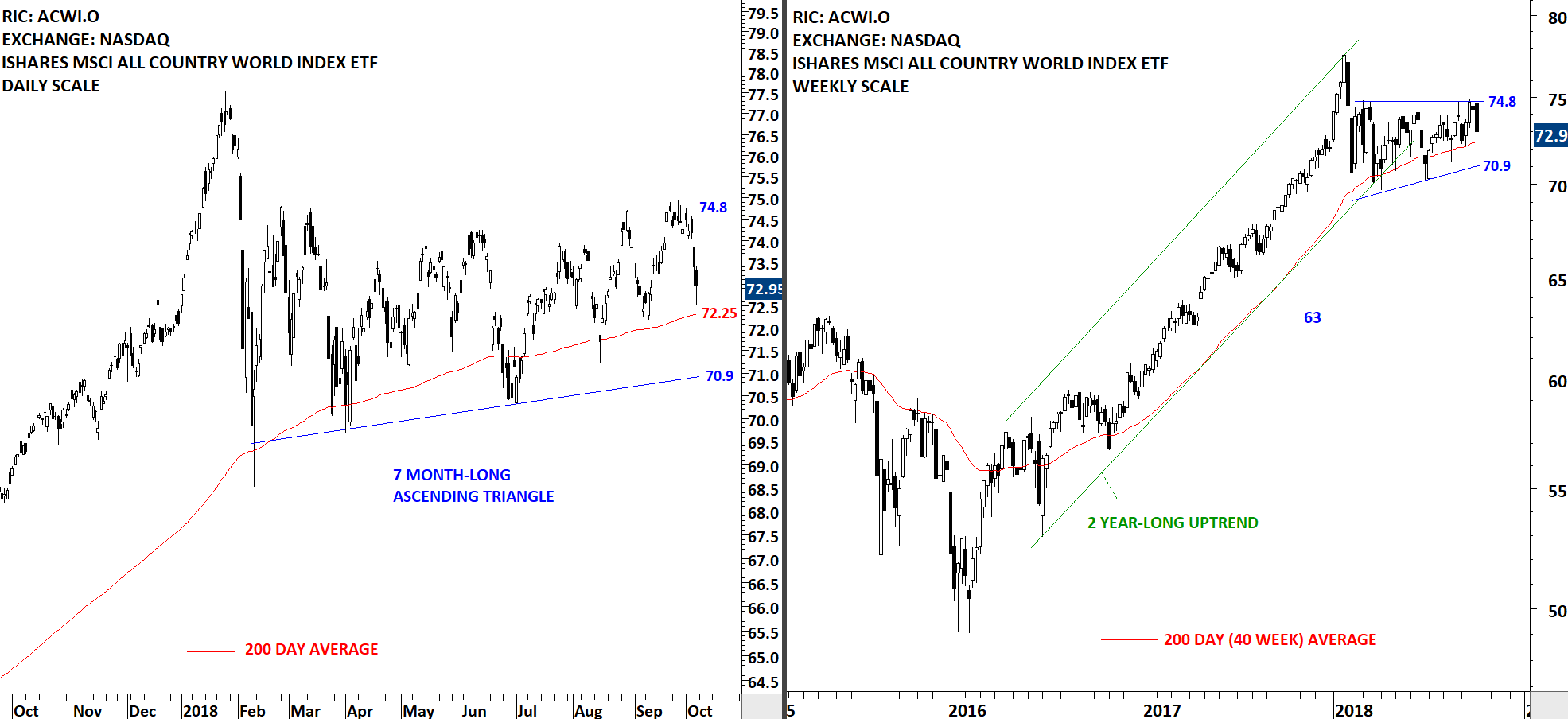
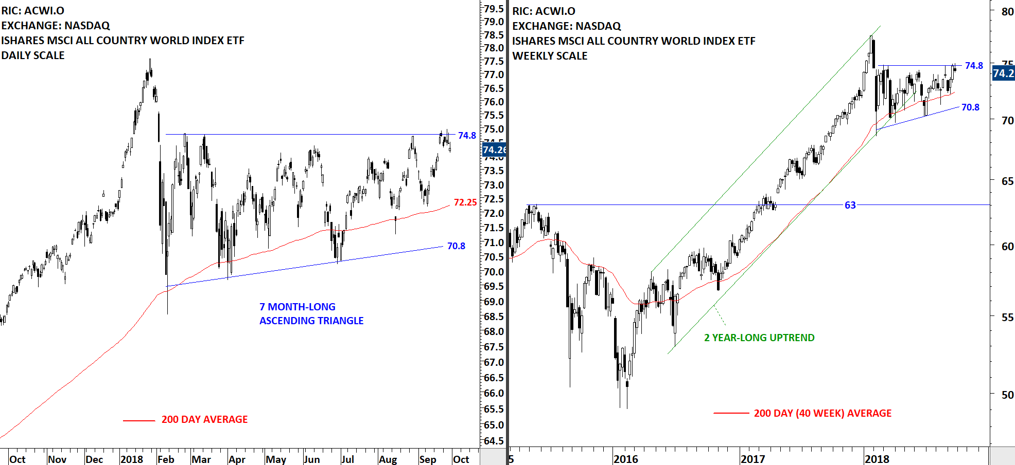
Every week Tech Charts Global Equity Markets report features some of the well-defined, mature classical chart patterns under a lengthy watchlist and the chart pattern breakout signals that took place during that week. Global Equity Markets report covers single stocks from developed, emerging and frontier markets, ETF’s and global equity indices. The report starts with a review section that highlights the important chart developments on global equity benchmarks. This blog post features a year-long Head and Shoulder top on Fiat Chrysler Automobiles N.V. listed on the Milan Stock Exchange.
FIAT CHRYSLER AUTOMOBILES NV (FCHA.MI)
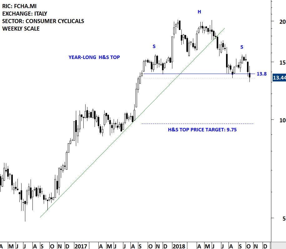
Fiat Chrysler Automobiles N.V. is engaged in designing, engineering, manufacturing, distributing and selling vehicles. The stock is listed on the Milan Stock Exchange. Price chart formed a year-long head and shoulder top with the horizontal boundary (neckline) acting as strong support at 13.8 levels. The horizontal boundary was tested several times over the course of the chart pattern. A daily close below 13.4 levels will confirm the breakdown from the year-long head and shoulder top with the possible chart pattern price target of 9.75 levels.
Tech Charts Membership

By becoming a Premium Member, you’ll be able to improve your knowledge of the principles of classical charting.
With this knowledge, you can merge them with your investing system. In fact, some investors use my analyses to modify their existing style to invest more efficiently and successfully.

As a Premium Member of Aksel Kibar’s Tech Charts,
You will receive:
-
Global Equities Report. Delivered weekly.
-
Classical charting principles. Learn patterns and setups.
-
Actionable information. Worldwide indices and stocks of interest.
-
Risk management advice. The important trading points of each chart.
-
Information on breakout opportunities. Identify the ones you want to take action on.
-
Video tutorials. How patterns form and why they succeed or fail.
-
Watch list alerts. As they become available so you can act quickly.
-
Breakout alerts. Usually once a week.
-
Access to everything (now and as it becomes available)o Reports
o Videos and video series -
Multi-part webinar course. You learn the 8 most common charting principles.
-
Webinars. Actionable and timely advice on breaking out chart patterns.
For your convenience your membership auto renews each year.