INTERIM UPDATE – June 16, 2017

An interim update on some of the financial stocks might be valuable before the trading week ends. Over the past few weeks Tech Charts Global Equity Markets report drew attention to possible breakouts on Bank NY Mellon and Hartford Financial. Both stocks had strong breakouts from their multi-month long consolidation ranges and they are resuming their uptrends.

Read More

GLOBAL EQUITY MARKETS – June 10, 2017

UK election results, FANG (Facebook, Amazon, Netflix & Google) Volatility and U.S. Financial/Banking stocks strength. As much as I followed, these were the market moving topics of the week. It is important to note that U.K. FTSE 100 index broke out to all-time highs from its multi-decade long consolidation and the outlook remains positive in the long-term. Please see June 3, 2017 report for U.K. FTSE 100 Index chart.

Political/geopolitical events should not affect our chart interpretation. In fact, I believe that price action is primary and events are secondary. Price is a leading indicator. I am sure many of you experienced a breakout followed by a major news or event.

Read More

GLOBAL EQUITY MARKETS – June 3, 2017

This week's Global Equity Markets report covers several ETFs and global equity indices and single stocks from Developed and Emerging countries. You will find that some of the themes are longer-term and can offer great opportunity once these chart patterns are resolved on the upside. The info-graphic below explains what each label on the charts and section headers stand for. I hope this will make it easier to navigate through the charts.

Read More

GLOBAL EQUITY MARKETS – May 27, 2017

Dear Tech Charts members,

Thank you for joining Tech Charts as Founding Member. I hope to identify many great chart set-ups, trading & investment themes and add value to your decision making process in the years ahead. This week's Global Equity Markets report covers several ETFs from different regions, single stocks from Developed and Emerging countries and equity indices. You will find that some of the themes are longer-term and can offer great opportunity once these chart patterns are resolved on the upside. In this report I also added a section that explains what each label on the charts and section headers stand for. I hope this will make it easier to navigate through the charts.

  Read More

GLOBAL EQUITY MARKETS – May 20, 2017


The Russell 2000 Index is the recognized benchmark measuring the performance of the small-cap segment of the U.S. equity universe. The Russell 2000 Index is a subset of the Russell 3000 Index, representing approximately 10% of the total market capitalization of that index. It includes 2000 of the smallest securities based on a combination of market cap and current index membership. The index is maintained by FTSE Russell, a subsidiary of the London Stock Exchange Group. The Russell 2000 is by far the most common benchmark for mutual funds that identify themselves as "small-cap", while the S&P 500 index is used primarily for large capitalization stocks.

RUSSELL 2000 INDEX (.RUT)

Since the beginning of 2017, the small-cap segment of the U.S. equities had a volatile price action. The swings on the Russell 2000 index possibly formed a very rare chart pattern called a Broadening Top. Richard W. Schabacker in his book Technical Analysis and Stock Market Profits explains the Broadening Top chart pattern as below:

Read More

Video Tutorial – Long Term Charts


Long Term Charts - Video Tutorial

 
Richard W. Schabacker discussed the importance of chart patterns in the averages, in his book Technical Analysis and Stock Market Profits. He concluded that if many individual issues were to make strong Head and Shoulders formations at exactly the same time, the average chart would, obviously, show a similar Head and Shoulders. However, since the many different stocks do not, as a rule, make their ‘‘peaks and valleys’’ on precisely the same days, the average chart is likely to show a less specialized and distinct pattern. We should, for this reason, expect the averages to show Common or Rounding Turns more often than do the charts of individual issues at times of important reversals.   Most stocks sooner or later will follow the major swings of the market. Individual stocks in a sector or industry group might form similar chart patterns due to economic cycles or sector rotation. These individual stocks can be affected by other factors such as commodity prices.   One should stay alert and start anticipating a major shift in the direction of the trend after finding similar chart patterns developing in a specific sector or industry group. It is important to note that these chart patterns are usually well-defined on the individual stocks when compared with the chart patterns on the averages.   The video tutorial discusses what can be next for the European banks by giving examples from the two major trading themes in energy sector equities and mining companies.
Read More

GLOBAL EQUITY MARKETS – May 13, 2017


It has been a strong week for equities in emerging Asia and also a strong start for the month of May. South Korea KOSPI index is breaking out to all-time highs by clearing its 6 year-long horizontal resistance at 2,210 levels. The index possibly formed a multi-year long bullish ascending triangle. A strong monthly close will signal positive performance for the coming months. The ascending triangle chart pattern price target stands at 2,750 levels. Emerging Asia is a big component in the MSCI Emerging Markets index. As of May 11, 2017 the top 3 counties in the index are China (26.92%), S.Korea (15.34%) and Taiwan (12.20%).

While the local currency stock market index South Korea KOSPI is breaking out to all-time highs, the U.S. Dollar denominated MSCI S.KOREA price index is few percentage points away from reaching new all-time high levels. The price action is clearly positive. The 9 year-long downward sloping trend line is standing at 460 levels. MSCI S.KOREA index is trying to break out of its multi-year sideways consolidation range.

Read More

GLOBAL EQUITY MARKETS – April 29, 2017

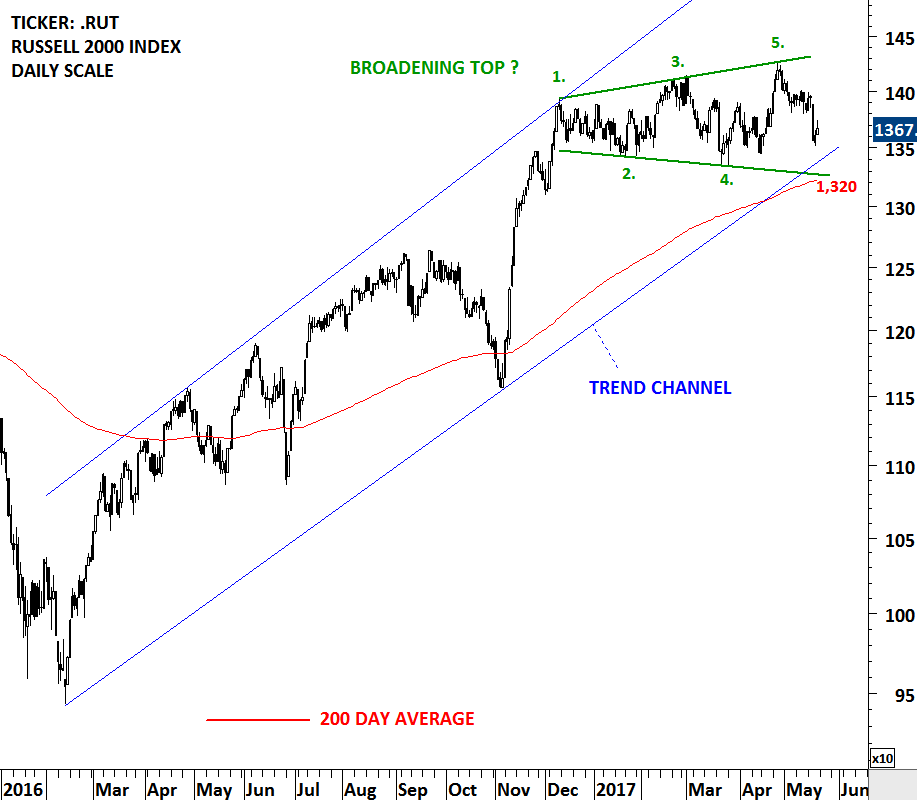
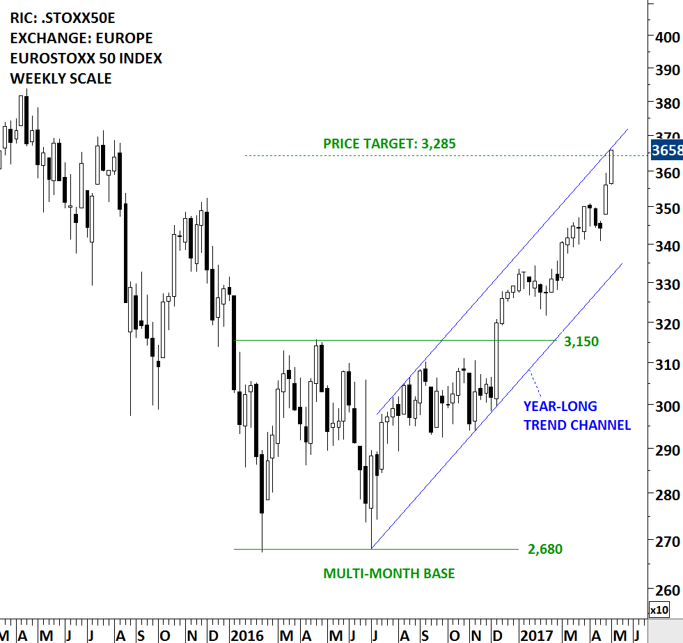
The first round of the 2017 French presidential election was held on 23 April 2017. As no candidate won a majority, a run-off election between the top two candidates, Emmanuel Macron of En Marche! and Marine Le Pen of the National Front (FN), will be held on 7 May 2017. Global equity markets reacted positively after centrist candidate Emmanuel Macron won the first round of the weekend’s French presidential election. European equities have been performing poorly since the beginning of the global financial crash in 2008. Any positive political and economic development is likely to help European equities to catch up in the relative performance. Though, European equities might need more catalyst than an election result to reverse long-term relationships.

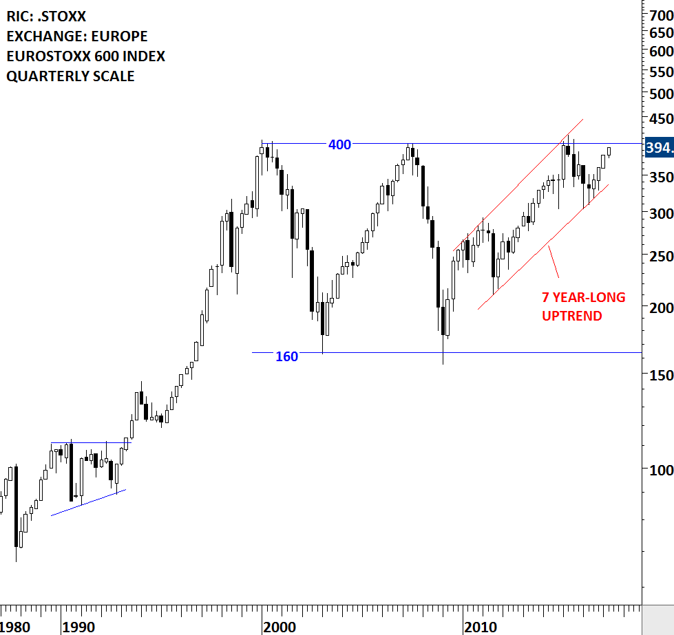
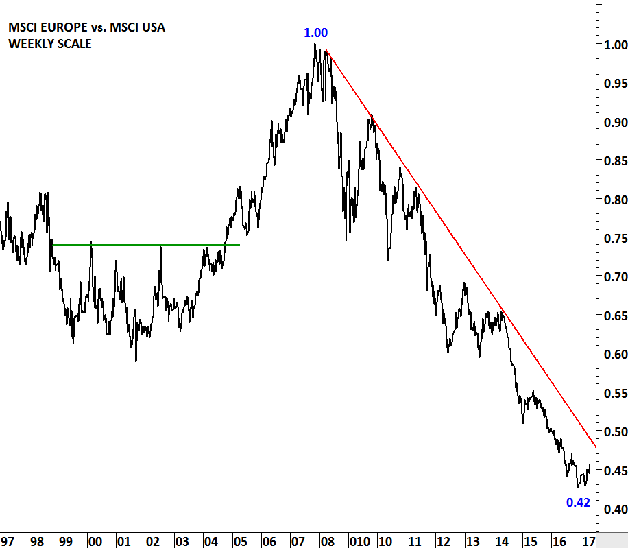
Two charts below show the massive under performance of the European equities vs. the U.S. equities over the past 9 years. Both the relative performance ratio between MSCI EUROPE vs. MSCI U.S. and EUROSTOXX 600 Index vs. S&P 500 Index shows a multi-year downtrend. This long-term relationship is something that we should keep a close eye on, as any major turnaround in European indices performance will result in more breakout opportunities in the European equities.

Relative performance ratio between the two indices is converted into an index to better visualize the change in value in percentage terms. 1.00 is an index value of 100. 0.42 is an index value of 42. The chart shows the index losing more than half of its value from the highest level in 2008. In other words MSCI EUROPE underperformed MSCI USA by 58% over the past 9 years. Data used for MSCI EUROPE and MSCI USA are price index in U.S. Dollar.

Read More