GOLD Continuous

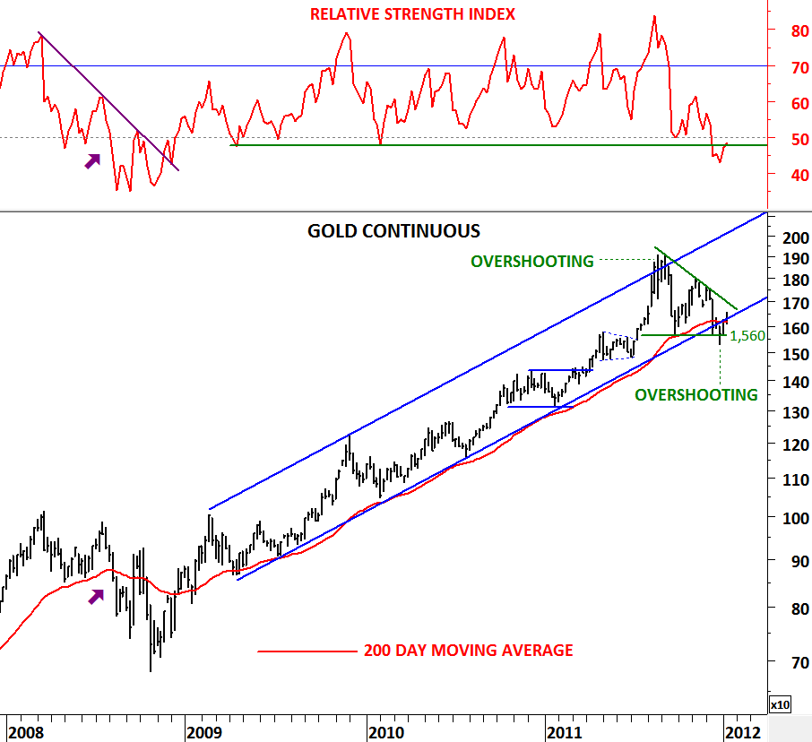
When I’m analyzing the long-term charts I try to combine 200 day moving average with the RSI. When combined they are helpful in giving you the big picture and the overall trend. Though there could be minor violations of the support/resistance areas, they will always generate timely warning signals in the intermediate/long-term.

RSI tends to move between 40 and 80 levels during a bull market. Other than signaling divergences, RSI helps us to define bull/bear market ranges. Likewise, the momentum indicator RSI moves between 60 and 20 levels during a bear market. When combined with the long-term moving average (200 day moving average) confirmation signal of a bull market is; price trending above its long-term moving average and preferably RSI holding above 50 levels.

Since the beginning of 2009, Gold has been moving higher in a clear parallel trend channel. During the uptrend price held above the 200 day moving average and RSI rebounded from the 50 level on every pullback of the price to the long-term moving average. While we were following the price trending above its long-term moving average we received confirmations from the RSI. In August 2011, price overshoot the trend channel at 1,850 and reversed immediately to test the lower boundary of the trend channel and the 200 day moving average. Meanwhile RSI weakened towards 50 levels. Similar price action occurred in mid-2008 where Gold fell below its 200 day moving average and RSI breached 50 levels warning us of a lengthy correction.

Gold is now at an important juncture to decide on either holding above the 200 day MA and RSI pushing back above 50 levels to resume its 3 year-long uptrend or establishing a lengthy corrective period below the 200 day moving average and RSI reaching to lower levels.

Horizontal support at $1,560 and short-term downtrend resistance at $1,700 are two critical support/resistance levels to watch in the next few weeks.

CANADA S&P/TSX COMP INDEX & USD/CAD

Here is a valuable analysis that would mainly interest Canadian investors and traders. Throughout the 3 years I’ve spent in Canada I’ve realized how important the crossrate has been for the Canadian economy and its export/import business. Currency advantage (when I started my studies in 2004, 1 U.S. dollar equaled 1.4 Canadian dollar), better education and multicultural society were some of the reasons why I chose Canada to study for my Masters degree in Economics. Though the latter two are still very much in place (good education & multicultural society), thanks to its commodity based economy and relatively better banking system + more stable real estate market, the currency advantage  has disappeared with the Canadian dollar gaining strength.

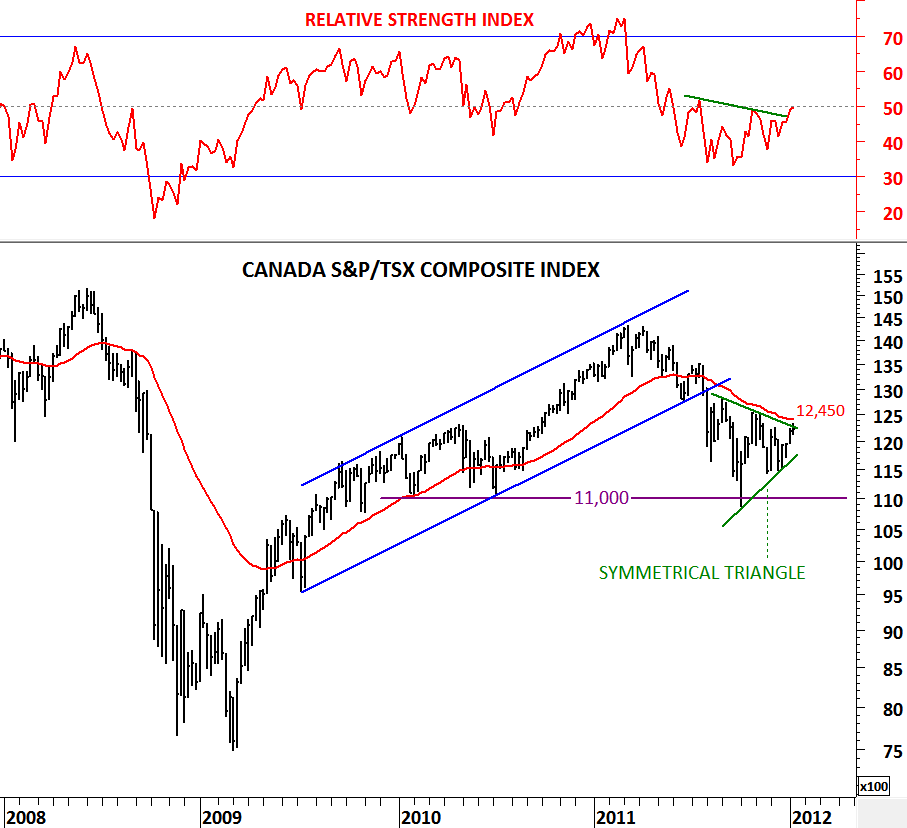
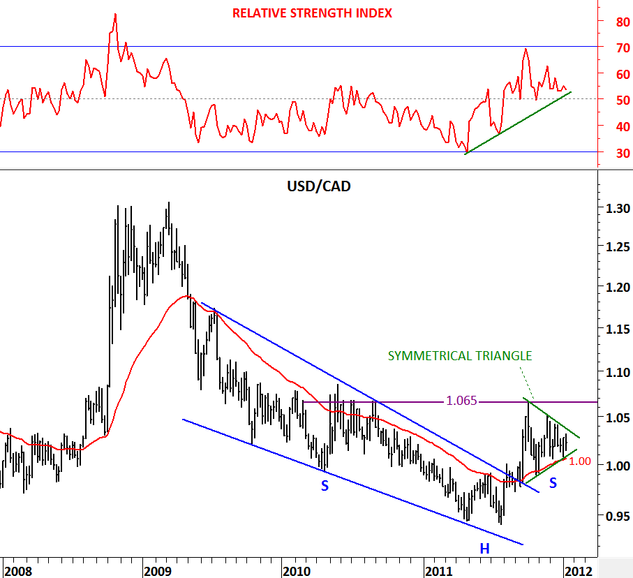
Strong CAD helped importers of goods and services for the past decade. This relationship might be changing. Traders and businesses should watch out for a possible depreciation in Canadian dollar if the above analysis were to be confirmed. USD/CAD might be forming an inverted H&S chart pattern (base formation, bullish for USD) and a breakout above 1.065 can result in further depreciation of the Canadian dollar. It is interesting to see a symmetrical triangle forming as the right shoulder of the 2 year-long inverted H&S pattern. What’s more interesting is that the same symmetrical triangle has also formed on the S&P/TSX Composite equities index.

Conclusion: Charts are showing bullish signs for the USD and bearish signs for the equities. However we should wait for strong confirmations. Breakout from the symmetrical triangle consolidation ranges will confirm the next directional movement on both asset classes. Strong support/resistances for the equities and currencies are the 200 day moving averages (12,450 for S&P/TSX Composite Index and 1.00 for USD/CAD). As long as S&P/TSX Composite stays below 12,450 and USD/CAD above 1.00 we will expect strong U.S. dollar and weak equities.

USD/SEK (US DOLLAR/SWEDISH KRONA)

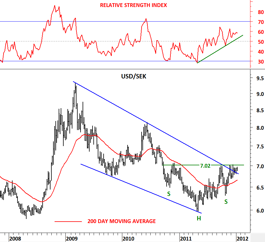
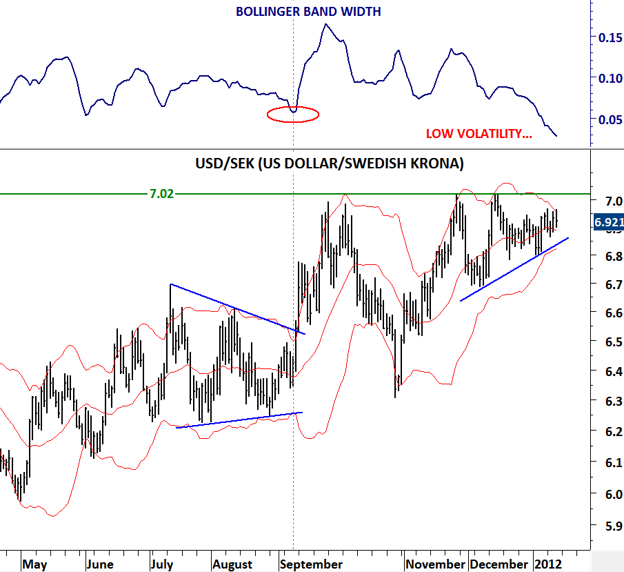
Currency traders should pay attention to this pair in the next few weeks. Though not a widely traded crossrate, USD/SEK can offer great opportunity if dollar strength continues. I like to look at volatility on daily charts and when I see low volatility combined with beautiful chart patterns I start following them for possible breakouts. USD/SEK has one of those nice chart patterns giving us bullish signal both on the daily and weekly scale. On the weekly scale which is the first chart on this post we can see an inverted head and shoulder pattern forming in the past one year with the neckline at 7.02 levels. A breakout above 7.02 will confirm the inverted H&S pattern and this will be extremely bullish for US dollar versus Swedish Krona.
On the daily chart USD/SEK formed an ascending triangle for the past 2 months. It has a horizontal resistance at 7.02 which is also the neckline of the inverted H&S pattern. We are definitely close to a breakout given the extreme low volatility. You can check my previous copper analysis to visualize what can follow after these type of low volatility periods (http://techcharts.wordpress.com/2012/01/05/copper/) I would suggest waiting for the breakout to take place in order to have confirmation. This chart should be on your watch list.

GBP/USD

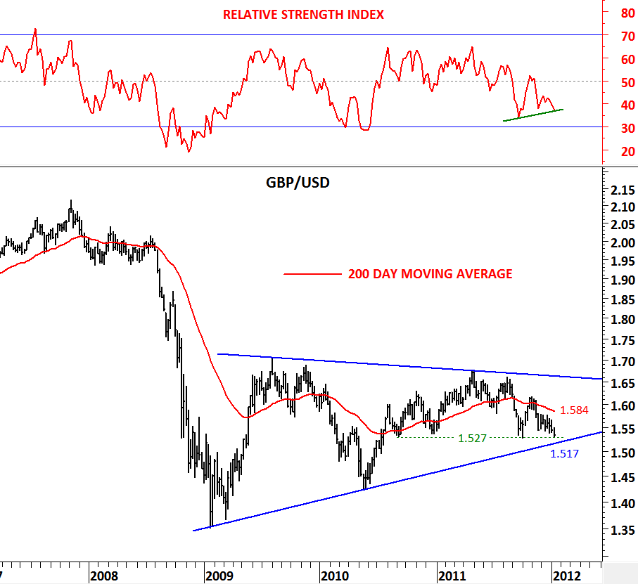
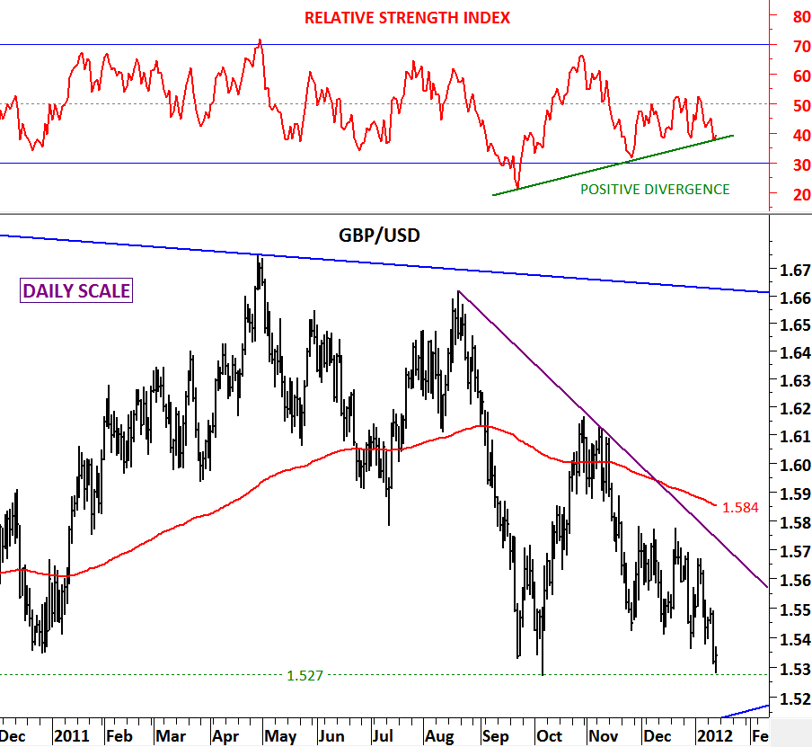
I wanted to share this analysis for some time. Perfect chart pattern (long-term symmetrical triangle) on GBP/USD has almost used the maximum space available in the contracting range. For the past 3 years the currency pair contracted in a range with its boundaries standing at 1.65 and 1.52 levels. The latest re-test of the lower boundary has generated positive divergences both on the daily and weekly scale. Given the strong supports between 1.51 and 1.52 and the positive divergence both on the daily and weekly charts we can expect a rebound on GBP/USD. 200 day moving average is standing at 1.584 and the downward sloping trend resistance is at 1.56.

Conclusion: With an intermediate/long-term stop-loss at 1.51, expect a rebound towards 1.56. In the intermediate/long-term this is still a sideways consolidation.

EURO ZONE GOVT YIELDS

Spain sold 10 billion euros ($13 billion) of bonds, twice the target for the sale, while Italy placed 12 billion euros of bills, easing concerns the countries would struggle to finance their debts and sending bonds higher. Italy, with the euro region’s second-biggest debt at almost 1.9 trillion euros, faces more than 50 billion euros in bond maturities in the first quarter, whereas Spanish bond redemptions in the period are about 2 billion euros.

Demand for the German debt was strong during the week with the cover ratio for the offering was 1.8, meaning there were almost twice as much demand for German govt bonds up for sale.

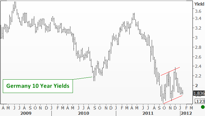
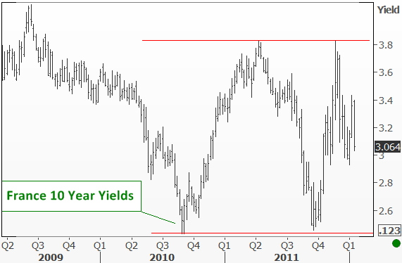
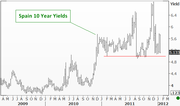
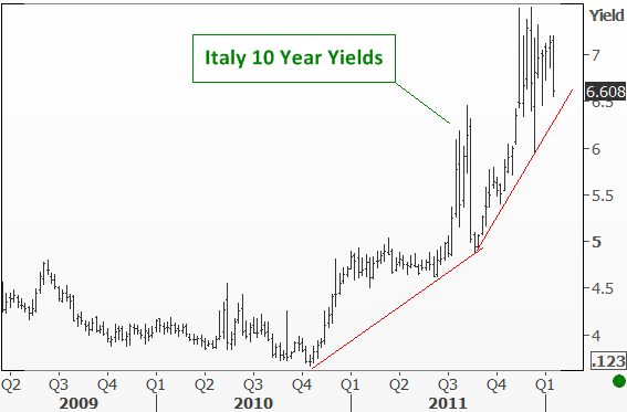
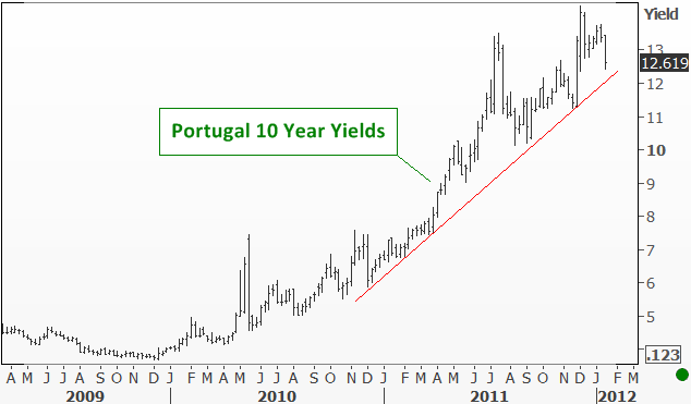
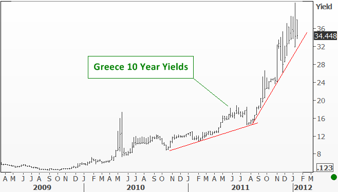
All these developments helped the yields ease further to strong technical support levels that we have been watching for some time. Spanish yields is now closer to the strong support at 5 levels. Greece yields is now closer to the upward trend line support at 32 levels (still very high). France yields is in the middle of its consolidation range. Portugal similar to Greece and Italy, now closer to the upward trend line support at 12 levels. Germany at the lower boundary of its consolidation and Italy close to the strong support at 6.5 levels.

Yes there is some positive sentiment out there but intermediate term outlook will depend on those technical levels being breached on the downside and giving way for lower borrowing costs for EZ.

GOLDMAN SACHS COMMODITY INDEX

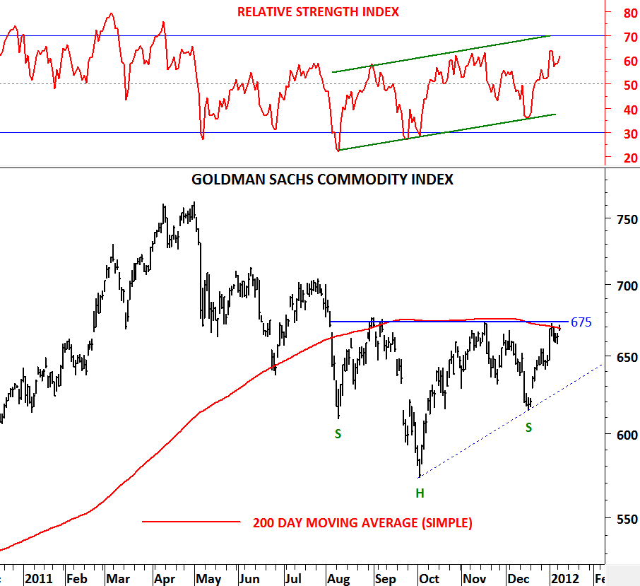
What would China’s easing mean for commodities? Higher prices? How would the Commodity Index perform if Crude oil breaks above $104 levels? I believe the positive technical outlook on the commodity index is mainly driven by these two factors that investors are currently anticipating. Of course we still haven’t seen a confirmed breakout from the possible inverted Head & Shoulder pattern but if we were to say few words on this chart, it is bullish.

Neckline or in other words the most important resistance is at 675 levels and a breach above this level will be positive for the commodities. In this study I used the 200 day simple moving average  because in the past one year it has been a better fit when compared with the 200 day exponential moving average. Also the level it is standing at (675) is critical resistance for the inverted H&S pattern neckline. It stresses the importance of 675 level on this chart. Please note that a breakout above 675 will be the first “higher high” since March 2011.

DOW JONES INDUSTRIAL AVERAGE

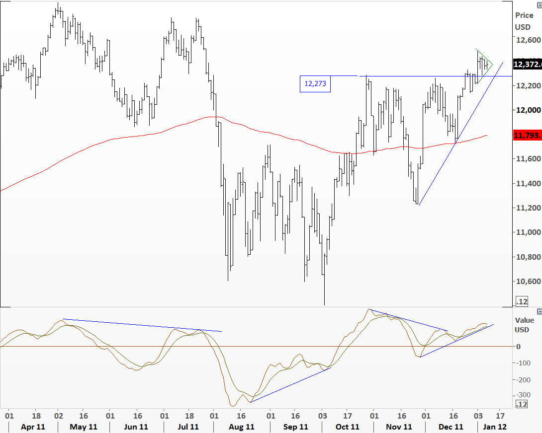
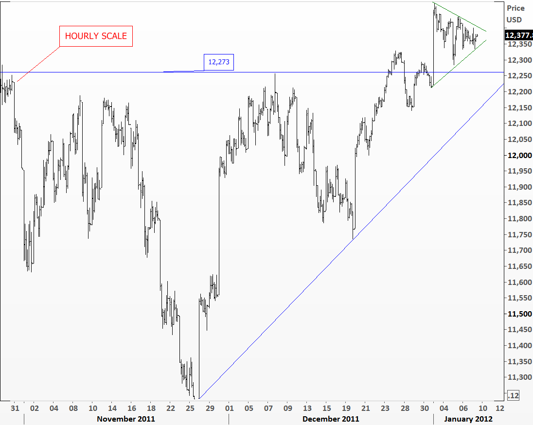
New year started with  strong equity market performance especially for the U.S. indices. Gap openings in most of the indices were followed by consolidations. Gaps were filled in the past one week and the indices tested their support levels. It is clear from the charts that last one week’s contracting ranges accumulated some energy that will be released in the next few days. I’m not sure how long would the sideways movement continue but it will be explosive in the direction of the breakout. On the Dow Jones Industrial Average we might be forming a flag or pennant formation that could be followed by an upside breakout. This needs to be confirmed by market action.

Hourly chart of the Dow Jones Industrial Average shows the consolidation in detail. We should expect a breakout!

MSCI ACWI & MSCI EM (WORLD & EMERGING MARKETS)

It is always easier to call for a market action after it takes place. This is called hindsight bias. Technical analysts look at several charts per day/week, go through different markets, time frames and analyze vast amount of data. While looking back at a chart pattern it can appear so predictable that we often ask ourselves how we missed that move. However, the toughest application of technical analysis comes into play when dealing with these patterns in real-time and actively managing your risk as the patterns unfold.

I have been following the two major MSCI indices, MSCI All Countries World Index and MSCI Emerging Markets Index for some time. In my previous post in November I analyzed these two charts with the same template and since then the markets have moved sideways and there has been no change in the technical outlook.

(http://techcharts.wordpress.com/2011/11/07/msci-acwi-msci-em-2/)

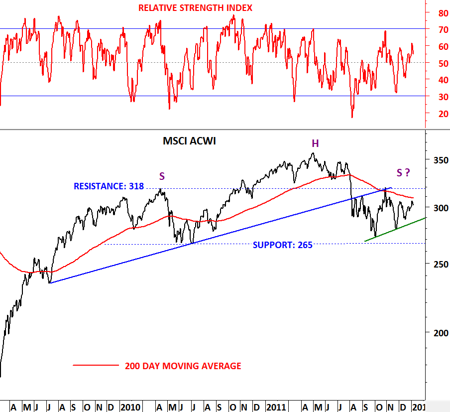
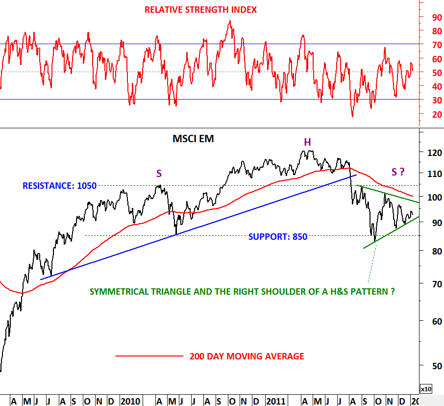
2012 started with volatile price movements in most of the markets. Two indices above might be forming 2 year-long H&S top formations and in these H&S tops we might be in the process of completing the right shoulders. This would be extremely bearish for the equity markets. Confirmation of this bearish scenario would need a major breakdown below 850 levels on the MSCI EM and 265 levels on the MSCI ACWI.

When a H&S pattern fails it is usually followed by a major counter trend. H&S pattern fails when the price exceeds the highest level of the right shoulder. In this case 200 day moving averages will play a major role in deciding if 2012 will be a good or bad year for the world equity markets. We all know that both indices are below their 200 day moving averages and this has been the case since August 2011. If we were to reverse this trend by breaking above the 200 day moving averages this would also fail the 2 year-long H&S top formations and would be a bullish signal for 2012.

Then it boils down to 2 critical technical levels which are not far from today’s closes; 200 day moving averages as major resistance (310-320 area for MSCI ACWI) and (1000-1050 area for MSCI EM), necklines of the H&S patterns as major support (265 for MSCI ACWI) and (850 for MSCI EM)


U.S. DOLLAR INDEX

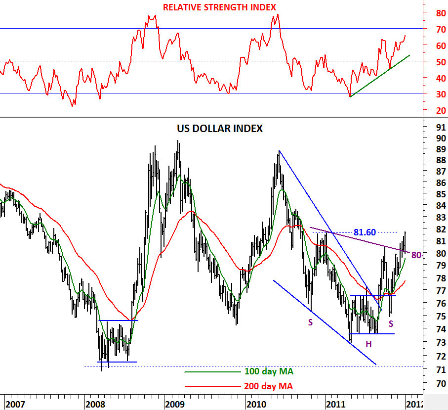
Strength in U.S. dollar continued this week with the dollar index moving away from 80 levels, an important technical support level. Bullish outlook remains intact with the index possibly breaking out of a 2 year-long inverted H&S pattern (neckline: 80 levels). In the past, bullish/bearish crossovers of the long-term moving averages worked well and to support the recent bullish outlook it is worth mentioning the 100-200 day moving average crossover that occurred in September 2011. This signal hasn’t been reversed since then and it suggests further strengthening of the U.S. dollar against major currencies.

Price will now challenge the minor resistance at 81.60 levels. Unless the dollar index falls below 80 levels in the following months we will continue to follow the greenback with a clear bullish bias.

US 10 YEAR T-NOTE & EURO BUND

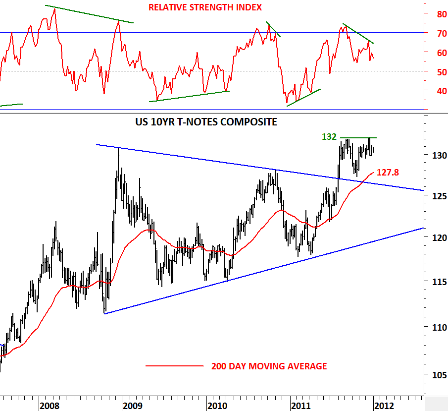
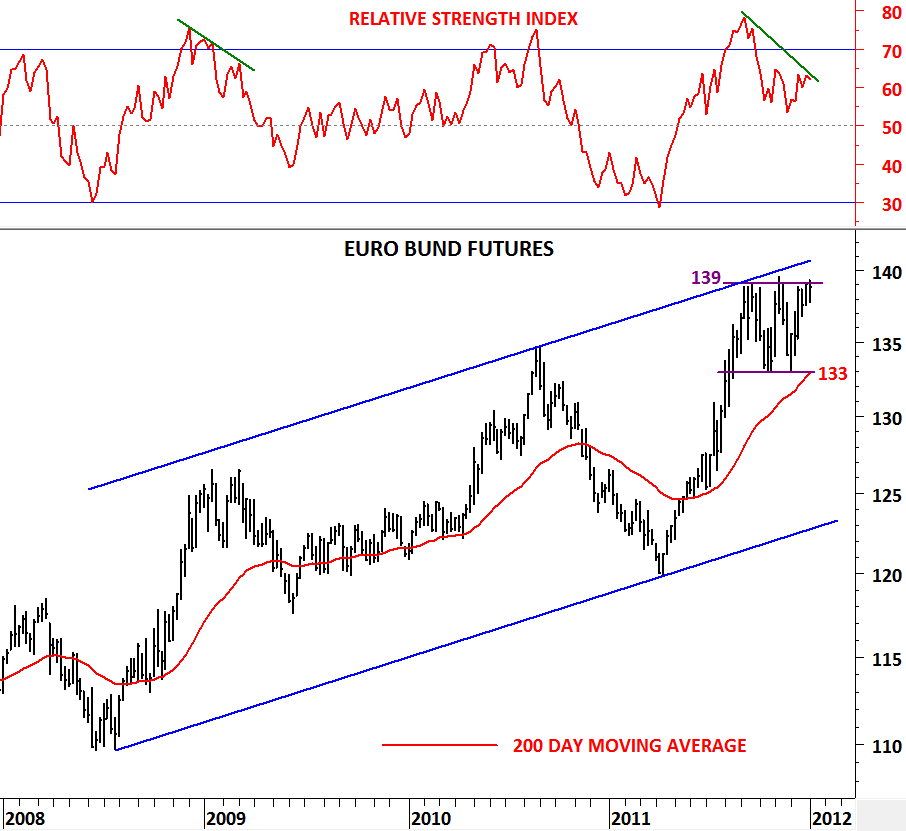
In technical analysis, divergence is considered either positive or negative, both of which are signals of major shifts in the direction of the price. Negative divergence occurs when the price of the security makes a new high, but  the indicator fails to do the same and instead closes lower than the previous  high.

US 10 Year T-Notes and Euro Bund prices have generated negative divergences as they approached their previous high levels. Both government bond prices tested their intermediate term resistances with a negative divergence. For US govt bonds the critical level stands at 132 while for the German govt bond it is at 139 levels. Both prices could fall back to test their 200 day moving averages resulting in higher yields in both economies. Though determining a divergence doesn’t rule out the continuation of the uptrend and is not conclusive of a reversal in trend direction rather it is an early warning signal suggesting weakness (inability to break higher) at the strong resistance area. For the US 10 Year T-Notes the 200 day moving average stands at 127.8 levels and for the Euro Bund it is at 133 levels.