NATURAL GAS, CRUDE OIL & GSCI

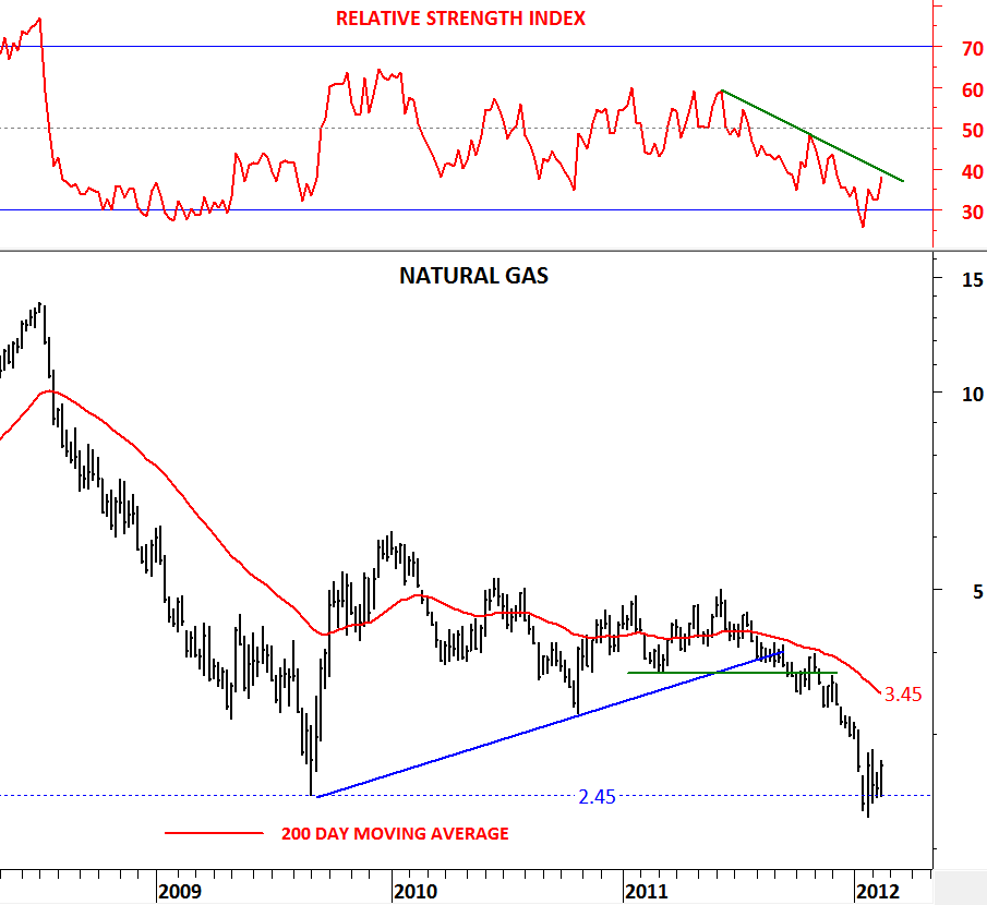
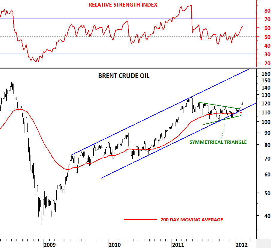
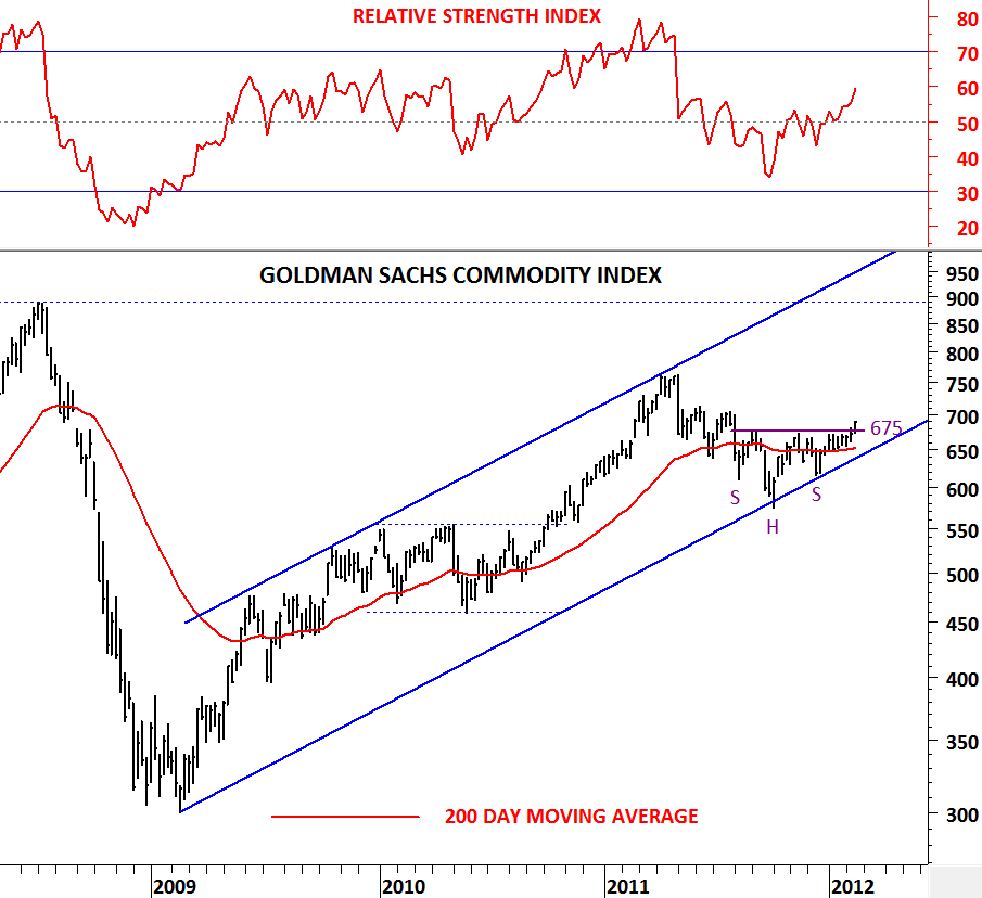
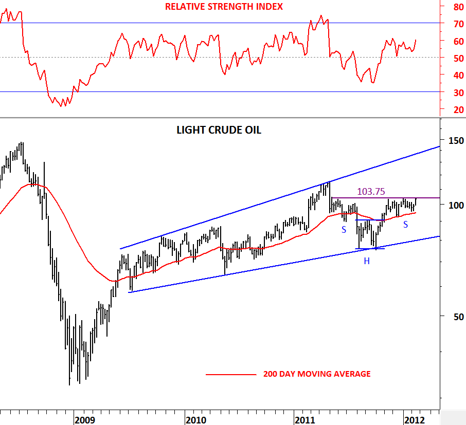
This week we have seen strength in the energy sector with Brent Crude continuing higher after the breakout from its consolidation range, Light Crude Oil testing the horizontal resistance at $103.75 and Natural Gas trying to rebound from a major support at 2.45 levels. Strength in energy sector helped the Goldman Sachs Commodity Index breakout from its year-long consolidation range.

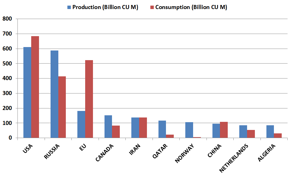
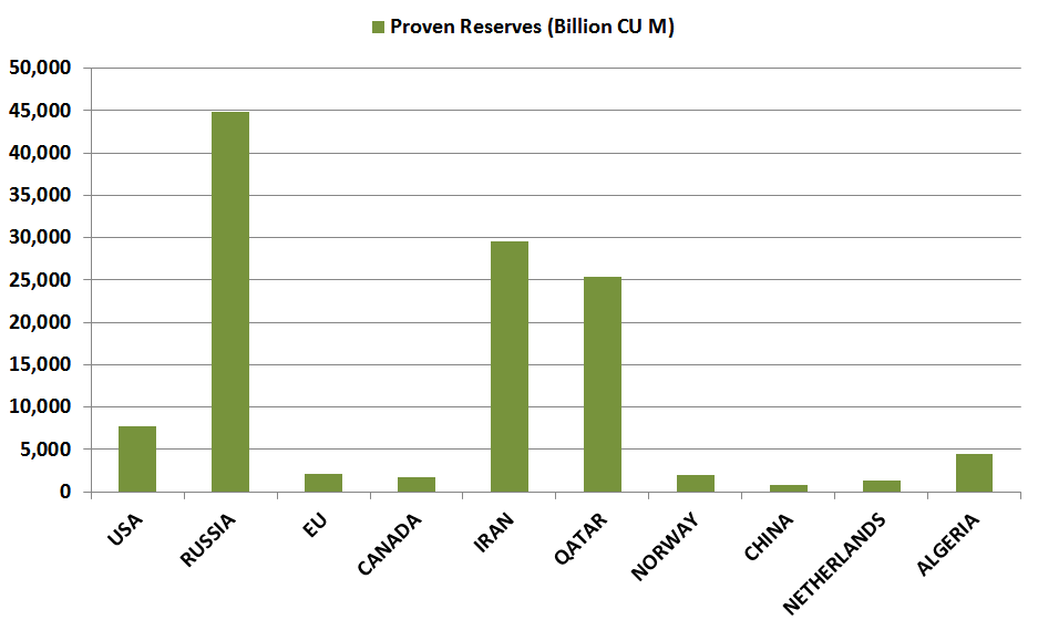
While I was reading futures magazine (www.futuresmag.com) I came across this nice presentation with numbers on natural gas-producing countries. I wanted to put the numbers in a nice graph and share them on this post. Meanwhile, I have updated the energy sector charts and reviewed the technical outlook. Below are some numbers for top 10 natural gas-producing countries with their annual production, consumption and proven reserves. In terms of production and consumption EU is in great disadvantage. While Qatar and Norway have the advantage to export their production due to their relatively limited consumption. In terms of proven reserves Russia, Iran and Qatar are the top 3 countries that can benefit from higher gas prices if they were to rebound from today’s depressed levels.
Let’s start our technical review with Natural Gas prices. After the global sell-off in 2008, natural gas had a weak recovery from 2.45 levels to 6.1 levels. Since the beginning of 2010, price moved sideways/downwards and recently reached 2009 low levels at 2.45. However during the same time period both Light Crude Oil, Brent Crude Oil and Heating Oil moved higher and recovered most of their 2008 losses. 2.45 level is a major support for Natural Gas and we can expect a rebound from this level towards the 200 day moving average at 3.45 levels.

In the beginning of February I analyzed Brent Crude Oil and drew attention to the bullish outlook and the symmetrical triangle that formed over the past one year. We can see that Brent Crude is now breaking out of the year-long consolidation range and helping the energy sector perform better in the commodities universe. It is important to note that large part of Goldman Sachs Commodity Index is composed of energy sector and strength in energy sector will have a positive effect on the GSCI.

http://techcharts.wordpress.com/2012/02/05/brent-crude-oil/

It was a strong week for Light Crude Oil. Price moved from $99 levels to $104 levels and closed at the important horizontal resistance. Light Crude might be forming a bullish continuation Head & Shoulder pattern with the neckline (resistance) standing at $103.75. Next week we should watch Light Crude for a possible breakout from this bullish pattern. A decisive breakout above $103.75 will target $115-$120 area in the intermediate term.
Almost all related charts are giving the same bullish signals. Brent Crude oil broke out of its consolidation range earlier in the month. This week we have seen a breakout on GSCI and now we are expecting a similar breakout on Light Crude Oil. Goldman Sachs Commodity Index breached above its horizontal resistance at 675 level. This should be regarded as a bullish signal for commodities. For the strength to continue on GSCI in the following weeks, price should stay above 675 level.


APPLE (AAPL.O)

Though one share of Apple still not as valuable as one ounce of Gold, Apple with its products and its value in terms of market cap has been widely followed and discussed over the past five years. Every day I go through hundreds of charts and analyze different asset classes and I come across great opportunities that I share with you here on this platform. In this post I’d like to show a remarkable similarity between two strong uptrends. These uptrends drew investors attention and they have been widely discussed and followed in the financial media in the past few years. But before I analyze these two charts I would like to give a short definition of a parabolic move.

Parabolic trend is an exponential curve. The shape of the curve is parabolic and it reflects the acceleration in price activity. The curve (price) starts off almost as a horizontal line. The slope of the curve (price) increases exponentially as price action moves higher. The parabolic curve eventually develops to a point where the last points on the curve create a vertical line. The curve is then completed and so is the trend that it defines. Parabolic trends are momentum driven and when the trend ends, the sell-off is often dramatic and substantial.

Gold, in the second half of 2011 had a parabolic move. This was part of the continuing long-term uptrend that took off from $1,570 levels and reached $1,909 levels in less than two months. Interestingly, price reached the upper boundary of the long-term trend channel at $1,900 levels and entered into a multi month correction which started with a sharp sell-off.

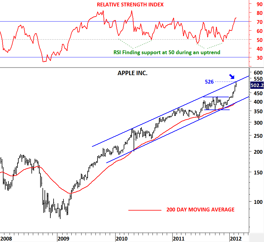
Similarities between the uptrends on APPLE and GOLD  caught my attention while I was analyzing the technology stocks in U.S. During the uptrend APPLE respected the long-term moving average and found support at each correction. It also trended higher in a clear trend channel. The exciting part of this uptrend is the last run off from $400 levels to $526 levels in less than two months. The parabolic move reached the upper boundary of the long-term trend channel. Price behavior, technical indicators and the duration of the trends are similar for APPLE stock price and GOLD.

Is this an intermediate term peak for APPLE and can the stock price enter into multi month correction? Can the correction start with a sharp sell-off?


COFFEE

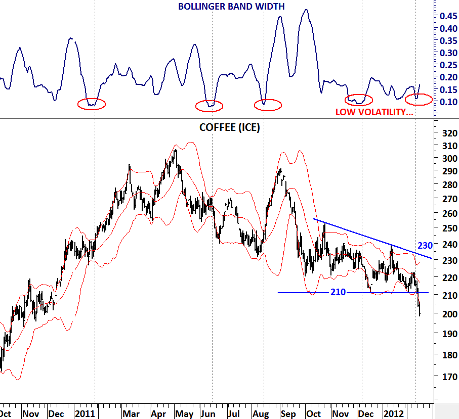
If a market is below its 200 day moving average, it is likely to experience downward pressure on each high volatility period. When analyzing a chart I try to make sure below conditions are satisfied.

1) Direction on the long-term chart should be clear. If a market is above its 200 day moving average I should trade the bullish breakouts and expect the short-term chart patterns to break upwards. If a market is below its 200 day moving average I should trade the bearish breakdowns and expect short-term chart patterns to resolve on the downside.

2) I always follow volatility and look for chart patterns. Low volatility begets high volatility and vice versa. I combine volatility breakouts with the long-term technical outlook.

On the 23rd of January I’ve posted the long-term chart for COFFEE price. (http://techcharts.wordpress.com/2012/01/23/coffee/)

Long term price chart signaled weakness for COFFEE with stop-loss at 240 levels. Since the last update price moved lower and technical outlook deteriorated. Given that the price has been trading below the long-term moving average the latest volatility breakout on the daily chart signaled additional weakness in the short-term. COFFEE price is in a clear downward trend and with the intermediate/long-term stop-loss standing at 233 levels. Unless price moves above this level we should expect lower prices for COFFEE.

US DOLLAR / TURKISH LIRA (USD/TL)

Thanks everyone for participating in the poll on what to read at Tech Charts. The feedback has been valuable. As there are plenty of opportunities in the financial markets it is important to filter them and present the widely followed instruments on a daily basis. Though this post is not one of them, many of my friends who are investing in Turkish equities and are following this currency on a day to day basis kindly asked me to post an update on this specific topic.

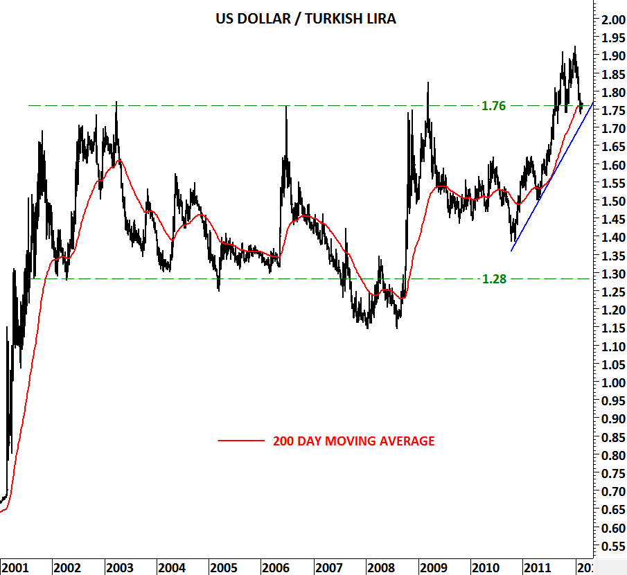
It is a timely request as USD/TL has been one of my favorite breakout and pullback pattern for the past one year. As you can see from the long term chart, USD/TL broke out of a decade long cosnolidation range in 2011 at 1.76 levels and quickly reached 1.91 levels. Since then the crossrate experienced a nice pullback to that long-term consolidation range. What makes 1.76 levels strong is the overlap of the horizontal support and the 200 day moving average at the same level.

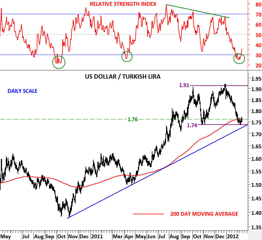
We can see last 4 month’s flat consolidation range much better on the daily scale. With USD/TL reaching 1.74-1.76 area it is now time to expect a rebound from these levels towards 1.80-1.85 area. Three major support levels are holding the crossrate from moving lower. RSI is oversold and is signaling a rebound on the crossrate. US dollar should gain strength against Turkish Lira.

U.S. DOLLAR INDEX & EUR/USD

Rebound in Euro and weakness in U.S. dollar has now reached to the targets I’ve mentioned in my previous update on the 22nd of January.

(http://techcharts.wordpress.com/2012/01/22/u-s-dollar-index-eurusd/)

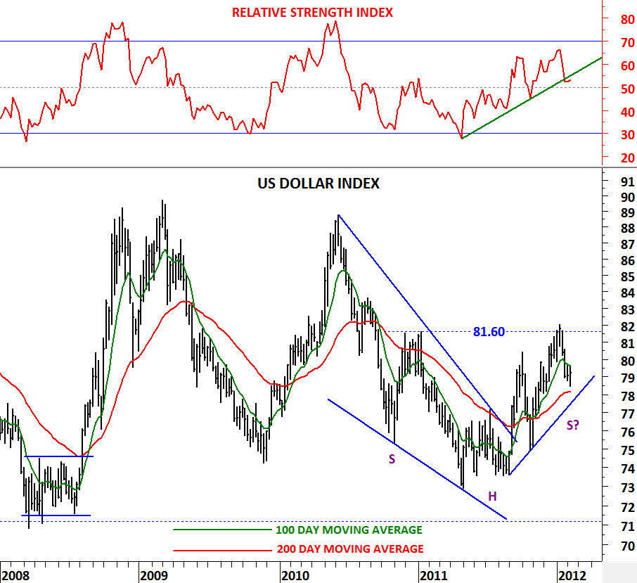
EUR/USD rebounded from 1.26 levels and reached 1.33 levels. U.S. dollar index reversed from 81.60 levels and pulled back towards the support area between 78 and 80 levels. Since the beginning of 2011, EUR/USD is making lower lows and lower highs (downtrend) and US dollar index vice versa (uptrend). U.S. dollar index reached its 200 day moving average over the past 4 week’s correction and RSI (14) got close to 50 levels. Both technical action on RSI and around the long-term moving average suggest that the uptrend is still intact on the dollar index. 4 week-long correction has now reached its lower limits and for the positive trend in dollar to continue we should see the greenback firming at these levels.

For the U.S. dollar index the 200 day moving average is now at 78 levels. Price should stay above 78 to resume its uptrend. EUR/USD found resistance at 1.33 levels and weakened towards 1.3150 on the last day of the week. Price should stay below 1.33 level on a weekly closing basis for the weak technical outlook on EUR/USD to continue.

A break below 78 levels on the U.S. dollar index and a weekly closing above 1.33 levels on the EUR/USD will put the bullish outlook on the dollar index and the bearish outlook on the EUR/USD into question.

U.S. Unemployment Rate (%)

Since August 2011 I’m updating U.S. Unemployment Rate with the above template. I looked at the % change on the unemployment rate from a different perspective and applied 1 & 2 year moving averages to see crossover signals and the length of trends after major crossover signals.

(http://techcharts.wordpress.com/category/economics-united-states/)

In this analysis I concluded that in the worst case  unemployment rate can continue lower for another year until 2012. Because in the past the shortest trend last for a year after a moving average crossover signal. Unemployment rate continues to move lower in United States with 8.3% by the end of January. We can expect better figures in the first half of 2012.

LUMBER

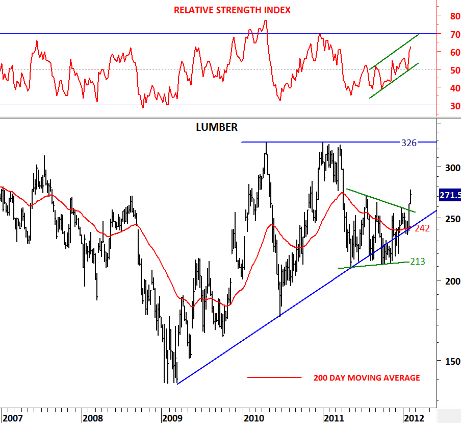
Breakouts from consolidation ranges have always been powerful. The longer the time spent in the consolidation range the stronger the breakout is. Lumber is a perfect example of a range breakout where price has been consolidating for almost a year. Price could have breached the lower boundary of the year-long consolidation at 213 and also violate the 3 year-long uptrend but instead we have seen an upward breakout. As I always mention in my updates, it is always better to wait for a confirmation and the confirmation was a weekly closing outside the boundaries of the contracting range. With the RSI breaching 50 levels on the upside and price breaking out of its year-long consolidation range at 260 levels we can call the technical action on Lumber bullish and expect price to trade between 250 and 326 levels in the following months. Both the 200 day moving average at 240 levels the 3 year-long trend support at 250 levels should act as strong support during any pullback.

NO 2 HEATING OIL

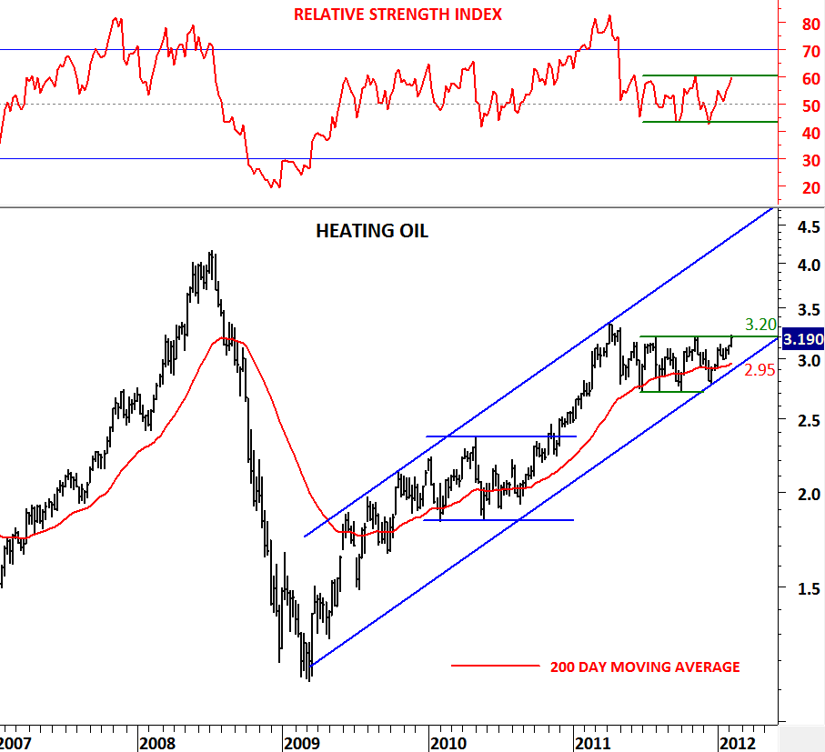
In the previous update I discussed the strength in the energy sector and analyzed Brent Crude Oil. Price of Brent Crude is breaking out of a long-term symmetrical triangle. 3 year-long uptrend resumes in the parallel trend channel and  price is clearly above the 200 day moving average.

In this update I’m looking at other energy commodities to see similar patterns. Heating Oil, due to its high correlation with Brent Crude and Light Crude followed the same pattern, a 3 year-long uptrend that found support at the lower boundary of its trend channel and price held above the 200 day moving average. Though Brent Crude formed a symmetrical triangle over the past one year, Heating Oil traded in  flat range and formed a rectangle.

3.20 level is strong resistance for Heating Oil and if price breaches above this level we will expect further strength towards 4.00 levels.

EURO ZONE GOVT YIELDS

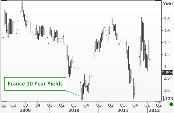
While Greek debt, spending cuts and their negotiations with European leaders continue to occupy the headlines, I thought an update on Euro Zone government yields would be timely. How bad is it out there? Will Greece default? Are Portugal yields more worrying than the Greek situation? These are the questions investors are trying to answer right now and the clock is ticking for Greek negotiations!

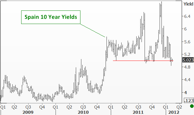
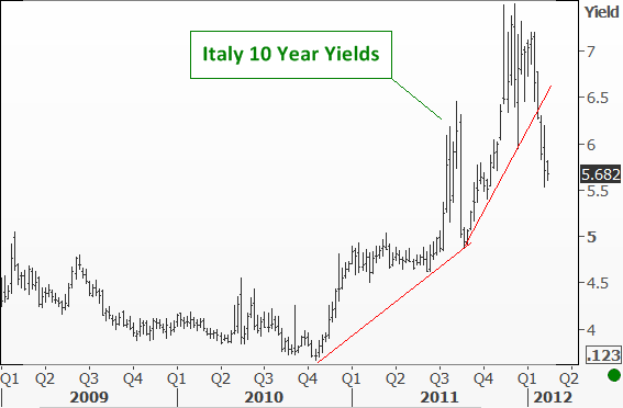
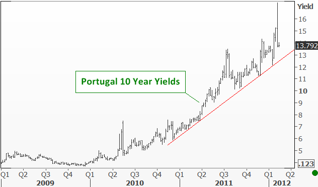
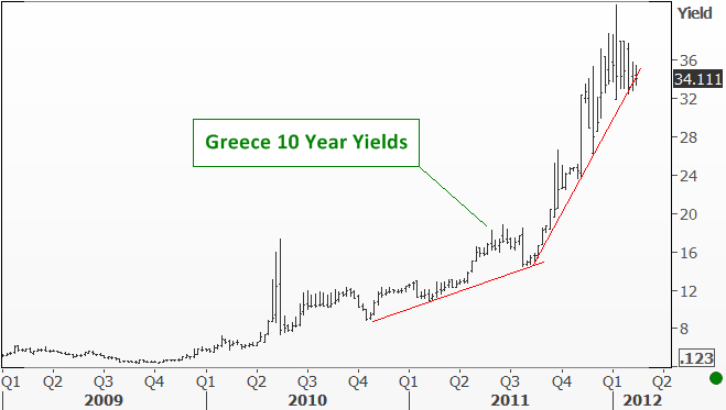
It would be a bold statement to say things are not bad, but compared with my earlier analysis (http://techcharts.wordpress.com/2012/01/12/euro-zone-govt-yields-2/) on Euro zone government yields I have to say that it is relatively better. Wouldn’t the yields on Greek debt be skyrocketing above 42 levels if Greece were to default? Instead 10 year yields on Greek bonds are now testing the major trend support at 33 levels. Spain is also testing a critical support level at 5. While France yields are now below 3 levels. Portugal is still high but off of its high levels at 17. Italy… broke down the trend support at 6.4 levels and eased towards 5.7 levels. Germany is the strongest, trading close to its lower boundary at 1.88 levels.

Yes it is not great out there but it is relatively better when compared with the highest levels Euro zone govt yields have reached.

AUD/USD

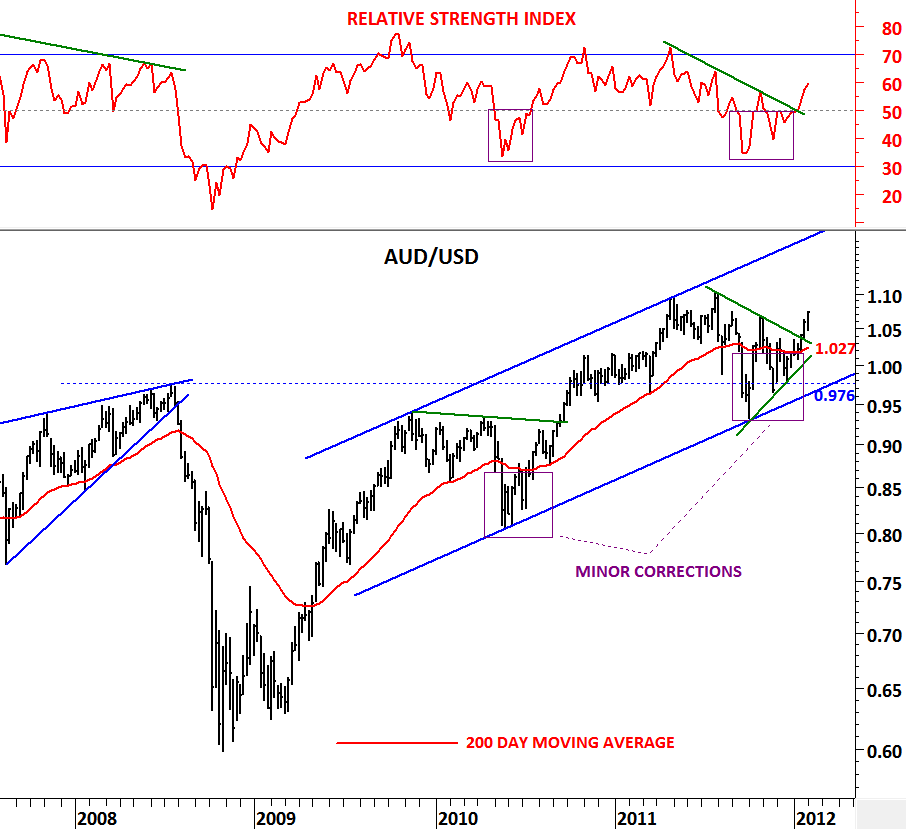
When analyzing long-term charts, 200 day moving average is extremely helpful in deciding the direction of the long-term trends. Supported by the 200 day moving average, 14 period RSI on the weekly scale is a good confirmation of that trend. In the previous posts you’ve come across the term “road map” referring to the 200 day moving average. Price can move sideways and violate the 200 day moving average several times during a corrective period. These are the difficult times in decision-making. Likewise RSI would violate 50 levels. During these indecisive periods price forms a chart pattern that becomes clear once the pattern is close to completion. Breakout from a chart pattern confirms the direction of the long-term trend. AUD/USD is a good example.

Currency pair fell below its 200 day moving average in the first half of 2010 and in the last quarter of 2011. These periods ended up being minor corrections with price recovering above the long-term average and RSI above 50 levels. In the last two weeks we have seen AUD/USD breaking out of its sideways consolidation range at 1.047 levels. RSI moved above 50 levels and price moved higher confirming its uptrend above its 200 day moving average.

Upward trend channel is still intact and AUD/USD resumes its long-term uptrend. Our road map tells us to stay on the long side of this chart with  intermediate/long-term stop-loss levels between 1.027 (200 day moving average) and 0.976 (lower boundary of the trend channel)