GOLD, SILVER and PALLADIUM

Metals have been one of the exciting areas as we got closer to the end of this week. Precious metals moved higher and challenged important resistances. First, we saw a major breakout on Platinum followed by Palladium. Low volatility range breakouts are usually very powerful and are followed by strong moves. While a surge in volatility can last for several weeks it can also fade in a few days. False breakouts (head fakes) are part of the game. However, when combined with technical chart pattern breakouts (flags, wedges, pennants, triangles etc.), low volatility breakouts usually present good trading opportunities.

Palladium was one of the precious metals that clearly broke out of its short-term consolidation range on Friday. The strong move was followed by Platinum’s breakout which took place on Thursday. Both Gold and Silver closed the week at critical resistance areas and we are likely to see a directional movement on these metals sooner or later. I’ve attached metals charts with their critical support/resistance levels to watch. Gold has to clear 1,630 level and Silver has to break above 2,850 level. Failure to do so will result in more sideways consolidation.

CURRENCIES

Here is an update on major currency pairs including U.S. dollar index, GBP/USD, EUR/USD, AUD/USD, NZD/USD, USD/JPY, USD/CAD and USD/CHF.

CURRENCIES (PDF Document)

Highlights:

U.S. dollar index continues to hold above its intermediate-term trend.

Best intermediate-term trading opportunity will present itself on GBP/USD.

AUD/USD & NZD/USD might have another leg up.

USD/JPY might be forming a major base formation.

COFFEE

Will Coffee price reverse its decade-long uptrend or is this another major medium-term low? We are looking for an answer to this question. I attached two charts of Coffee price, one with a long-term view and the other with a medium-term. Coffee is testing the lower boundary of its 10 year-long upward trend channel. A break below 158-148 area could reverse the long-term uptrend and push prices much lower in the medium term. Until we see a decisive break below 148-158 area we will expect the uptrend to resume. However, weekly close below 148 level would be a medium/long-term sell signal. If price can rebound from the support as it did in the previous tests, we will expect a spike towards the 200 day moving average, which is now strong resistance at 190 levels.

COFFEE (PDF Document)

U.S. HOUSING STARTS and JOBLESS CLAIMS

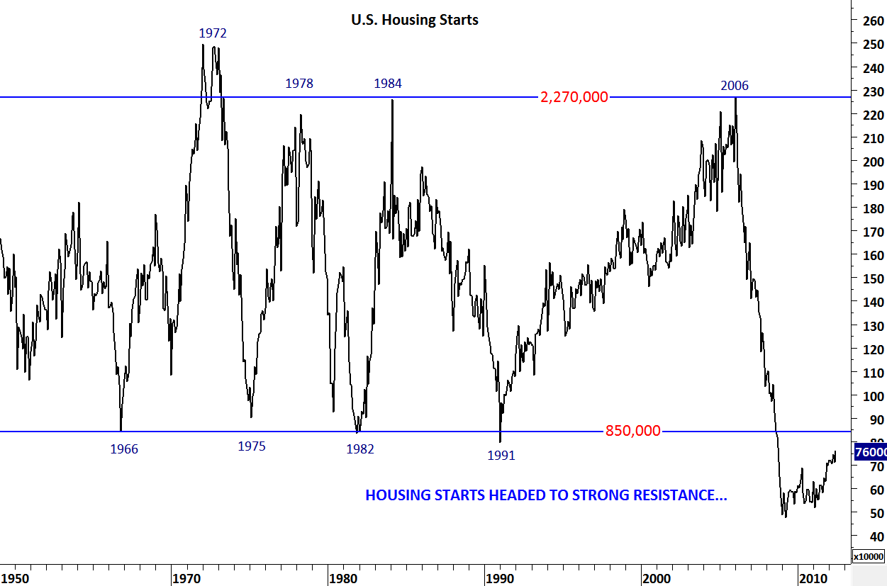
Yesterday’s data on housing and unemployment supported my view on weakening trends on both economic indicators. It is important to note that we are getting closer to a major long-term resistance on the housing starts data. Since 1966, 850,000 level has been a major support. During the latest downturn, hosing starts fell below this level. Since the beginning of 2009, housing starts has been moving higher, though with a slow pace. As we get closer to the long-term resistance we are likely to see weaker housing data. Until we see housing starts above 850,000 levels, it will be early to call for a recovery on that front.

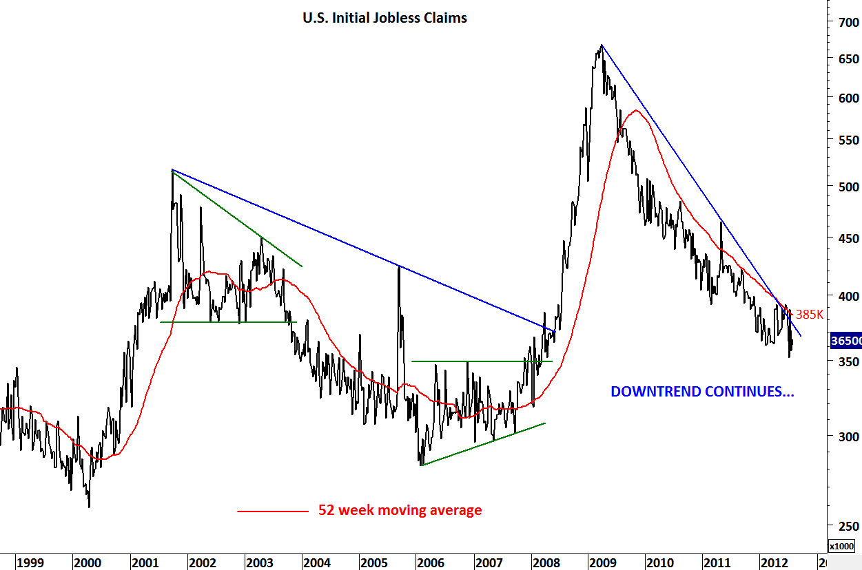
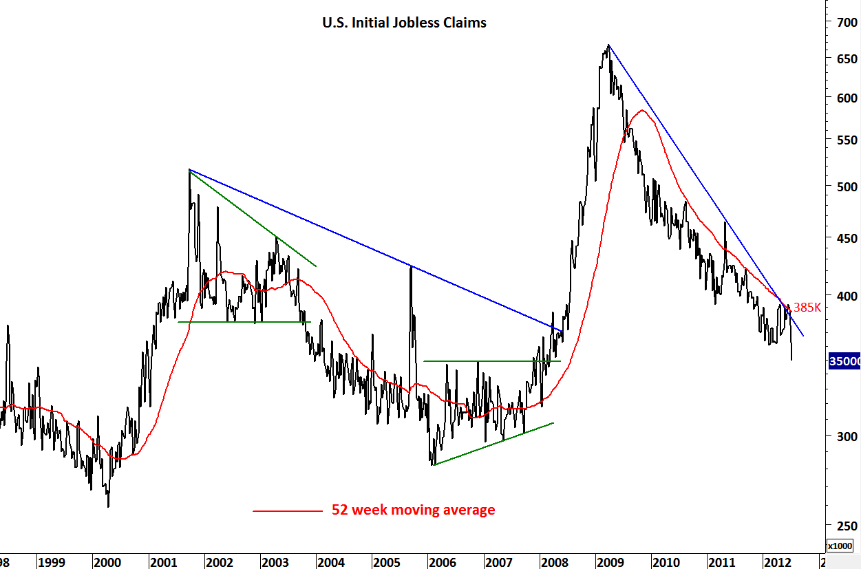
Unemployment number has been stubborn when compared with the aftermath of the previous recessions. Since the last quarter of 2009, jobless claims moved lower but now it looks like the downtrend is losing momentum. Incase of a rebound on jobless claims 385,000 level will be an important threshold as it is the last one year’s average. 52 week moving average has stopped the previous rebounds. I think it should be respected.

Followers might have realized the change in format on Tech Charts. I started posting the charts in PDF files and attaching the links below each post. There are two reasons for this: 1) Pictures were not as clear as before and I like my charts to be clear, texts easy to read and both time and price scales visible. 2) I can add more text on the charts in PDF format.

Please send me your feedback regarding the new format.

US HOUSING STARTS & JOBLESS CLAIMS (PDF Document)

McDonald’s

McDonald’s was one of the first stocks that entered a major uptrend after breaking out of a massive symmetrical triangle. Breakout from a widely recognized chart pattern (symmetrical triangle) resulted in a 3 year-long uptrend. McDonald’s is now forming another popular technical chart formation; head and shoulder top. Head and shoulder patterns are not confirmed until price breaks down the neckline. Both shoulders are symmetrical and the right shoulder formed below the 200 day moving average. Technical outlook suggests lower prices in the coming months. Breakdown below 85 levels will confirm the H&S top formation and price will target 70 levels. H&S top will fail only if the price breaches above 94 levels.

MCDONALD’S (PDF document)

FEEDER CATTLE and LIVE CATTLE

On the 4th of July I analyzed the feeder and live cattle charts from a long-term perspective. Both commodities had perfect breakouts from their long-term consolidation ranges and formed consistent uptrends.

http://techcharts.wordpress.com/2012/07/04/feeder-cattle-live-cattle/

Over the past few weeks the medium-term uptrend on feeder cattle has reversed after it completed a double top chart pattern and broke down its long-term moving average. However, live cattle continued to hold above its medium-term uptrend. We are now seeing a pullback on feeder cattle towards the broken support/resistance at 146 levels and a weak rebound on live cattle.

As the medium-term uptrend on feeder cattle is violated, we can expect at best a short-medium term pullback towards the broken trend channel. Correction on feeder cattle can continue towards 120 levels in the following months. Live cattle will try to sustain its uptrend above the medium-term upward trend but failure to hold above this strong technical level can push prices lower towards 104 levels.

Please note that charts will be attached below in a PDF format for better viewing experience.

FEEDER CATTLE & LIVE CATTLE

S&P 500 INDEX and CBOE VIX

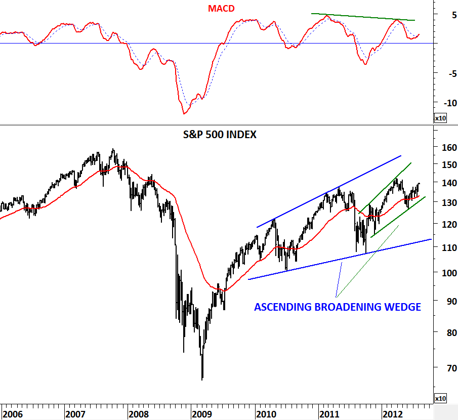
Thomas Bulkowski (author of encyclopedia of Chart Patterns) defines an ascending broadening wedge as a reversal chart pattern. An ascending broadening wedge has two upward sloping trend lines; the top one has a slightly steeper slope than the bottom one. Together, the two trend lines spread out over time but both slope upward. Once prices pierce the bottom trend line, they drop rapidly. The two trend lines are not parallel. If they were parallel you would have a trend channel. In a uptrend we see ascending broadening wedge formations and in a downtrend descending broadening wedges. They are both reversal chart patterns.

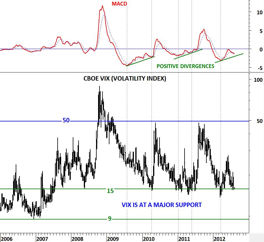
In this update I’m looking as S&P 500 Index and the Volatility Index. VIX reached a major support at 15 levels. Next support is at 9 levels but only after it breaks below 15 levels. VIX reached 9 levels in 2007 and in 1994. Other than that its boundaries have been 15 and 50 levels. In the previous two tests of the 15 levels, MACD generated positive divergences and the VIX formed an intermediate term low. It is now the 3rd time the VIX is testing 15 levels (a major support) with a positive divergence on MACD.

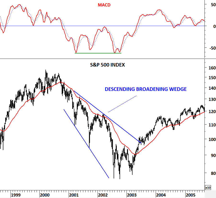
S&P 500 Index has been moving higher since the beginning of 2009. The uptrend has been choppy, with each medium term up leg overlapping the others price range. Choppy uptrend formed an ascending broadening wedge; usually regarded as a reversal chart pattern. Both the S&P 500 index and the VIX warns us of a possible change in trend. As a comparison I analyzed a descending broadening wedge that formed on the S&P 500 Index between 2000 and 2003. This was also a reversal chart pattern which was followed by a multi-year uptrend.

U.S. Initial Jobless Claims, Housing Starts and Unemployment

After a long break let me start with updating the latest economic data on housing and unemployment. I think these are the two most important economic data that we should be watching closely over the next few months. Housing because it is the latest bubble that burst and it was the cause of the global financial turmoil. Unemployment because it is the result of the economic slowdown. Recovery in housing will no doubt help the markets and a pick up in employment will restore confidence and help economic recovery.

Yes, there has been a recovery in the housing market with increasing housing starts when compared with the low in 2009 but housing starts are far from 2008 levels and still below major resistance at 850,000. We should expect this major support at 850,000 level to become resistance over the next few months. Before we see housing starts above 850,000 level it will be early to call for a strong recovery in the housing market.

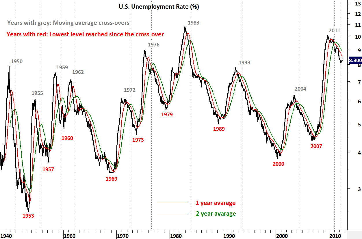
Downtrend continues in jobless claims but unemployment rate rebounded from 8.1% to 8.3% over the past few months. Since the last cross-over on the 1 & 2 year moving averages it has been 1 year and historical data warns us to pay attention to the critical time cycle. In 1960 and 1973 recovery in the job market and downtrend on the unemployment rate reversed in the year following the moving average cross-over . Recoveries were shortlived. Longest recoveries (downtrend) last 7 years between 1962 & 1969 and 1993 & 2000. It is important for the downtrend in unemployment rate to continue past the 1 year threshold to extend the recovery into 3-7 year time cycle.

Earlier analysis on U.S. Unemployment Rate:

http://techcharts.wordpress.com/2012/06/01/u-s-unemployment-rate-chicago-pmi/

U.S. Initial Jobless Claims

Fewer Americans than forecast filed first-time claims for unemployment insurance payments last week. Applications for jobless benefits decreased by 26,000 in the week ended July 7 to 350,000, the fewest since March 2008, Labor Department figures showed today. Even though the sharp drop is reflecting the volatility of applications during the annual auto-plant retooling period, it is positive and shows one more time the significance of the 1 year average. 52 week moving average was the important resistance and jobless claims reversed downwards after testing the long-term average in June. Downtrend in jobless claims continues and this is good news. Going forward we should keep a close eye on the 1 year moving average as strong resistance (385K).

Earlier updates:

http://techcharts.wordpress.com/2012/06/14/u-s-initial-jobless-claims-2/

http://techcharts.wordpress.com/2012/06/08/u-s-initial-jobless-claims/

GBP/USD & SOY MEAL

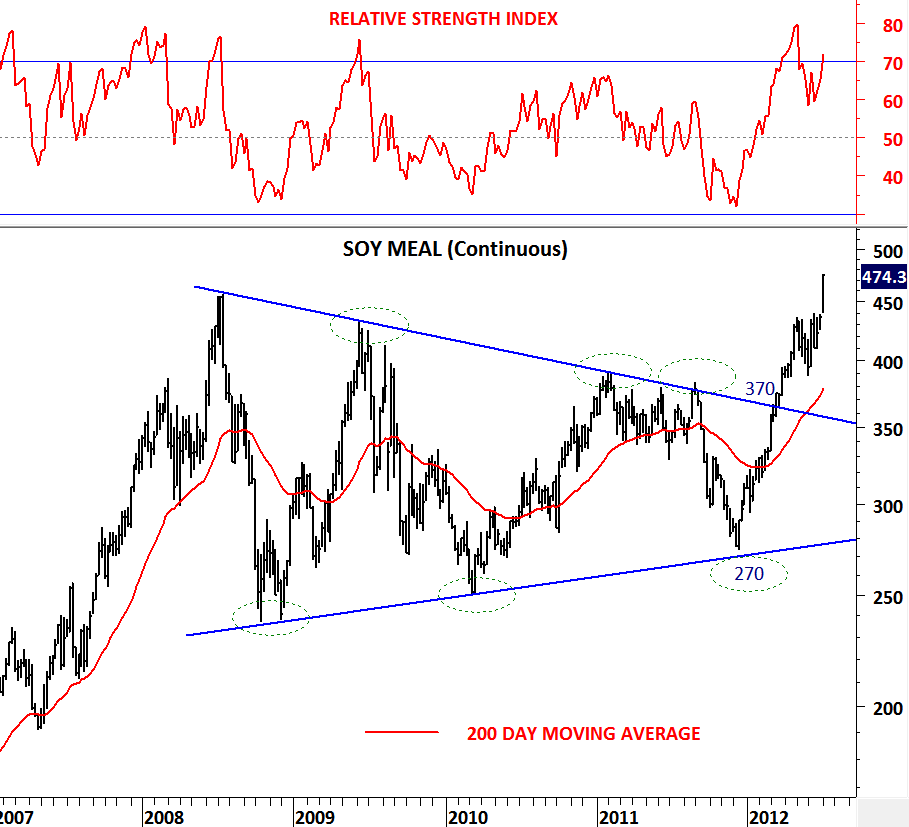
Followers of Tech Charts blog will remember my earlier analysis on Soy Meal which was posted in March. Soy Meal had one of the best technical chart patterns; symmetrical triangle. It was a long-term chart pattern which made it even more significant.

http://techcharts.wordpress.com/2012/03/05/soy-meal-3/

Soy Meal broke out of its long-term consolidation at 370 levels in March and has been moving higher since then. It has been a powerful breakout followed by a pullback in June. Recent rally is being supported by the weather news in grains market. Whatever the reason is it has been a perfect technical action.

This is how a long-term symmetrical triangle resolves and this is the type of technical action we should expect after such a breakout.

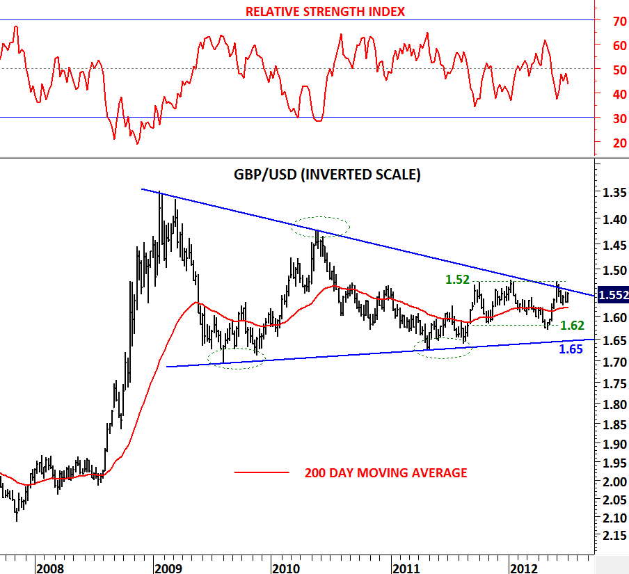
Now let’s look at another long-term symmetrical triangle on GBP/USD. Please not that for ease of display I  have inverted the price scale. So a breakout on the upside will result in weak GBP and strong USD. GBP/USD not only formed a large-scale symmetrical triangle it also formed a minor horizontal consolidation range between 1.52 and 1.62. GBP/USD should be on our watch list. I expect a strong move in the following months which should be no less than the magnitude we have seen on Soy Meal breakout and rally. A breakout above (below) 1.52 levels can easily target 1.35 levels. This would be a massive devaluation for the pound and strength for the dollar.