EUR/USD

Will EUR/USD manage to hold above its 200-day moving average? I have updated EUR/USD chart earlier during October. http://techcharts.wordpress.com/2012/10/12/eurusd-5/ Since then, cross rate continued to consolidate above its long-term average. While the direction of the next trend period is not clear yet, failure to rebound from this strong support area is a warning signal for euro weakness. Over the past 2 months, EUR/USD tested its support for 4 times… Breakdown below  1.2880 (200 day moving average) will suggest larger scale correction towards 1.25 levels.

SOYBEANS

Soybeans are close to a strong directional move. Since the dry summer conditions ended prices have reversed sharply and pulled back to their 200 day moving average. Soybeans found resistance between 1,664-1,800 area in August and formed a double top chart pattern which was broken down at 1,600 level in September. Prices are now consolidating above the long-term support at 1,517 levels. Failure to hold above this level could result in a larger scale correction towards 1,300 levels.

Daily chart focuses on the last one year’s uptrend and shows the last two month’s consolidation between 1,574 and 1,517. Low volatility suggests a breakout is imminent and should be followed by a strong directional movement. Breakout above the short-term resistance at 1,574 will push prices towards 1,650 levels. We should watch Soybeans closely in the following weeks.

U.S. 5 YEAR NOTE

U.S. government bonds are likely to rebound at the back of a risk-off environment. Weak commodities and equities helped cash and cash equivalents to gain strength over the past week. U.S. 5 year note provides good risk/reward in the short-term as it found support at a strong technical level and also rebounded with an outside day.  Outside days are days where the chart bar is both higher and lower than  that of the previous day. When the bar is both higher and lower than the previous day’s bar, it falls  outside the trading range of the previous day. This may indicate a change in the  general direction of the trend (in this case upwards). U.S. 5 year note rebounded from the horizontal support and the 200-day moving average. 123.65 level is the support. Upper boundary of the consolidation range is at 125 and price can target this level in the following days. Breakdown below 123.65 will reverse the positive technical outlook.

S&P GSCI (COMMODITY INDEX)

Commodities are selling off. From energy to metals we have seen widespread weakness in commodities at the back of global growth concerns. Since March 2011, S&P GSCI has been in a downtrend forming wide swings. Feb 2012 peak was lower than the April 2011 and Sept 2012 peak was lower than Feb 2012. This resulted in a downward sloping trend channel and in this trend channel we have seen wide swings between 700 levels and 500 levels. During this medium-term range bound trading (with a downward bias), 200-day moving average acted as a balance where index levels above the average resulted in continued strength and index and below that threshold it resulted in weakness.

After finding resistance at 700 levels in September 2012, S&P GSCI sold-off sharply to test its long-term average at 652 levels. Two months-long consolidation that formed above the 200-day moving average broke down with a gap opening during this week. Index is now below the 200-day moving average. Failure to hold above long-term support levels will put further pressure on the downside and will pull the index towards 600 levels.

Unless S&P GSCI reverses back above 652 levels in the following weeks, we should expect lower prices and continued weakness in the commodity universe.

WHEAT

After a dry summer and a global scale drought, agricultural commodity prices moved higher resulting in returns in excess of 30%. From those, wheat and corn were sharply higher when compared with other soft commodities like coffee, cocoa, cotton & sugar. Sharp spike in wheat prices pushed the agricultural commodity from 600 to 950 levels in less than two months. Wheat price reached 947 levels by the end of July. Since the beginning of August it has been relatively quiet for agriculturals. Over the past three months wheat price has been consolidating above 840 levels; a medium-term support level. Short/medium-term consolidation took a bullish flag or pennant shape that is now closer for a decisive breakout. While bullish flags and pennants are usually continuation patterns in an ongoing trend, a safe way to trade these set-ups is to wait for a breakout as a confirmation. I’ve defined the boundaries of the short/medium-term consolidation. 910 levels act as resistance and 842 levels as support. Breakout in either direction should result in a strong trend and present a good medium-term opportunity. Breakout above 910 levels could target 1,000-1,100 area and breakdown below 842 levels could pull price towards 777 levels.

U.S. INITIAL JOBLESS CLAIMS

Fool me once, shame on you. Fool me twice, shame on me… Jobless claims increased by 46,000 to 388,000 in the week ended Oct. 13 from a revised 342,000 the prior period that was the lowest since February 2008. This was recorded as a sharp reversal on our charts and with 388K, initial jobless claims is now above the 52-week average, an important threshold for the 3 year-long downtrend. In the following weeks 52 week moving average will become support at 376K.

UNEMPLOYMENT

I’m sure everybody read the critics on how the data on job numbers were misleading or totally wrong. While the expectation was 8.2% for the month of September, unemployment rate was reported as 7.8%. A sharp drop! Leaving all the conspiracy theories aside, this data was exactly what we needed to resume the downtrend in jobless claims and improve the unemployment numbers. You’ll remember I wrote about the loss of momentum on the jobless claims and how long it took for the unemployment number to decline from 10% to 8% when compared with previous recoveries. With latest data charts are looking better now! I’ve updated the charts below and the conclusion is:  1) Downtrend on the jobless claims continues below the 52 week moving average. 2) Since the 1 year & 2 year moving average bearish crossover, unemployment rate continues to decline. Jobless claims managed to resume its 3 year-long downtrend by staying below its long-term average. 52 week moving average stands at 372K.

EUR/USD

Did euro reverse its 2 year-long downtrend? EUR/USD broke down its long-term moving average in September 2011. Since then it has been trending below the 200 day moving average with one exception in October 2011, which was a 3 day spike above the long-term average and was not a valid breakout. In July 2012, EUR/USD reached 1.20 levels. Rebound from the oversold levels carried EUR/USD to the trend resistance at 1.2650. It didn’t take long for the cross rate to clear this resistance in September 2012. Breakout was followed by a sharp rally towards 1.3150 levels. During this rally EUR/USD breached the 200-day moving average for the first time in one year. In the last two months we have seen a pullback to the long-term average which is now forming support at 1.2860. If EUR/USD can stabilize above the long-term average at 1.2860 levels, we are likely to see the continuation of the strength in the euro. It is important for the cross rate to hold above this support. Failure to hold above 1.2860, could send EUR/USD back to 1.25 levels.

VOLATILITY INDEX

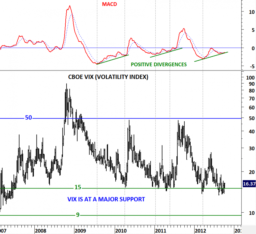
Followers of Tech Charts will remember this chart on the CBOE VIX. I have been bringing this important chart to your attention for almost 3 months. Repetitive positive divergences and similar technical outlook in the past two CBOE VIX reversals made this chart even more essential. VIX found support at 15 levels in 2008, 2010, 2011 and 2012. Each one of those tests were followed by a sharp spike in volatility. In the past two reversals MACD generated positive divergences that were early warning signals of correction in equity markets. When we compare the low in the first quarter of 2012 and the low in the second half of the year, we can’t miss the non-confirmation on the momentum indicator and the volatility index. So the question is: Are we at the beginning of an increased volatility period?

USD/TL

Long-term charts are usually self-explanatory. They lay out the big picture in a clear-cut way. The below long-term chart (decade-long) shows U.S. dollar vs. Turkish Lira. From 2002 to 2011 USD/TL moved between 1.15 and 1.76. This was a wide trading range with several of volatile swings. In the last quarter of 2011 there has been a major change in supply & demand. USD/TL breached 1.76 levels… This was followed by a consolidation above the long-term resistance. Long-term resistance at 1.76 became support.

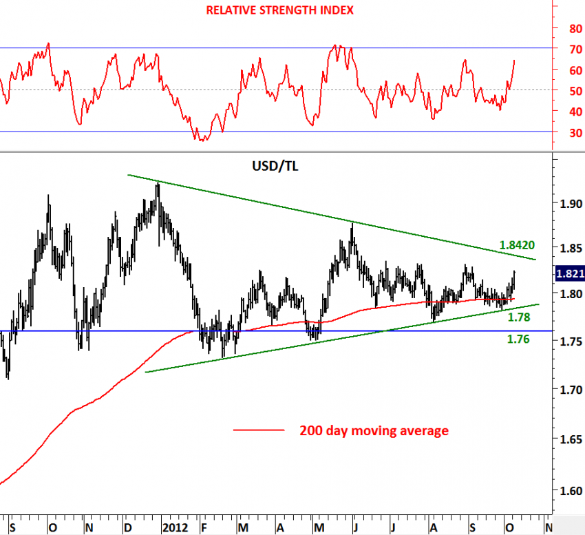
Not only USD/TL found support at 1.76 levels but also above the 200-day moving average. Over the past year, the consolidation took the shape of a symmetrical triangle. Symmetrical triangle is usually regarded as a continuation chart pattern. The chart below takes a closer look at the symmetrical triangle consolidation between 1.8420 and 1.78. It is now clear that USD/TL will breakout from the year-long contracting range. A breakout on the upside (breaching above 1.8420) will be bullish for the dollar. Unless we see USD/TL below 1.76, we should continue to expect strong USD and weak TL.