VOLATILITY INDEX
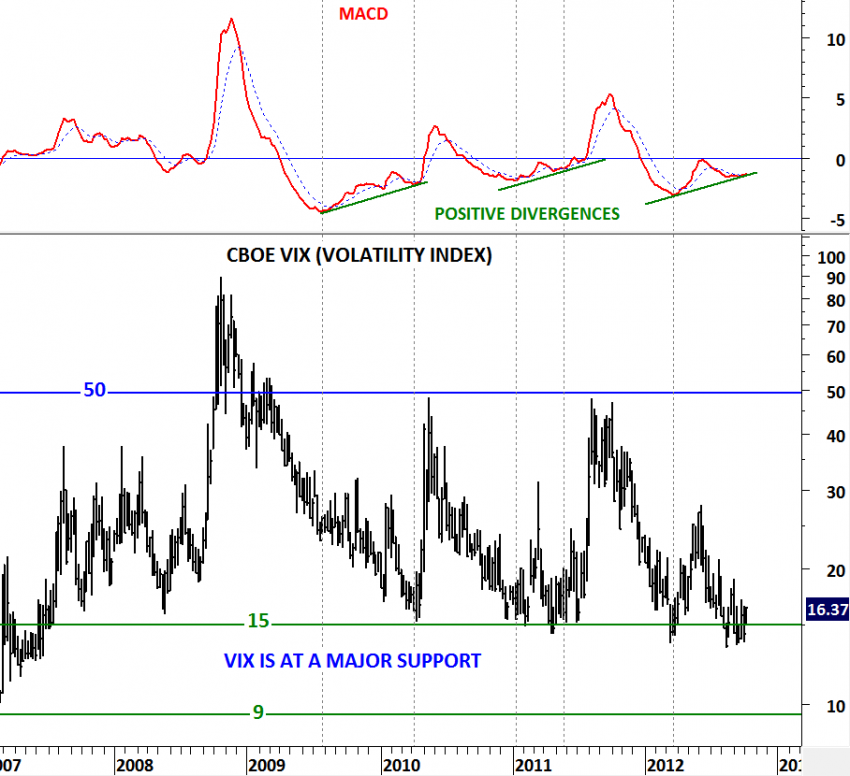
Followers of Tech Charts will remember this chart on the CBOE VIX. I have been bringing this important chart to your attention for almost 3 months. Repetitive positive divergences and similar technical outlook in the past two CBOE VIX reversals made this chart even more essential. VIX found support at 15 levels in 2008, 2010, 2011 and 2012. Each one of those tests were followed by a sharp spike in volatility. In the past two reversals MACD generated positive divergences that were early warning signals of correction in equity markets. When we compare the low in the first quarter of 2012 and the low in the second half of the year, we can’t miss the non-confirmation on the momentum indicator and the volatility index. So the question is: Are we at the beginning of an increased volatility period?


