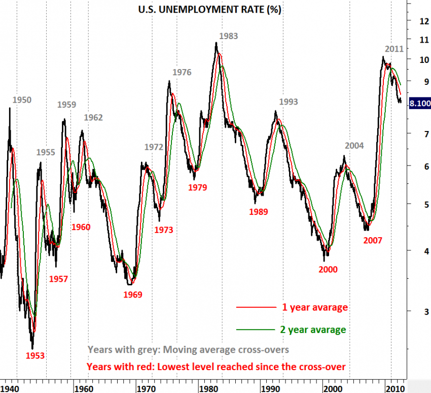
U.S. UNEMPLOYMENT RATE and JOBLESS CLAIMS
One of the most important time series that I’m following is the employment situation in U.S. The other one is related to housing. In this post I’m updating my charts with the latest data. On Thursday initial jobless claims data was better than expected with 365,000. Expectation was a range between 365,000-380,000. What is the importance of this data and how should we read it? Since the beginning of 2009, initial jobless claims have been trending down. Over the past few months downward momentum has weakened. In other words the pace of an improving job market has slowed down. That’s why it is crucial to see the resumption of the last 3 year downtrend. A critical threshold is the 52-week moving average which is now at 380K. As long as we see the initial jobless claims below its long-term average we will expect better jobs market. A trend reversal (to the upside) would occur only if jobless claims break above the 52-week moving average.
Unemployment rate dropped to 8.1% in August. Payroll jobs were anemic even though the unemployment rate dipped. The unemployment rate slipped to 8.1 percent from 8.3 percent in July due to a sharp drop in the labor force. Is this positive? Well any number that helps the unemployment rate maintain its downtrend is positive in my opinion. After we have seen the 1 & 2 year moving average crossover (bearish crossover suggesting lower unemployment rate) on the unemployment rate, our expectation was to see better numbers month after month. However, unemployment has been sticky and took longer to drop from 9% to 8% levels. What we need to see is the continuation of this downtrend. For now donwtrend remains intact and we should expect better numbers in the following months.


