AUD/USD

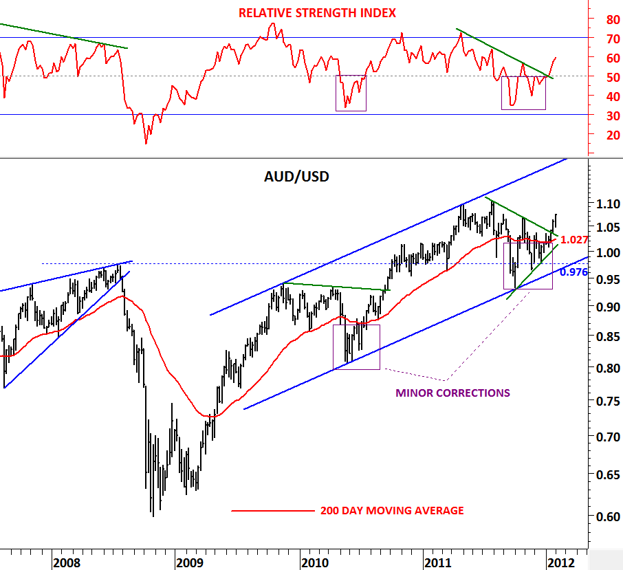
When analyzing long-term charts, 200 day moving average is extremely helpful in deciding the direction of the long-term trends. Supported by the 200 day moving average, 14 period RSI on the weekly scale is a good confirmation of that trend. In the previous posts you’ve come across the term “road map” referring to the 200 day moving average. Price can move sideways and violate the 200 day moving average several times during a corrective period. These are the difficult times in decision-making. Likewise RSI would violate 50 levels. During these indecisive periods price forms a chart pattern that becomes clear once the pattern is close to completion. Breakout from a chart pattern confirms the direction of the long-term trend. AUD/USD is a good example.

Currency pair fell below its 200 day moving average in the first half of 2010 and in the last quarter of 2011. These periods ended up being minor corrections with price recovering above the long-term average and RSI above 50 levels. In the last two weeks we have seen AUD/USD breaking out of its sideways consolidation range at 1.047 levels. RSI moved above 50 levels and price moved higher confirming its uptrend above its 200 day moving average.

Upward trend channel is still intact and AUD/USD resumes its long-term uptrend. Our road map tells us to stay on the long side of this chart with  intermediate/long-term stop-loss levels between 1.027 (200 day moving average) and 0.976 (lower boundary of the trend channel)

DOW JONES INDUSTRIAL

After strong performance from equity markets and commodities and a positive start for 2012, indices are challenging their minor/major resistance levels. One of those indices is the Dow Jones Industrial Average now testing 12,750 levels, a resistance now being challenged for the third time. Since October 2011, Dow Jones Industrial moved from 10,500 levels to 12,750 levels. It has breached its 200 day moving average which is now standing at 11,925 level. We might see some weakness at this strong resistance area and the index might experience a pullback towards its 200 day moving average. Resilience around 12,750 will signal strength and a possibility to break above the strong resistance. Dow Jones Industrial is on my watch list with these two levels; resistance 12,750 and support 11,925.

SPAIN IBEX INDEX

The beauty of technical analysis is that it helps us compare current price movement with past price movements and layout a trading strategy depending on the historical price movements. Chartist have developed an extensive list of chart patterns throughout the years. For those interested in learning chart patterns Thomas Bulkowski’s The Encyclopedia of Chart Patterns is a must read. In fact this was my first technical analysis book in my library back in 2000. Another book that I’m currently reading on chart patterns is Peter L. Brandt’s Diary of a Professional Commodity Trader. In this book you’ll find plenty of chart pattern applications. 

You can find the book on Amazon as well as on his website. 

http://peterlbrandt.com/ 

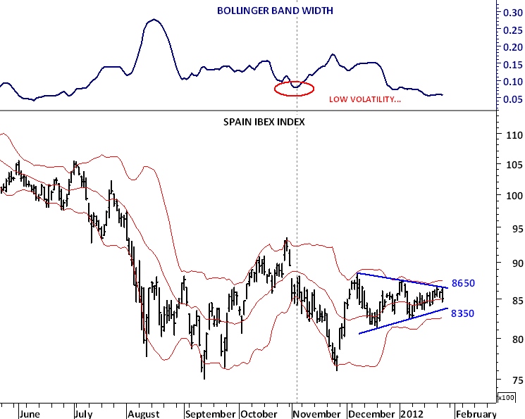
Similar chart patterns develop one after another on different instruments, different time frames and in different markets. I try to stick with the widely followed chart patterns and don’t search  for “new generation” chart formations. Because usually new generation chart patterns are derivatives of the common chart patterns. Symmetrical triangle (coil) is one of the widely followed chart pattern in technical analysis. It’s strength comes from the perfect boundaries it forms and the breakout that follows the completion of the pattern.

I usually combine chart patterns with volatility analysis to see if the volatility has reached an extreme low level at the time of the breakout. If I see that the volatility has also decreased, I’m more comfortable with the breakout from these consolidation ranges. Followers of this blog enjoyed a perfect example of a symmetrical triangle breakout on Copper in January.

(http://techcharts.wordpress.com/2012/01/05/copper/)

In this post I’m presenting another text-book symmetrical triangle with a perfect volatility reading (6 month low). Spain’s IBEX index is now close to a breakout from this short-term consolidation range (symmetrical triangle). The direction of the breakout will be important. My suggestion as usual will be to wait for a breakout and then act on the direction of the breakout. I’m watching 8,650 level as resistance and 8,350 as support.      

SOY MEAL

In December I wrote about Soy Meal. A commodity that I’ve often traded and analyzed. Agricultural commodities are perfect for traders who are starting with a small capital. Their low margins allow you to trade 1-2 contracts per trade. Unlike Gold, Silver or even Crude Oil that have high margin requirements, agricultural commodities are better place to start with. I had a very timely call in December on Soy Meal when it was testing the lower boundary of its long-term symmetrical triangle at 270 levels(http://techcharts.wordpress.com/2011/12/10/soy-meal/) Since then price have rebounded sharply and reached 320 levels.

Sharp rebound in December 2010 and pullback in January has probably formed a nice inverted H&S pattern. The neckline of the inverted H&S pattern and the 200 day moving average are overlapping at 325 levels by increasing the significance of this resistance. If we see a decisive break above both the neckline and the 200 day moving average, Soy Meal will generate a clear buy signal in the short/intermediate term. Soy products should be on our watch list in the next few weeks.

COFFEE

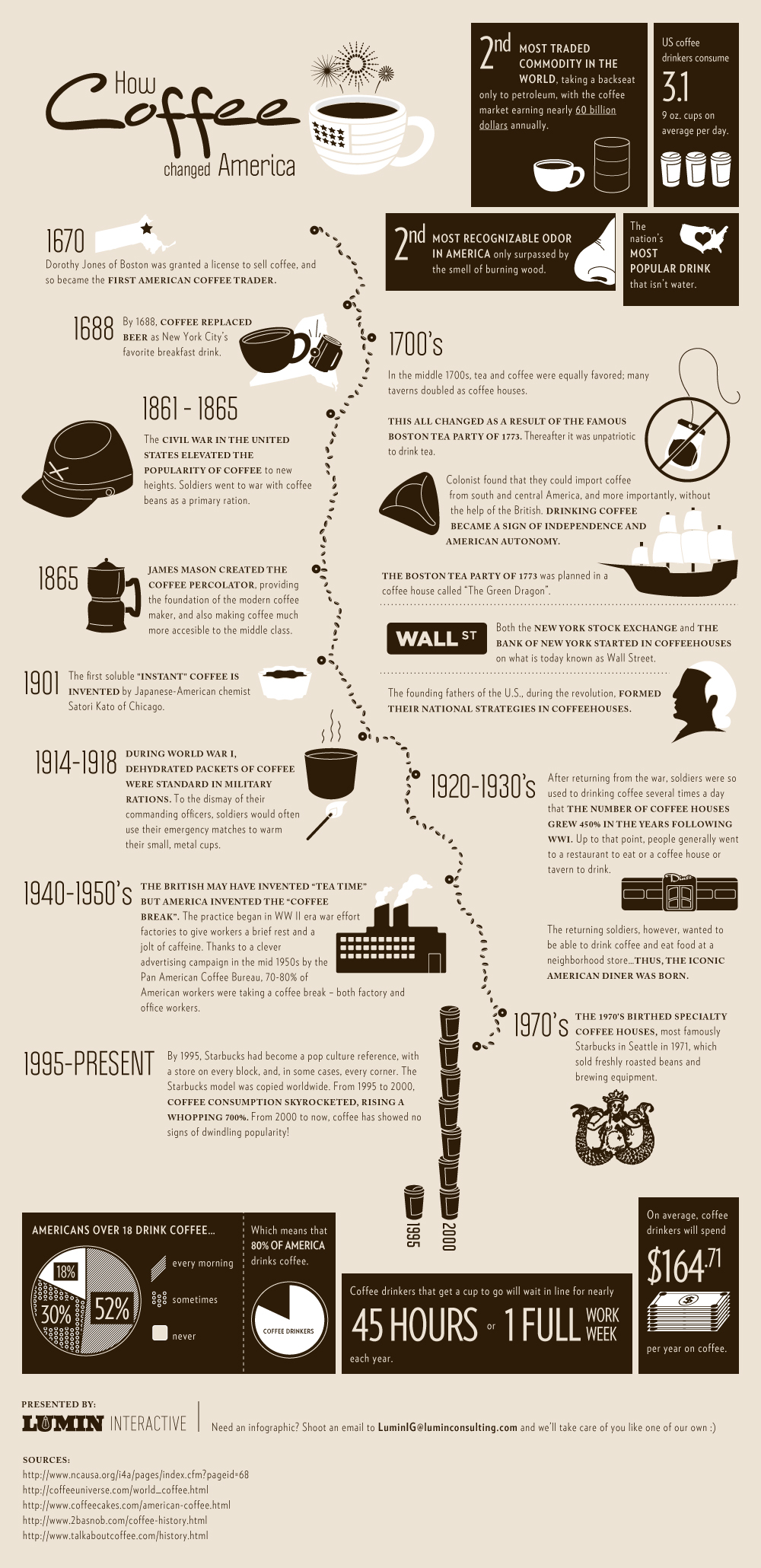
Here is an interesting illustration on a commodity that we consume almost every day. I have always been a coffee fan. Of course born and raised in Turkey, Turkish coffee has been a part of our daily life. I start and finish my day with coffee and consume 4-5 cups per day. When I saw this great illustration I thought of the importance of coffee during my work day and my trading of this highly volatile commodity, so I revisited my charts. If you are a technical analyst that lives and dies by charts you see almost everything in charts, patterns and prices. So here is a brief history of coffee on how it changed America. I also share a long and medium term analysis of coffee price that you might find interesting.

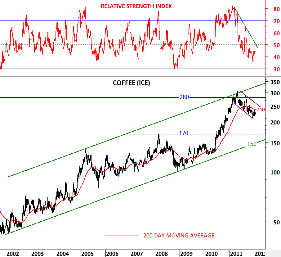
Long term coffee chart goes back to 1979 and it clearly shows the importance of 280 level over the past three decades. In 2011 Coffee price tested the long-term horizontal resistance at 280 levels and pulled back. Same level was tested in 1986, 1994 and in 1997. Every time price tested the horizontal long-term resistance, it pulled back sharply except this time (at least for now).

To analyze the supply/demand dynamics in the intermediate term I’m presenting a shorter term view. On the second chart (weekly scale) 2002-2012 can be seen as a nice uptrend developing in a parallel trend channel. In 2011, price reversed from the upper boundary of the trend channel and the long-term horizontal resistance at 280. This was a strong resistance. Coffee price is now below its 200 day moving average and the RSI is below 50 levels (bearish signals). Downtrend on the RSI and on the price chart shows that Coffee is headed lower in the short/intermediate term.  I believe 200 day moving average will be an important threshold to call for further weakness or a possible reversal to the upside. If price breaches above 240 level with a confirmation from the RSI (breaching 50 level) then we will expect a re-test of the long-term horizontal resistance at 280 once again. Otherwise, we will expect the price to pullback to the lower boundary of the trend channel at 150 levels.

U.S. DOLLAR INDEX & EUR/USD

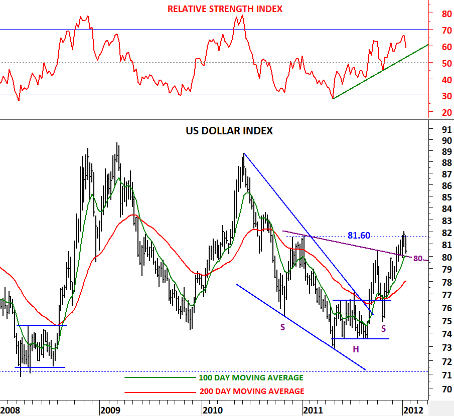
Looks like in the short-term Euro is due for a rebound. With the positive news flow from Euro Zone regarding the latest debt sales and restructuring of the Greek debt, U.S. dollar might pullback further helping the RISK ON trades to gain ground. I’ve mentioned in my previous updates that the technical outlook has turned positive for the next several months for the U.S. dollar after the bullish crossover signal of the 100 & 200 day moving averages. While 81.60 challenges the uptrend on the dollar index in the short-term we might be due for a sizable rebound towards 1.328 levels on the EUR/USD. (http://techcharts.wordpress.com/2012/01/07/u-s-dollar-index/)

Let’s look at some of the important technical signals. RSI has a downward trend on the EUR/USD and an upward trend on the U.S. dollar index. For the intermediate/long-term trend to reverse from negative to positive on EUR/USD, RSI should break down the up trend on the RSI. Meanwhile we need to see the RSI breaching above 50 levels to call for a bull market on EUR.

1.328 is a strong resistance for EUR/USD and the price needs to breach above the trend resistance to reverse its downtrend. A rebound towards 1.328 will not change the negative outlook to neutral/positive in the intermediate term. 78-80 area is strong support for the U.S. dollar index. Unless price breaches below the strong support area between 78 and 80, we should view any pullback as a short-term correction.

EURO BUND & US 10 YEAR T-NOTE

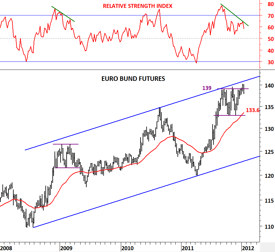
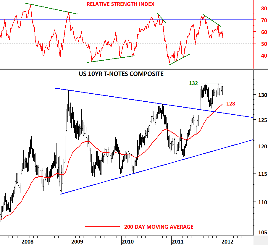
On January 6th I discussed government bonds for Germany & U.S. and drew attention to negative divergences on momentum indicators. U.S. 10 Year T-Notes and Euro Bund prices have generated negative divergences as they approached their previous high levels and both government bond prices tested their intermediate term resistance levels with negative divergences. The battle between bulls and bears resolved in favor of the bulls in the equity markets. With strong data from U.S. and better than expected debt sales in Euro Zone, investors said “RISK ON” in the short-term. Equity indices rebounded and bonds weakened.

Euro Bund price failed to break above 139 levels and fell below the strong resistance. U.S. 10 Year T-Notes didn’t even breach the horizontal resistance at 132 levels. We should now expect more weakness in bonds that would pull prices towards their 200 day moving averages Euro Bund: 133.6, U.S. 10 Year T-Note: 128. Weakness of this kind will help equities in the short/intermediate term. Strong resistance for Euro Bund is still at 139 levels and for U.S. T-Note at 132 levels.

GBP/USD

Strong rebound from a major support helped GBP to firm after falling from 1.6150 to 1.54 levels in the past 3 months. Rebound was timely as the cross rate was testing major support levels. First resistance for GBP/USD is at 1.584 level (200 day moving average). From a long-term perspective GBP/USD might be forming a 3 year-long symmetrical triangle. So for a long-term buy/sell signal we need to wait for a breakout from the last three year’s consolidation range. However, meanwhile we can expect a short-intermediate term strength that can target 1.58-1.60 area.

Either as a reversal triangle that would break upwards around 1.65 or as a continuation symmetrical triangle that would break downwards around 1.52, GBP/USD should be watched closely for long-term opportunity.