“Demystifying the world of Classical Charting”
– AKSEL KIBAR
As part of our member webinars, on the 8th of March 2018 we recorded a live webinar discussing ascending triangle patterns. During the Q&A session one of the Tech Charts members asked this question, "If I’m new to classical charting, what should I do to learn how to identify each pattern?"
We have prepared an excerpt from the webinar. I hope that it will add value in your learning experience. Educational Videos section is expanding rapidly. In the following months we plan not only more educational tutorials on Classical Charting Principles but also videos on the fine points of Technical Analysis.
Read More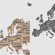
Both Members and Non-Members are invited to join us for the public webinar on Thursday, May 17, 11am mountain: Tech Charts Year in Review. I will compare the before and after of charts shared with Members over the last year and go through some of the developing chart setups on equities and Global indices. I will also discuss some statistics on chart pattern reliability. As always, we'll end the webinar with a live Q&A.
If you have any questions you'd like to submit, please send them to us via the "Contact" link under Support on our website.
CLICK HERE to registerEvery week Tech Charts Global Equity Markets report features some of the well-defined, mature classical chart patterns under a lengthy watchlist and the chart pattern breakout signals that took place during that week. Global Equity Markets report covers single stocks from developed and emerging markets, ETF’s and global equity indices. The report starts with a review section that highlights the important chart developments on global equity benchmarks. This blog post features a recent breakout opportunity in European equity ETF listed on the NYSE.
Read More
Both Members and Non-Members are invited to join us for this public webinar: Tech Charts Year in Review. Aksel will compare the before and after of charts shared with Members over the last year and go through some of the developing chart setups on equities and Global indices. As always, we’ll end the webinar with a live Q&A.
If you have any questions you’d like to submit, please send them to us via the “Contact” link under Support on our website.

Every week Tech Charts Global Equity Markets report features some of the well-defined, mature classical chart patterns under a lengthy watchlist and the chart pattern breakout signals that took place during that week. Global Equity Markets report covers single stocks from developed and emerging markets, ETF’s and global equity indices. The report starts with a review section that highlights the important chart developments on global equity benchmarks. This blog post features a recent breakout opportunity in U.S. equities from the Breakout Alerts section of the latest weekly Global Equity Markets report. Also below you will find a free educational video on cup & handle classical chart pattern.
Read More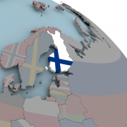
Every week Tech Charts Global Equity Markets report features some of the well-defined, mature classical chart patterns under a lengthy watchlist and the chart pattern breakout signals that took place during that week. Global Equity Markets report covers single stocks from developed and emerging markets, ETF’s and global equity indices. The report starts with a review section that highlights the important chart developments on global equity benchmarks. This blog post features short and long-term analysis of Finland equity benchmarks and ETF from the review section of the latest weekly Global Equity Markets report.
Read More
As part of our member webinars, on the 8th of March 2018 we recorded a live webinar discussing ascending triangle patterns. During the Q&A session one of the Tech Charts members asked this question, “Do you actually search through hundreds of charts each week or do you use a software that alerts you to a breakout taking place across various markets?”
We have prepared an excerpt from the webinar. I hope that it will add value in your learning experience.

By becoming a Premium Member, you’ll be able to improve your knowledge of the principles of classical charting.
With this knowledge, you can merge them with your investing system. In fact, some investors use my analyses to modify their existing style to invest more efficiently and successfully.
You will receive:
For your convenience your membership auto renews each year.

Every week Tech Charts Global Equity Markets report features some of the well-defined, mature classical chart patterns under a lengthy watchlist and the chart pattern breakout signals that took place during that week. Global Equity Markets report covers single stocks from developed and emerging markets, ETF’s and global equity indices. The report starts with a review section that highlights the important chart developments on global equity benchmarks. This blog post features two equities from U.S. banking sector that formed rectangle chart patterns that can act as bullish continuation. Both charts were discussed in the latest weekly Global Equity Markets report.
Read More
I really enjoyed our conversation with Caroline Stephen, the host of Talking Trading. We discussed Technical Analysis, Classical Charting and my charting and trading experience in the Middle East & North Africa markets.
You can listen the interview by clicking this link (http://talkingtrading.com.au/frontier-markets/). I hope you will find it interesting and valuable.

Rectangle is one of my favorite classical chart pattern. It is relatively easy to identify on weekly scale price charts due to its well-defined horizontal boundaries. After an initial advance, Rectangle chart pattern marks a breath taking period, in other words, consolidation of previous gains and suggests a possible continuation of the previous trend. Every week Tech Charts Global Equity Markets report features some of the well-defined, mature classical chart patterns under a lengthy watchlist and the chart pattern breakout signals that took place during that week. Global Equity Markets report covers single stocks from developed and emerging markets, ETF’s and global equity indices. The report starts with a review section that highlights the important chart developments on global equity benchmarks. This blog post features two equities that formed rectangle chart patterns that can act as bullish continuation. Both charts were discussed in the latest weekly Global Equity Markets report.
Read More
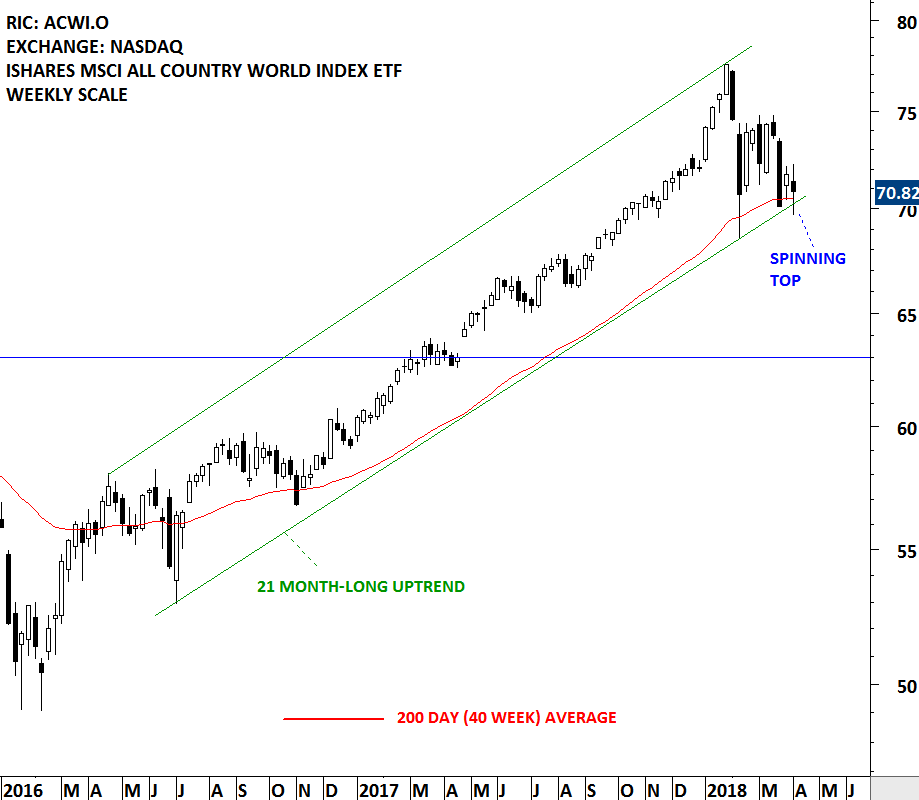
Every week Tech Charts Global Equity Markets report features some of the well-defined, mature classical chart patterns under a lengthy watchlist and the chart pattern breakout signals that took place during that week. Global Equity Markets report covers single stocks from developed and emerging markets, ETF’s and global equity indices. The report starts with a review section that highlights the important chart developments on global equity benchmarks. This blog post features a review on the iShares MSCI All Country World Index ETF that was featured in the latest Global Equity Markets report. Below you will also find a long-term chart on the iShares MSCI Emerging Markets Index.
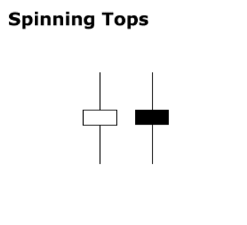 Indecision. Jury is still out. This week's price action is best explained with the help of candlestick patterns definitions. Spinning top is a candlestick with a long upper shadow, long lower shadow, and small real body. One long shadow represents a reversal of sorts; spinning tops represent indecision. The small real body (whether hollow or filled) shows little movement from open to close, and the shadows indicate that both bulls and bears were active during the session. Even though the week opened and closed with little change, prices moved significantly higher and lower in the meantime. Neither buyers nor sellers could gain the upper hand and the result was a standoff. After a long advance or long white candlestick, a spinning top indicates weakness among the bulls and a potential change or interruption in trend. After a long decline (I think this is what we experienced over the past 3 weeks) or long black candlestick, a spinning top indicates weakness among the bears and a potential change or interruption in trend.
 Read More