“Demystifying the world of Classical Charting”
– AKSEL KIBAR

Every week Tech Charts Global Equity Markets report features some of the well-defined, mature classical chart patterns under a lengthy watchlist and the chart pattern breakout signals that took place during that week. Global Equity Markets report covers single stocks from developed, emerging and frontier markets, ETF’s and global equity indices. The report starts with a review section that highlights the important chart developments on global equity benchmarks. This blog post features from the watchlist section a rectangle chart pattern that is listed on U.S. Exchange. The well-defined range can be utilized for trading opportunity between the boundaries until price experiences a confirmed breakout/breakdown. A link is provided here to learn more about Support and Resistances.
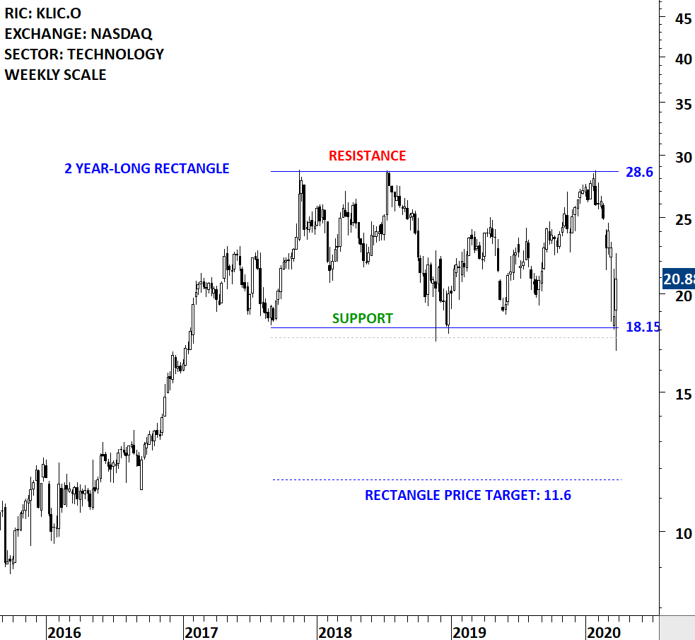
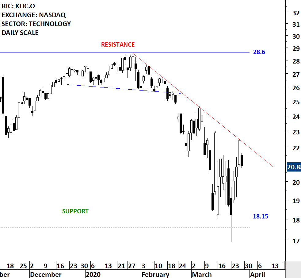
Kulicke and Soffa Industries, Inc. designs, manufactures and sells capital equipment and expendable tools used to assemble semiconductor devices, including integrated circuits (ICs), high and low powered discrete devices, light-emitting diodes (LEDs) and power modules. The stock is listed on the Nasdaq Stock Exchange. Price chart formed a 2 year-long rectangle with the horizontal boundaries acting as strong support at 18.15 levels and resistance at 28.6 levels. Both boundaries were tested several times over the course of the chart pattern. A daily close below 17.6 levels will confirm the breakdown from the 2 year-long rectangle with the possible chart pattern price target of 11.6 levels. Until a breakdown takes place the stock can offer a trading opportunity between the wide range 18.15-28.6. A re-test of the previous low and the support area can form a short-term reversal chart pattern. The daily chart is added below. (Data as of March 27, 2020)

By becoming a Premium Member, you’ll be able to improve your knowledge of the principles of classical charting.
With this knowledge, you can merge them with your investing system. In fact, some investors use my analyses to modify their existing style to invest more efficiently and successfully.
You will receive:
For your convenience your membership auto renews each year.

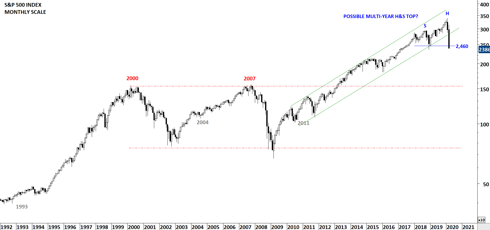
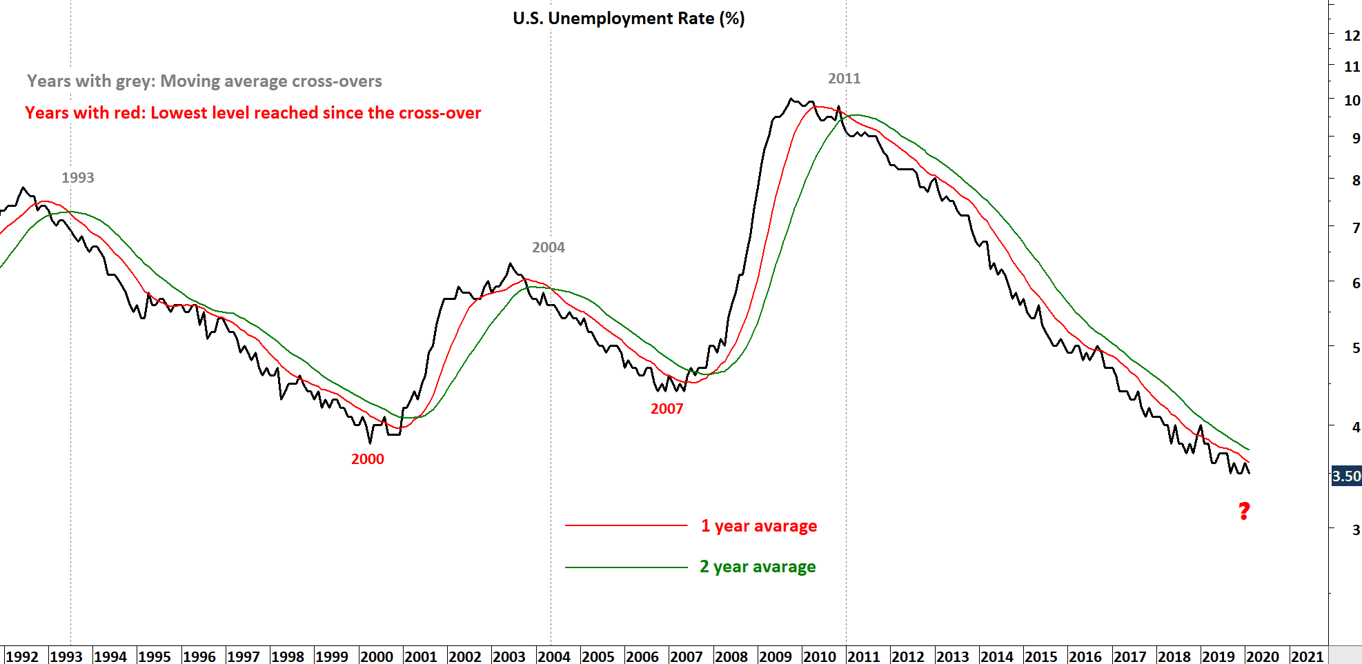
Every week Tech Charts Global Equity Markets report features some of the well-defined, mature classical chart patterns under a lengthy watchlist and the chart pattern breakout signals that took place during that week. Global Equity Markets report covers single stocks from developed, emerging and frontier markets, ETF’s and global equity indices. The report starts with a review section that highlights the important chart developments on global equity benchmarks. This blog post features from the review section the S&P 500 Index and U.S. Unemployment Rate %.
Global economies are going through difficult times. Below I discuss a possibility. In 2011, I wrote a blog post when Global equities were recovering from the 2007-2008 financial melt-down. I analyzed the Unemployment rate with the S&P 500 Index. You can read the blog post here U.S. Unemployment Rate (%) 2011 Blog Post. Since 2011, the unemployment rate remained in a steady downtrend and reached significantly low levels. We are now seeing discussions about Global recession. I refer to my charts to understand the possibility of it taking place in current environment.
The recent sell-off on S&P 500 Index found support at 2018 minor lows (2,460). I’m weighing the possibility of a multi-month long H&S top. If such scenario taking place we are likely to spend the rest of 2020 by forming the right shoulder of the multi-month long top reversal. Stock market is always regarded as a leading indicator for economic activity. When we put the two charts together, the U.S. unemployment rate and the S&P 500 Index, a top reversal would coincide with a bottom on unemployment rate. Please note that these are monthly scale price charts and it can take several months for reversals to take place. And also please note that this is not a forecast. I view this as a possibility. As I get new evidence, I will update these charts.
By becoming a Premium Member, you’ll be able to improve your knowledge of the principles of classical charting.
With this knowledge, you can merge them with your investing system. In fact, some investors use my analyses to modify their existing style to invest more efficiently and successfully.
You will receive:
For your convenience your membership auto renews each year.

The flag forms on a mast, a nearly vertical price movement, either up or down. The length of the mast (in points) from the preceding congestion to the point where the Flag begins to form, will be found to indicate in by far the great majority of the cases the extent of the rapid price movement which proceeds from the last reversal point in the Flag. The price projection by using this half mast technique will give us the possible price target but does not call for a reversal of trend when the price objective is met.
Read More
Every week Tech Charts Global Equity Markets report features some of the well-defined, mature classical chart patterns under a lengthy watchlist and the chart pattern breakout signals that took place during that week. Global Equity Markets report covers single stocks from developed, emerging and frontier markets, ETF’s and global equity indices. The report starts with a review section that highlights the important chart developments on global equity benchmarks. This blog post features from the review section the iShares MSCI All Country World Index ETF (ACWI.O) as a measure of Global Equity Markets performance.
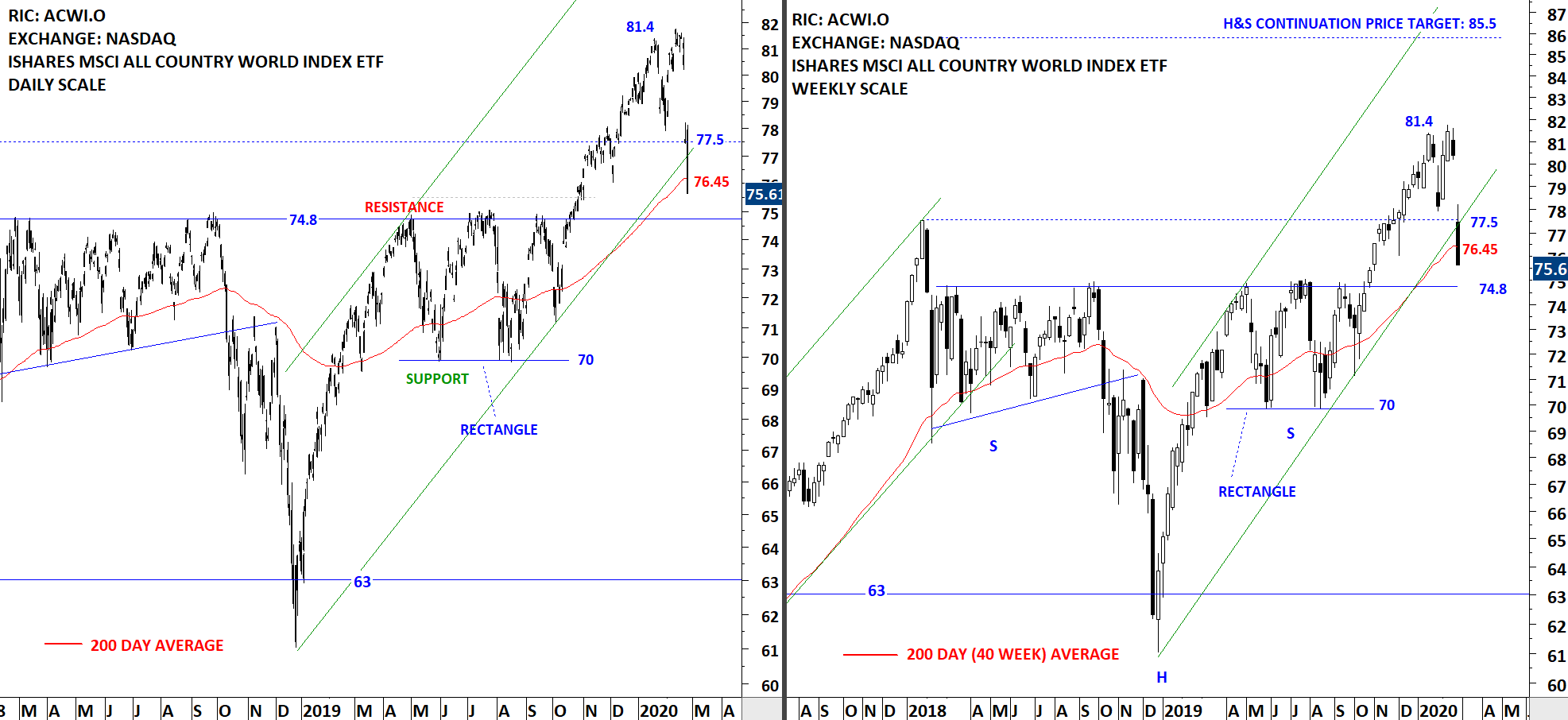
The benchmark for Global Equity Markets performance reversed from all-time highs at 81.4 levels. In the last quarter of 2019, the ACWI ETF experienced two important breakouts. One of them was clearing the horizontal resistance at 74.8 levels which completed a 2 year-long H&S continuation, the other one was to breakout above 2018 highs at 77.5 levels. Since mid-January (first news of coronavirus), the ETF has experienced sharp corrections. The first sell-off pulled the ETF towards 77.5 levels which was followed by a recovery to 81.4 levels. The rebound failed at the previous high and this time another sell-off followed, pulling the ETF back to previous resistance/support area between 74.8 and 77.5 levels.
The ACWI ETF will try to stabilize around the support area. It will be important for ACWI ETF to recover and stabilize above its 200-day average. Failure to do so can put the support at 74.8 in danger, resulting in a larger scale correction and a possible change in trend. It is important to note that the last candlestick on the weekly scale price chart includes two days of trading (Monday & Tuesday). The weekly candle can look much different by the end of the week.
By becoming a Premium Member, you’ll be able to improve your knowledge of the principles of classical charting.
With this knowledge, you can merge them with your investing system. In fact, some investors use my analyses to modify their existing style to invest more efficiently and successfully.
You will receive:
For your convenience your membership auto renews each year.
Every week Tech Charts Global Equity Markets report features some of the well-defined, mature classical chart patterns under a lengthy watchlist and the chart pattern breakout signals that took place during that week. Global Equity Markets report covers single stocks from developed, emerging and frontier markets, ETF’s and global equity indices. The report starts with a review section that highlights the important chart developments on global equity benchmarks. This blog post features from the breakout section two rectangle breakout opportunities that are listed on U.S. Exchanges. The first chart is a breakout on a weekly scale and the second is a shorter-term duration chart pattern breakout taking place on a daily scale.
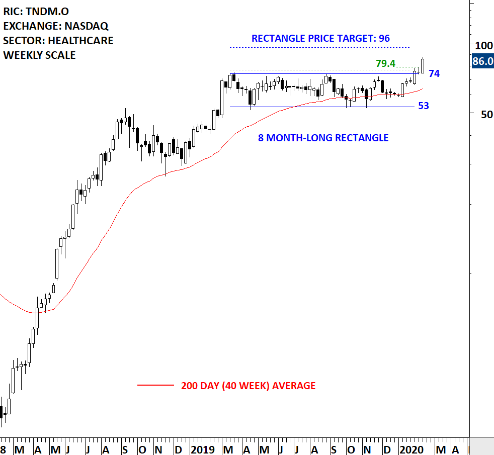
Tandem Diabetes Care, Inc. is a medical device company. The Company is engaged in designing, developing and commercializing products for people with insulin-dependent diabetes. The stock is listed on the Nasdaq Stock Exchange. Price chart formed an 8 month-long rectangle with the horizontal boundary acting as strong resistance at 74.0 levels. The horizontal boundary was tested several times over the course of the chart pattern. The daily close above 77.0 levels confirmed the breakout from the 8 month-long rectangle with the possible chart pattern price target of 96.00 levels. Tight and lengthy consolidations like these can have 2x or even 3x price targets. 2x price target stands at 118 levels (not shown on the chart)
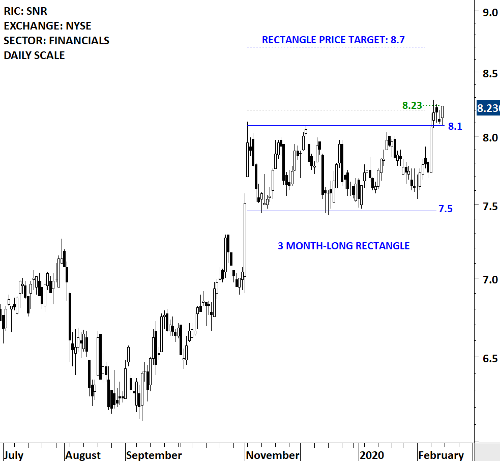
New Senior Investment Group Inc. is a real estate investment trust with a diversified portfolio of primarily private pay senior housing properties located across the United States. The stock is listed on the New York Stock Exchange. Price chart formed a 3 month-long rectangle with the horizontal boundary acting as strong resistance at 8.10 levels. The daily close above 8.20 levels confirmed the breakout from the 3 month-long rectangle with the possible chart pattern price target of 8.70 levels.
By becoming a Premium Member, you’ll be able to improve your knowledge of the principles of classical charting.
With this knowledge, you can merge them with your investing system. In fact, some investors use my analyses to modify their existing style to invest more efficiently and successfully.
You will receive:
For your convenience your membership auto renews each year.
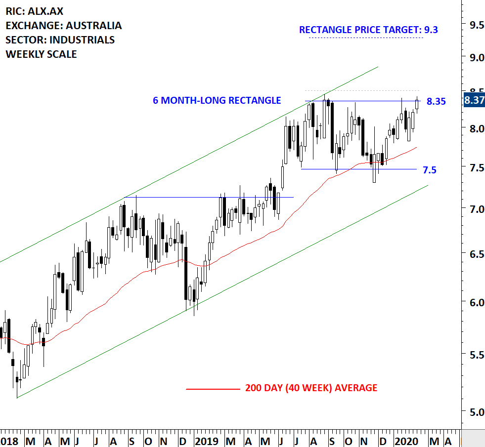
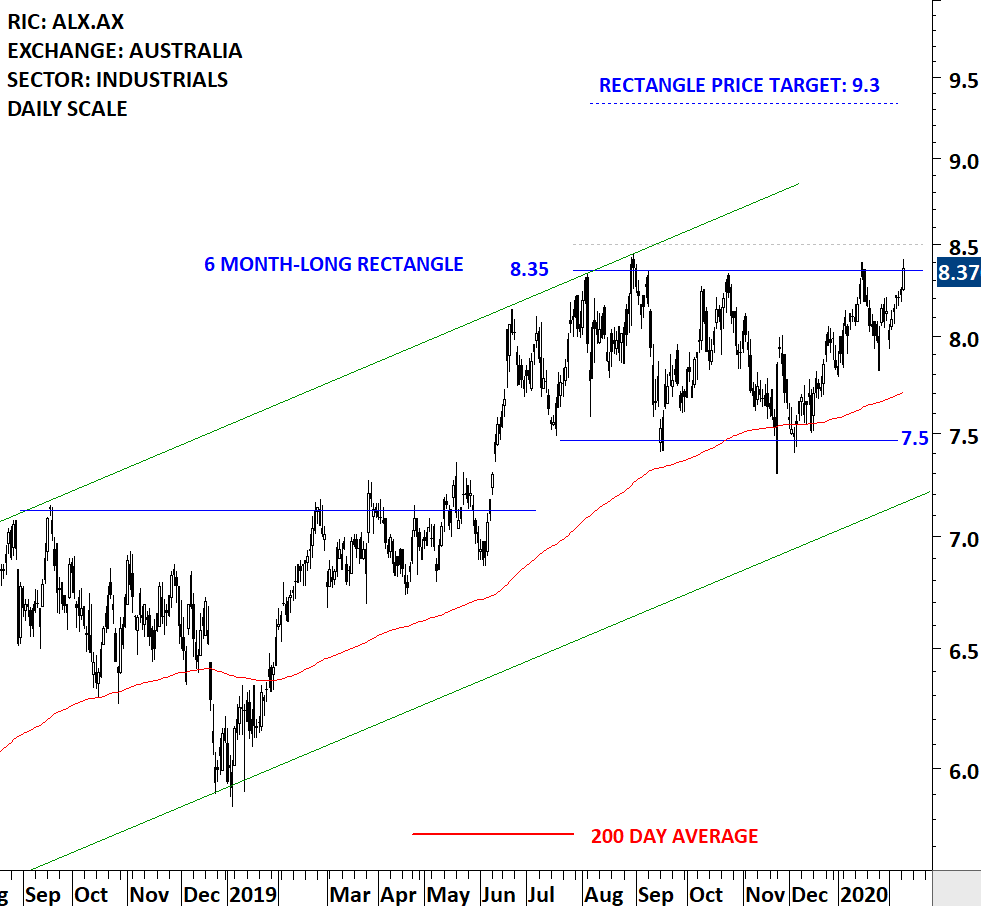
Every week Tech Charts Global Equity Markets report features some of the well-defined, mature classical chart patterns under a lengthy watchlist and the chart pattern breakout signals that took place during that week. Global Equity Markets report covers single stocks from developed, emerging and frontier markets, ETF’s and global equity indices. The report starts with a review section that highlights the important chart developments on global equity benchmarks. This blog post features from the watchlist section a rectangle breakout opportunity that is listed on Australia Stock Exchange.
Atlas Arteria Group, formerly Macquarie Atlas Roads Group, is an Australia-based global infrastructure developer, operator and investor. The stock is listed on the Australia Stock Exchange. Price chart formed a 6 month-long rectangle with the horizontal boundary acting as strong resistance at 8.35 levels. The horizontal boundary was tested several times over the course of the chart pattern. A daily close above 8.5 levels will confirm the breakout from the 6 month-long rectangle with the possible chart pattern price target of 9.3 levels. Data as of Feb 11, 2020. Please note that the last weekly candlestick includes only two days of trading. Below you can also find the daily scale price chart.
By becoming a Premium Member, you’ll be able to improve your knowledge of the principles of classical charting.
With this knowledge, you can merge them with your investing system. In fact, some investors use my analyses to modify their existing style to invest more efficiently and successfully.
You will receive:
For your convenience your membership auto renews each year.
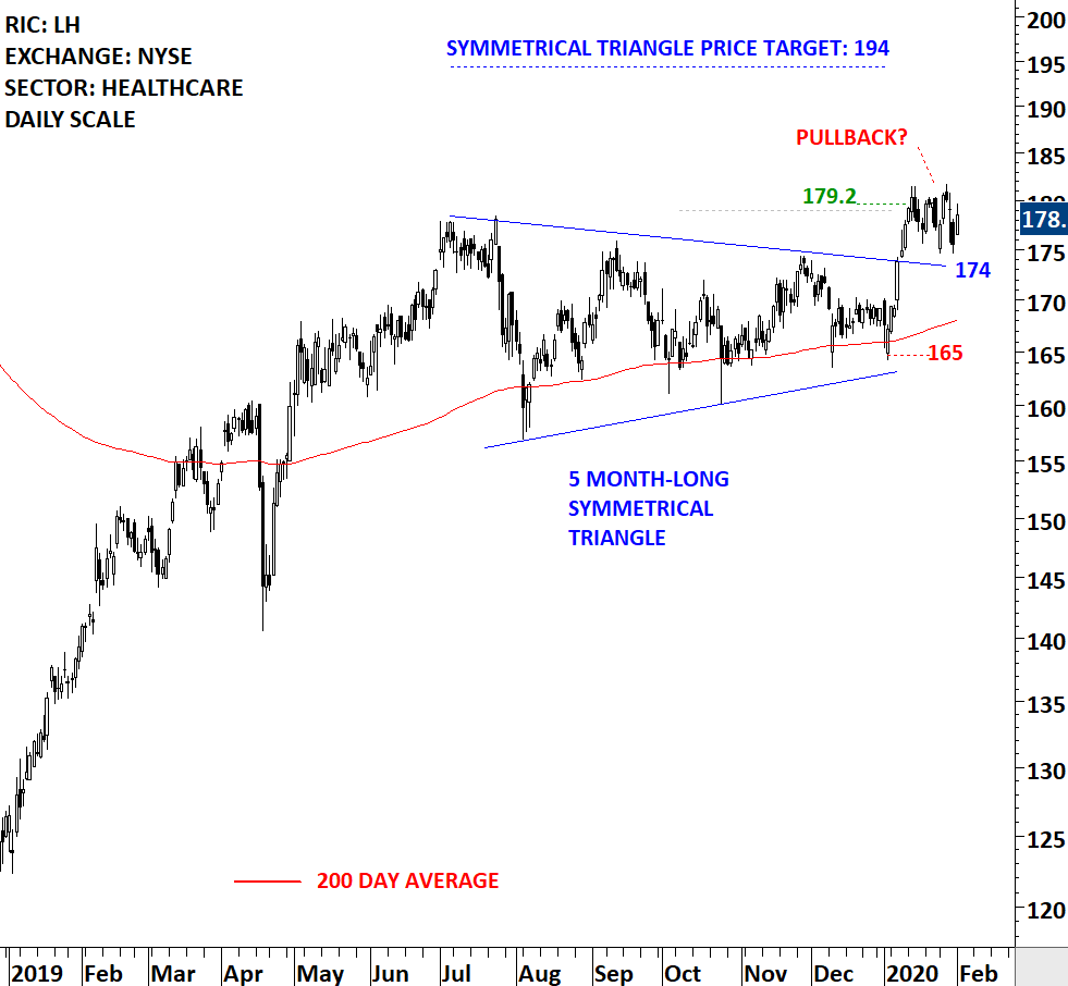
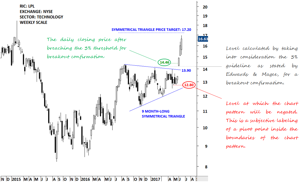
Every week Tech Charts Global Equity Markets report features some of the well-defined, mature classical chart patterns under a lengthy watchlist and the chart pattern breakout signals that took place during that week. Global Equity Markets report covers single stocks from developed, emerging and frontier markets, ETF’s and global equity indices. The report starts with a review section that highlights the important chart developments on global equity benchmarks. This blog post features from the breakout section a symmetrical triangle. Breakout signal was confirmed few weeks back and since then the stock has possibly completed a pullback. This chart is a good example to discuss the dynamics of breakouts from diagonal chart patterns. Below you will also find a short educational video on how breakouts can develop after completing symmetrical triangle chart patterns.
Laboratory Corporation of America Holdings is a life sciences company that is integrated in guiding patient care, providing clinical laboratory and end-to-end drug development services. The Company operates as a healthcare diagnostics company. The stock is listed on the New York Stock Exchange. Price chart formed a 5 month-long symmetrical triangle with the upper boundary acting as strong resistance at 174.00 levels. Both boundaries were tested several times over the course of the chart pattern. The daily close above 179.00 levels confirmed the breakout from the 5 month-long symmetrical triangle with the possible chart pattern price target of 194.00 levels. The chart below is an update with the latest data from 03/02/2020.
By becoming a Premium Member, you’ll be able to improve your knowledge of the principles of classical charting.
With this knowledge, you can merge them with your investing system. In fact, some investors use my analyses to modify their existing style to invest more efficiently and successfully.
You will receive:
For your convenience your membership auto renews each year.
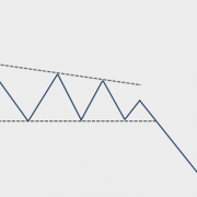
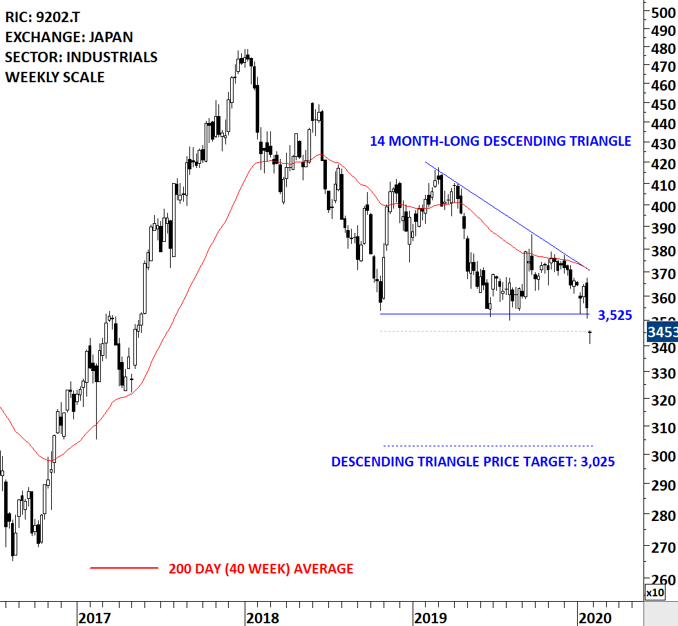
Every week Tech Charts Global Equity Markets report features some of the well-defined, mature classical chart patterns under a lengthy watchlist and the chart pattern breakout signals that took place during that week. Global Equity Markets report covers single stocks from developed, emerging and frontier markets, ETF’s and global equity indices. The report starts with a review section that highlights the important chart developments on global equity benchmarks. This blog post features from the watchlist section a bearish descending triangle that is completing on the downside. Descending triangle is a bearish chart pattern with a downward sloping upper boundary. Trading in the first two days of the week confirmed the breakdown from the 14 month-long bearish continuation chart pattern.
ANA HOLDINGS INC. is a Japan-based holding company principally engaged in the aviation business. The stock is listed on the Tokyo Stock Exchange. Price chart formed a 14 month-long descending triangle with the horizontal boundary acting as strong support at 3,525.0 levels. The horizontal boundary was tested several times over the course of the chart pattern. The daily close below 3,455.0 levels confirmed the breakdown from the 14 month-long descending triangle with the possible chart pattern price target of 3,025.0 levels. Data as of 28/01/2020. Please note that the last bar on the weekly scale price chart includes two days of trading.
By becoming a Premium Member, you’ll be able to improve your knowledge of the principles of classical charting.
With this knowledge, you can merge them with your investing system. In fact, some investors use my analyses to modify their existing style to invest more efficiently and successfully.
You will receive:
For your convenience your membership auto renews each year.

Every week Tech Charts Global Equity Markets report features some of the well-defined, mature classical chart patterns under a lengthy watchlist and the chart pattern breakout signals that took place during that week. Global Equity Markets report covers single stocks from developed, emerging and frontier markets, ETF’s and global equity indices. The report starts with a review section that highlights the important chart developments on global equity benchmarks. This blog post features from the breakouts section some of the text-book rectangle chart pattern breakouts. Rectangle is one of my favorite classical chart pattern. It has well-defined boundaries. It is easier to identify on price charts. Usually before the breakout takes place price has several tests of the chart pattern boundary. Breakouts after several tests of pattern boundary are usually powerful and are followed by strong trends.
A quick note for our new followers; the red lines on price charts are not provided as stop-loss levels. While they can be used as stop-loss, they are actually a subjective level for chart pattern negation. Chart pattern negation is different than a stop-loss. A stop-loss can be placed below the chart pattern boundary tighter or wider depending on your risk profile and other factors. I attached below a chart that explains each labeling on price charts.
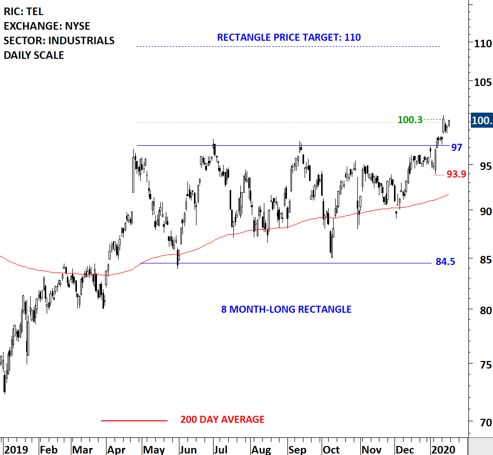
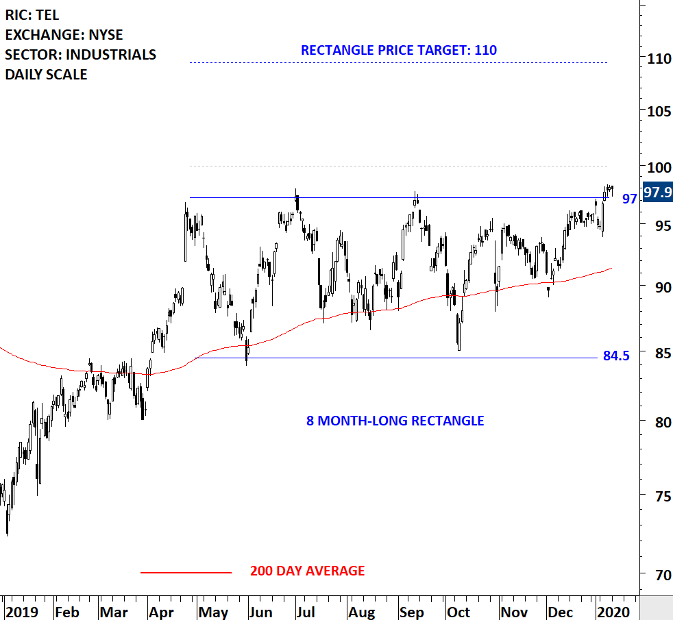
TE Connectivity Ltd. is a technology company. The Company designs and manufactures connectivity and sensors solutions. The stock is listed on the New York Stock Exchange. Price chart formed a 8 month-long ascending triangle with the horizontal boundary acting as strong resistance at 97.0 levels. The horizontal boundary was tested several times over the course of the chart pattern. The daily close above 100.0 levels confirmed the breakout from the 8 month-long ascending triangle with the possible chart pattern price target of 110.0 levels.
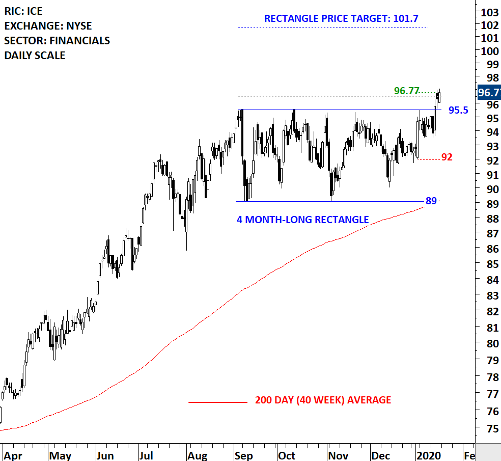
Intercontinental Exchange, Inc. is an operator of regulated exchanges, clearing houses and listings venues. The Company provides data services for commodity and financial markets. The stock is listed on the New York Stock Exchange. Price chart formed a 4 month-long rectangle with the horizontal boundary acting as strong resistance at 95.50 levels. The horizontal boundary was tested several times over the course of the chart pattern. The daily close above 96.50 levels confirmed the breakout from the 4 month-long rectangle with the possible chart pattern price target of 101.70 levels.
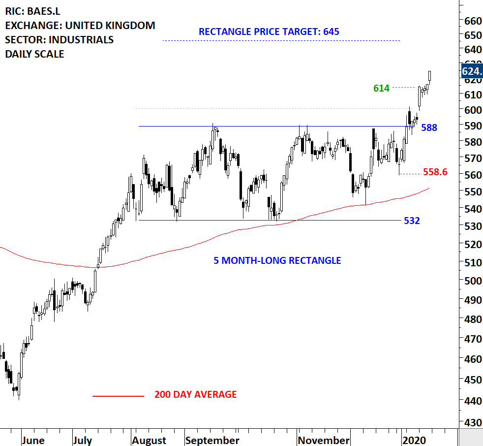
BAE Systems plc is a defense, aerospace and security company. The stock is listed on the London Stock Exchange. Price chart formed a 5 month-long rectangle with the horizontal boundary acting as strong resistance at 588.0 levels. The horizontal boundary was tested several times over the course of the chart pattern. The daily close above 600.0 levels confirmed the breakout from the 5 month-long rectangle with the possible chart pattern price target of 645.0 levels.
By becoming a Premium Member, you’ll be able to improve your knowledge of the principles of classical charting.
With this knowledge, you can merge them with your investing system. In fact, some investors use my analyses to modify their existing style to invest more efficiently and successfully.
You will receive:
For your convenience your membership auto renews each year.

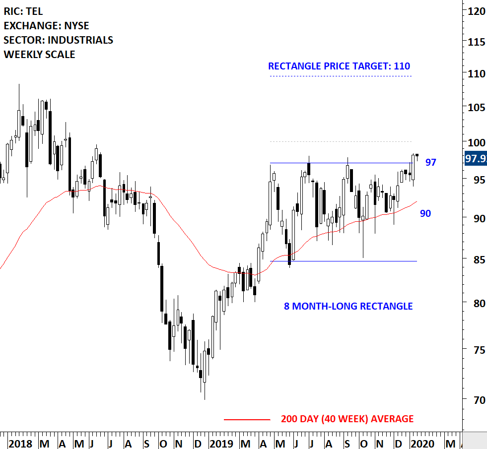
Every week Tech Charts Global Equity Markets report features some of the well-defined, mature classical chart patterns under a lengthy watchlist and the chart pattern breakout signals that took place during that week. Global Equity Markets report covers single stocks from developed, emerging and frontier markets, ETF’s and global equity indices. The report starts with a review section that highlights the important chart developments on global equity benchmarks. This blog post features from the watchlist section a rectangle chart pattern opportunity, listed on the New York Stock Exchange.
Both the weekly and daily scale price charts are featured below.
TE Connectivity Ltd. is a technology company. The Company designs and manufactures connectivity and sensors solutions. The stock is listed on the New York Stock Exchange. Price chart formed an 8 month-long rectangle with the horizontal boundary acting as strong resistance at 97.0 levels. The horizontal boundary was tested several times over the course of the chart pattern. A daily close above 100.0 levels will confirm the breakout from the 8 month-long rectangle with the possible chart pattern price target of 110.0 levels. (Data as of 13/01/2020) Last candlestick of the weekly scale price chart includes only one trading session (Monday).
By becoming a Premium Member, you’ll be able to improve your knowledge of the principles of classical charting.
With this knowledge, you can merge them with your investing system. In fact, some investors use my analyses to modify their existing style to invest more efficiently and successfully.
You will receive:
For your convenience your membership auto renews each year.