“Demystifying the world of Classical Charting”
– AKSEL KIBAR
Every week Tech Charts Global Equity Markets report features some of the well-defined, mature classical chart patterns under a lengthy watchlist and the chart pattern breakout signals that took place during that week. Global Equity Markets report covers single stocks from developed, emerging and frontier markets, ETF’s and global equity indices. The report starts with a review section that highlights the important chart developments on global equity benchmarks. This blog post features from the watchlist section Basilea Pharmaceutica AG listed on the Swiss Stock Exchange.
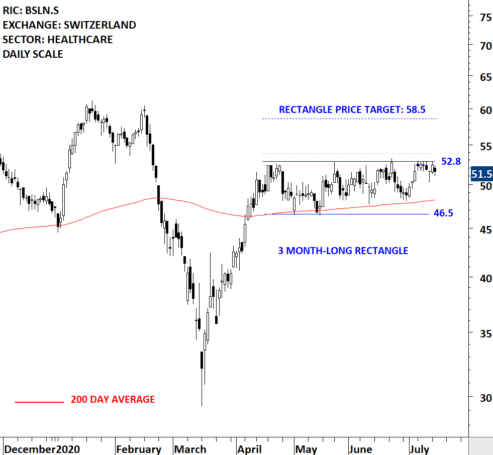
Basilea Pharmaceutica AG is a Switzerland-based company engaged in the research, development and commercialization of pharmaceutical products. The Company focuses on pharmaceutical products in the therapeutic areas of bacterial infections, fungal infections and oncology. The stock is listed on the Switzerland Stock Exchange. Price chart formed a 3 month-long rectangle with the horizontal boundary acting as strong resistance at 52.80 levels. The horizontal boundary was tested several times over the course of the chart pattern. A daily close above 53.85 levels will confirm the breakout from the 3 month-long rectangle with the possible chart pattern price target of 58.50 levels. (Data as of 14/07/2020 CET 10:45)

By becoming a Premium Member, you’ll be able to improve your knowledge of the principles of classical charting.
With this knowledge, you can merge them with your investing system. In fact, some investors use my analyses to modify their existing style to invest more efficiently and successfully.
You will receive:
For your convenience your membership auto renews each year.
Every week Tech Charts Global Equity Markets report features some of the well-defined, mature classical chart patterns under a lengthy watchlist and the chart pattern breakout signals that took place during that week. Global Equity Markets report covers single stocks from developed, emerging and frontier markets, ETF’s and global equity indices. The report starts with a review section that highlights the important chart developments on global equity benchmarks. This blog post features from the review section the China SSE 50 Index and from the watchlist section a breakout opportunity on Hisense Visual Technology Co listed on the Shanghai Stock Exchange.
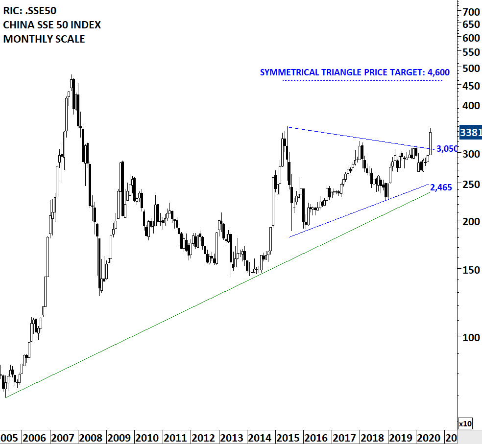
China SSE 50 Index breached the upper boundary of its possible 5 year-long symmetrical triangle. Last week’s strong performance cleared important technical levels. Breakout from the 5 year-long symmetrical triangle can set the tone for Emerging Markets performance in the coming years. Strong performance on the SSE 50 Index alerts us to consider Hong Kong and China listed equities. Below is a bullish chart pattern development on Hisense Visual Technology Co from Shanghai Stock Exchange. More and more bullish setups are developing on Chinese and Hong Kong listed equities. (Data as of 07/07/2020 CET 15:00)
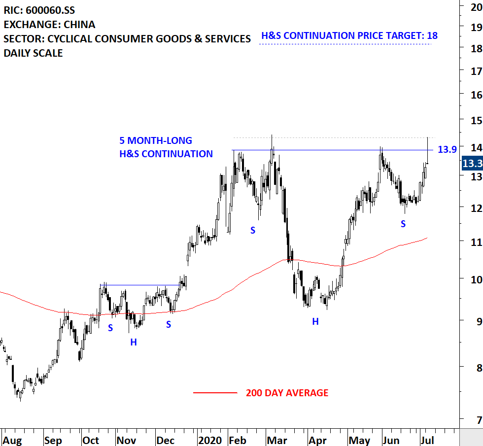
Hisense Visual Technology Co., Ltd., formerly QINGDAO HISENSE ELECTRIC CO., LTD., is a China-based company principally engaged in the manufacture and distribution of televisions. The Company’s main products are television sets, including ultra liquid crystal display (LCD) televisions, laser televisions and personal Internet televisions. The Company distributes its products in domestic and overseas markets. The stock is listed on the Shanghai Stock Exchange. Price chart formed a 5 month-long H&S continuation with the horizontal boundary acting as strong resistance at 13.90 levels. The horizontal boundary was tested several times over the course of the chart pattern. A daily close above 14.30 levels will confirm the breakout from the 5 month-long H&S continuation with the possible chart pattern price target of 18.00 levels.

By becoming a Premium Member, you’ll be able to improve your knowledge of the principles of classical charting.
With this knowledge, you can merge them with your investing system. In fact, some investors use my analyses to modify their existing style to invest more efficiently and successfully.
You will receive:
For your convenience your membership auto renews each year.
Every week Tech Charts Global Equity Markets report features some of the well-defined, mature classical chart patterns under a lengthy watchlist and the chart pattern breakout signals that took place during that week. Global Equity Markets report covers single stocks from developed, emerging and frontier markets, ETF’s and global equity indices. The report starts with a review section that highlights the important chart developments on global equity benchmarks. This blog post features from the watchlist section a flag/rectangle chart pattern that is listed on the Toronto Stock Exchange.
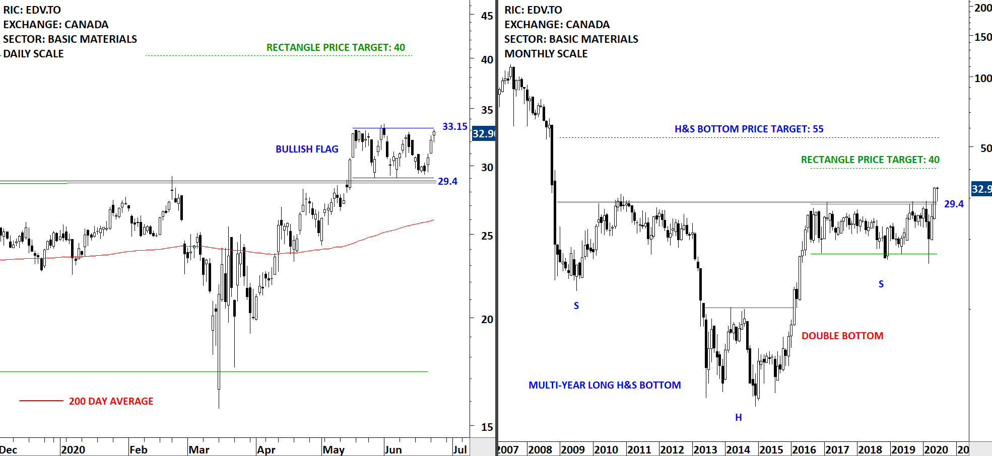
Endeavour Mining Corporation (Endeavour) is an intermediate gold producer. The Company is a gold mining company that operates four mines in Cote d’Ivoire (Agbaou and Ity), Burkina Faso (Karma) and Ghana (Nzema), along with project development and exploration assets. The stock is listed on the Toronto Stock Exchange. I’ve covered Endeavour Mining in the review section of previous reports. The long-term chart completed a multi-year long H&S bottom. The short-term price chart is possibly forming a month-long bullish flag that is acting as a pullback to the previously broken support/resistance. The horizontal boundaries for the bullish flag was tested several times over the course of the chart pattern. Current pullback can offer a new entry for those who missed the May breakout. Given the bullish chart setup on Gold ETF and cash Gold prices, mining companies can benefit from a possible breakout on Gold prices.

By becoming a Premium Member, you’ll be able to improve your knowledge of the principles of classical charting.
With this knowledge, you can merge them with your investing system. In fact, some investors use my analyses to modify their existing style to invest more efficiently and successfully.
You will receive:
For your convenience your membership auto renews each year.
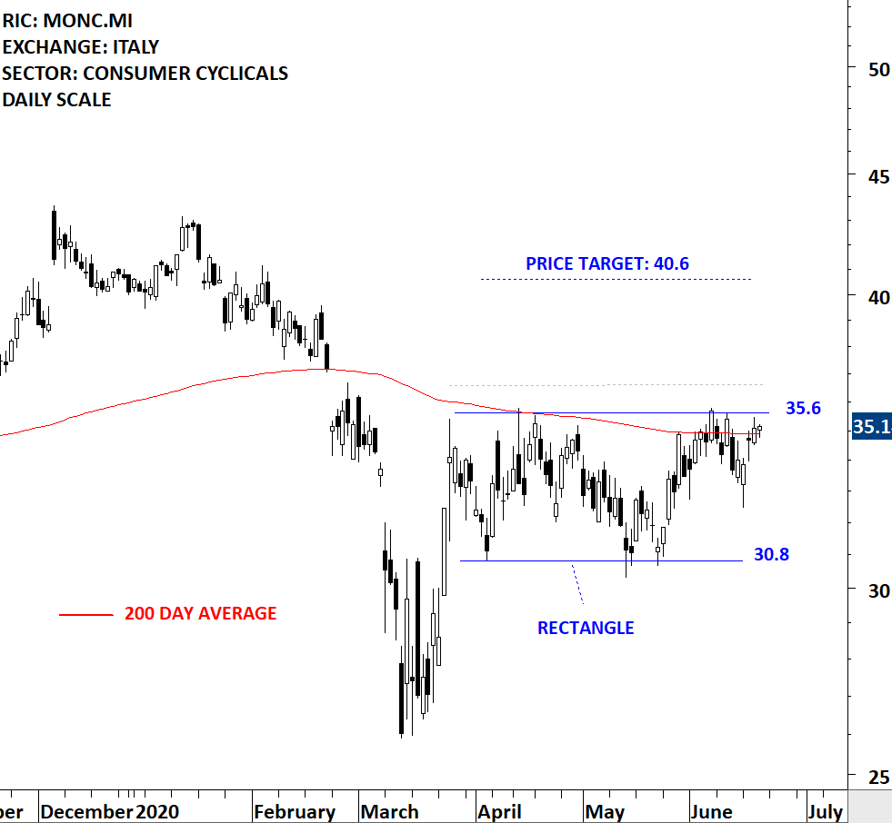
Every week Tech Charts Global Equity Markets report features some of the well-defined, mature classical chart patterns under a lengthy watchlist and the chart pattern breakout signals that took place during that week. Global Equity Markets report covers single stocks from developed, emerging and frontier markets, ETF’s and global equity indices. The report starts with a review section that highlights the important chart developments on global equity benchmarks. This blog post features from the watchlist section a rectangle chart pattern that is listed on the Milan Stock Exchange.
Moncler SpA is an Italy-based company engaged in fashion industry. The Company designs, produces and distributes clothing and accessories through Moncler brand. The stock is listed on the Milan Stock Exchange. Over the past 3 months the stock formed a short-term consolidation between 30.8 and 35.6 levels. The short-term consolidation can be identified as rectangle. A daily close above 36.6 levels will confirm the breakout with the possible chart pattern price target of 40.6 levels. Breakout from the rectangle can also clear the 200-day average which is acting as resistance at the same level. I’ve adjusted the upper boundary of the rectangle to 35.6 levels to better reflect the boundaries of the consolidation range. (Data as of June 18, 2020 CET 10:30 AM) (Learn more: Video Tutorial)

By becoming a Premium Member, you’ll be able to improve your knowledge of the principles of classical charting.
With this knowledge, you can merge them with your investing system. In fact, some investors use my analyses to modify their existing style to invest more efficiently and successfully.
You will receive:
For your convenience your membership auto renews each year.
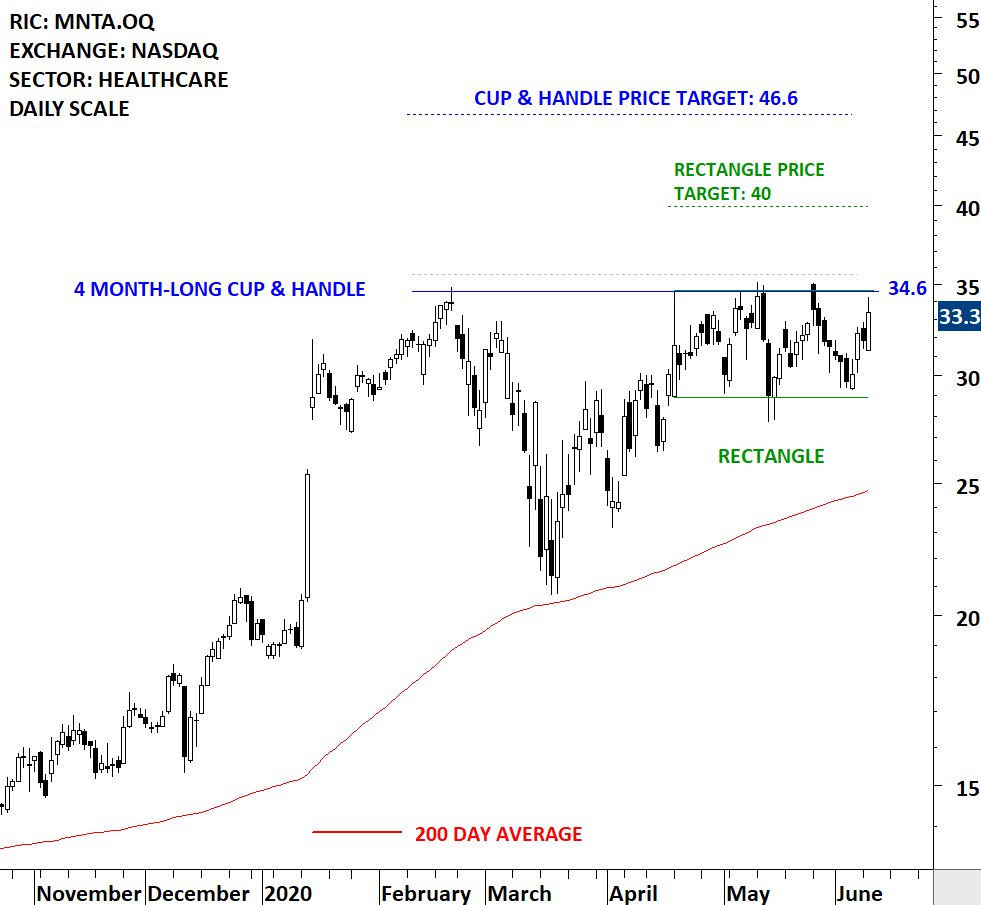
Every week Tech Charts Global Equity Markets report features some of the well-defined, mature classical chart patterns under a lengthy watchlist and the chart pattern breakout signals that took place during that week. Global Equity Markets report covers single stocks from developed, emerging and frontier markets, ETF’s and global equity indices. The report starts with a review section that highlights the important chart developments on global equity benchmarks. This blog post features from the watchlist section a cup & handle continuation chart pattern listed on the Nasdaq Stock Exchange.
Also you will find below a short educational video on how to identify a cup & handle continuation chart pattern, how to measure price objective and what to expect following the breakout.
If you are interested to learn more about classical charting principles and fine points on how to trade those breakout opportunities, our annual special discount is still ongoing and finalizing today (June 10th). You can get access to everything on Tech Charts website for $29 for 3 months (special discounted price is valid for the first 3 months only). More than 35 educational videos, each with 5-10 min of important points to look for on a classical chart pattern.
Here is the link for special 3rd anniversary discount >> GET ACCESS NOW
Momenta Pharmaceuticals, Inc. is a biotechnology company. The Company is focused on developing generic versions of drugs, biosimilars and therapeutics for oncology and autoimmune disease. The stock is listed on the Nasdaq Stock Exchange. Price chart formed a 4 month-long cup & handle continuation with the horizontal boundary acting as strong resistance at 34.60 levels. The horizontal boundary was tested several times over the course of the chart pattern. A daily close above 35.60 levels will confirm the breakout from the 4 month-long cup & handle continuation with the possible chart pattern price target of 46.60 levels. The handle part of the chart pattern can be identified as a rectangle with the possible chart pattern price target of 40 levels. (Data as of June 9, 2020)

By becoming a Premium Member, you’ll be able to improve your knowledge of the principles of classical charting.
With this knowledge, you can merge them with your investing system. In fact, some investors use my analyses to modify their existing style to invest more efficiently and successfully.
You will receive:
For your convenience your membership auto renews each year.
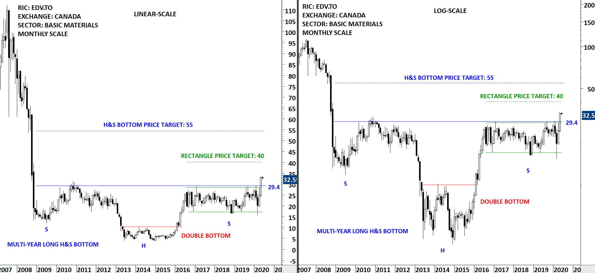
Every week Tech Charts Global Equity Markets report features some of the well-defined, mature classical chart patterns under a lengthy watchlist and the chart pattern breakout signals that took place during that week. Global Equity Markets report covers single stocks from developed, emerging and frontier markets, ETF’s and global equity indices. The report starts with a review section that highlights the important chart developments on global equity benchmarks and miscellaneous charts of interest. This blog post features from the review section a long-term base formation and a breakout opportunity that is listed on Toronto Stock Exchange.
Endeavour Mining Corporation (Endeavour) is an intermediate gold producer. The Company is a gold mining company that operates four mines in Cote d’Ivoire (Agbaou and Ity), Burkina Faso (Karma) and Ghana (Nzema), along with project development and exploration assets. The stock is listed on Toronto Stock Exchange. Price chart formed a multi-year long rectangle as part of a possible decade-long H&S bottom. This is a very long-term chart pattern and should be given enough room with protective stops. I would view it as a long-term breakout opportunity. I added both the linear scale and logarithmic scale price charts (difference between log and linear scale price charts). Rectangle chart pattern has a possible price target of 40 and the price objective for the H&S bottom is at 55 levels.

By becoming a Premium Member, you’ll be able to improve your knowledge of the principles of classical charting.
With this knowledge, you can merge them with your investing system. In fact, some investors use my analyses to modify their existing style to invest more efficiently and successfully.
You will receive:
For your convenience your membership auto renews each year.
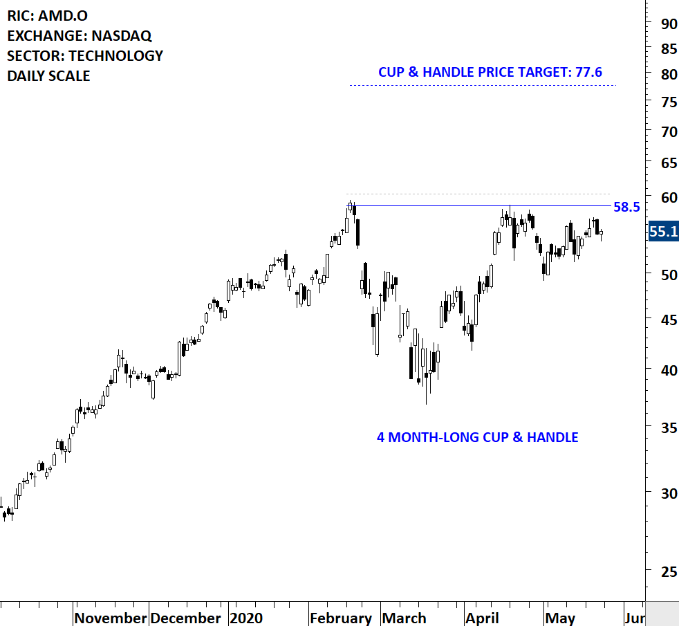
Every week Tech Charts Global Equity Markets report features some of the well-defined, mature classical chart patterns under a lengthy watchlist and the chart pattern breakout signals that took place during that week. Global Equity Markets report covers single stocks from developed, emerging and frontier markets, ETF’s and global equity indices. The report starts with a review section that highlights the important chart developments on global equity benchmarks. This blog post features from the watchlist section a cup & handle continuation chart pattern listed on the Nasdaq Stock Exchange.
Advanced Micro Devices, Inc. is a global semiconductor company. The Company is engaged in offering x86 microprocessors, as standalone devices or as incorporated into an accelerated processing unit (APU), chipsets, discrete graphics processing units (GPUs) and professional graphics, and server and embedded processors and semi-custom System-on-Chip (SoC) products and technology for game consoles. The stock is listed on the Nasdaq Stock Exchange. Price chart formed a 4 month-long cup & handle with the horizontal boundary acting as strong resistance at 58.5 levels. The horizontal boundary was tested several times over the course of the chart pattern. A daily close above 60.2 levels will confirm the breakout from the 4 month-long cup & handle with the possible chart pattern price target of 77.6 levels.

By becoming a Premium Member, you’ll be able to improve your knowledge of the principles of classical charting.
With this knowledge, you can merge them with your investing system. In fact, some investors use my analyses to modify their existing style to invest more efficiently and successfully.
You will receive:
For your convenience your membership auto renews each year.
Every week Tech Charts Global Equity Markets report features some of the well-defined, mature classical chart patterns under a lengthy watchlist and the chart pattern breakout signals that took place during that week. Global Equity Markets report covers single stocks from developed, emerging and frontier markets, ETF’s and global equity indices. The report starts with a review section that highlights the important chart developments on global equity benchmarks. This blog post features from the watchlist section a head and shoulder bottom reversal chart pattern that is listed on the Paris Stock Exchange.
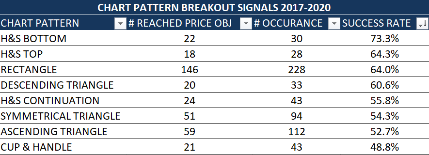
Over the past 3 years (2017-2020) Tech Charts Global Equity Markets report alerted members on 616 breakouts and breakdowns (long and short opportunities). The compiled statistics on those breakouts are as below. A chart pattern once completed with a confirmed breakout either reaches its chart pattern price target (successful) or it reaches chart pattern negation level (failed). It is interesting to note that H&S bottom reversal has been one of the best performing chart pattern followed by another H&S; the H&S top reversal. More detailed statistics will be shared during our members annual review which should take place by end of May.
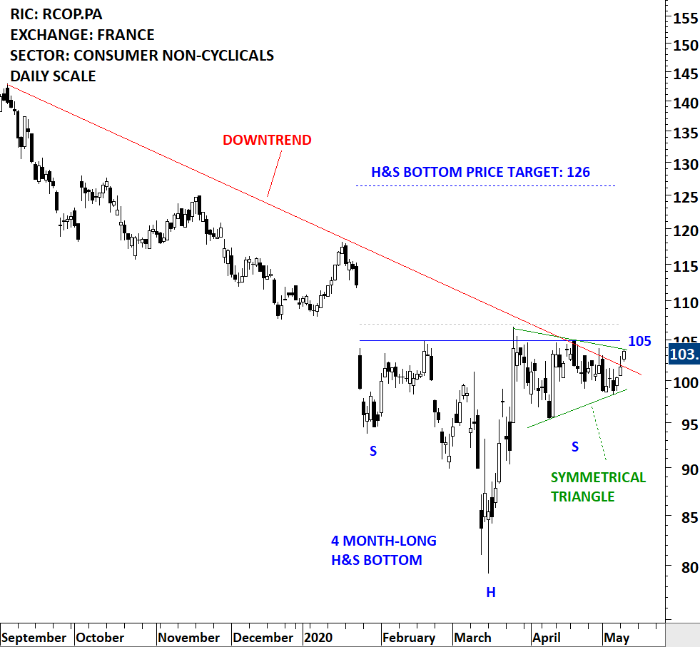
Remy Cointreau SA is a France-based company engaged in the production and distribution of wines and spirits. The stock is listed on the Paris Stock Exchange. Price chart formed a 4 month-long head and shoulder bottom with the horizontal boundary acting as strong resistance at 105.0 levels. The horizontal boundary was tested several times over the course of the chart pattern. A daily close above 107.0 levels will confirm the breakout from the 4 month-long head and shoulder bottom with the possible chart pattern price target of 126.0 levels. (Data as of May 12, 2020, CET 13:00)

By becoming a Premium Member, you’ll be able to improve your knowledge of the principles of classical charting.
With this knowledge, you can merge them with your investing system. In fact, some investors use my analyses to modify their existing style to invest more efficiently and successfully.
You will receive:
For your convenience your membership auto renews each year.
Every week Tech Charts Global Equity Markets report features some of the well-defined, mature classical chart patterns under a lengthy watchlist and the chart pattern breakout signals that took place during that week. Global Equity Markets report covers single stocks from developed, emerging and frontier markets, ETF’s and global equity indices. The report starts with a review section that highlights the important chart developments on global equity benchmarks. This blog post features from the breakout alerts section a rectangle chart pattern that completed on the Nikkei Stock Exchange.
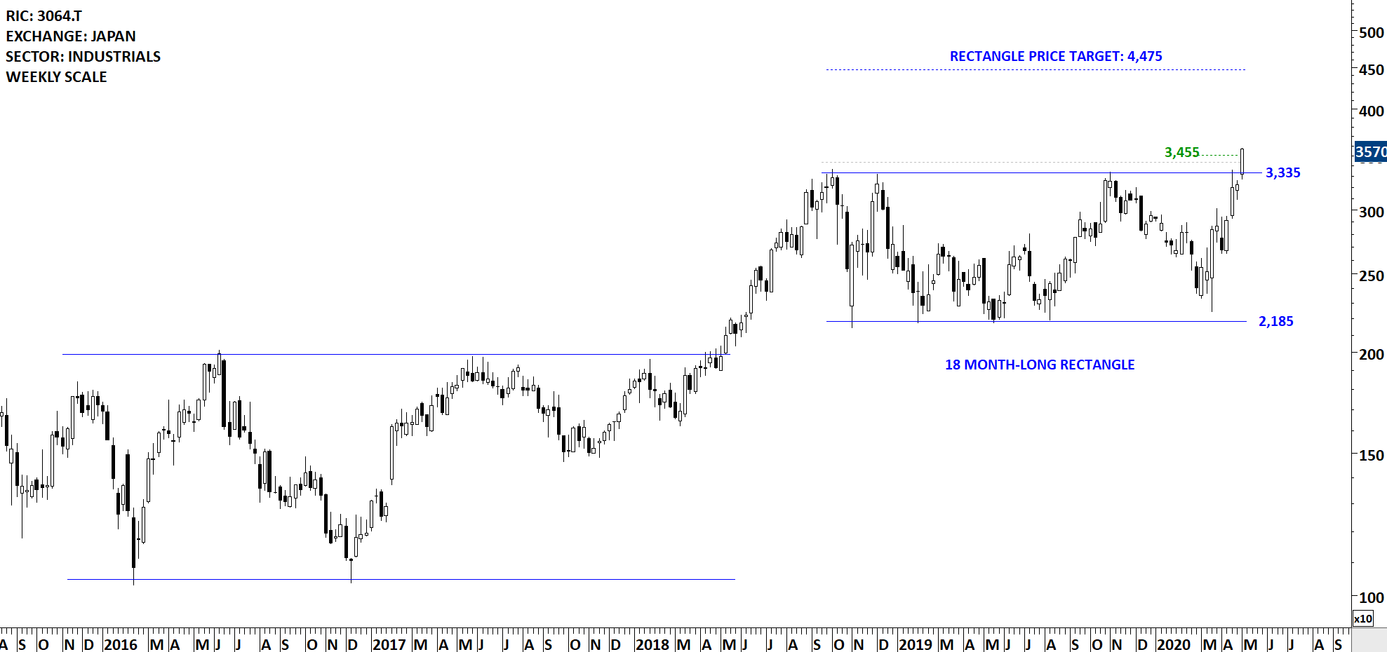
MonotaRO Co.,Ltd. is a Japan-based company principally engaged in the sale of factory indirect materials. The Company sells factory indirect materials to customers, mainly small and medium-sized manufacturing companies in Japan and overseas, by mail order using e-commerce (distribution based on the Internet). The stock is listed on the Tokyo Stock Exchange. Price chart formed an 18 month-long rectangle with the horizontal boundary acting as strong resistance at 3,335.0 levels. The horizontal boundary was tested several times over the course of the chart pattern. The daily close above 3,435.0 levels confirmed the breakout from the 18 month-long rectangle with the possible chart pattern price target of 4,475.0 levels.
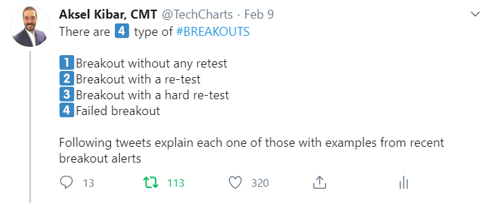
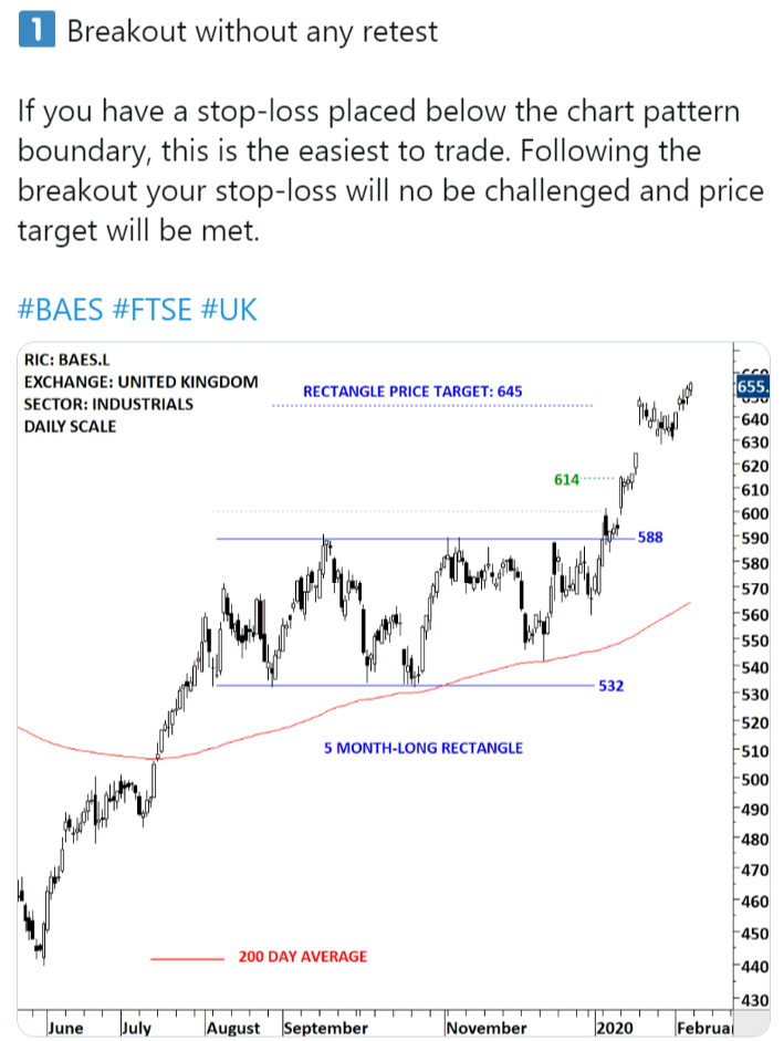
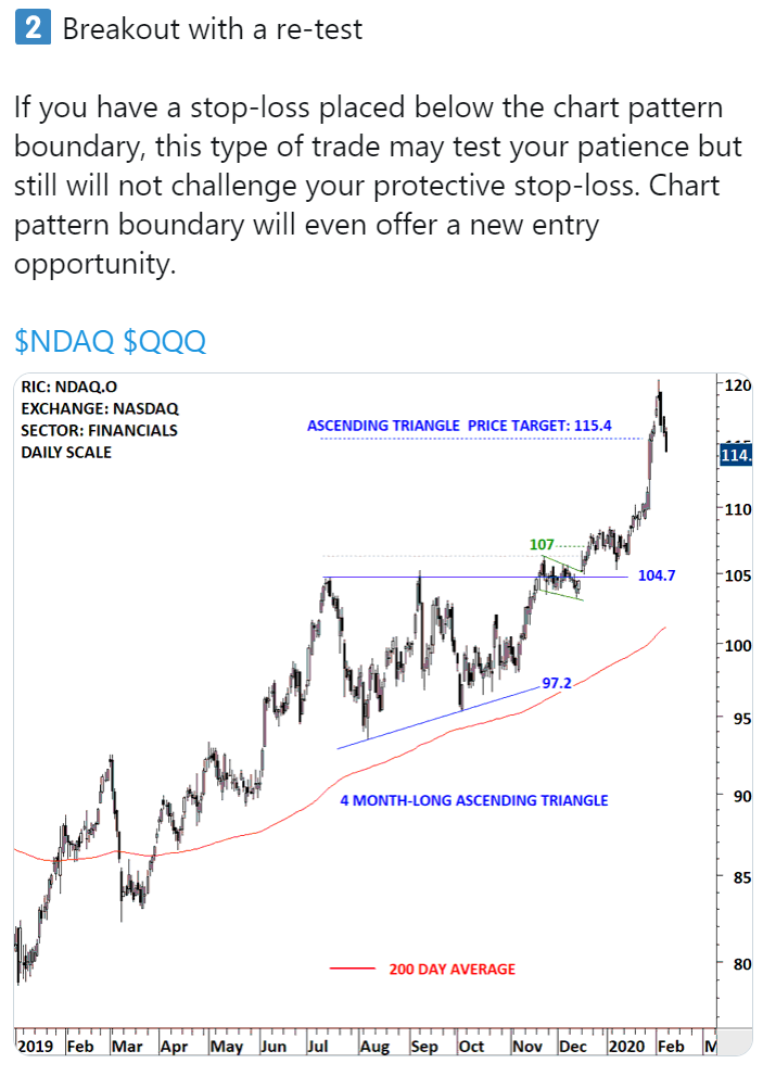
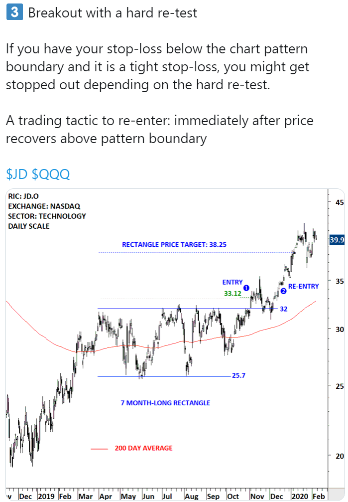
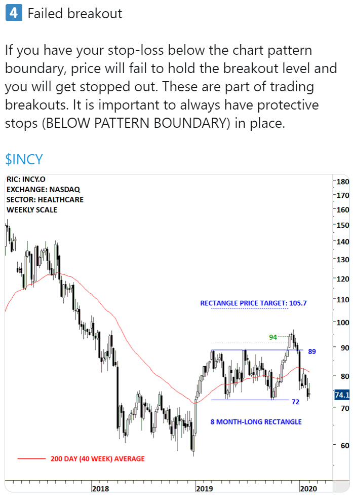
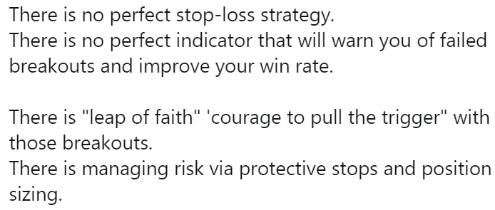
Depending on each trader/investor risk profile a stop-loss can be placed below the chart pattern boundary at 3,335 levels. There are different types of breakouts. I discussed 4 types of breakouts in a twitter thread. I also attached it below for your reference.

By becoming a Premium Member, you’ll be able to improve your knowledge of the principles of classical charting.
With this knowledge, you can merge them with your investing system. In fact, some investors use my analyses to modify their existing style to invest more efficiently and successfully.
You will receive:
For your convenience your membership auto renews each year.
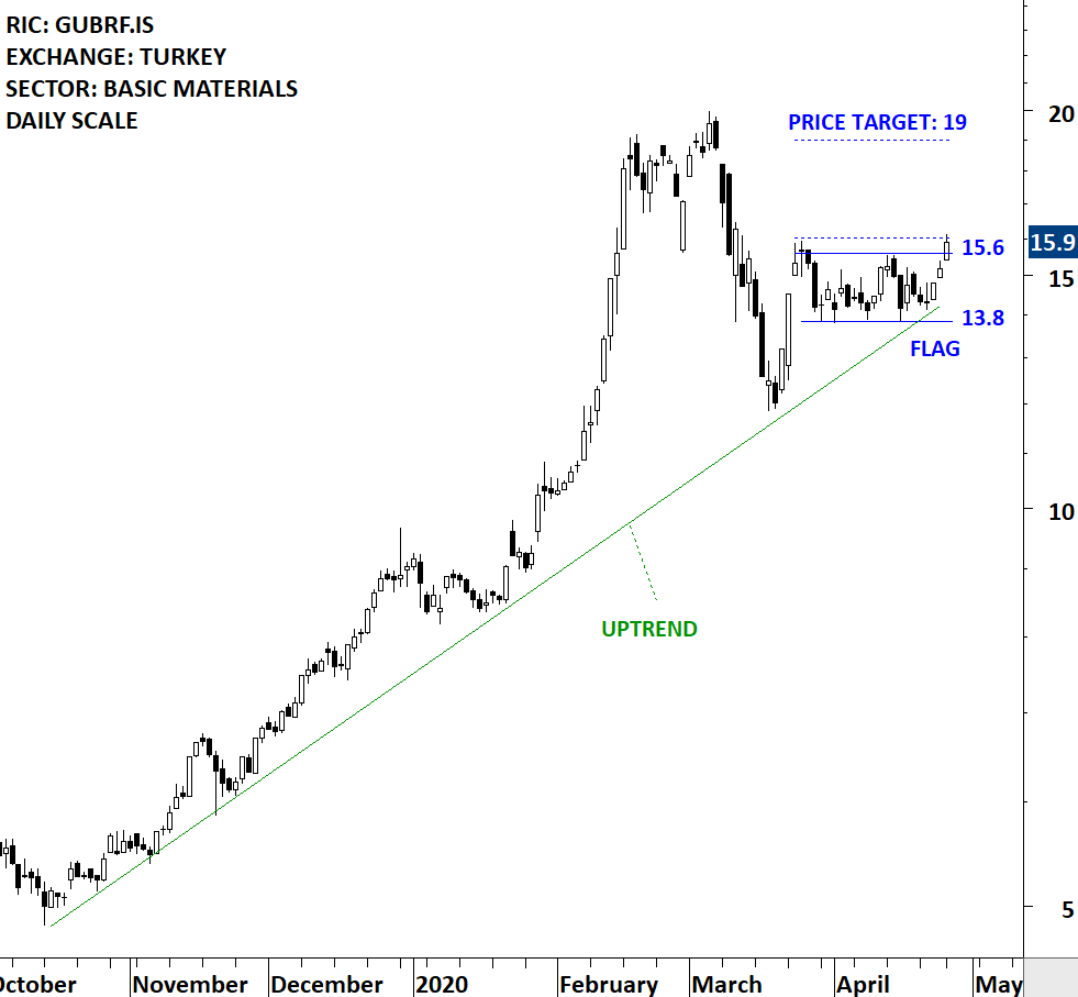
Every week Tech Charts Global Equity Markets report features some of the well-defined, mature classical chart patterns under a lengthy watchlist and the chart pattern breakout signals that took place during that week. Global Equity Markets report covers single stocks from developed, emerging and frontier markets, ETF’s and global equity indices. The report starts with a review section that highlights the important chart developments on global equity benchmarks. This blog post features from the watchlist section a flag chart pattern on Gubre Fabrikalari that is listed on the Istanbul Stock Exchange.
Gubre Fabrikalari TAS (Gubretas) is a Turkey-based company engaged in the production and marketing of chemical fertilizers, including solid fertilizers, liquid fertilizers, powder-based fertilizers and organic fertilizers. The stock is listed on the Istanbul Stock Exchange. Price chart formed a 1 month-long flag with the horizontal boundary acting as resistance at 15.6 levels. The horizontal boundary was tested several times over the course of the chart pattern. A daily close above 16.0 levels will confirm the breakout from the 1 month-long flag with the possible chart pattern price target of 19.0 levels.

By becoming a Premium Member, you’ll be able to improve your knowledge of the principles of classical charting.
With this knowledge, you can merge them with your investing system. In fact, some investors use my analyses to modify their existing style to invest more efficiently and successfully.
You will receive:
For your convenience your membership auto renews each year.

