CBOE VIX (VOLATILITY INDEX)

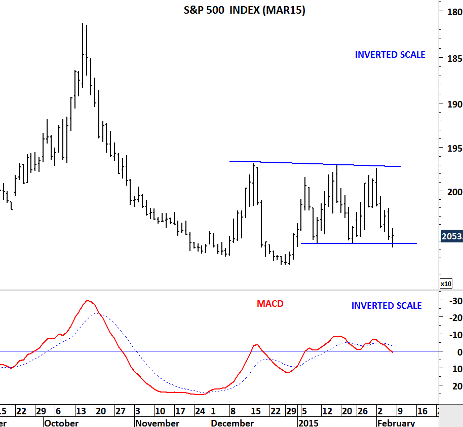
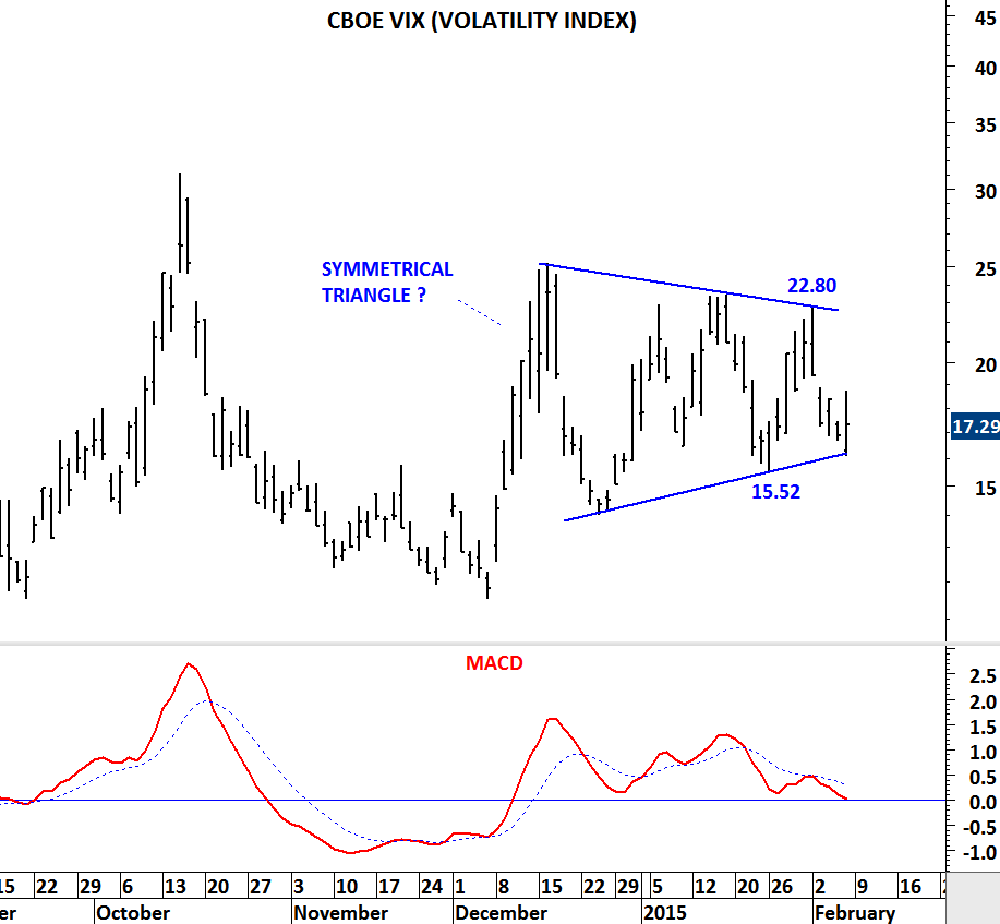
During the sharp correction in October 2014, S&P 500 index reached 1,800 levels and CBOE VIX jumped to 31 levels. VIX is often called the “fear index”. Higher levels of VIX can coincide with market corrections. Over the past 2 months CBOE VIX has been consolidating in a tight range. Consolidation can be a symmetrical triangle. Breakout from this consolidation will result in high volatility for U.S. equities. Breakout above 22.80 levels can send the VIX to 35-40 area. Breakdown below 15.52 levels will be positive for equities. I have posted the S&P 500 index futures on an inverted scale to see the price movements in sync with the VIX. Symmetrical triangle chart pattern (if it is a valid one) should resolve in the next few days/week.

CBOE VIX

S&P 500 INDEX

S&P 500 INDEX (MAR 2015) FUTURES PRICE

AUSTRIA VIENNA ATX INDEX

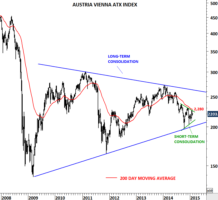
Austria Vienna ATX Index formed similar chart patterns in different time frames. Since 2009 the index has been consolidating in a wide range. Long-term chart pattern is a symmetrical triangle. Over the past six months, ATX index formed a short/medium-term consolidation; another symmetrical triangle. Direction of the breakout from the short-term consolidation range will be important. Breakout above 2,280 levels will push the index towards 2,500. Breakdown below 2,000-2,100 range can be very negative in the long-term.

AUSTRIA VIENNA ATX INDEX

CBOE VIX (VOLATILITY INDEX)

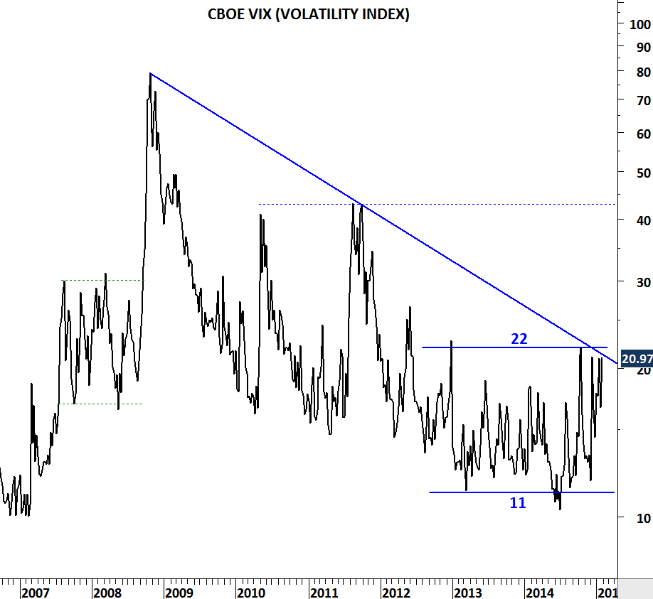
Volatility can move higher in the following months if we see a decisive weekly close above 22 levels. In the last two years CBOE VIX consolidated in a range between 11 and 22. Six year-long downward trend line and the upper boundary of the horizontal consolidation range meet at 22 levels. A decisive break above 22 levels can result in a sharp upward move towards 40-45 area. Such price action will be bearish for global equity markets. It is important to keep a close eye on this chart development in the next few months.

CBOE VIX

Chart is plotted on a weekly scale and closing prices are taken into consideration.

MSCI EMERGING MARKETS INDEX

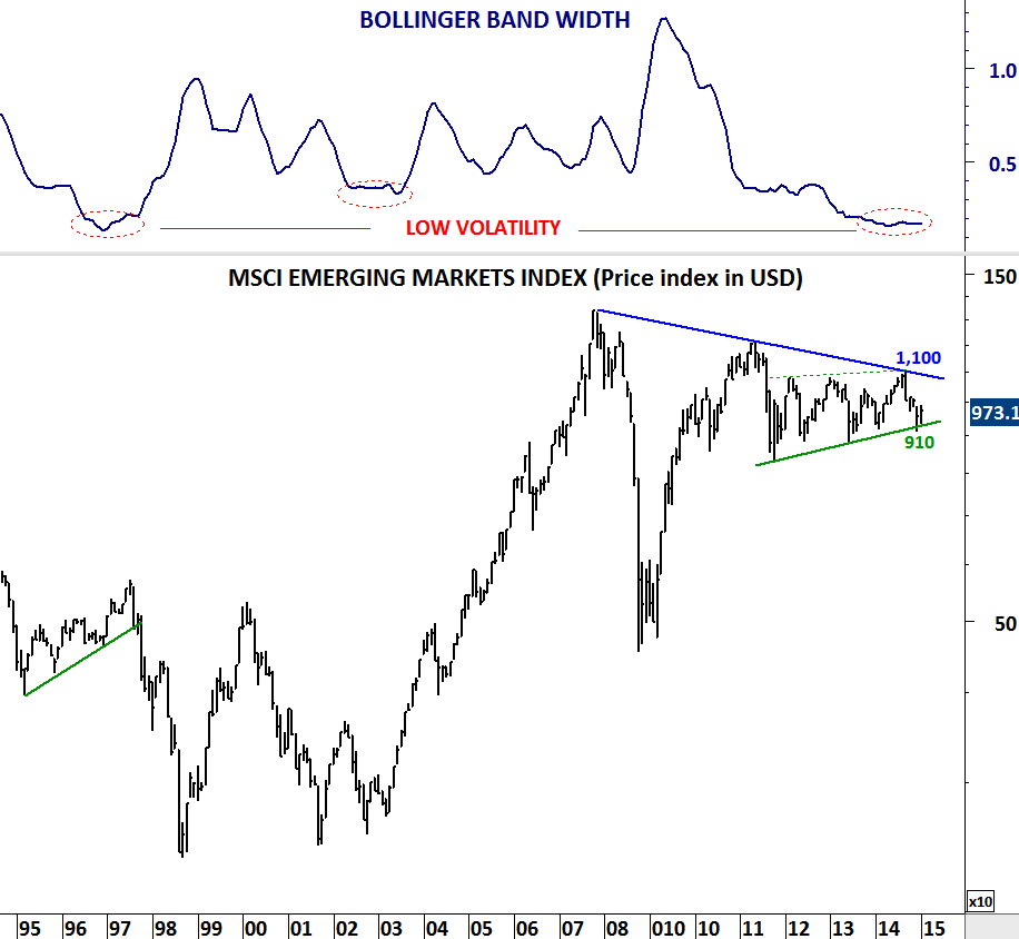
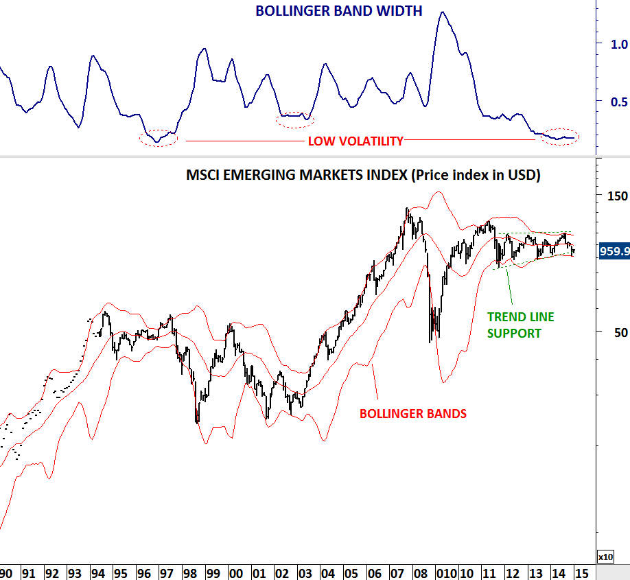
Strong trends usually emerge from low volatility periods. Low volatility reading on long-term charts is more significant. MSCI Emerging Markets index is getting closer to a strong directional movement after the band width reached multi-decade low level. Index is now in a tight range between 910 and 1,100 levels. Breakout in either direction will result in a strong move. Last two year’s choppy sideways trading is a sign of weakness. Though, I would wait for a decisive close above or below the mentioned levels.

MSCI EMERGING MARKETS INDEX

FEEDER CATTLE

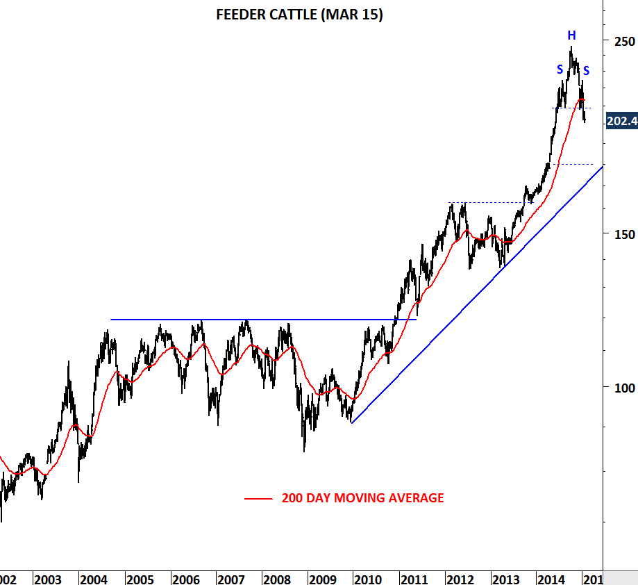
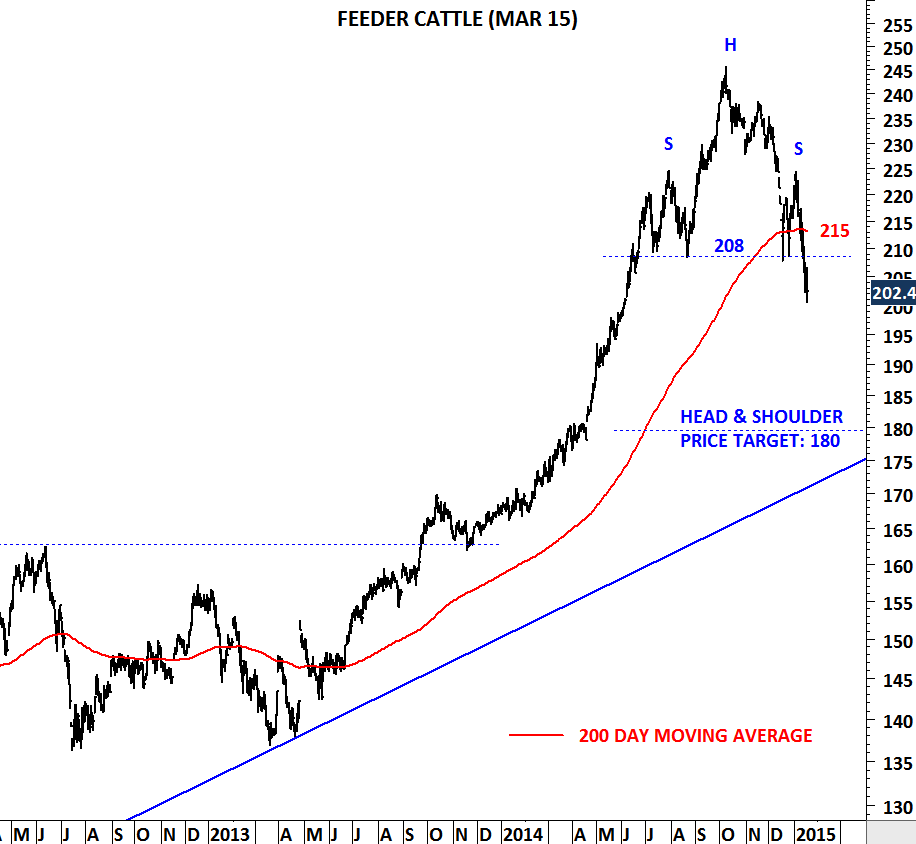
FEEDER CATTLE had a strong bull market since its long-term breakout in 2010. Though, this uptrend might be over. Feeder Cattle which had a strong rally after breaking out of its 2005-2010 consolidation period, formed a head & shoulder top chart pattern. Both the neckline and the 200-day moving average were between 208-215 area. Price broke down the neckline and the 200-day moving average. Possible H&S price target remains at 180 levels. Unless we see Feeder Cattle price climbing back above 208-215 area in the following days/weeks, expectation will be lower prices towards 180 levels.

Note: Analyzed chart is the March 2015 Feeder Cattle futures contract that trades on the CME. For more information you can follow this –> More info on FEEDER CATTLE

FEEDER CATTLE I

FEEDER CATTLE II

COPPER vs. GOLD

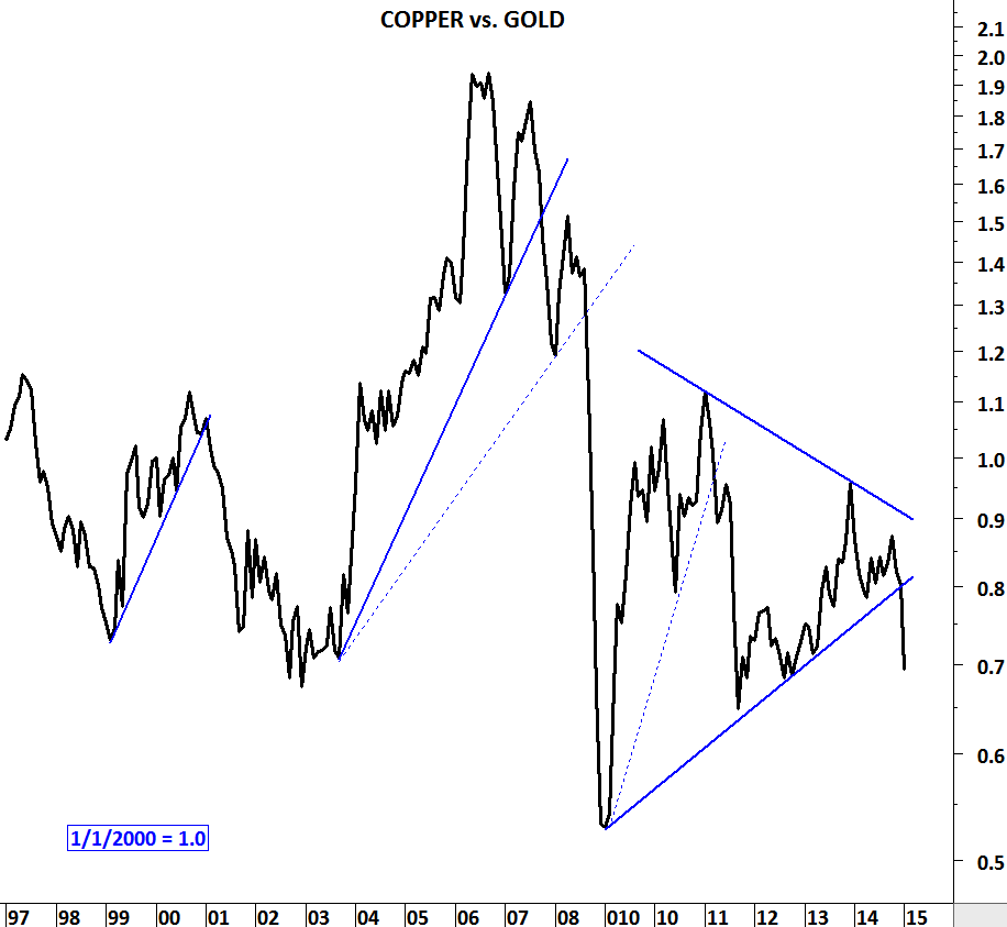
Over the past two decades Copper underperformed Gold during turbulent times in the financial markets. Ratio between Copper and Gold declined sharply during 2000-2003 and 2007-2009 periods. Latest breakdown from the consolidation range can result in further underperformance for Copper. This is a powerful long-term chart with a strong message.

COPPER vs GOLD

NIKKEI 225 & EURO STOXX 50

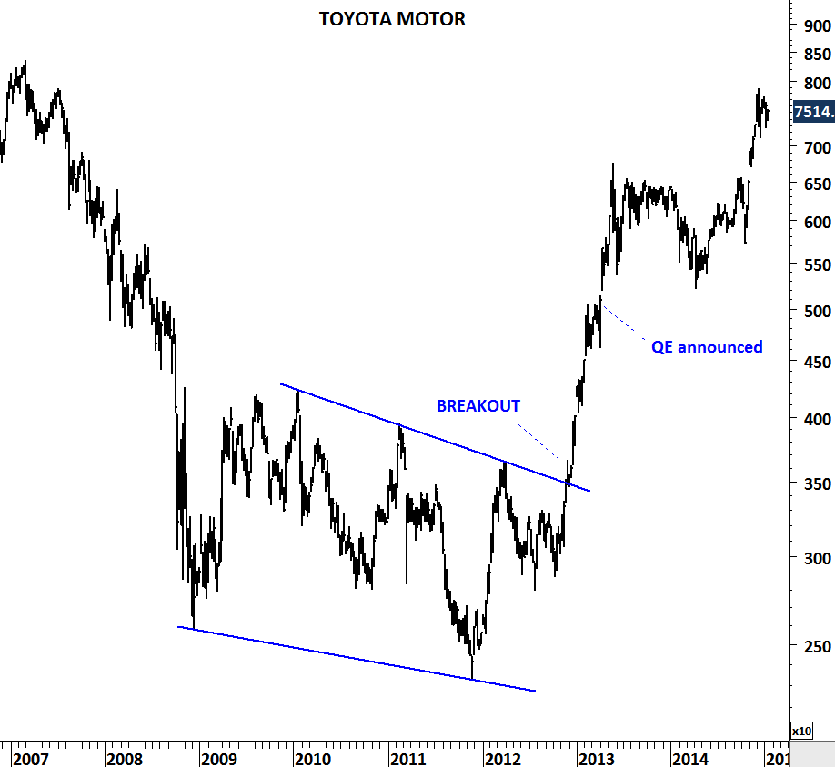
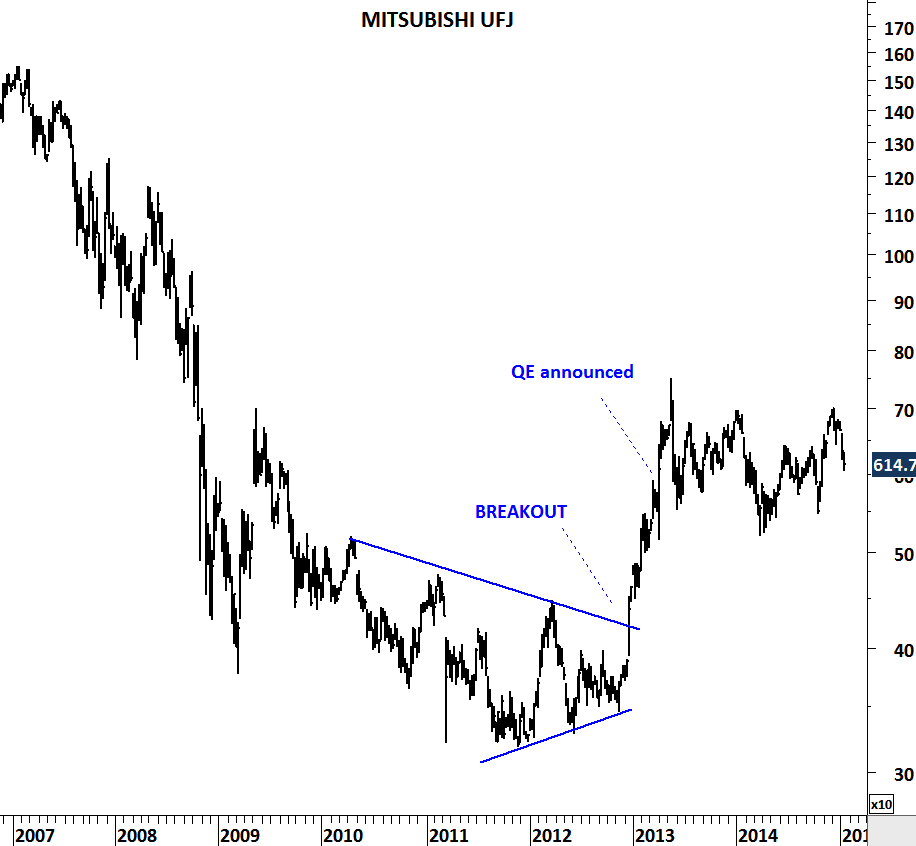
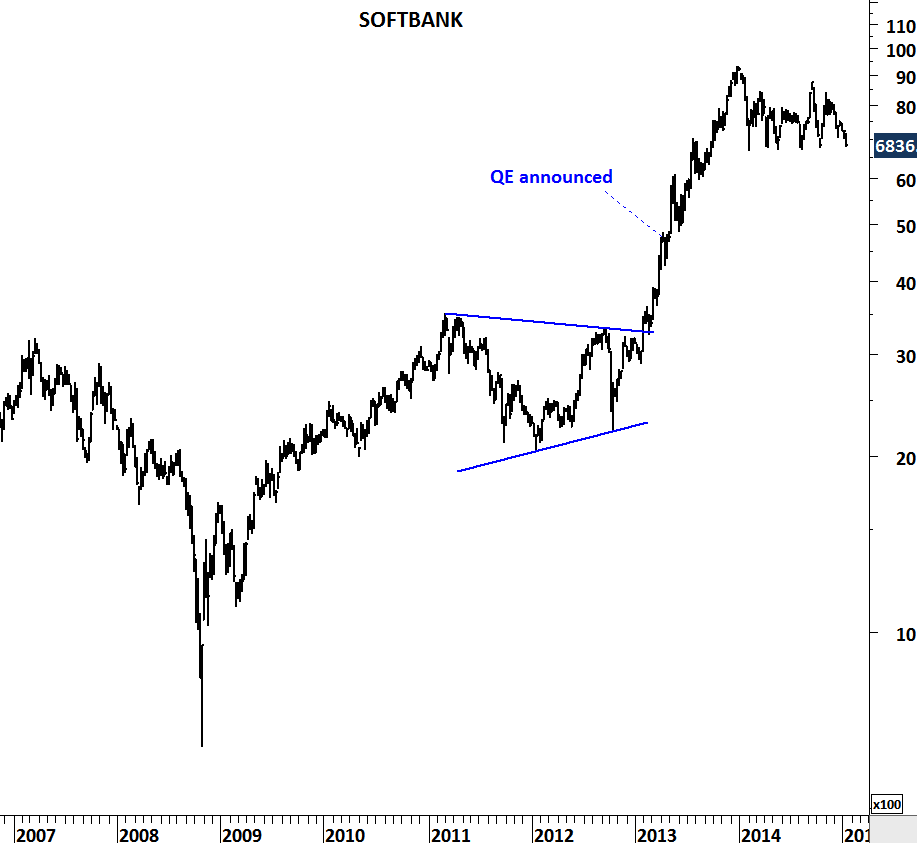
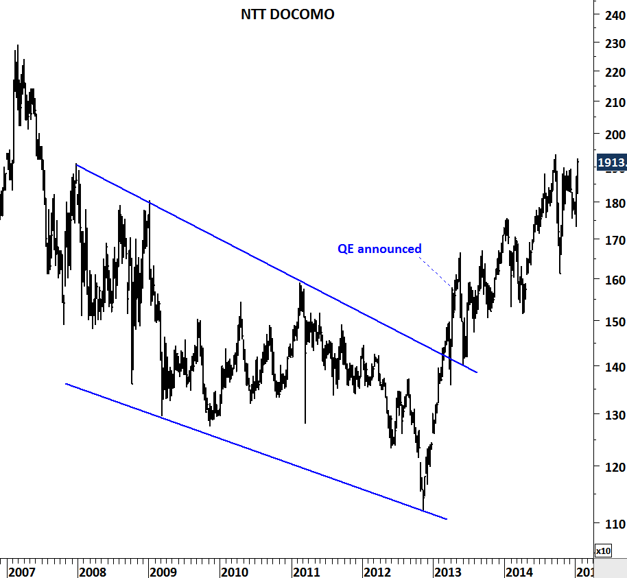
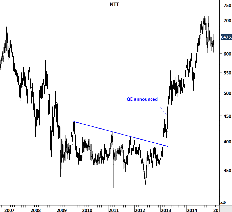
When Japan’s Central Bank announced its QE program in April 2013 it was a big surprise for the public at least according to the way some of the mainstream media announced it. The Independent wrote “Japan tries shock and awe to jump-start stalled economy”. At the time Japan had already elected a new government which signaled monetary easing.

I reviewed the top 5 names in the widely followed Japanese equity benchmark – Nikkei 225. Most of the names anticipated the monetary easing and broke out of their multi-year base formations. When the QE was announced it was a confirmation for the market rather than a surprise. Below are the top 5 names from the Nikkei 225. Markets are discounting mechanisms.

TOYOTA MOTORS

MITSUBISHI

SOFTBANK

NTT DOCOMO

NTT

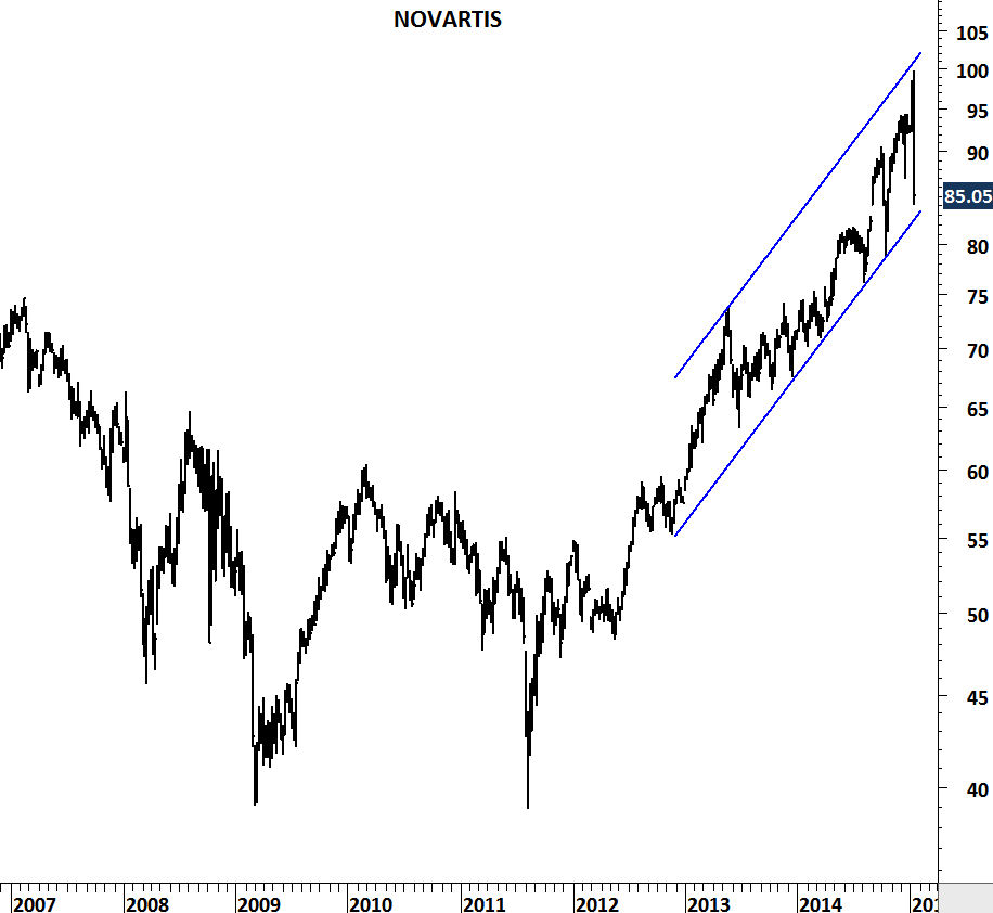
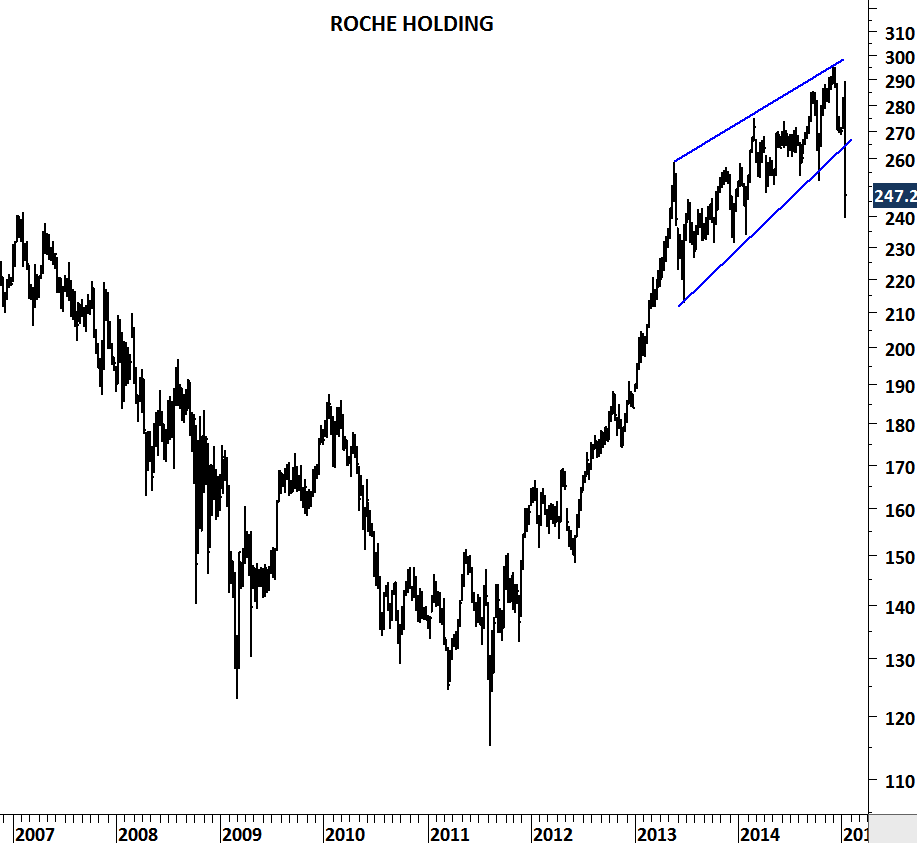
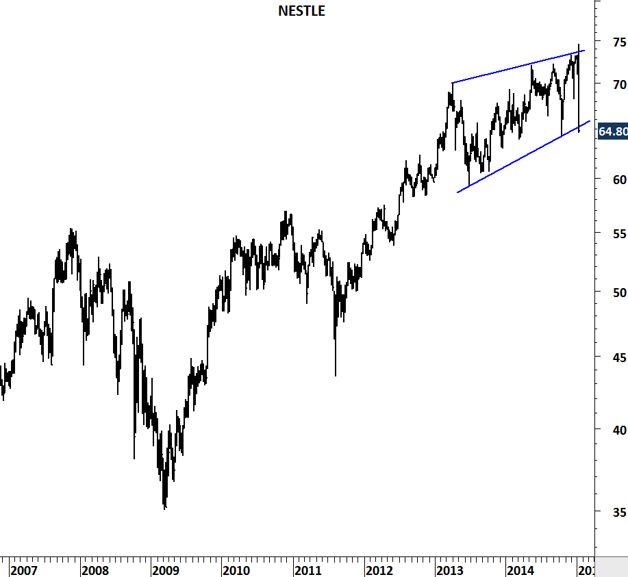
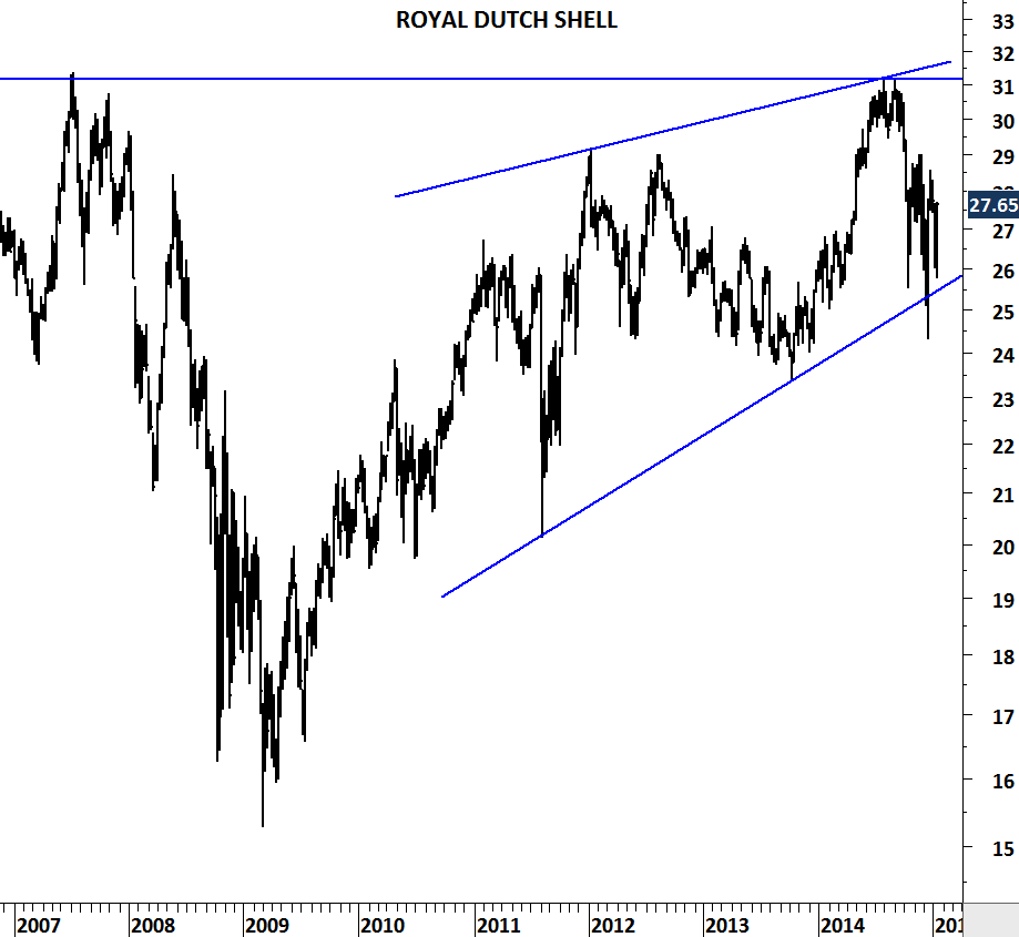
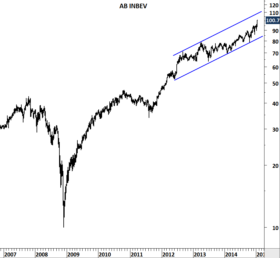
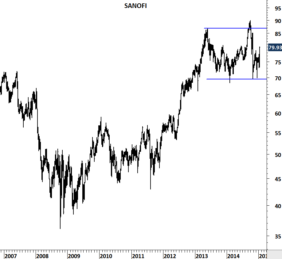
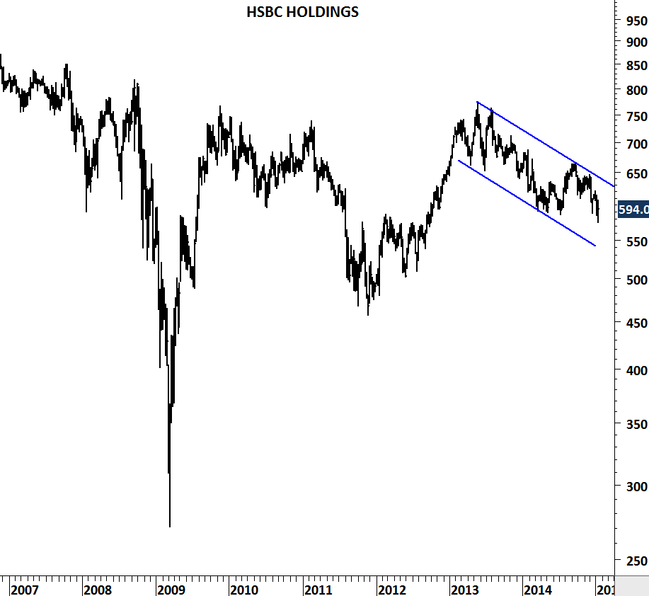
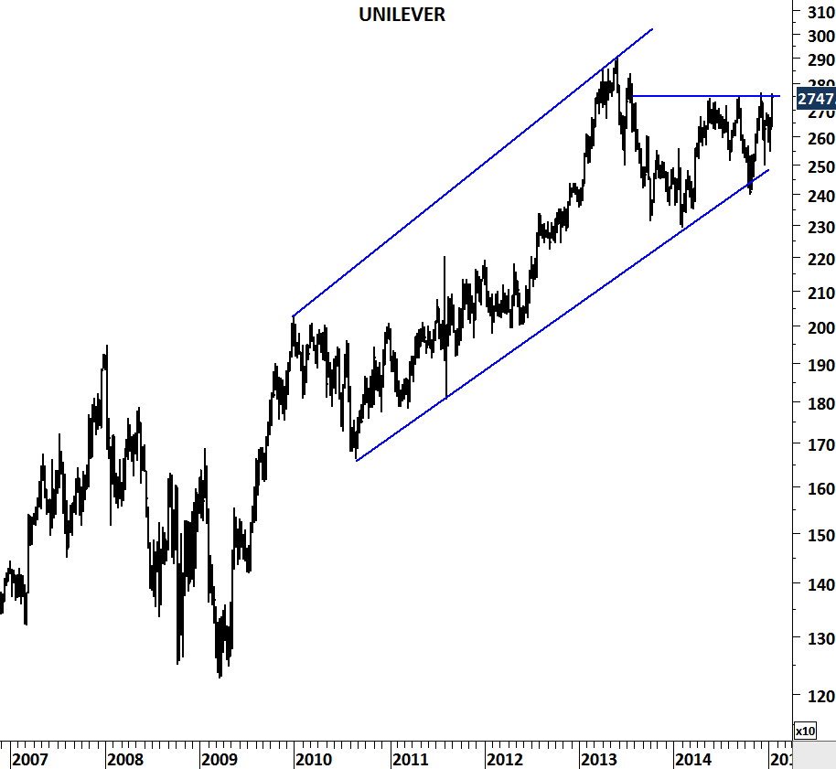
When a trade is assigned %100 probability of success, I start getting uncomfortable. I look around and see almost certainty for an event to occur… this becomes a case study for me. European Central Bank’s Quantitative easing is now being announced by the mainstream media as almost a certain event. I reviewed the top names in the Euro Stoxx 50 index to see if the market is anticipating this almost sure event. What I find is a bit different from the Japanese QE announcement. None of the names except UNILEVER is preparing for a breakout. Some of the names are overbought and some are showing significant weakness.

Take this update as a case study and not as a forecast. My conclusion for the top European stocks is that there is no clear anticipation of QE that would spill over to result in further equity gains. Below are the largest market cap stocks in the Euro Stoxx 50 index. I welcome any thoughts on this.

NOVARTIS

ROCHE HOLDING

NESTLE

ROYAL DUTCH

AB INBEV

SANOFI

HSBC HOLDINGS

UNILEVER

U.S. UNEMPLOYMENT RATE

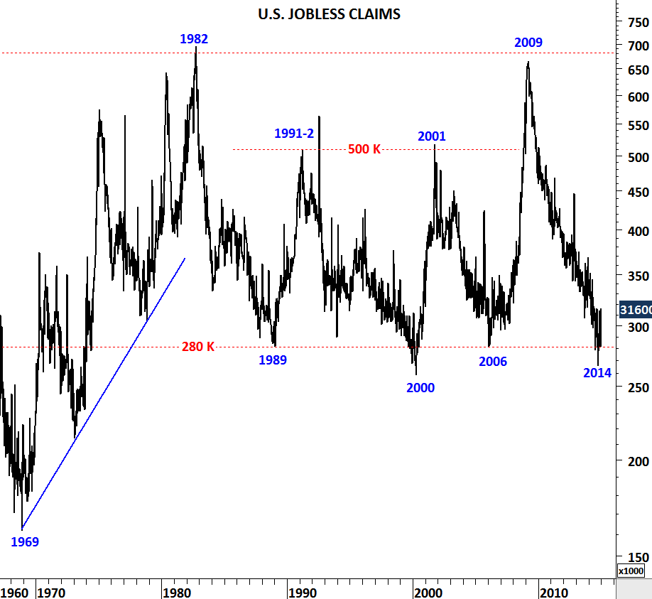
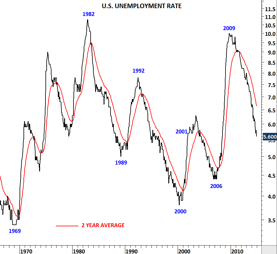
Two-decade long horizontal support at 280K on the U.S. weekly jobless claims chart suggest we might be at a “positive extreme” for the U.S. job market. 1989, 2000 and 2006 have proved to be the lowest levels for the weekly jobless claims. Reversals from 280K area resulted in a weak U.S. job market in the following years. Unemployment rate moved higher following the years 1989, 2000 and 2006. In 2014, U.S. weekly jobless claims reached as low as 266K. Latest data stand at 316K. Every long-term trend has an end. Historical levels on the long-term charts are warning us of a possible reversal. It is important to keep an eye on these two long-term charts in the following months.

US WEEKLY JOBLESS CLAIMS

US UNEMPLOYMENT RATE

MSCI ALL COUNTRIES WORLD INDEX

This update will cover several markets. There has been significant developments in the first half of January. I’ve given the title MSCI ALL COUNTRIES WORLD INDEX because I think it is one of the most important chart in this update. However, developments in Copper, Palladium and Emerging Markets index are also exciting. Over the past few weeks I’ve updated Tech Charts twitter followers on Copper, Palladium, Light Crude Oil, MSCI Emerging Markets index and some other chart patterns on equities. This will be an update for all followers.
MSCI ALL COUNTRIES WORLD INDEX

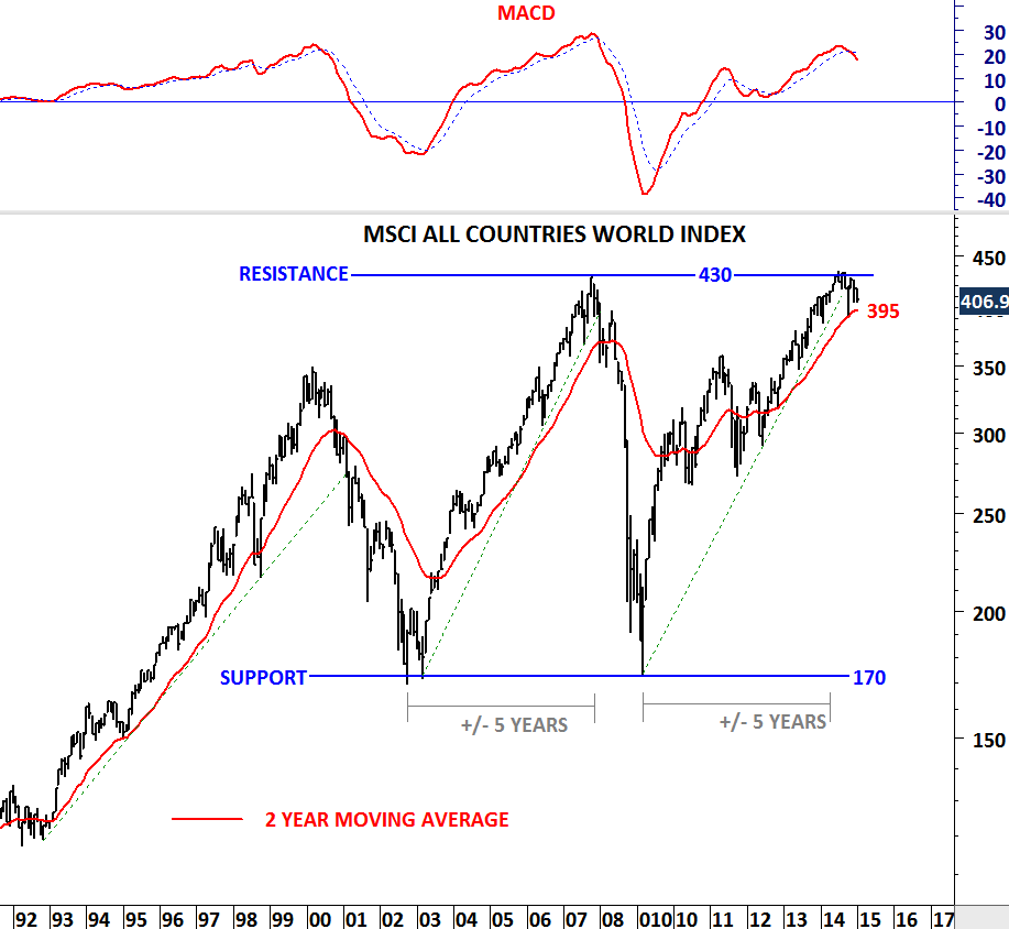
MSCI ALL COUNTRIES WORLD INDEX is at a critical juncture. Index covers more than 9000 securities in 46 different Developed and Emerging markets. I find it as a good representation of the global equity market performance. Attached is a monthly scale chart. MACD, which is a momentum and a trend following indicator generated a sell signal in November 2014. Cross-over on MACD is usually the first warning signal for a possible trend reversal. 2-year moving average which acted as a good trend following tool over the past decades is now at 395 levels. Breakdown below 392 (previous low in October 2014) will confirm the medium/long-term correction in global equities. We need to be prepared. This chart is at the top of my watch list.
COPPER

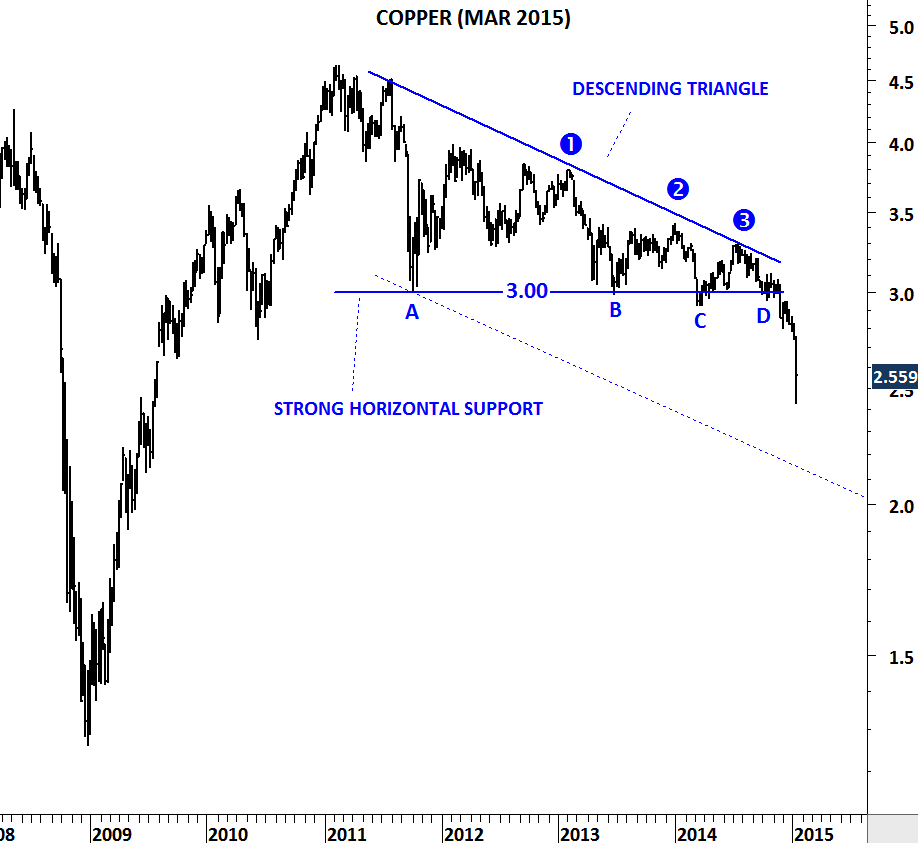
Dr. Copper warned us and I’ve sent several updates on this chart development. Weakness in Copper prices is negative for the global growth. Chart pattern (descending triangle) suggested lower prices below 3 levels. Breakdown was followed by an acceleration on the downside. Descending triangle price target is between 2.10-2.25. 2.10-2.25 area is also the lower boundary of the trend channel. Weakness can continue.
MSCI EMERGING MARKETS INDEX

I study volatility on daily, weekly and monthly scale. A chart with low volatility on weekly and monthly scale is important for me. The longer the low volatility period, the better it is. Because that means there is a lot of energy built in that low volatile consolidation range and a a breakout is usually followed by a strong directional movement. This is the case for the MSCI Emerging Markets Index. Volatility reached multi-decade low levels on the monthly scale chart. A decisive monthly scale breakdown below 900 levels will push emerging markets to lower levels. This is a developing story and should also be watched closely.
LIGHT CRUDE OIL

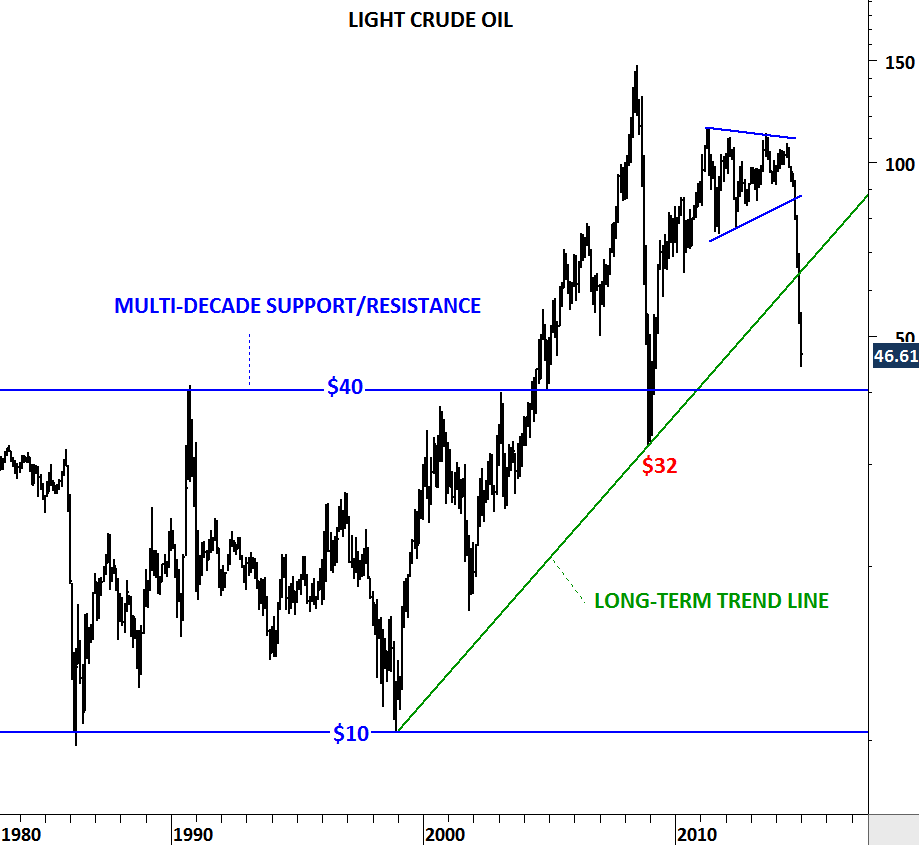
Mainstream media is talking about $40 oil price. Here is where that level is coming from. $40 is a long-term support/resistance level for the WTI Light Crude Oil. The important question is will it find support at that level? Well, for me the long-term chart is the best available information. In the past buyers/sellers appeared around $35-$40 area. I’ll expect the same. If we see a rebound, the next thing I will check will be how strong the rebound is. A weak rebound that hardly pushes the prices above $50 will signal further weakness for energy prices in the long-term.
PALLADIUM

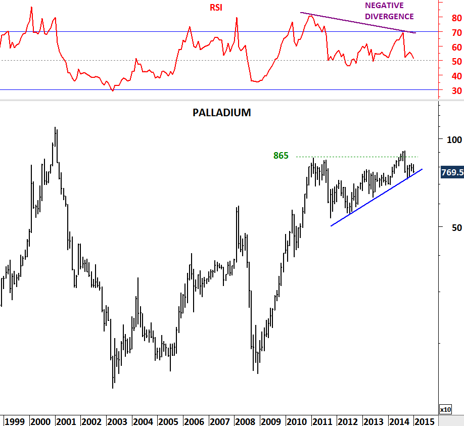
Last but not least, Palladium. I think the last 2 year’s uptrend has been extremely weak. Price tried to reach 2011 high level and it took 2 years for Palladium to reach that level with a major negative divergence on RSI on the monthly scale chart. October low stands at 725 levels. Breakdown below this level will send prices lower, possibly towards 500 levels.

TIN

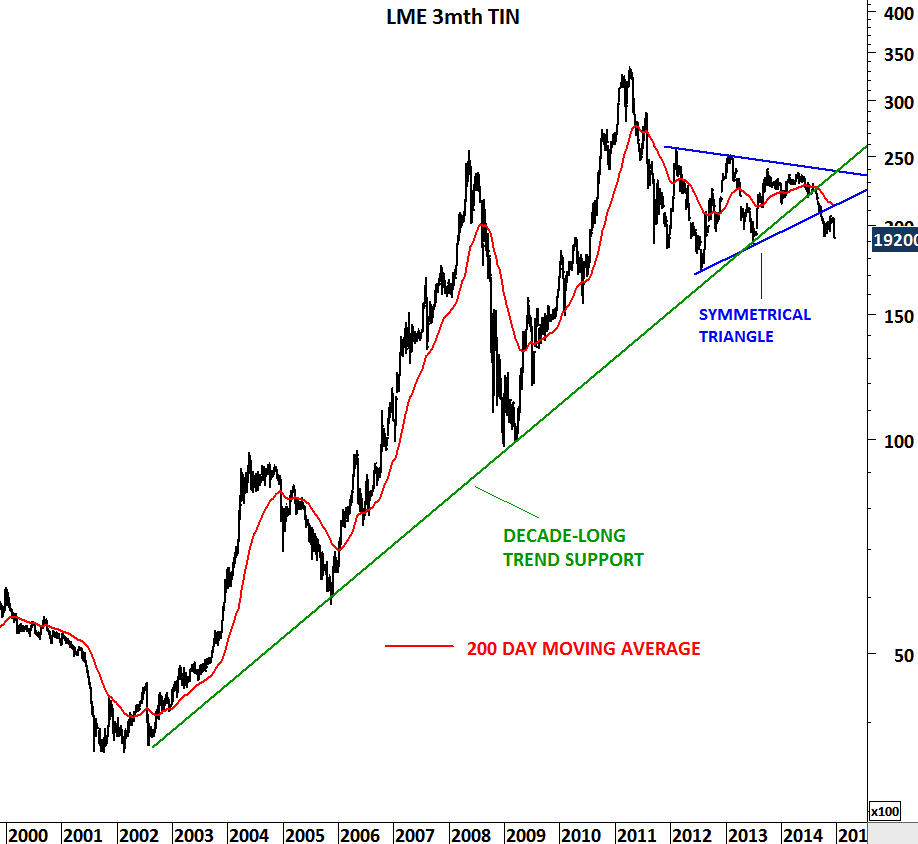
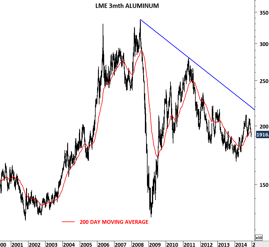
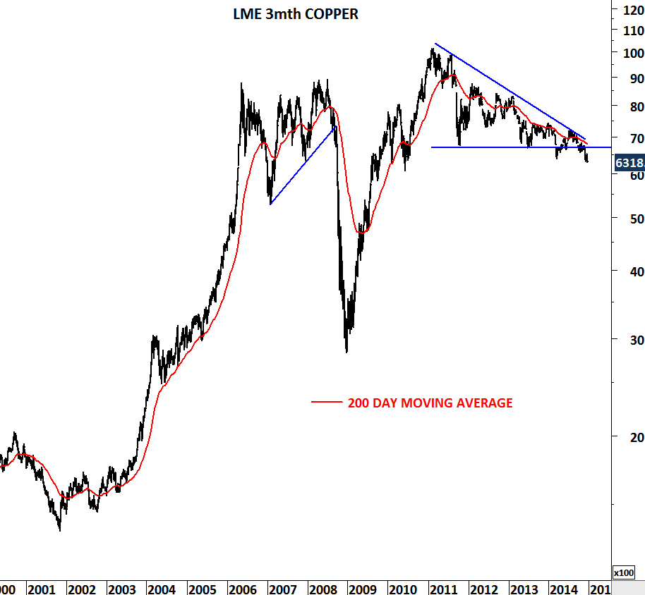
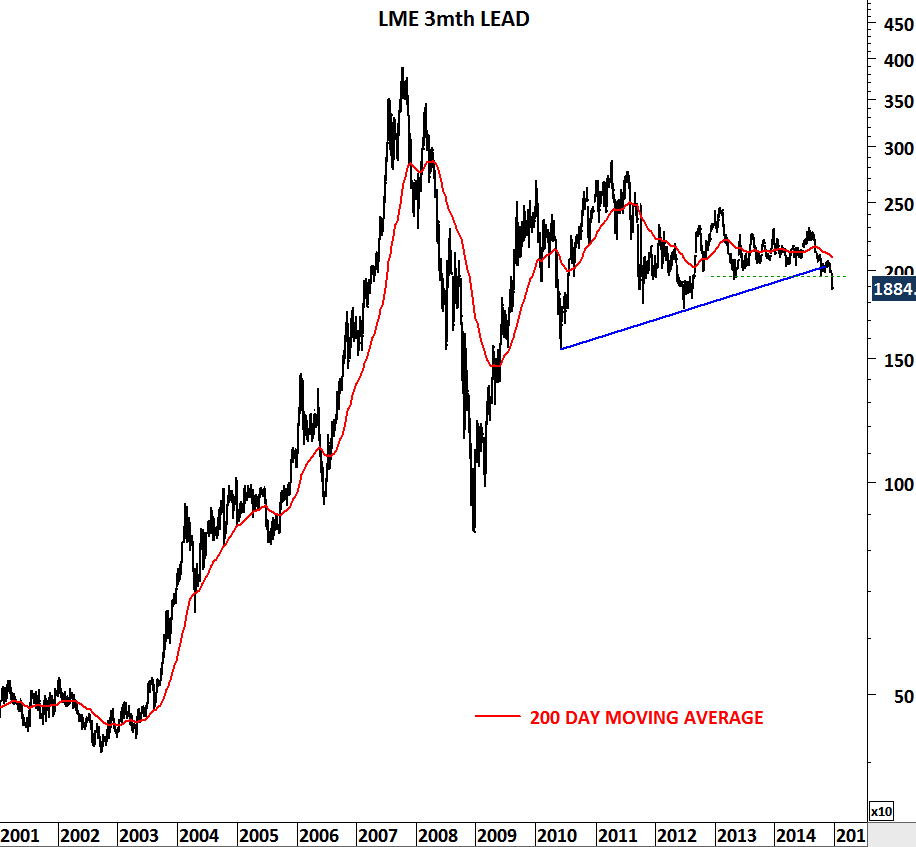
TIN IMAGEOne of the strongest bull markets in the metal complex is about to end. Tin is highly used in electronics. It is mixed into solder for circuitry in smartphones. Tin is used in everyday life in almost all electronic item. Notebooks, tablets, smartphones… Chart pattern suggests prices are headed for lower levels as we have seen some major breakdowns over the past year. Both the uptrend that has been intact since 2002 and the medium-term sideways consolidation (symmetrical triangle) have broken down. Unless we see a recovery above 21K levels, price could sell-off towards 15K-12K area in the following months. I have also added other industrial metals such as Lead, Aluminum and Copper. Both Copper and Tin are likely to join the weakness in other industrial metals.

TIN

ALUMINUM

COPPER

LEAD