
A stock (ETF, Index etc.) price is either in a trending phase or in a consolidation period. During strong trend periods prices move uninterrupted from one price level to another. During consolidations prices move in both directions without producing any meaningful or sustained price change and will form well-defined support and resistance areas on the charts. A support range represents a concentration of demand, and a resistance range represents a concentration of supply.
A resistance level is an approximate level or fairly well-defined price range, where previously advancing stock meets resistance in the form of strong selling. A support level is an approximate level or price range where a preceding decline meets support, in the form of strong buying. A possible explanation for appearance of such well-defined price boundaries in the form of support and resistance can be the fact that the public tend to remember previous levels the stock has traded.
The longer the time which the stock spent in that range, therefore, the greater the number of transactions, the more important that range becomes for future technical consideration. In applying support and resistance study to price charts, the weekly scale time frame is usually more informative than daily scale. Weekly charts show much more plainly the levels at which congestion of significant duration appeared.
Rectangle chart pattern is a good case study for the application of support and resistance analysis. The upper and lower boundary lines of this familiar and dependable chart pattern are resistance and support levels. Until a decisive breakout occurs in either direction, the boundaries of the rectangle chart pattern (given that it is well-defined with almost perfect horizontal boundaries) provides good reference levels. When a breakout occurs, penetrating one of these levels, that level changes its role. If it is an upward break, the resistance becomes support and if it is a downward break the support becomes resistance.
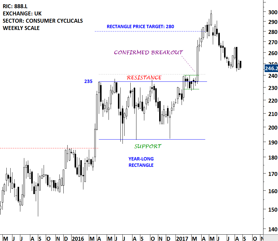
888 Holdings formed a year-long rectangle chart pattern in 2016. The boundaries of the rectangle was well-defined and the price respected the support and resistance areas. While one can have several different strategies to analyze and trade such price changes, two strategies that are common are:
- Trading price changes between the boundaries: Once the price chart forms a well-defined (more than 2 tests of resistance or support around the same price range) pattern boundary, one can buy at support and sell at resistance.
- Trading price change after a breakout is confirmed: Breach of the chart pattern boundary usually changes the balance between the supply & demand and results in a directional move. Buying at the breakout or selling at the breakdown confirmation is another common strategy.
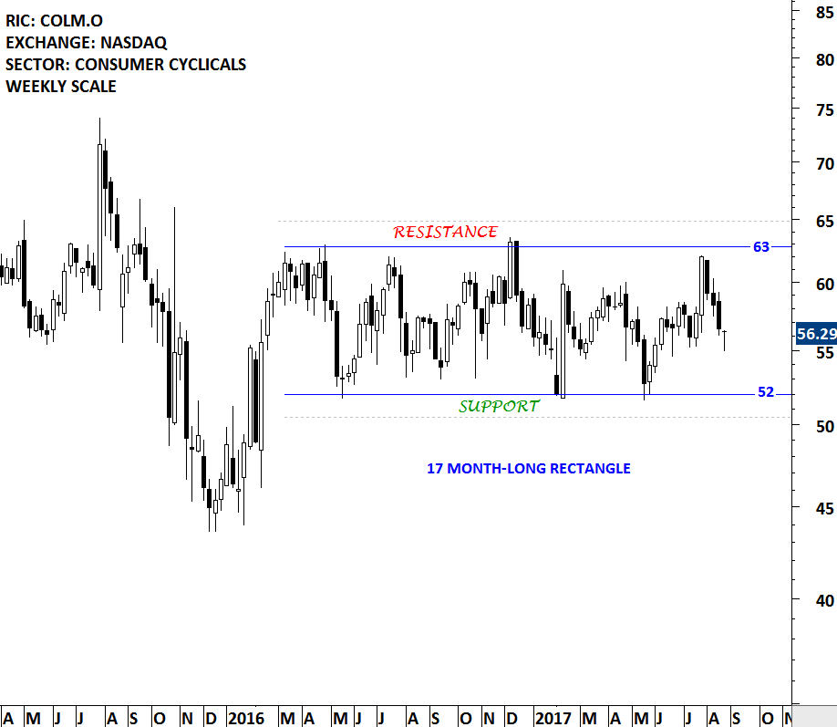
Another good example for a well-defined trading range is the price chart of Columbia Sportswear. The multi-month trading range on Columbia Sportswear was discussed in the May 27, 2017 report [1]. The analysis drew attention to a possible rebound from the lower boundary (support) of the 17 month-long range at 52 levels to the upper boundary at 63 levels. Columbia Sportswear price continues to remain between the boundaries. Tech Charts Global Equity Markets report will continue to bring member’s attention such chart pattern developments as well as breakout opportunities.
Tech Charts Membership

By becoming a Premium Member, you’ll be able to improve your knowledge of the principles of classical charting.
With this knowledge, you can merge them with your investing system. In fact, some investors use my analyses to modify their existing style to invest more efficiently and successfully.
Get Access Now [2]
As a Premium Member of Aksel Kibar’s Tech Charts,
You will receive:
-
Global Equities Report. Delivered weekly.
-
Classical charting principles. Learn patterns and setups.
-
Actionable information. Worldwide indices and stocks of interest.
-
Risk management advice. The important trading points of each chart.
-
Information on breakout opportunities. Identify the ones you want to take action on.
-
Video tutorials. How patterns form and why they succeed or fail.
-
Watch list alerts. As they become available so you can act quickly.
-
Breakout alerts. Usually once a week.
-
Access to everything (now and as it becomes available)o Reports
o Videos and video series -
Multi-part webinar course. You learn the 8 most common charting principles.
-
Webinars. Actionable and timely advice on breaking out chart patterns.
For your convenience your membership auto renews each year.
Get Access Now [2]